

Seriously playful design.
- $1k+
- Earned
- 2x
- Hired
- 5.0
- Rating
- 91
- Followers
Seriously playful design.
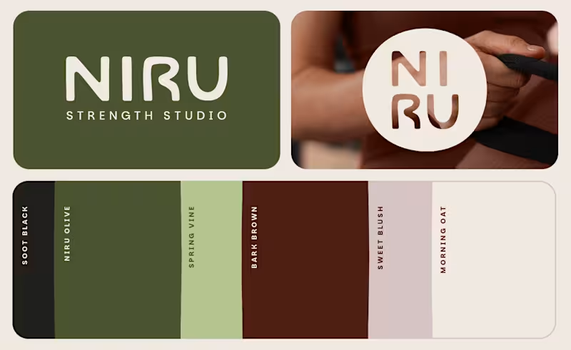
NIRU Strength Studio Brand Identity by FLM Studio (https://www.flm.studio)
NIRU is a modern Pilates and strength studio created to feel more like a boutique hospitality space than a traditional gym. FLM Studio built the brand around calm, connection and intentional movement, creating a space where strength feels grounded, accessible and quietly empowering.
Strength meets softness. Warm, tactile and considered. The identity balances a premium wellness aesthetic with an approachable sense of community and connection.
A complete brand identity spanning strategy, creative direction, visual identity, art direction, social templates, signage and physical studio touchpoints.
#branding #branddesign #brandidentity #wellness #fitnessbranding
:::
1
3
249
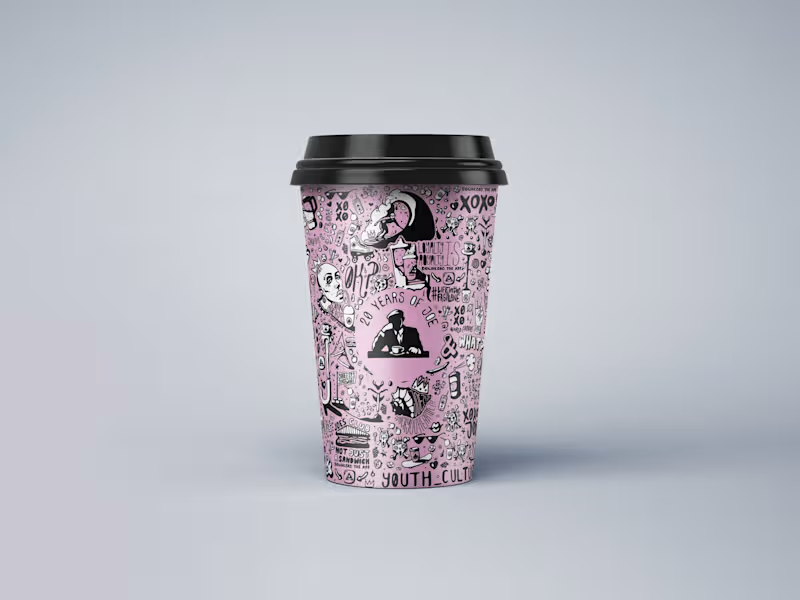
JOE & THE JUICE 20th Anniversary Artwork by FLM Studio (https://www.flm.studio)
To celebrate 20 years of JOE & THE JUICE, FLM Studio created a bold, hand-illustrated artwork celebrating two decades of energy, flavour and community, while staying rooted in JOE’s distinctive visual world.
Hand-drawn. Playful. Unapologetically indie. Packed with JOE-themed motifs, expressive characters and playful concepts, the artwork was designed to feel vibrant, energetic and unmistakably JOE.
A bespoke illustration created for JOE’s signature pink cups, with applications across packaging, social media and limited-edition merchandise.
#branding #branddesign #illustration #packaging #foodandbeverage
2
2
261
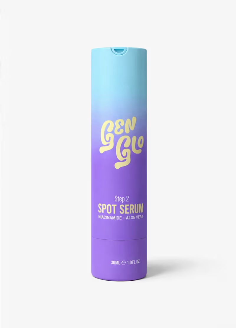
GenGlo (https://www.genglo.co.uk) Skincare Brand Identity by FLM Studio (https://www.flm.studio )
GenGlo is redefining early skincare for ages 8–14 with gentle, dermatologist-guided formulas and a confidence-building approach. FLM Studio built the brand from the ground up, creating a world that speaks to young skin without feeling childish.
Sunshine yellow. Soft gradients. Playful illustration. Big-sis energy. The identity was designed to feel bright, approachable and uplifting, turning everyday skincare routines into moments of joy.
A complete brand identity, custom illustration system, full packaging design across three products and comprehensive brand guidelines.
#branding #branddesign #brandidentity #packaging #skincare
1
1
246
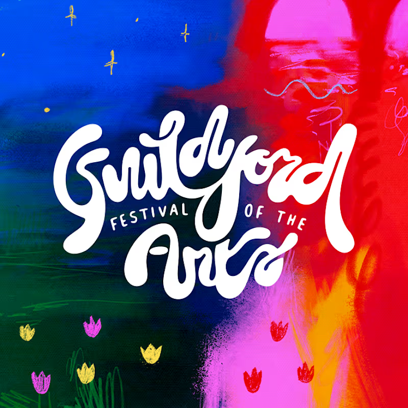
Guildford Festival of the Arts (https://www.guildfordfestivalofthearts.co.uk) Brand Identity by FLM Studio (https://www.flm.studio )
Guildford Festival of the Arts is a brand new, grassroots celebration of visual arts, created to champion local and emerging artists. For its inaugural 2025 edition, FLM Studio built the visual identity from the ground up.
Bold colour. Bespoke typography. Playful energy. The identity was designed to feel accessible, expressive and rooted in the local creative community.
A complete brand identity, bespoke logo, custom typeface, event materials and a full suite of merch and products.
#branding #branddesign #brandidentity #typography #graphicdesign
1
1
211


Strategic Branding & Digital Marketing Specialist


I will make users love your product / brand. Hire me!
I will make users love your product / brand. Hire me!


Web, Graphic and Motion Designer
Web, Graphic and Motion Designer



High-end brand identities and pitch presentations
High-end brand identities and pitch presentations

Kinvox comes from King + Veloz, creating a short and memorable name that conveys leadership and speed.
The logo combines typography and symbol.
The icon is formed by the fusion of two “K” shapes, representing motion and control.
The upper bar suggests a crown and the lower a foundation, expressing stability and authority.
The gold and grey palette reinforces energy, technology and professionalism across multiple applications.
2
77

Um Lugar Brasileiro is a interior design studio that brings nature into indoor spaces through a biophilic and sustainable approach. The brand reflects warmth, optimism, and reliability, creating interiors that feel both welcoming and environmentally conscious.
With a strong commitment to sustainability, Um Lugar Brasileiro incorporates natural materials, green elements, and eco-friendly solutions. The visual identity should communicate this harmony with nature while maintaining a professional and inviting presence.
A place to feel at home, inspired by nature, and built on trust.
This is Um Lugar Brasileiro.
6
5
144

Bullter Beer is a brewery designed to express personality, presence and authenticity.
The project included naming creation and full branding development, combining the idea of strength and ownership — Bull (strong) + ter (have) — into a bold and modern visual identity that positions the brand as intense, contemporary and memorable.
2
1
103

BLN Advogados is a law firm designed to represent a more contemporary, approachable and human legal practice.
The project involved the complete branding development, creating a modern and dynamic visual identity that communicates youthfulness, trust and professionalism without relying on traditional legal industry aesthetics.
1
84

Specializing in Branding, Packaging, and Graphic Design


High-quality video editor
High-quality video editor


