
Mayara Dimbarre
High-end brand identities and pitch presentations
New to Contra
Mayara is ready for their next project!
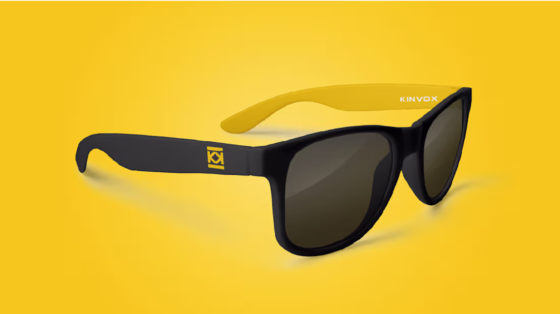
Kinvox comes from King + Veloz, creating a short and memorable name that conveys leadership and speed.
The logo combines typography and symbol.
The icon is formed by the fusion of two “K” shapes, representing motion and control.
The upper bar suggests a crown and the lower a foundation, expressing stability and authority.
The gold and grey palette reinforces energy, technology and professionalism across multiple applications.
2
36
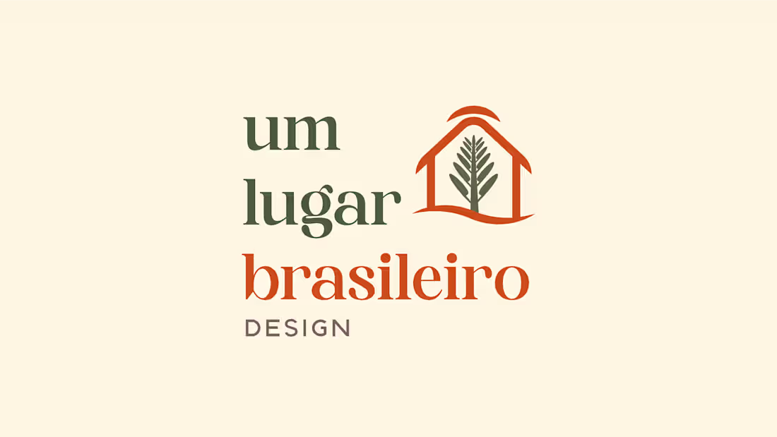
Um Lugar Brasileiro is a interior design studio that brings nature into indoor spaces through a biophilic and sustainable approach. The brand reflects warmth, optimism, and reliability, creating interiors that feel both welcoming and environmentally conscious.
With a strong commitment to sustainability, Um Lugar Brasileiro incorporates natural materials, green elements, and eco-friendly solutions. The visual identity should communicate this harmony with nature while maintaining a professional and inviting presence.
A place to feel at home, inspired by nature, and built on trust.
This is Um Lugar Brasileiro.
6
5
84
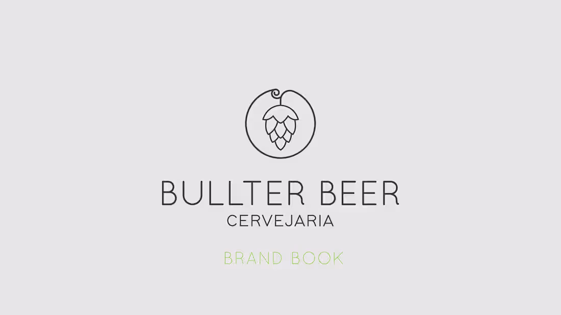
Bullter Beer is a brewery designed to express personality, presence and authenticity.
The project included naming creation and full branding development, combining the idea of strength and ownership — Bull (strong) + ter (have) — into a bold and modern visual identity that positions the brand as intense, contemporary and memorable.
2
1
52
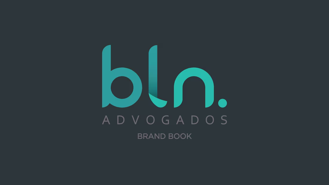
BLN Advogados is a law firm designed to represent a more contemporary, approachable and human legal practice.
The project involved the complete branding development, creating a modern and dynamic visual identity that communicates youthfulness, trust and professionalism without relying on traditional legal industry aesthetics.
1
48
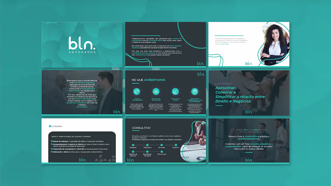
This presentation was developed for BLN Advogados to communicate legal services in a clearer and more approachable way. The goal was to translate formal legal content into an organized and client-friendly narrative.
Structured layouts, soft contrasts, and visual highlights guide the reader through the information while maintaining credibility and professionalism. The design balances institutional tone with accessibility, reinforcing trust and transparency.
A modern legal presentation designed to simplify communication between law and business.
0
63
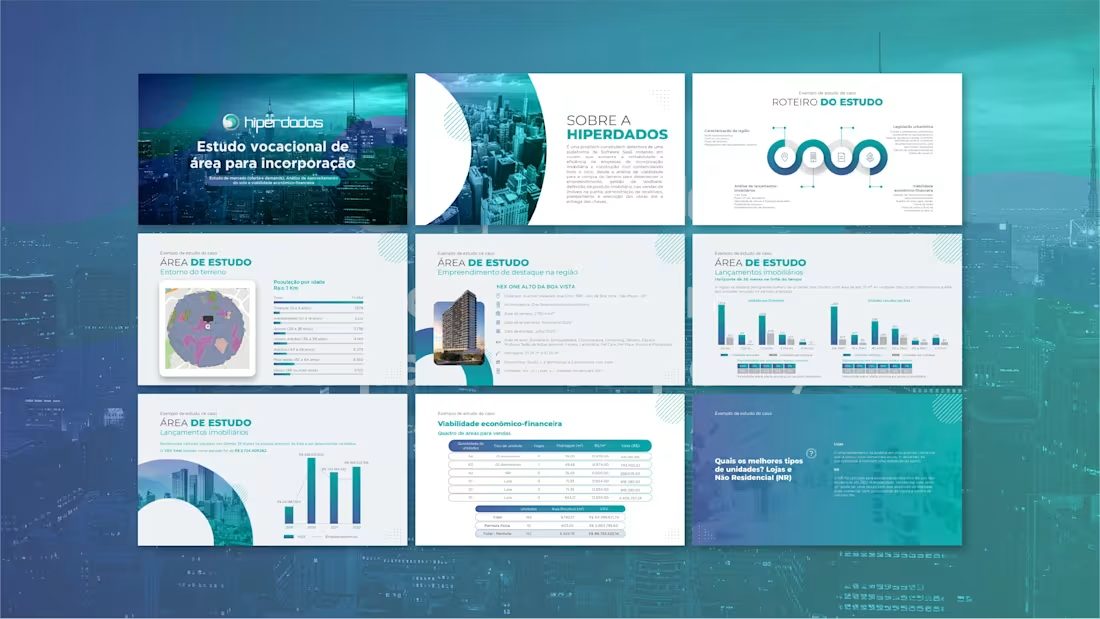
This presentation was created for Hiperdados to communicate technical studies and market analysis in a clear and structured way. The challenge was transforming dense information into an accessible and visually organized narrative.
Clean layouts, consistent hierarchy, and data-focused visuals improve readability while maintaining a professional and analytical tone. Charts and diagrams were designed to support decision-making and highlight key insights.
A corporate presentation built to simplify complex data and strengthen credibility.
0
68
Hunter was created for a media consulting company focused on positioning and market visibility. The identity needed to communicate precision, strategy, and upward growth.
The symbol suggests direction and pursuit, reinforcing the idea of guiding brands toward better opportunities. Clean typography and balanced spacing convey professionalism and clarity, while the minimal composition keeps the brand versatile across digital environments.
A modern identity designed to represent guidance, performance, and strategic presence in media.
0
79
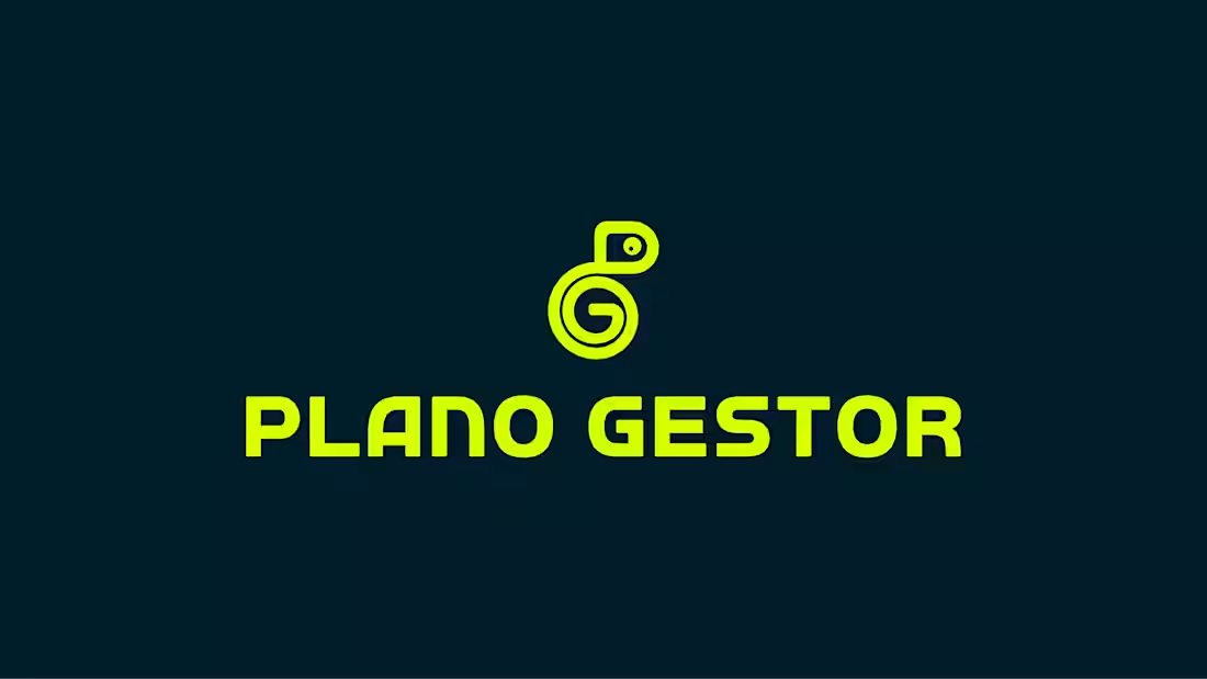
Plano Gestor was developed for a modern marketing agency focused on strategy and business growth. The identity needed to communicate innovation, clarity, and analytical thinking while remaining approachable and dynamic.
The bold typography combined with a fluid symbol creates a balance between structure and movement — representing planning, management, and continuous evolution. The vibrant contrast reinforces visibility and energy, aligning the brand with a results-driven mindset.
A contemporary identity designed to position Plano Gestor as a strategic partner for companies seeking direction and expansion.
0
75
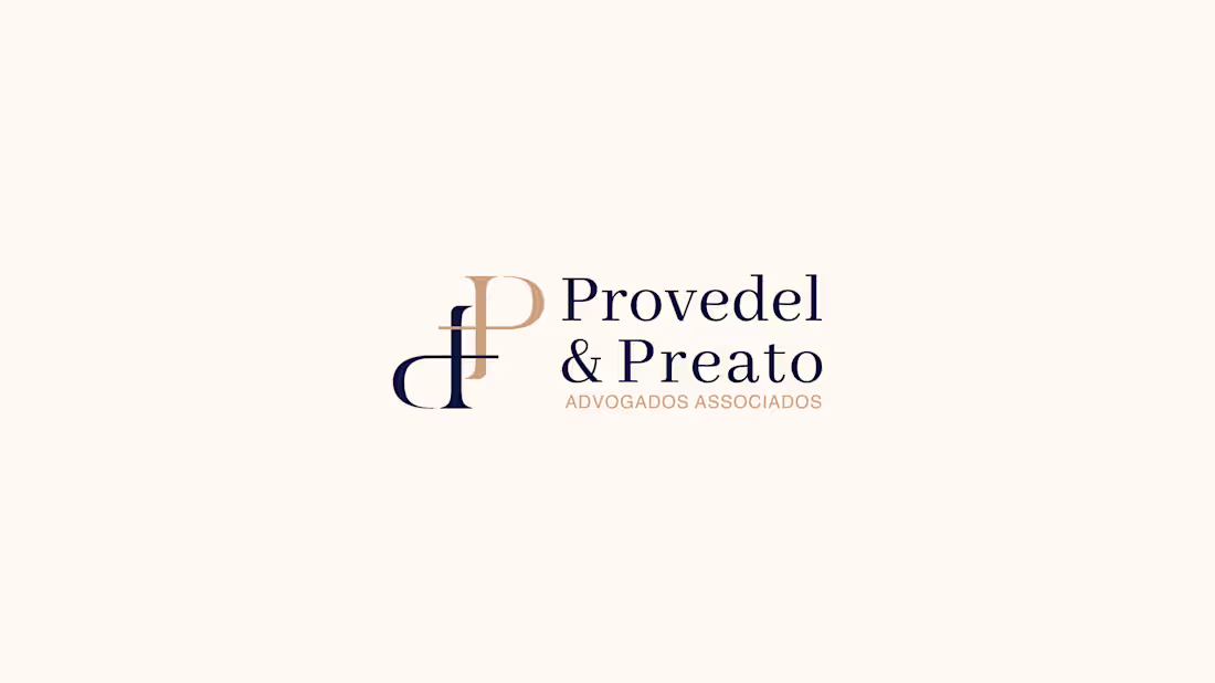
Provedel & Preato was developed for a law firm seeking a refined and trustworthy visual presence. The identity combines classic legal aesthetics with a contemporary approach to convey credibility and professionalism.
Elegant typography and balanced composition reinforce authority and clarity, while subtle contrast adds sophistication without excess. The monogram works as a discreet signature, strengthening recognition across formal applications.
A timeless identity designed to communicate confidence, tradition, and reliability in the legal field.
0
78
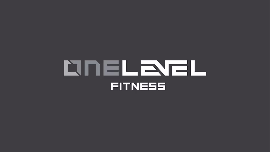
OneLevel was created for a modern gym concept focused on accessibility and low-cost membership without compromising quality. The identity needed to feel strong, energetic, and contemporary while remaining approachable.
The logo uses sharp geometry and structured typography to communicate performance, discipline, and progression. Clean lines and balanced proportions reinforce efficiency — reflecting a fitness experience that is simple, direct, and effective.
A bold and modern mark designed to position OneLevel as an accessible entry point into a better lifestyle.
0
75
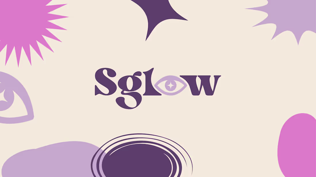
glow was created for a modern retail brand centered around mysticism and spiritual aesthetics. The visual identity blends contemporary design with symbolic elements, creating a balance between trend and meaning.
Organic shapes, soft contrasts, and expressive typography evoke intuition, energy, and self-connection while maintaining a clean and current look. The brand feels mystical without becoming esoteric, making it accessible to a wider audience.
A distinctive identity that transforms spirituality into a modern lifestyle experience.
0
63
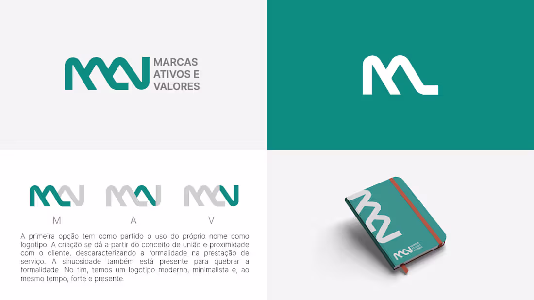
MAV was designed for a company specialized in trademark registration.
The client requested a logo without an icon, where the name itself would be the main element.
The solution focused on a strong typographic structure, using bold geometry and precise spacing to convey authority, reliability, and legal clarity. The wordmark becomes the identity — reinforcing the value of a protected name.
A clean, modern brand built on recognition through simplicity.
0
65