Freelance Packaging Designers in Lisbon
Sign Up
Post a job
Sign Up
Log In
Filters
2
Projects
People
João Vicente
Queluz, Portugal
Brand Designer with Strategy and Purpose
18
Followers
Follow
Message
Brand Designer with Strategy and Purpose
1
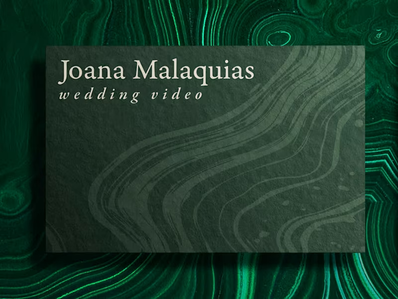
Joana Malaquias · Brand Identity + Packaging
1
34
53
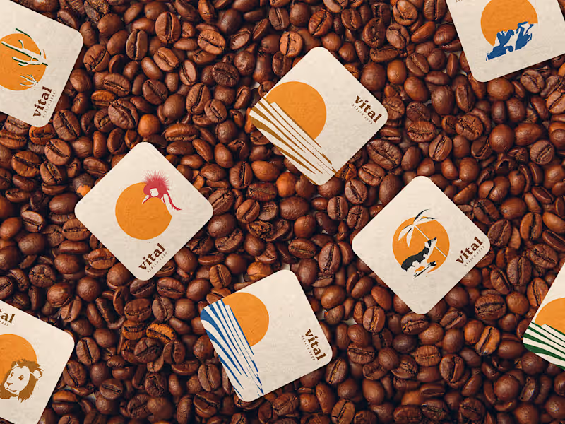
Vital · Brand Identity + Packaging
53
497
0
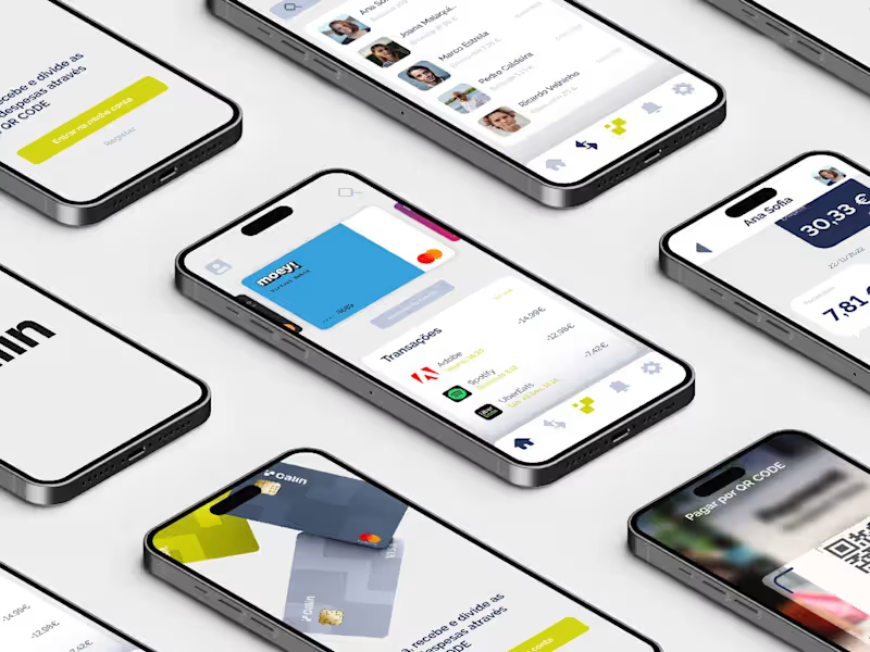
Calin · Brand Identity + App Development
0
28
View more →
Packaging Designer
(2)
Follow
Message
Marco Fortes
Lisbon, Portugal
Expert Brand & Product Designer with Proven Impact
Follow
Message
Expert Brand & Product Designer with Proven Impact
0
Fuel® — Rebranding
0
25
0
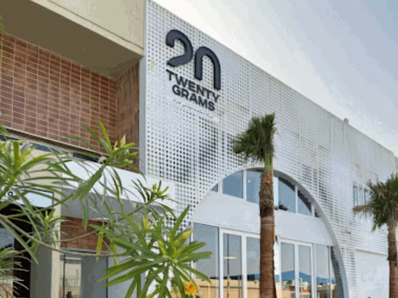
20GR® — Rebranding
0
20
0
UI / UX Collection
0
33
0
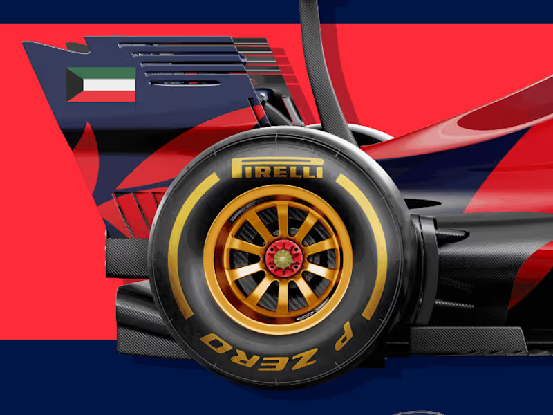
KMT Race Track — Branding
0
32
Packaging Designer
(2)
Follow
Message
Bruna Monte
Lisbon, Portugal
Brand & Marketing Designer | Branding + Growth | 9+ Years
Follow
Message
Brand & Marketing Designer | Branding + Growth | 9+ Years
0
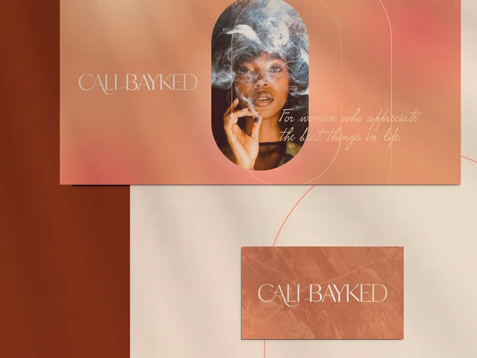
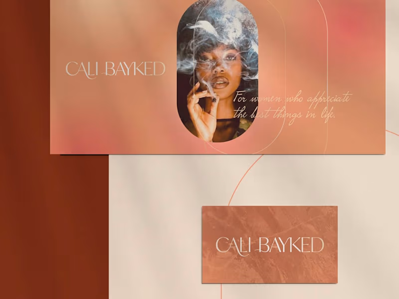
Cali Bayked - Branding & Packaging
0
12
0
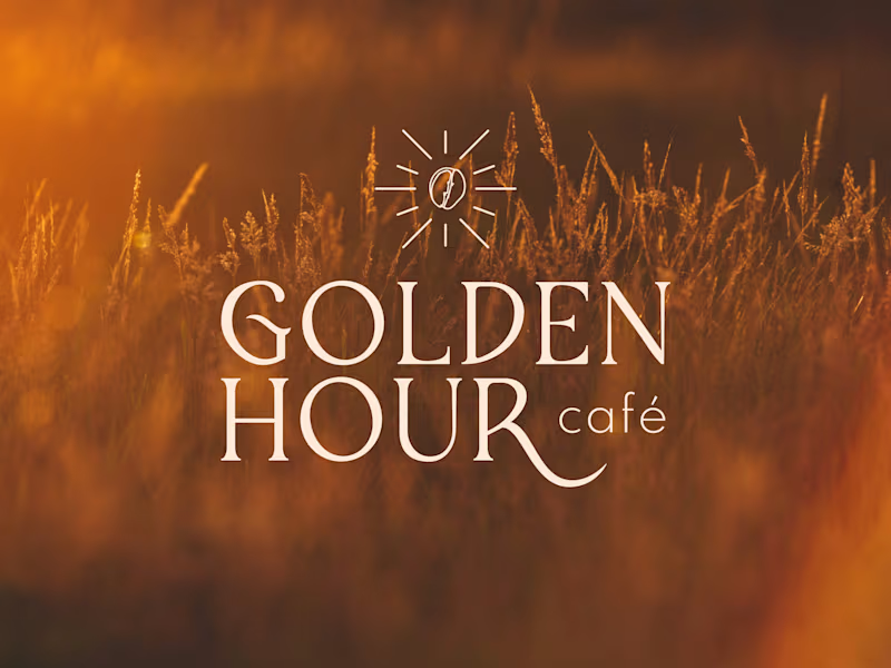
Golden Hour Café - Branding and Packaging
0
6
0
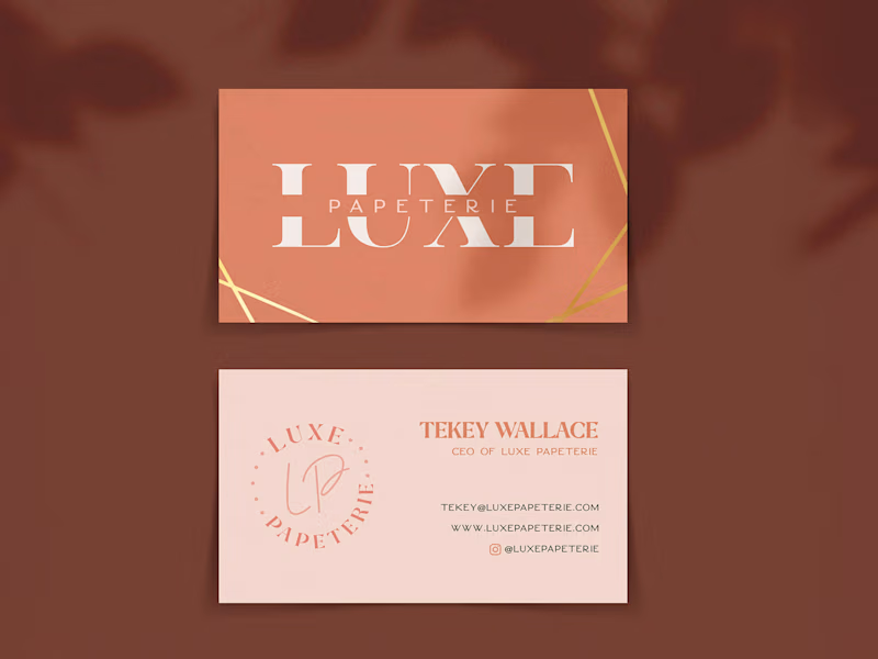
Luxe Papeterie - Branding & Packaging
0
6
View more →
Packaging Designer
(2)
Follow
Message
Paula Soares
Lisbon, Portugal
senior graphic designer
Follow
Message
senior graphic designer
0
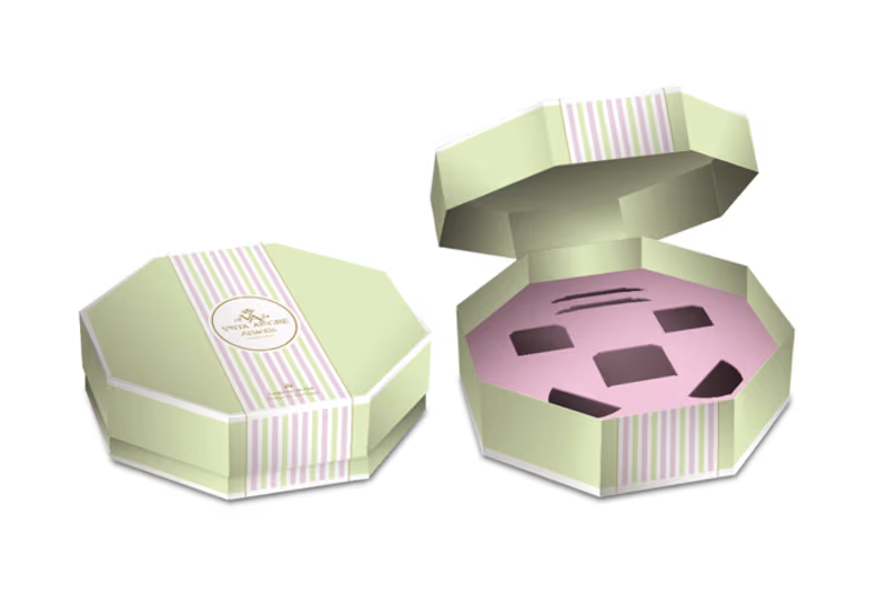
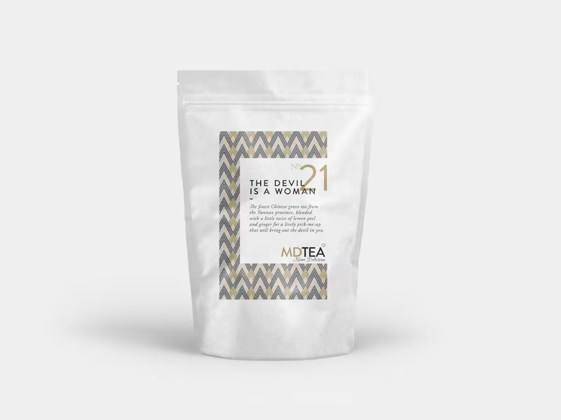
Packaging “Chitas” Tea Set Vista Alegre
0
2
0
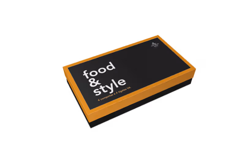
Packaging Gourmet Food&Style Vista Alegre
0
1
0
Logo Dignidade
0
1
0
Logo and Image Open House Presentation Vista Alegre
0
2
Packaging Designer
(2)
Follow
Message
Darya Batyr ✦
max
Lisbon, Portugal
Creative partner in your brand’s success
$250k+
Earned
58x
Hired
5.0
Rating
1.2K
Followers
Top
Hired
+1
Follow
Message
Creative partner in your brand’s success
23
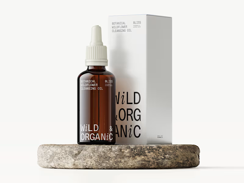
Brand Identity & Packaging | Wild & Organic
23
468
75
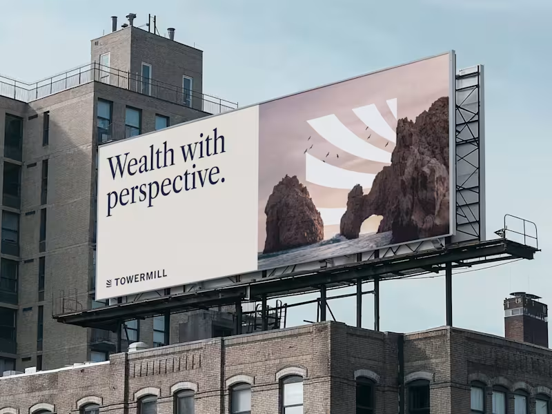
Modern Identity for a Future-Ready Investment Firm
75
1.3K
18
Tahcar: Building an Enterprise Brand for Modern Logistics
18
278
40
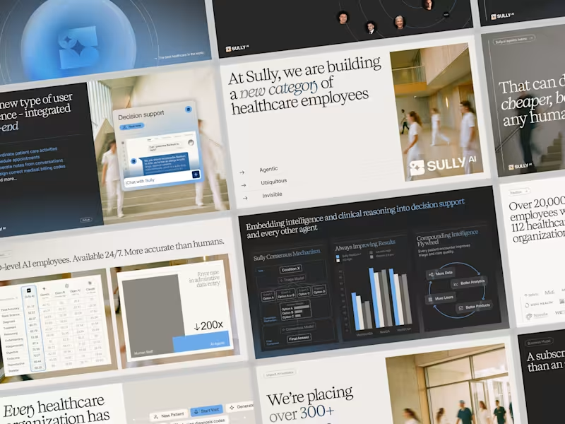
Sully.ai Series B Pitch Deck Design
40
989
Packaging Designer
(1)
Follow
Message
Carolina Marques
pro
Lisbon, Portugal
Luxury Brand and Web Designer
$5k+
Earned
1x
Hired
5.0
Rating
14
Followers
Follow
Message
Luxury Brand and Web Designer
0
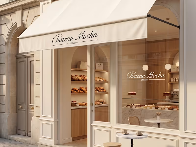
Château Mocha Luxury Pâtisserie Brand Identity & Creative Direction Overview Château Mocha is a luxury pâtisserie concept inspired by the quiet elegance of Parisian cafés, where timeless interiors, artisanal craftsmanship, and refined simplicity come together. The project was developed as a complete brand universe, combining strategy, visual identity, packaging, and art direction to create a cohesive experience across every customer touchpoint. Rather than designing individual assets, the objective was to create a brand that feels instantly recognizable, from the storefront to the packaging, product presentation, and digital imagery. The Concept Luxury isn't created through decoration, it's created through consistency. Château Mocha was imagined as a modern Parisian pâtisserie that celebrates slow mornings, handcrafted pastries, and elevated everyday rituals. Every visual decision was made to communicate warmth, sophistication, and timeless elegance while allowing the products to remain the true focal point. What I Created: • Brand Strategy • Creative Direction • Brand Identity Design • Logo & Monogram Design • Visual Identity System • Packaging Design • Product Visualization • Art Direction Creative Direction The visual language balances classic French elegance with a contemporary minimal aesthetic. A restrained palette of warm creams, rich mocha browns, and soft neutrals creates a sense of warmth and refinement. Editorial-inspired photography, understated typography, and carefully styled product imagery establish an atmosphere that feels premium without appearing excessive. Every element, from the embossed butter monogram to the takeaway packaging and storefront applications, was designed as part of one cohesive brand experience. Outcome The result is a fully realized luxury brand concept that demonstrates how consistent creative direction transforms individual assets into a memorable customer experience. Designed to feel timeless rather than trend-driven, Château Mocha showcases how branding extends beyond a logo to shape the atmosphere, perception, and emotional connection of a brand.
0
65
3
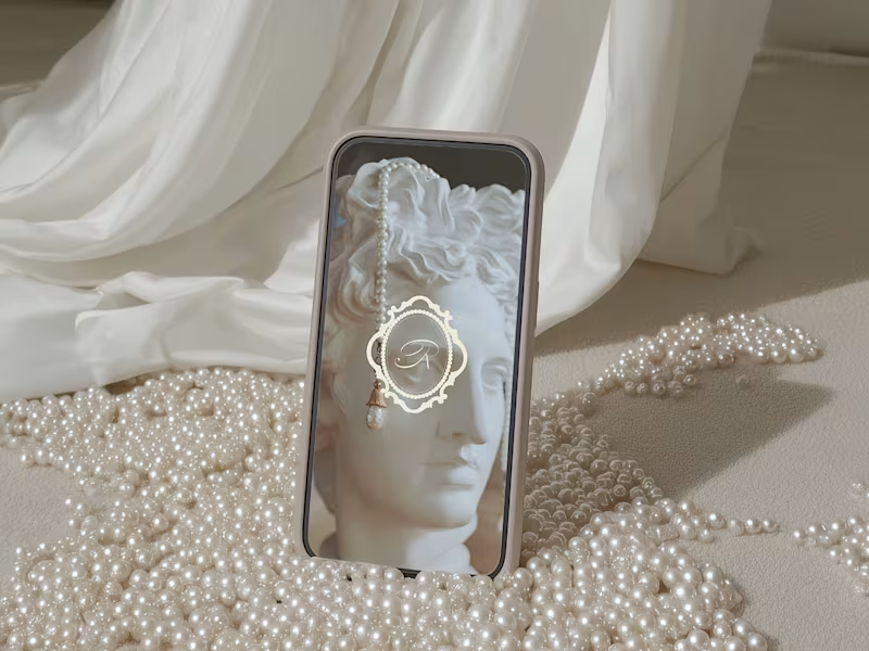
Orivienne Building a timeless jewelry brand inspired by heritage, femininity, and modern luxury. Orivienne is a conceptual fine jewelry brand created to embody quiet luxury through refined design. Inspired by royal emblems, heirloom craftsmanship, and classical European aesthetics, the identity blends tradition with contemporary minimalism to create a brand that feels elegant, collectible, and enduring. Services • Brand Strategy • Visual Identity • Logo Design • Packaging Design • Art Direction • Brand Applications The Vision The goal was to create a jewelry brand that felt established rather than trendy. Instead of following contemporary jewelry branding, I explored visual references rooted in heritage: antique family crests, engraved emblems, archival typography, and timeless packaging. The result is a brand that feels sophisticated, feminine, and quietly luxurious—designed to evoke emotion through restraint rather than excess. Brand Direction Three principles guided the identity: Timeless Design choices that remain relevant beyond seasonal trends. Feminine Elegant typography, delicate ornamentation, and soft neutral tones create a refined aesthetic. Collectible Every touchpoint—from the emblem to the packaging—is designed to feel worthy of keeping. The Identity The centerpiece of the brand is a bespoke emblem inspired by classical European seals. Rather than relying on ornate decoration, the identity balances intricate detailing with generous spacing and understated typography, creating a visual language that feels premium and enduring. The logo system was designed to work seamlessly across packaging, jewelry boxes, digital platforms, and printed materials. Packaging Luxury is experienced through details. The packaging system uses muted taupe tones, embossed finishes, and minimalist layouts to create an elevated unboxing experience. Every element reinforces the brand's heritage-inspired aesthetic while remaining clean and contemporary. Art Direction The imagery embraces soft natural light, sculptural forms, marble textures, pearls, and classical references. Instead of overwhelming the viewer with decoration, each composition leaves space for the product and identity to breathe, reinforcing the quiet confidence of the brand. Digital Presence The visual language extends naturally into digital applications, creating consistency across social media, and marketing assets. Every touchpoint reflects the same elevated atmosphere as the physical brand experience. Outcome Orivienne demonstrates how strategic branding can transform a concept into a complete luxury universe. By combining thoughtful strategy with refined visual execution, the project creates a brand that feels established, desirable, and memorable from its very first interaction.
3
3
788
4
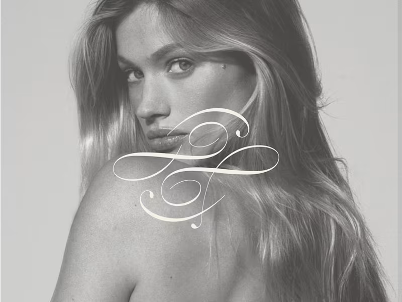
Original Femme Luxury Skincare Brand Identity & Creative Direction Overview Original Femme is a luxury skincare concept created around the belief that beauty isn't something to achieve—it's something to reveal. Rather than promising transformation, the brand celebrates the features that already make every woman unique. I developed the creative direction, brand identity, packaging, and digital assets, creating a refined visual language that reflects confidence, femininity, and timeless beauty. The Idea The beauty industry often relies on the idea that women need to fix, correct, or become someone else. Original Femme takes a different approach. The brand positions skincare as a ritual of care rather than correction, celebrating natural beauty through thoughtful design and understated luxury. My Role Brand Strategy Creative Direction Brand Identity Logo Design Packaging Design Art Direction Social Media Assets Product Visualization Creative Direction The visual identity was designed to feel soft, editorial, and quietly luxurious. A restrained neutral palette, elegant typography, and warm photography create a sense of intimacy while allowing the product to become the focal point. Every touchpoint was crafted to communicate sophistication without excess.
4
4
250
1
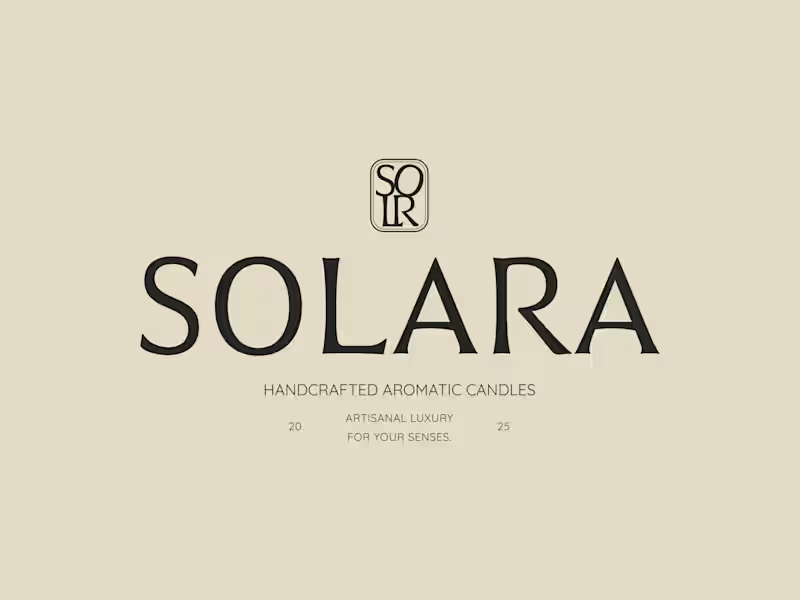
SOLARA Building a brand that invites people to slow down. Overview SOLARA is a handcrafted candle studio founded on the belief that luxury isn't found in excess—it's found in intention. Created with natural materials, handcrafted vessels, and an appreciation for slower living, the brand was designed to become more than a candle company. It was envisioned as a sensory experience that transforms everyday rituals into moments of calm. As co-founder and Creative Director, I led the entire creative development of the brand, shaping its strategy, visual identity, digital presence, and ongoing creative direction. The Challenge Today's home fragrance market is saturated with brands competing through trends, seasonal collections, and visually noisy marketing. SOLARA needed to feel different. Rather than selling candles, the brand needed to sell a feeling. A feeling of stillness. Warmth. Quiet luxury. Craftsmanship. The challenge was creating an identity that felt timeless enough to exist beyond trends while remaining emotionally engaging across every customer touchpoint. My Role I was responsible for developing the brand from the ground up, including: • Brand Strategy • Creative Direction • Brand Identity • Logo Design • Typography System • Color Palette • Packaging Direction • Social Media Strategy • Content Creation • Website Design (currently in development) • Art Direction Creative Strategy Every creative decision began with one question: How should someone feel when they discover SOLARA? Not what should they see. How should they feel. The answer became the foundation of the entire brand. The identity was designed to evoke: • calm • intimacy • refinement • softness • craftsmanship • permanence Rather than relying on overt luxury cues, the visual language embraces restraint. Soft neutrals. Generous whitespace. Elegant typography. Natural textures. Editorial composition. The result is a brand that feels quietly confident rather than attention-seeking. Visual Identity The visual identity reflects the physical qualities of the product itself. Warm neutrals inspired by clay, stone, linen and sunlight. Delicate serif typography that feels both contemporary and timeless. Photography direction centered around natural light, texture and atmosphere. Minimal layouts that allow the materials to speak for themselves. Instead of decorating the brand, every element exists to reinforce the same emotional experience. Digital Experience The digital experience extends the brand beyond packaging. From social media to the website, every interaction was designed to feel immersive and intentional. Rather than treating Instagram as a marketing tool, content became an extension of the brand universe—using storytelling, materiality, and atmosphere to create emotional connection before asking for a sale. The website continues this philosophy through an editorial approach that prioritizes pacing, whitespace, and visual storytelling over conventional ecommerce patterns. Design Philosophy Luxury is often mistaken for complexity. For SOLARA, luxury meant removing everything that wasn't essential. The project became an exercise in restraint. Every color, every image, every word and every layout decision was carefully considered to ensure the brand felt effortless, timeless and emotionally resonant. Outcome SOLARA launched with a cohesive visual identity that extends consistently across branding, social media, packaging and digital experiences. More importantly, the project demonstrates how strategic branding can transform a handcrafted product into a distinctive lifestyle brand with long-term recognition potential.
2
1
193
Packaging Designer
(1)
Follow
Message
Dan Jones
Lisbon, Portugal
Brand, Website & Product Design for Startups, DTC & more
27
Followers
Follow
Message
Brand, Website & Product Design for Startups, DTC & more
38
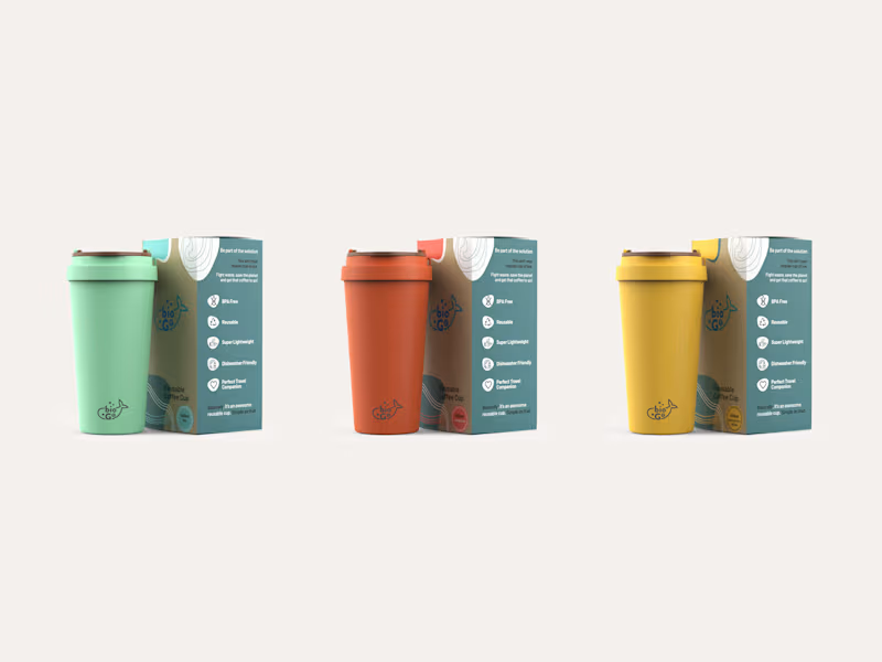
Reusable Cup Packaging
38
976
0
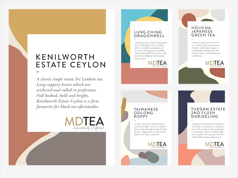
Label design for Single Origin Tea Range
0
12
0
Tea Label Re-Brand
0
13
4
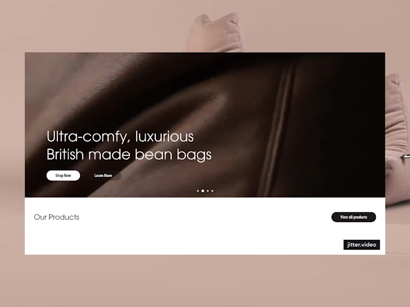
Been looking through some previous projects recently, and this one for Extreme Lounging came up (via agency Prosper Online), I was brought in to help refresh this Shopify store and surface their DTC channel a little more. Their branding was all dialled in, so my main job was to keep it clean, get out of the way and let the identity and products do the talking.
3
4
336
Packaging Designer
(3)
Follow
Message
Nico C
Lisbon, Portugal
Purposeful branding, user-focused design & web experiences
5.0
Rating
76
Followers
expert
Follow
Message
Purposeful branding, user-focused design & web experiences
20
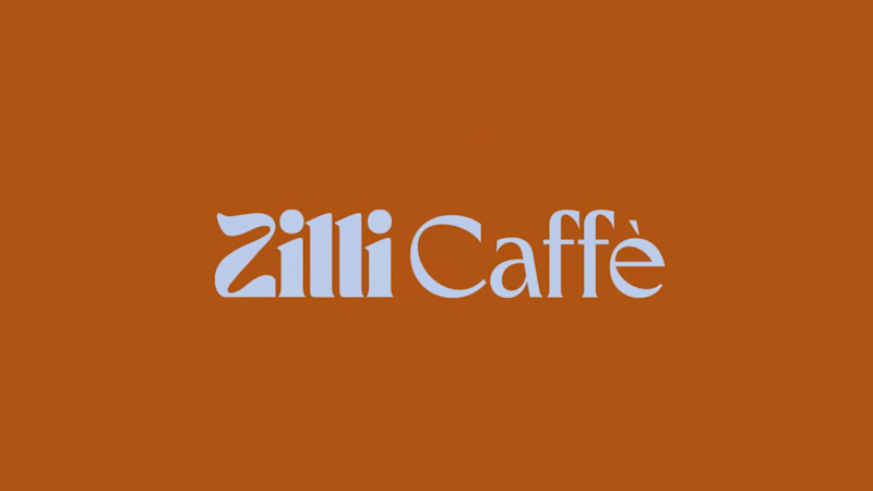
Sharing a recent one: Zilli Caffè in Bromley 😊 a cheerful, modern-retro identity built for everyday joy. Logo suite, colour palette, typography, packaging, menus and promo posters.
6
20
393
0
Tart Modern Brand Identity
0
19
23
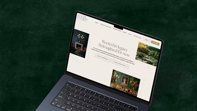
A recent project for The Royal Bell, a heritage venue reimagined as a modern members’ club. I led the brand development across print and digital, designing and building a website that complements the visual identity. The result is a refined brand system that balances heritage character with timeless elegance.
4
23
419
21
A bold refresh for The Dragon Trip, a travel company known for its immersive group adventures across Asia, from backpacking through Vietnam to family tours in Japan. As they expanded their adventures worldwide, I led the brand and digital evolution: restructuring the website for better UX, introducing a clear trip segmentation system and evolving the visual identity to feel more global while staying true to their adventurous spirit.
21
461
Packaging Designer
(2)
Follow
Message
Explore people