
Bubble.io Developer | Custom Code + AI Integration


Bubble.io Developer | Custom Code + AI Integration


Product Builder × Designer’s Technical Partner
Product Builder × Designer’s Technical Partner




Empowering Businesses to Build Tomorrow's Tech


Retool Partner, Radsoft.org

Retool Partner, Radsoft.org

AI CRM, Automation & Webflow Developer
- $10k+
- Earned
- 2x
- Hired
- 5.0
- Rating
- 29
- Followers
AI CRM, Automation & Webflow Developer




No-Code & Automation Expert | Product Designer & Developer
- 5.0
- Rating
- 10
- Followers
No-Code & Automation Expert | Product Designer & Developer
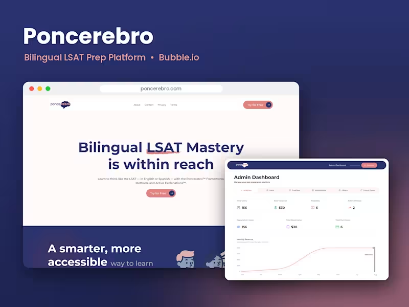

Senthome
Project description.
A web application for teachers where they can upload and manage their student data. It is integrated with Google Authentication and Google Classroom. Teachers can easily select student names from their synced Google Classroom data and share progress reports with each student's parent via email.
0
263
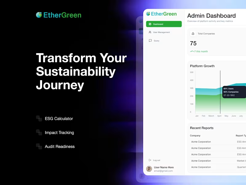
Worked on this MVP development project, starting with complete UI/UX design in Figma and then building the full application using Bubble.io (http://Bubble.io). Focused on creating a clean, intuitive user experience and a scalable backend to support future growth. Delivered a fully functional MVP aligned with the client’s vision, enabling them to test and launch their product efficiently.
0
422

I help startups build scalable web products & dashboards

Want to sell online but don’t have a website?
I’m testing a new platform called Vendly that helps small businesses create an online store without technical skills, plugins, or expensive subscriptions.
Try it here: https://vendly-pk.vercel.app/
I’m using this to understand:
• What sellers actually need
• What problems you face selling online
• Which features matter the most to you
Vendly is built for:
- Sellers without websites
- Small businesses
- People who sell via WhatsApp, Facebook, or Instagram
The idea is simple:
• Create your store
• Add products
• Share one link and start selling
No ads.
No complicated setup.
Just a clean and easy store.
If you try it, please share:
• What you like
• What’s confusing
• What features you want
Your feedback will shape the final version of Vendly
Let’s build something useful — together.
2
108

I’m building an LMS SaaS named eCourses — open‑source, community‑first, and designed to run cheap. Instead of hiding it in private repos, I’m shipping it in public: sharing code structure, architecture decisions, and failures on dev.to (http://dev.to) and here on Contra.
Building in public is forcing me to:
- Write clearly about complex systems.
- Extract “teachable” lessons from my own mistakes.
- Grow alongside a real audience instead of in isolation.
What’s the most impactful project you’ve ever built in public? What changed for you when you did it?
4
133

Most people don’t struggle with ideas.
They struggle with saying them.
So I built a voice-based AI conversation simulator using Figma Make.
Instead of chat bubbles, this experience is fully voice-driven:
• Choose a conversation mode
• Speak in real-time
• Get live feedback on tone, clarity & confidence
• Watch the interface react to your performance
• Get a personalized improvement summary
In “Cold Outreach” mode, the AI can interrupt — or even hang up if you lose clarity.
This project explores how interaction design can simulate real-world pressure and help introverts practice speaking, not just thinking.
Live App: https://syrup-mode-15103828.figma.site/
3
13
344


No Code Developer
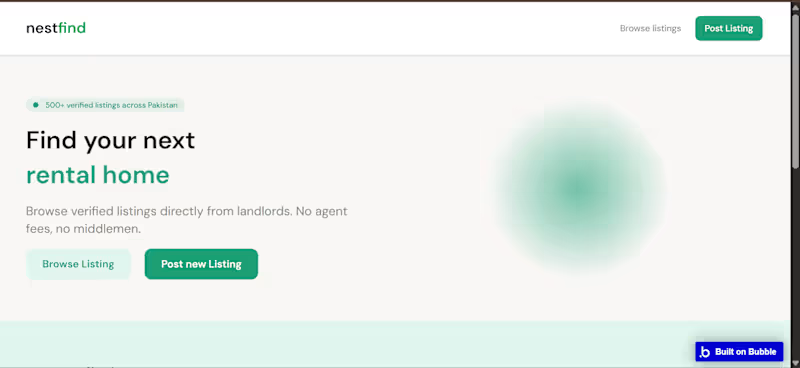
NestFind is a rental property listings platform built in Bubble. Landlords can post properties and tenants can browse, filter by location, price, and bedroom count, and contact landlords directly.
I handled everything from database design to UI and workflow logic. Features include dynamic listings, availability status, contact forms, and a fully responsive layout for desktop and mobile.
Built using repeating groups, conditional visibility, dynamic filtering, and multi-role data handling — core Bubble skills clients look for.
0
39
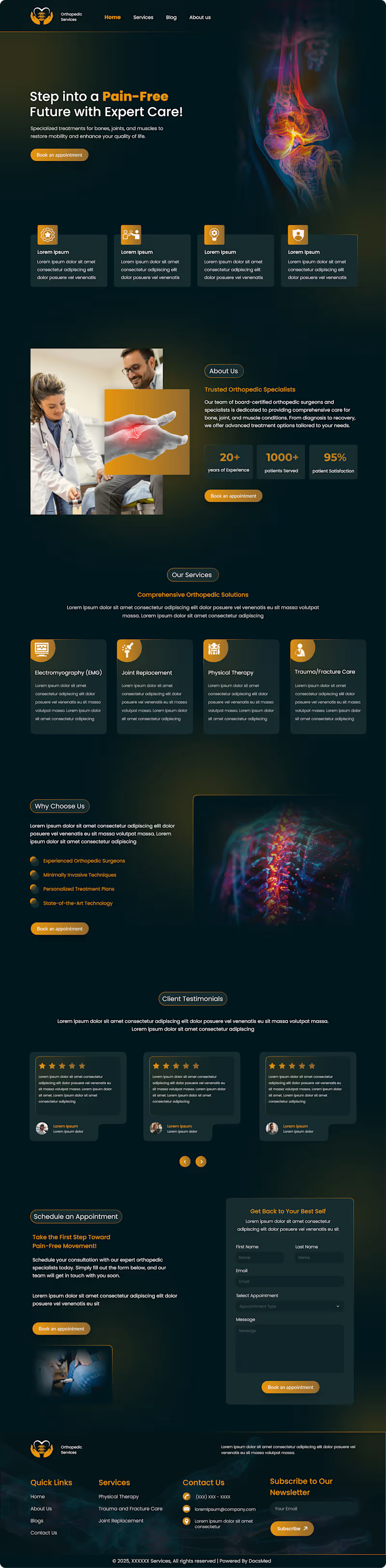
Designed a premium dark-themed website UI for a pain management and orthopedic clinic. The design features a bold hero section ("Step into a Pain-Free Future"), a stats bar, a trusted specialists section, a comprehensive "Our Benefits" services grid, a "Why Choose Us" section with spine imagery, star-rated patient testimonials, an appointment booking form, and a newsletter footer. A dark background with gold/amber accents was used to convey professionalism, authority, and trust in the medical space.
0
60
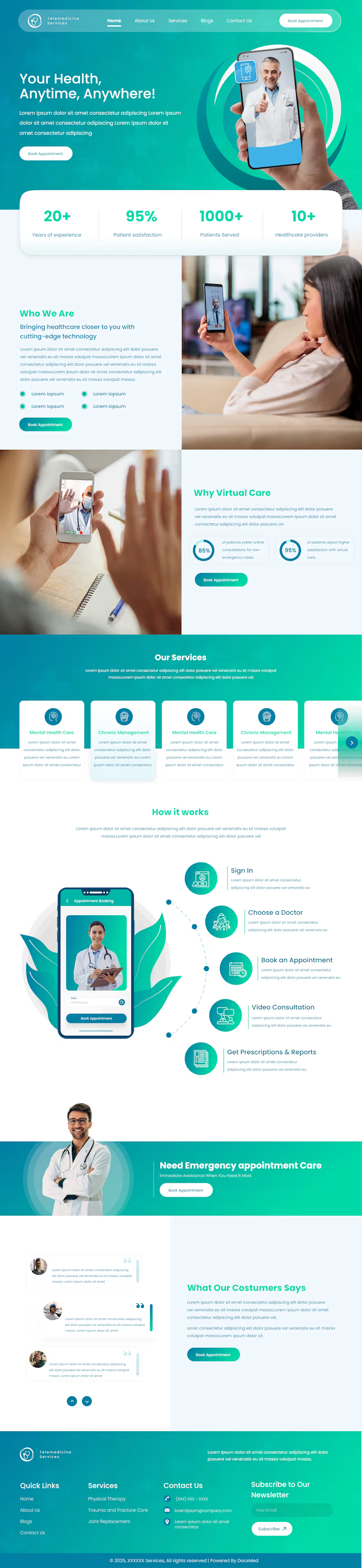
:Designed a full-page telemedicine website UI for a virtual healthcare platform. The design includes a hero section with a strong CTA, stats bar, "Who We Are" and "Why Virtual Care" sections, a services carousel, a 5-step "How It Works" flow (sign-in to prescription), emergency care banner, patient testimonials, and a newsletter footer. The layout uses a teal/white color scheme for a clean, professional medical aesthetic with a focus on user trust and easy appointment booking.
0
49
