Freelance Product Designers in Kyiv city
Sign Up
Post a job
Sign Up
Log In
Filters
2
Projects
People
Nazar Koliano
pro
Kyiv, 02000
Certified UI/UX Designer & Webflow Partner 12 yrs. of exp.
$50k+
Earned
15x
Hired
5.0
Rating
316
Followers
Certified Partner
expert
+1
Follow
Message
Certified UI/UX Designer & Webflow Partner 12 yrs. of exp.
4
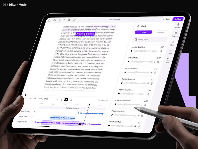
Podcast SaaS Platform UI/UX Design from scratch
4
21
30
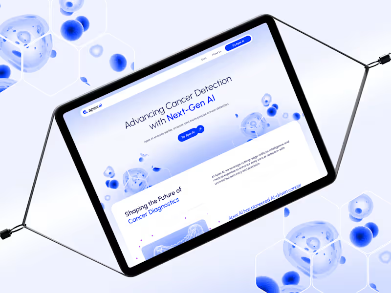
AI Healthcare Website & Webflow | $5M Raised
30
306
11
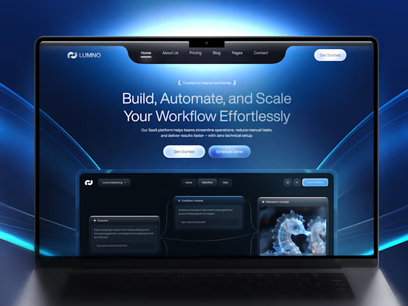
AI SaaS Website Redesign & Branding | +40% CR
11
75
4
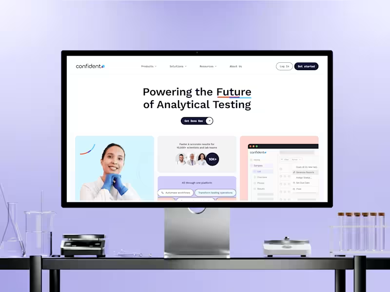
Confident (Y Combinator) Website Design & Webflow Development
4
32
Product Designer
(1)
Follow
Message
Anna asol_design
pro
Kyiv, 02000
Want a Mobile App UI UX Design that scales and converts?🚀
8x
Hired
4.8
Rating
390
Followers
Follow
Message
Want a Mobile App UI UX Design that scales and converts?🚀
12
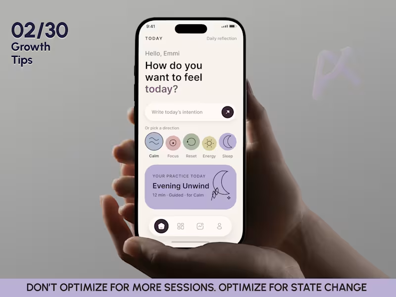
Mobile App Design | Wellness Meditation App | Mental Health App
12
24
14
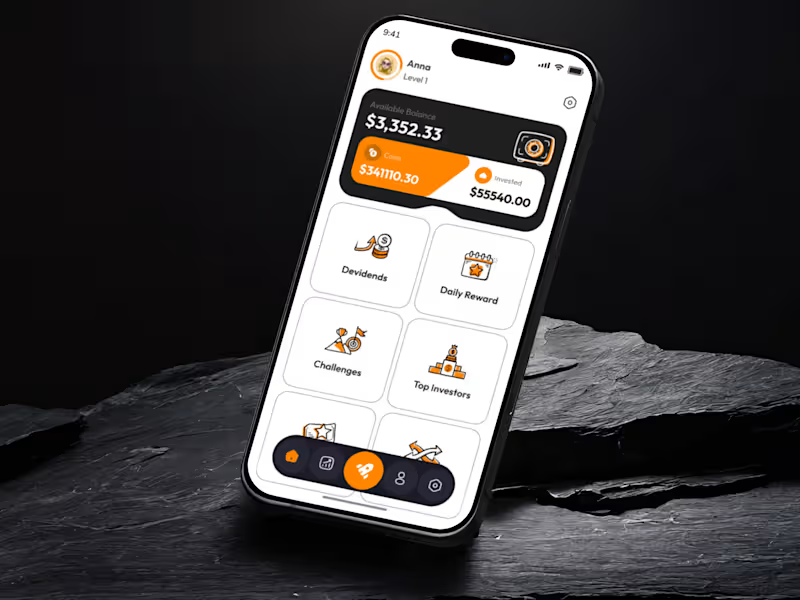
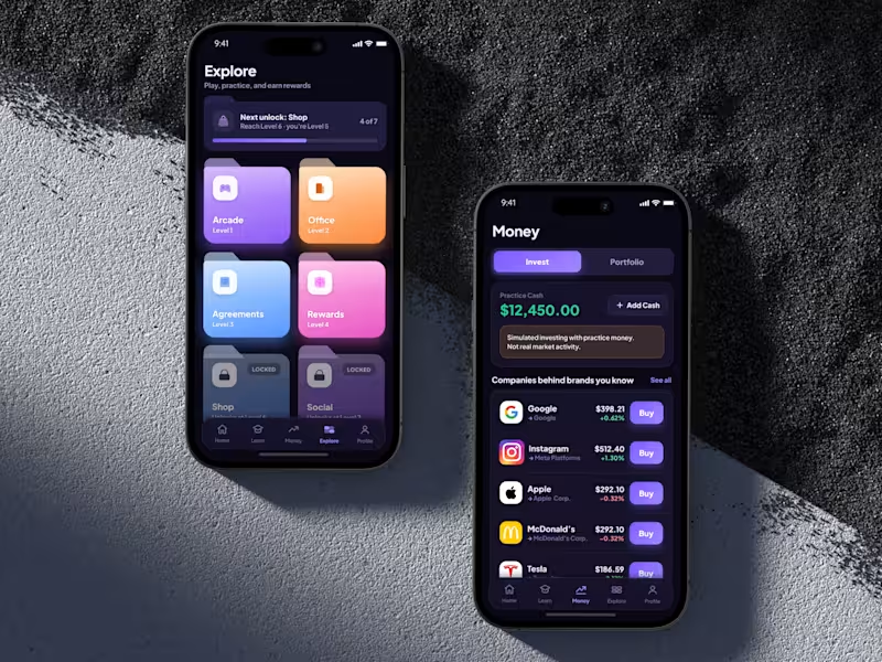
Mobile App Design | Fintech Investment App | Learning IOS App
14
34
6
UI/UX Mobile App Design for a Gamified Education & Rewards App
6
19
5
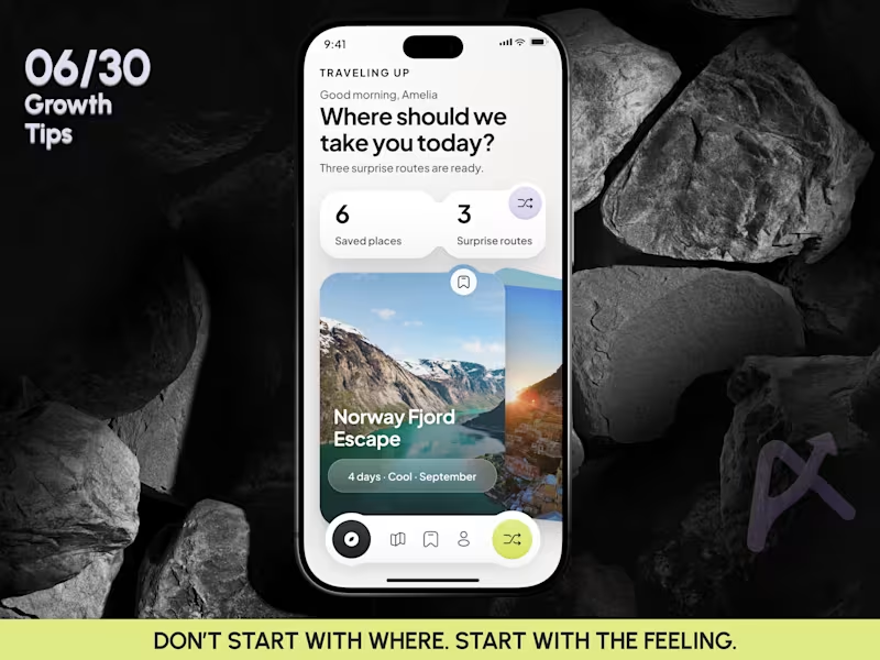
Mobile App Design | AI Trip Randomizer Planner Mobile IOS App
5
2
Product Designer
(3)
Follow
Message
Karina Bondarenko
Kyiv, 02000
Senior Product UI/UX Designer| HealthCare&AI | Mobile Apps
$10k+
Earned
4x
Hired
5.0
Rating
70
Followers
Follow
Message
Senior Product UI/UX Designer| HealthCare&AI | Mobile Apps
2
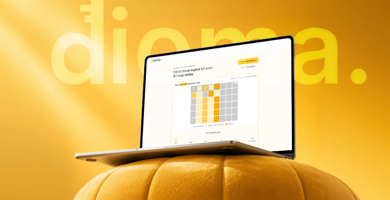
Dioma — AI-Powered Language Learning Experience
2
8
1
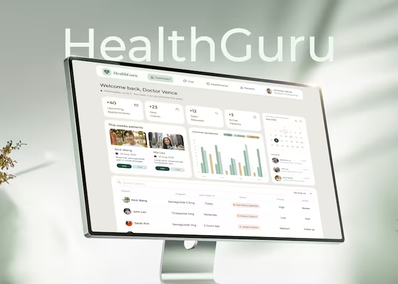
HealthGuru: Healthcare Platform UI/UX Case Study
1
12
5
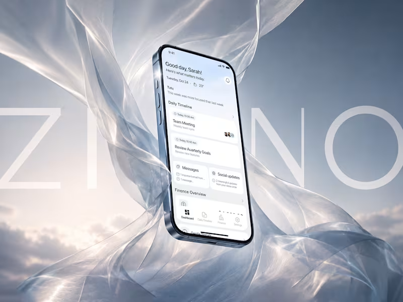
Zino: AI-Powered Productivity Platform for Focused Workflows
5
27
0
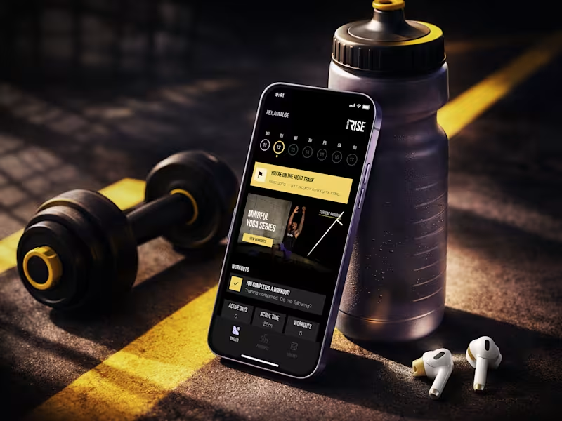
Brello Rise: Fitness & Wellness Mobile App UI Design, UX Design
0
14
Product Designer
(10)
Follow
Message
Bogdan Che
pro
Kyiv, 02000
Product UI/UX Design That Works | Webflow & Framer Websites
$1k+
Earned
4x
Hired
5.0
Rating
9
Followers
Follow
Message
Product UI/UX Design That Works | Webflow & Framer Websites
0
Accessible Web Application for a Health care | UI/UX | B2C
0
11
0
AI Sourcing Platform for SMB | UI/UX | B2B
0
11
0
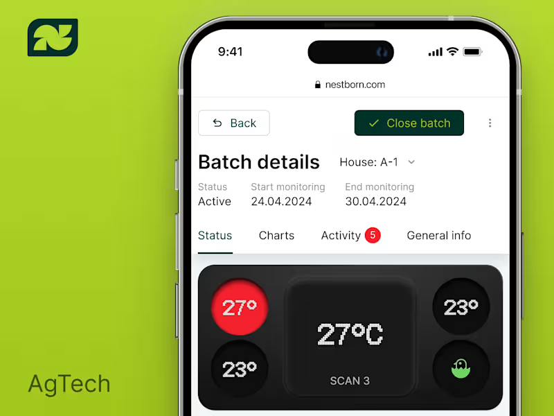
Agritech Monitoring Platform Web UI/UX Design
0
15
0
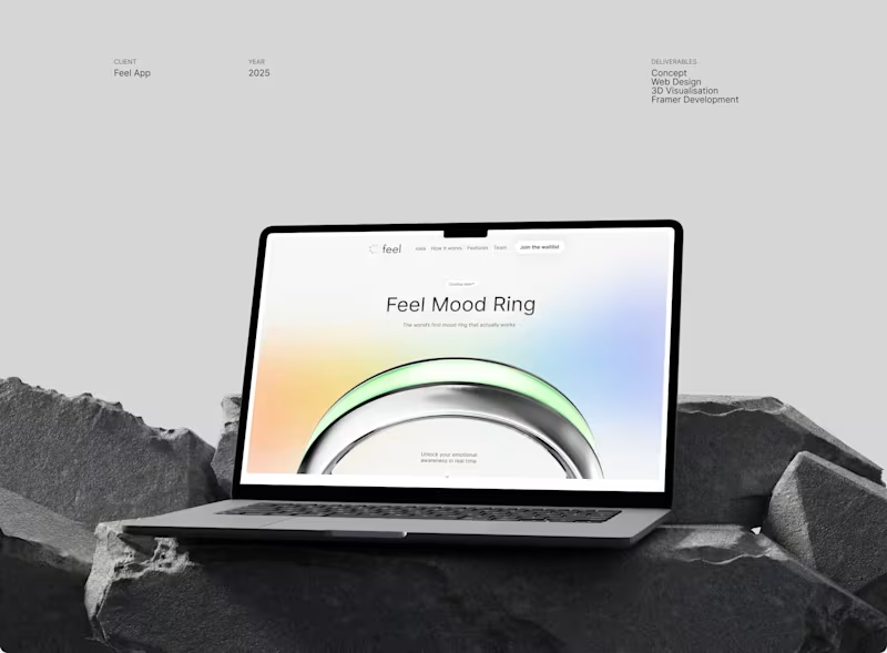
Amazing Smart Mood Ring Website | Design & Development
0
29
Product Designer
(3)
Follow
Message
Anna D.
Kyiv, 02000
UX Designer, Product Designer, Visual Designer
$5k+
Earned
34
Followers
Follow
Message
UX Designer, Product Designer, Visual Designer
13
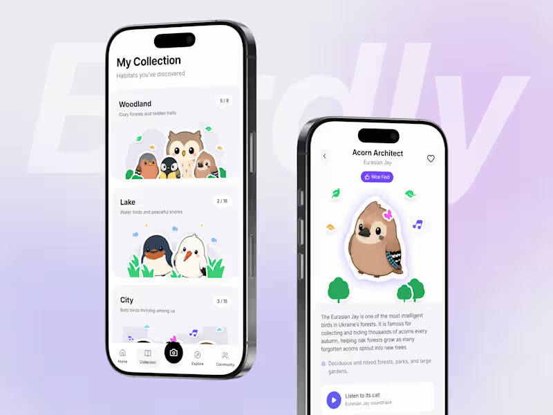
At some point in adulthood, something just clicks — you start paying more attention to nature. For me, it was birds 🦉 For the #FlowstepChallenge, I created Birdly (naming is hard, okay? 🐦) — a bird recognition app that turns every discovery into a collectable illustrated sticker. Users can identify birds by photo or sound, build personal collections, unlock achievements, explore nearby bird hotspots, and connect with a community of bird explorers. For the design process, I followed my usual design workflow, starting with the product vision, user flows, and a moodboard, but decided to skip wireframes and design directly in Flowstep. I quickly learned that the best results came from working screen by screen, refining prompts, and creating a design guidelines file to keep the UI consistent. I also experimented with different Flowstep features, which helped me overcome creative blocks and explore new directions. Flowstep helped me iterate quickly, explore different directions, and turn an idea into a complete interactive prototype. I'm really happy with the final result and learned a lot along the way. Thanks to @Flowstep and @Contra HQ for organising the challenge! 🔥 📱 Flowstep file: https://app.flowstep.ai/file?activeFileId=a37d6cf5-a264-41b9-9c87-9810c3a5be8b
6
13
559
37
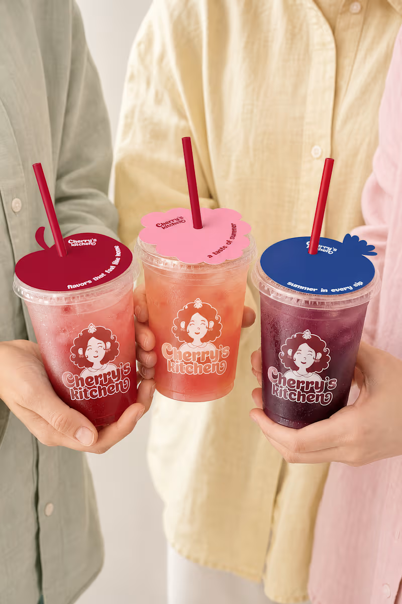
Hi everyone! 👋 For the #envatochallenge, I wanted to explore Envato in as many ways as possible, from stock assets and fonts to AI image generation, video creation, animation, mockups, and even the music for this video. To do that, I created Cherry's kitchen — a cozy café brand inspired by warm summer afternoons, homemade cherry desserts, and family gatherings. Throughout the project, I used Envato as my main creative toolkit while bringing everything together in Figma. I designed the mascot, visual identity, packaging, café interiors, animations, and brand guidelines. And honestly... I just couldn't stop exploring. Every time I finished one part of the project, I found another way to bring the brand to life. One of my favorite parts of the process was deciding what truly belonged in the brand identity. I explored different concepts and made the creative decision, choosing what to keep, what to refine, and what to leave behind. Check out the process video below! I'd love to hear your thoughts on the project 🍒😍
19
37
3.4K
10
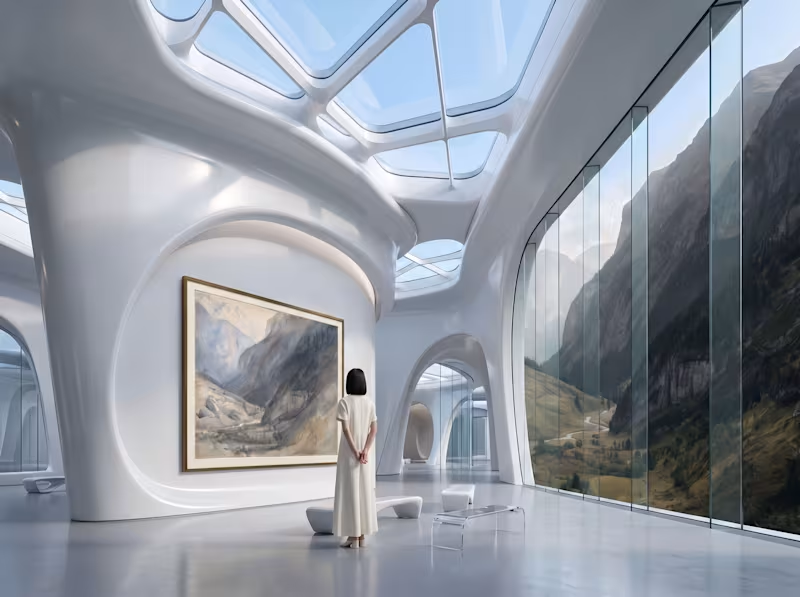
NATURE, ARCHIVED What if the painting outlived the landscape? The project was inspired by John Ruskin’s The Valley of Lauterbrunnen, Switzerland (ca. 1866), from The Metropolitan Museum of Art’s Open Access collection. Ruskin’s watercolor captures the Alpine landscape through layers of light, shadow, distant peaks, and atmospheric haze. Before generating, I mapped the idea into six scenes, each supporting a different part of the story. In FLORA, I worked iteratevly , and eplored several AI models, refining references, motion, scale, and composition to preserve photographic realism and visual consistency. Rather than remaking the painting, I imagined a future in which Ruskin’s work is no longer simply an image of a place. It has become an archive of something humanity can no longer encounter in the physical world. The museum preserves the artwork, but also reconstructs the world contained within it: its scale, atmosphere, movement, and sense of life. The painting becomes a portal between two realities — a record of what once existed and a way for future generations to experience what has been lost. The artwork survived. The landscape didn’t. For us today, the painting is a representation of nature. For people of the future, it is nature. Created in @ for the #FLORAMuseum challenge. 🖼️ Original artwork: John Ruskin — The Valley of Lauterbrunnen, Switzerland, ca. 1866 (https://www.metmuseum.org/art/collection/search/359021?utm_source=chatgpt.com) 🎨 Project link Nature, Archived (https://app.flora.ai/join-project/a0596e28-6868-4c6a-a21f-a53a807d44e1)
5
10
490
1
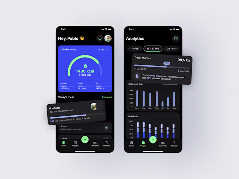
Mobile Calorie Tracking App A mobile app designed to help users build healthier eating habits and prevent overeating through a simple, personalized experience. The challenge was to create a solution for busy professionals who often forget to log meals, lose motivation over time, or find existing nutrition apps too time-consuming and overwhelming. The goal was to reduce friction in meal tracking while encouraging long-term healthy habits. What was done: User persona & problem definition, User needs and assumptions, User flows & information architecture, Wireframes, High-fidelity UI design, Interactive prototype. The final solution features AI-powered food scanning for effortless meal logging, personalised reminders, calorie-intake notifications, progress tracking, achievements, community challenges, and customizable cheat days. Every feature was designed to keep users engaged and motivated without making healthy living feel restrictive. This project allowed me to explore behaviour-driven design and create an experience that balances functionality, motivation, and simplicity to support sustainable lifestyle changes. #UXDesign #UIDesign #ProductDesign #MobileApp #AppDesign #CaseStudy
1
439
Product Designer
(2)
Follow
Message
Olha Purikova
Kyiv, 02000
Product Designer | Mobile Apps | UX Research | E-commerce
130
Followers
Follow
Message
Product Designer | Mobile Apps | UX Research | E-commerce
34
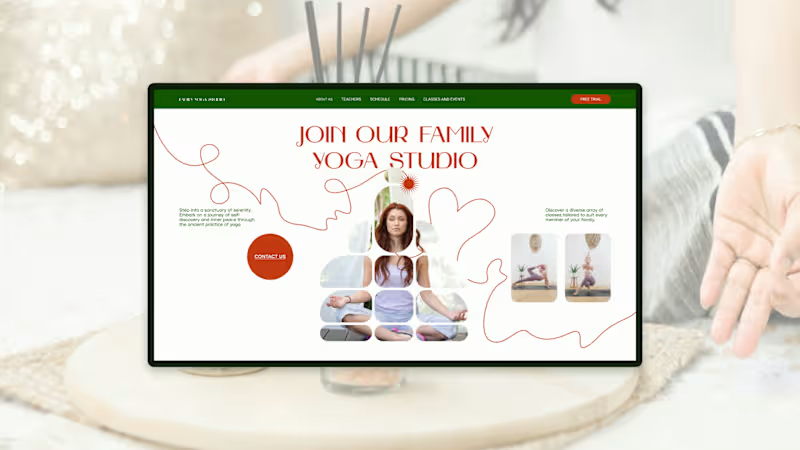
Family Yoga Studio — Hero Section Design A landing page concept designed for a family-focused yoga studio. The goal was to create a calm, welcoming first impression while maintaining a clear visual hierarchy and intuitive user experience. Goal Design a hero section that communicates the studio's atmosphere, establishes trust, and encourages visitors to take action without overwhelming them with information. Design Approach • Clean and minimal layout focused on readability and clarity • Strong visual hierarchy that guides attention from the headline to the primary call-to-action • Custom image masking and typography to create a distinctive brand presence • Carefully balanced supporting visuals that reinforce the message without competing for attention Outcome The result is a modern, aesthetically balanced hero section that highlights the studio's identity while making it easy for potential clients to explore classes and get in touch. Tools Figma Keywords #WebDesign #UIUXDesign #LandingPage #HeroSection #WellnessDesign #YogaStudio #MinimalDesign #Figma #ProductDesign
27
34
1.1K
33
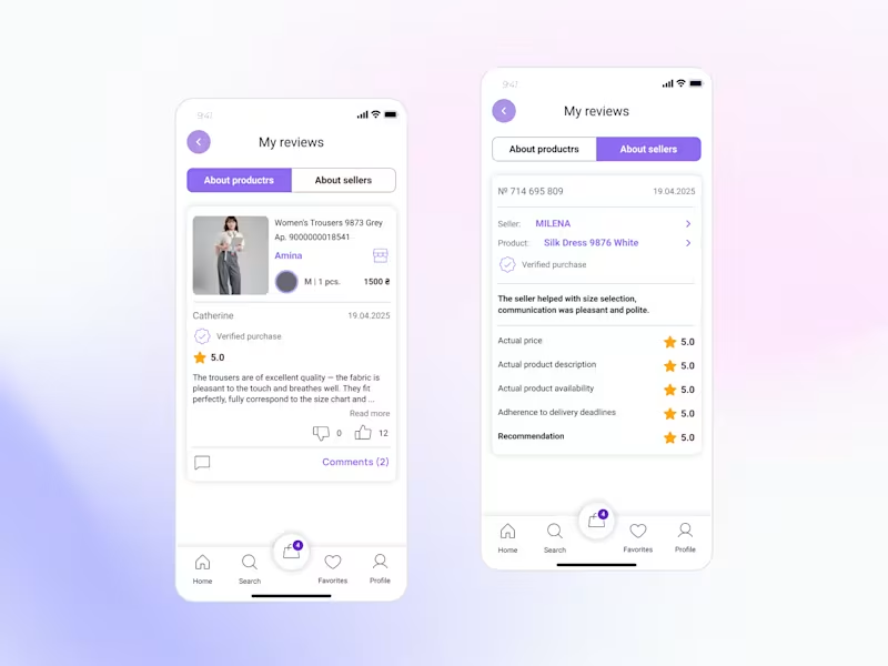
New design update: Reviews & Ratings for a Marketplace Buyer Profile🌟 Reviews are more than just stars - they help people decide who and what they can trust. While designing this feature, I focused on making reviews clear, transparent, and useful for buyers. Key improvements: • Separate reviews about products and sellers for better context. • Highlight verified purchases to increase credibility. • Structure feedback so users can quickly find relevant information. • Create a clean and intuitive experience that supports confident decision-making. The goal was to turn reviews into a trust-building tool rather than just a collection of ratings. Part of my ongoing Marketplace App concept. More screens coming soon 👀
20
33
948
14
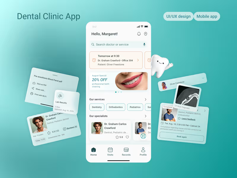
Dental Clinic Mobile App Design
14
39
29
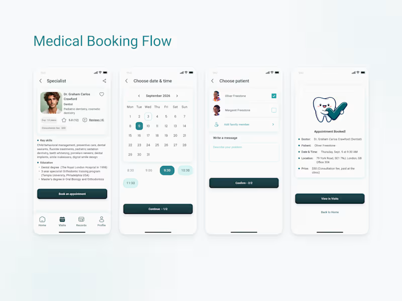
Medical Booking Flow A streamlined appointment booking flow designed for a local dental clinic. Starting from the specialist profile, patients can quickly schedule a visit, select the patient, add appointment details, and receive instant confirmation. The design focuses on clarity, transparency, and reducing friction throughout the booking process, making it easy to complete an appointment in just a few simple steps. #UIUXDesign #MobileAppDesign #HealthcareDesign #DentalApp #BookingFlow #UXDesign #ProductDesign #UserExperience #AppointmentBooking #Figma
20
29
957
Product Designer
(2)
Follow
Message
Qream Design
Kyiv city, 02000
Brand transformation agency for gamechanging tech businesses
55
Followers
Follow
Message
Brand transformation agency for gamechanging tech businesses
13
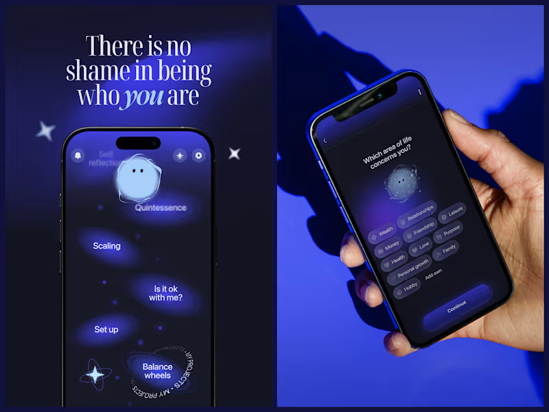
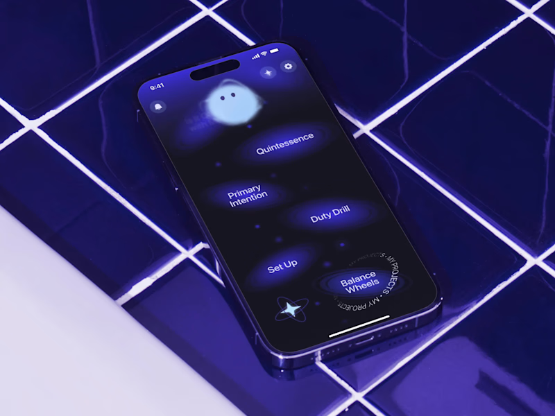
Mascot Animation for Mental Health Brand — SelfApp We approached animation as part of the product language, not a visual effect. The mascot animation system was designed to communicate emotional states through form and movement. Different mascot states represent how the self changes under external influence — becoming constrained, fragmented, or muted over time. Transitions between these states were carefully designed to feel gradual and intentional, mirroring moments of disconnection and reconnection. From a design perspective, animation acts as a narrative layer that supports the product’s core idea and maintains emotional continuity across the app experience.
13
171
1
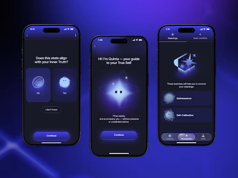
App Design for Mental Health Brand — Self App. Quinta, the Guide. Quinta was designed as a functional visual element within the app’s system, serving as a consistent point of reference across user flows. The interface is based on a progression metaphor, expressed through screen transitions, layout rhythm, and color contrast. Dark tones support introspection, while light accents indicate direction and state change. Quinta does not provide instruction or feedback. Its role is to maintain conceptual alignment — reinforcing the product’s focus on self-awareness without introducing hierarchy or judgment.
1
1
80
2
Hundreds of screens. Ten exercises. One goal—help people meet their true selves. That was a summary of a product we did for Self App. We didn’t want to build another “productivity” app that is based only on coaching, psychological terms, or fake success. We aimed higher—to create a space that feels safe enough to open up and find your Self.
2
60
1
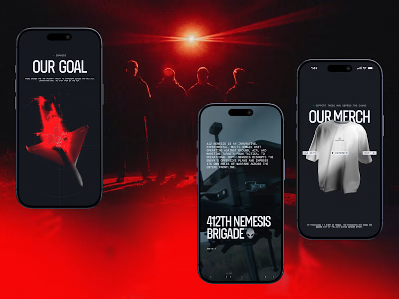
Darknode’s digital identity is built as a system — and that system adapts seamlessly across devices. The mobile version isn’t a simplified copy of desktop. It preserves the same tactical tension, optical metaphors, and controlled motion — just recalibrated for vertical interaction. Precision grids shift into compact structures. Red-spectrum accents become sharper. Every tap replaces hover with deliberate feedback. We designed the interface in layers: background depth, targeting lines, UI panels, motion overlays. Each layer serves a purpose — creating dimensionality without visual noise. Contrast plays a strategic role. Dark foundations amplify red highlights. Minimal typography sharpens hierarchy. Space becomes a tool for focus.
1
94
Product Designer
(3)
Follow
Message
Alesia Boiko
Kyiv, 02000
Founding Product Designer
275
Followers
Follow
Message
Founding Product Designer
162
🔥🔥🔥 LIVE PROJECT - TRY IT OUT 🔥🔥🔥 https://colorstory.figma.site Maybe the future of the web isn’t more UI... It’s MOVEMENT: Glide, show, pinch, like, push… _____________ 🖇️ Figma Community: https://www.figma.com/community/file/1610034797463334151/find-your-color-story 🖇️ IG: https://www.instagram.com/reel/DVWvo2jDKlZ/?igsh=MWZuMHhza2xtbHAxZg== 🖇️ LinkedIn: https://www.linkedin.com/posts/alesiaboiko_figmamakeathon-activity-7433975637800873984-Jwfi?utm_medium=ios_app&rcm=ACoAAApTfloBpGircORv5h9cDES_JEGlDAKcn04&utm_source=social_share_send&utm_campaign=copy_link 🖇️ X: https://x.com/alesiaboiko/status/2028210232833311134?s=46 🖇️ Threads: https://www.threads.com/@tiny.vibing/post/DVWxm5gjdfA?xmt=AQF05XOjZBX2V2isOHz9iKeAe5dvVelmCuUoFV3Xa-4tk9aL34QUZACdLXiHrYMZPzlLKYc&slof=1
81
162
6.8K
177
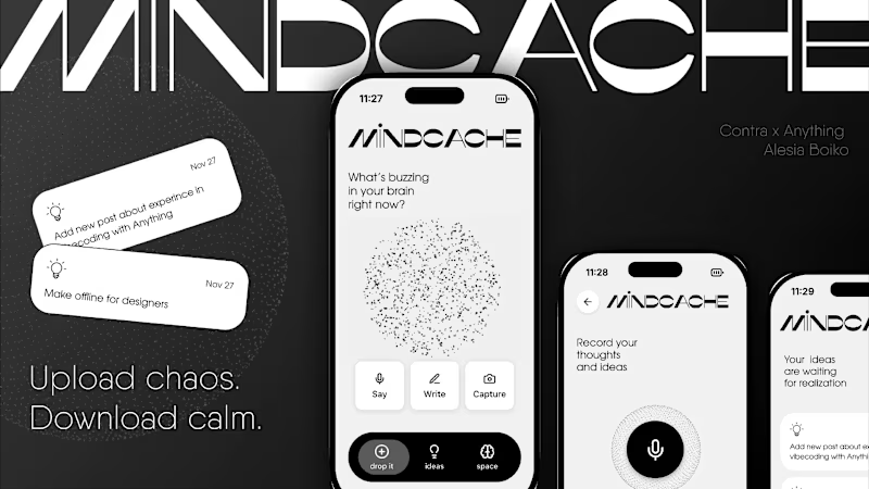
I've never thought that it would be so challenging just to publish the project and made mistakes in previous post. So I do that again — MINDCACHE app: Creators, founders, dreamers — your mental RAM is overheating. MindCache is your calm external drive. Dump chaos, keep clarity 😄 https://mindcache-158.created.app And tips for you for saving: 1. Your first prompt in Anything should be the most concrete: what you build, for whom, what will user do there, describe it like user flows, add description about each screen after and don't ask about wow design on the first step, let it be minimal. So you will be able to check the logic first... 2. Don't try to fix everything in the next prompt... Should I continue? (not enough symbols in 1 post) If yes, let me know in comments and yr reactions 🩷🐐 I VIBE YOU! THANK YOU!
83
177
4.6K
23
My new joy: reviewing new warm people in SLAMBOOK =) You are amazing!!!
10
23
688
305
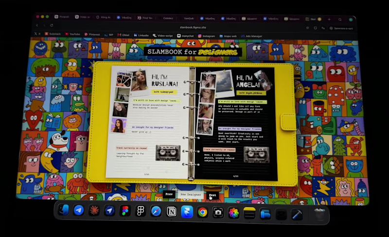
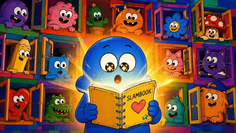
Hi creatives! 👋 For #ConfigMakeathon, I created SLAMBOOK for Designers ✨ https://slambook.figma.site It's inspired by the slambooks many of us had as kids, but reimagined for the internet. Designers from all over the world can create their own page by adding photos, favorite music, creative advice, inspirations, and a few fun facts about themselves. It's a playful way to discover people behind the portfolios and build new connections within the design community. The best part? It lives online and can always be in your pocket, just add it to your home screen like an app. This concept could work for any community. Imagine a special Config edition where attendees share their photos, inspirations, favorite talks, creative superpowers, or memorable moments from the event. A little internet corner where creativity, personality, and community come together 💛 If it resonates, pass it on and start your own page 💛 If you really love it, I’d be sooo grateful for your support. Every goat, like, comment, share, means so much for me. Thank you! Project Link: https://slambook.figma.site Video Instagram: https://www.instagram.com/reel/DZpeUvBo4bs/?igsh=bDhhMnc1aXlzODls (https://www.instagram.com/reel/DZpeUvBo4bs/?igsh=bDhhMnc1aXlzODls)
198
305
9.2K
Product Designer
(2)
Follow
Message
Explore people