Freelance Data Visualizers in Karachi
Sign Up
Post a job
Sign Up
Log In
Filters
2
Projects
People
Darakhshan Zahid
Karachi, Pakistan
Dashboard & Data Analytics Expert
New to Contra
Follow
Message
Dashboard & Data Analytics Expert
0
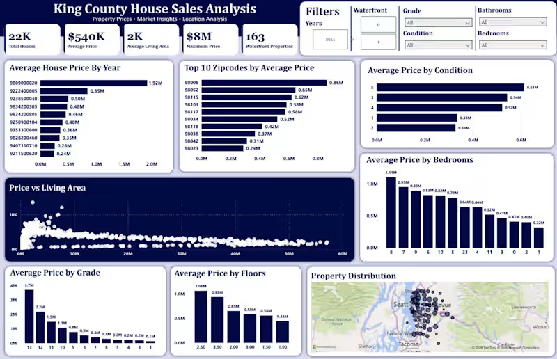
Finally wrapped up the Power BI dashboard for my House Sales Analysis project ๐ ๐ After cleaning and exploring the data with Python and writing SQL queries, I used Power BI to turn the analysis into an interactive dashboard. In the dashboard, I explored: House price trends Property size and pricing House grades Waterfront vs non-waterfront properties Location-wise pricing Bedrooms and other property features I also worked with DAX measures, slicers, interactive visuals, and KPIs to make the dashboard more useful for exploring the data. This project helped me practice the complete data analytics workflow: Python โ Data Cleaning & EDA โ SQL โ Power BI Still learning and improving with every project. ๐ #PowerBI #DataAnalyst #DataAnalytics #SQL #Python #EDA #DataCleaning #DAX #BusinessIntelligence #DataVisualization #PowerBIDashboard #PortfolioProject #DataAnalysis
0
5
0
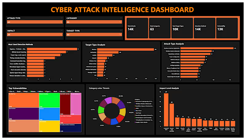
Cyber Security Analytics Dashboard ๐๐ Cybersecurity is more than detecting threatsโit's about turning security data into actionable insights. In this Power BI dashboard, I analyzed cybersecurity data to monitor security incidents, attack patterns, threat severity, affected systems, and overall security KPIs. The interactive dashboard helps organizations identify risks, improve monitoring, and support faster, data-driven security decisions. Tools Used: Power BI SQL Python (Data Cleaning & Analysis) Key Skills: Cyber Security Analytics | Threat Analysis | Security Dashboard | Risk Analysis | Incident Monitoring | Data Visualization | Business Intelligence | SQL | Python | Power BI | Data Analytics #PowerBI #CyberSecurity #CyberSecurityAnalytics #ThreatIntelligence #DataAnalytics #BusinessIntelligence #DashboardDesign #SQL #Python #DataVisualization #DataAnalyst #PortfolioProject #SecurityAnalytics
0
34
0
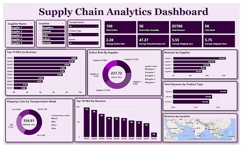
Supply Chain Performance Dashboard ๐ฆ๐ Efficient supply chains drive better business outcomes. This dashboard transforms operational data into actionable insights for inventory, logistics, and fulfillment performance. Using Power BI, I analyzed key supply chain metrics such as order status, inventory levels, shipping performance, supplier efficiency, delivery timelines, and overall operational KPIs. The interactive dashboard helps identify bottlenecks, optimize inventory, and support data-driven decision-making. Tools Used: Power BI SQL Python (Data Cleaning & Analysis) Key Skills: Supply Chain Analytics | Inventory Analysis | Logistics Analytics | KPI Dashboard | Business Intelligence | Data Visualization | Data Cleaning | SQL | Power BI | Python | Business Analytics #PowerBI #SupplyChain #SupplyChainAnalytics #Logistics #InventoryManagement #BusinessIntelligence #DataAnalytics #DashboardDesign #SQL #Python #DataVisualization #BusinessAnalytics #PortfolioProject #DataAnalyst
0
36
0
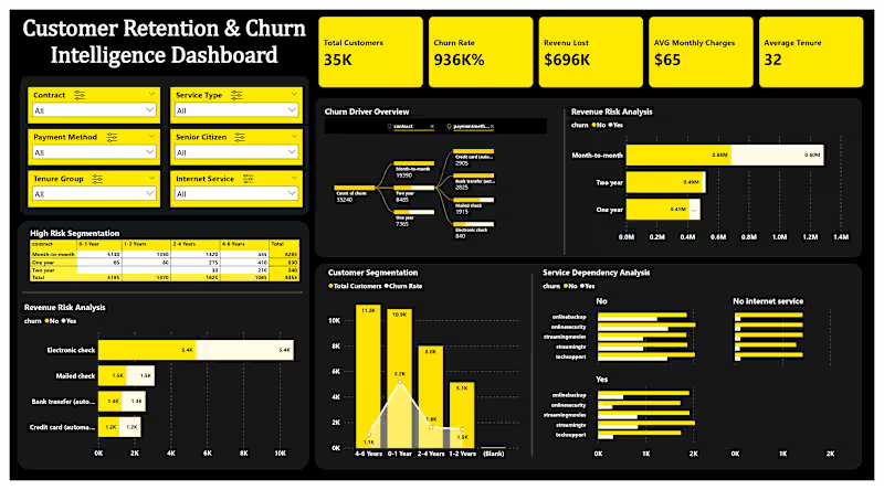
Telecom Customer Churn Analysis Dashboard ๐ Understanding why customers leave is essential for improving retention and business growth. In this Power BI dashboard, I analyzed a telecom customer churn dataset to identify key churn drivers, customer demographics, contract types, monthly charges, payment methods, and tenure patterns. The dashboard provides interactive KPIs and visual insights that help businesses make data-driven decisions to reduce customer churn. Tools Used: โข Power BI โข SQL โข Python (Data Cleaning & Analysis) Key Skills: Customer Churn Analysis | Data Cleaning | Data Visualization | KPI Dashboard | Business Intelligence | Interactive Reports | Data Analytics | Business Insights #PowerBI #DataAnalytics #BusinessIntelligence #CustomerChurn #DashboardDesign #SQL #Python #DataVisualization #BusinessAnalytics #DataAnalyst #PortfolioProject #DataDrivenDecisionMaking
0
38
Data Visualizer
(5)
Follow
Message
Hashir Bhatti
Karachi, Pakistan
Data Analysis & Visualization | Power BI Specialist
Follow
Message
Data Analysis & Visualization | Power BI Specialist
1
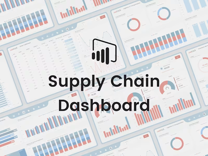
Iโm excited to share my Supply Chain Dashboard, built using Power BI. In this project, I focused strongly on UI/UX design to make the dashboard clean, simple, and easy to use. The goal was to present supply chain data in a clear way so users can quickly understand performance and key metrics. The dashboard shows important numbers using KPI cards and allows users to explore data with slicers and interactive visuals. It also includes smooth page navigation for a better user experience. This project is designed to support better, data-driven decisions through clear and visually engaging dashboards. Iโd be happy to hear your feedback or thoughts on this project.
1
1
77
1
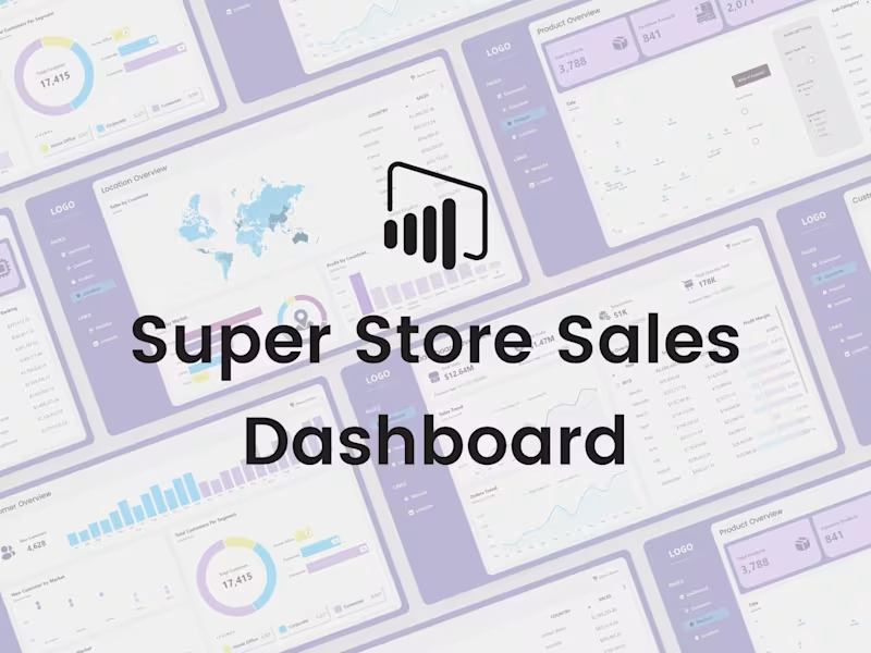
Iโm excited to share my Store Sales Dashboard, created using Power BI. I started this project by designing the dashboard in Figma and then developed it in Power BI. The focus was on making the dashboard interactive and easy to use, so users can quickly understand store performance and key sales metrics. The dashboard displays important numbers through KPI cards and uses slicers and interactive visuals to explore the data in more detail. It also includes smooth page navigation to make the experience better. This project is all about helping businesses make better, data-driven decisions using clear and visually engaging dashboards. Your feedback is always welcome.
1
72
0
Iโm happy to share another one of my Power BI projects โ the Sales Analysis Dashboard. I designed the dashboard layout in Figma first and then built it in Power BI. I used DAX to add advanced calculations and make the visuals dynamic and interactive. The main goal of this dashboard is to present sales data in a clear way so users can easily understand performance and trends. The dashboard shows important sales metrics using KPI cards, includes slicers for quick filtering, interactive visuals for deeper analysis, and smooth page navigation for a better experience. This project focuses on turning sales data into useful insights that support better decision-making. Iโd love to hear your feedback or suggestions.
0
65
0
Iโm excited to share my Customer Relationship Management (CRM) Dashboard, which I built from scratch using Power BI. The goal of this project was to turn complex data into clear and easy-to-understand insights. I used DAX for data analysis and focused a lot on interactivity so users can explore the data instead of just looking at numbers. The dashboard shows key business metrics through KPI cards, allows filtering with slicers, includes interactive visuals, and has smooth page navigation for a better user experience. Overall, this project reflects my approach of combining data analysis with good UI/UX design to support better business decisions. Iโd love to hear your thoughts or feedback on this project.
0
71
Data Visualizer
(4)
Follow
Message
Maaz Ahmad
Karachi, Pakistan
Data Scientist providing actionable insights
Follow
Message
Data Scientist providing actionable insights
0
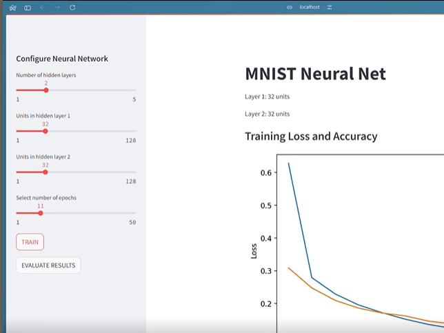
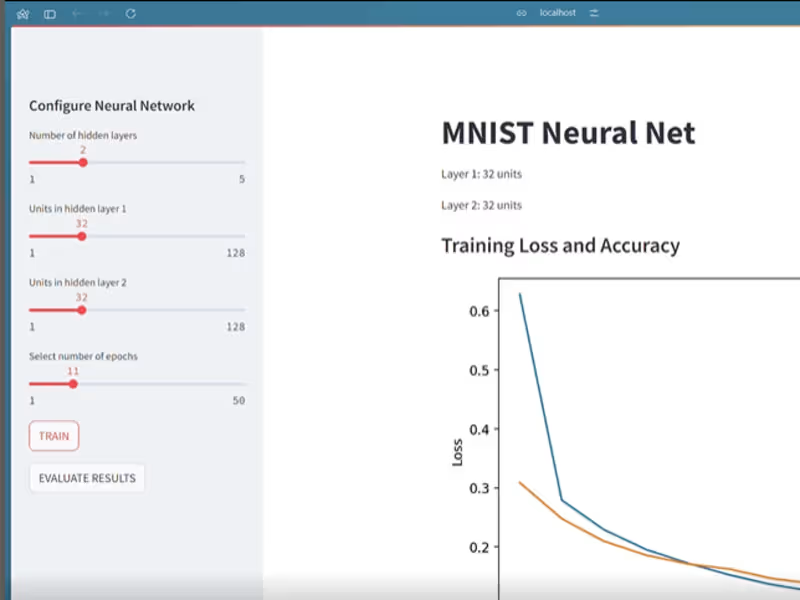
Neural Network Testing App
0
2
0
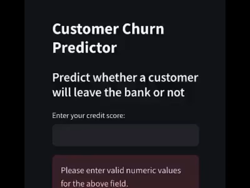
Customer Churn Predictor Web App
0
1
0
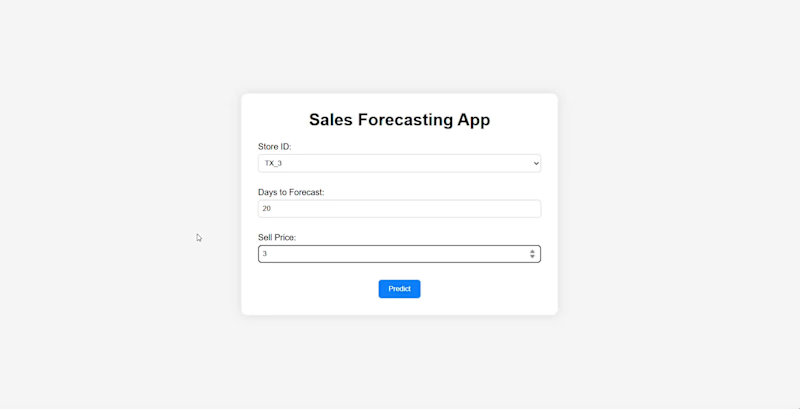
Sales Forecasting Web App Development
0
1
View more โ
Data Visualizer
(2)
Follow
Message
Kaim Syed
Karachi, Pakistan
Google Sheets | Apps Script | Google Ads Script Professional
Follow
Message
Google Sheets | Apps Script | Google Ads Script Professional
0
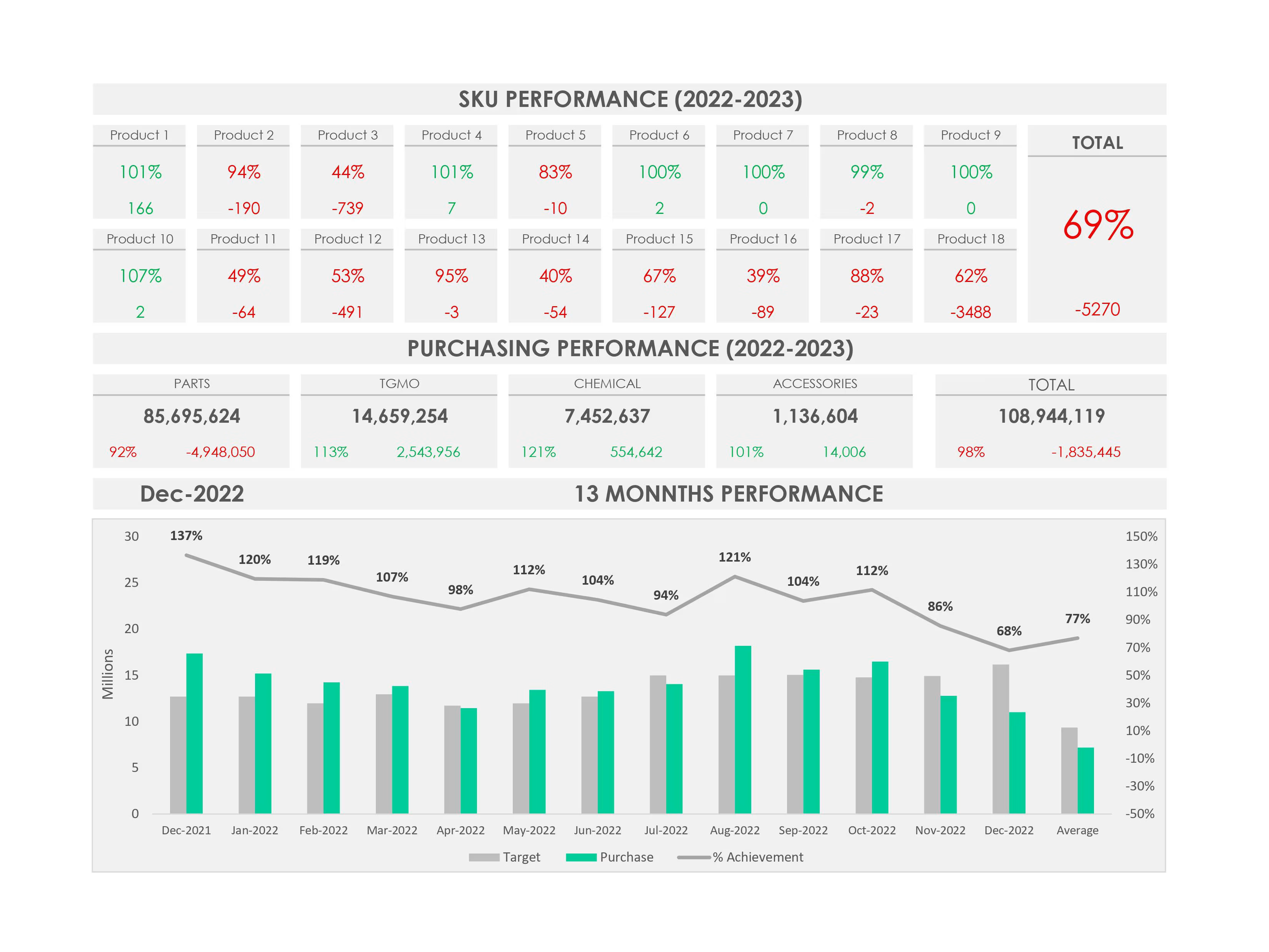
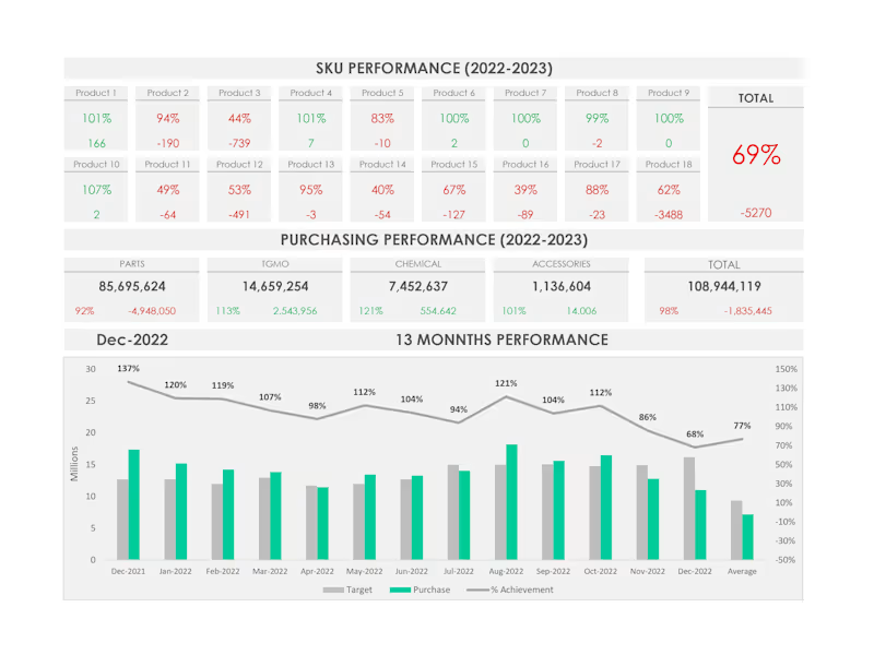
SKU Performance Dashboard
0
11
0
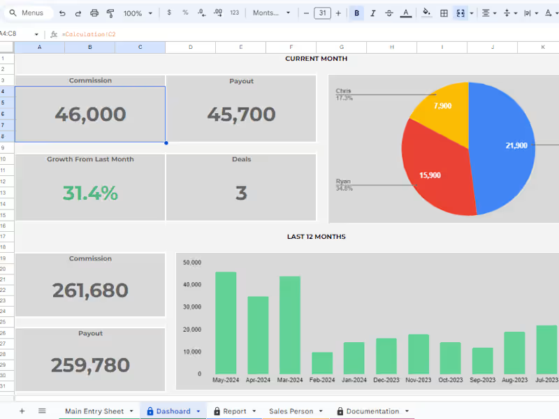
Sales Commission Tracking Sheet
0
15
0
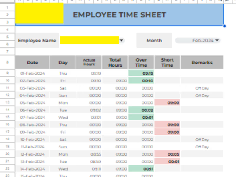
Employee TimeSheet
0
13
View more โ
Data Visualizer
(3)
Follow
Message
Muhammad Arsalan Amjad
Karachi, Pakistan
Automating Workflows: Your Data Science Partner
Follow
Message
Automating Workflows: Your Data Science Partner
0
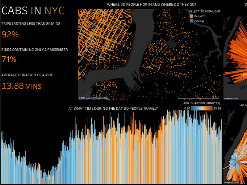
Cabs in NYC - Dashboard
0
6
0
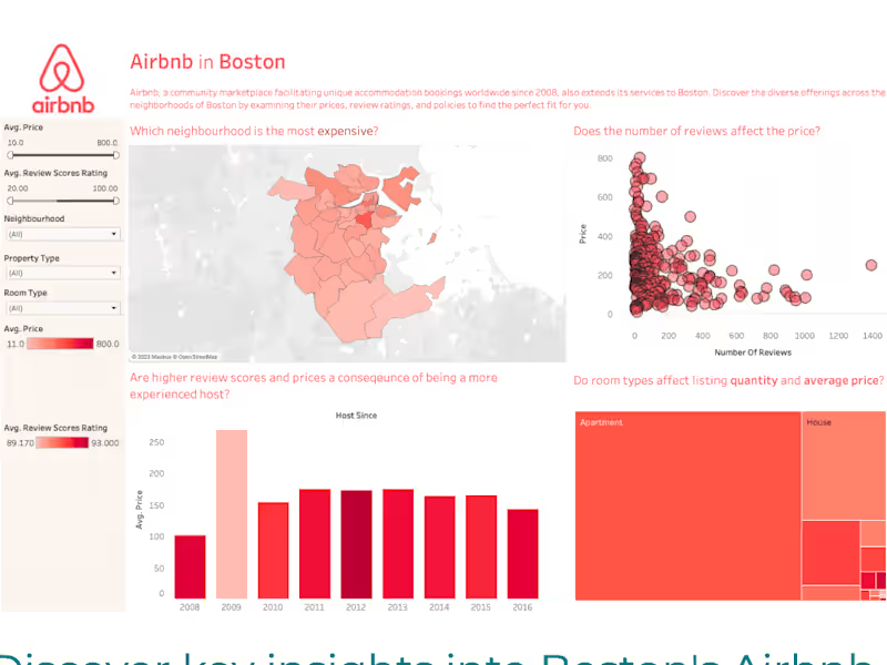
Airbnb in Boston - Dashboard
0
14
0
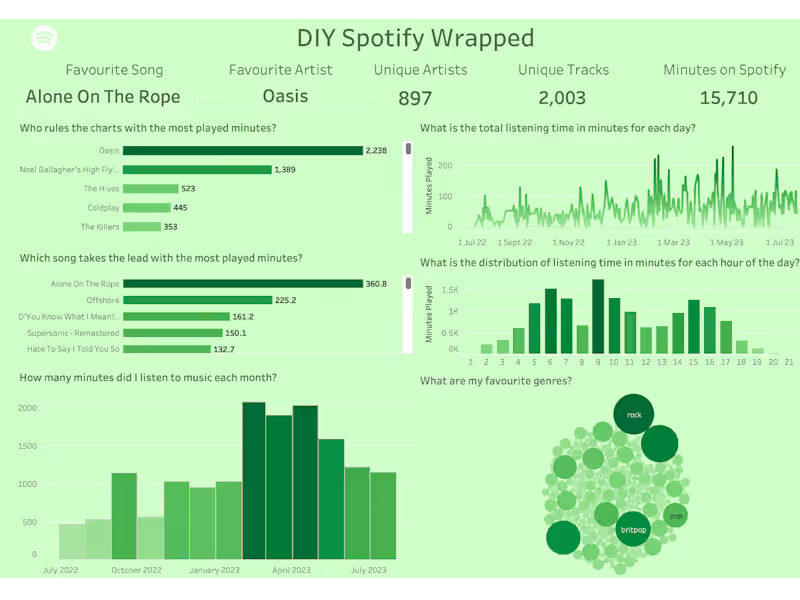
Spotify Dashboard
0
17
0
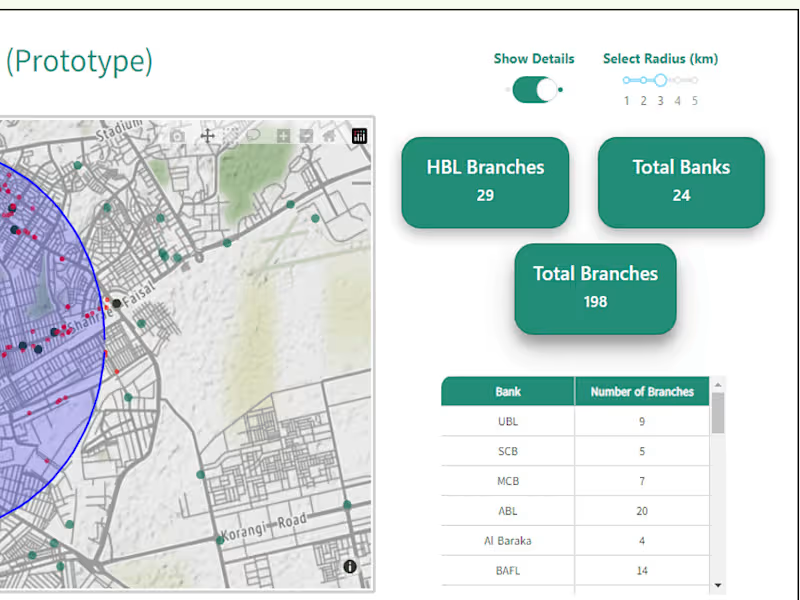
Proprietary Branch Locator - Dashboard
0
15
Data Visualizer
(4)
Follow
Message
Awais Anjum
Karachi, Pakistan
Turning complex data into actionable insights

Follow
Message
Turning complex data into actionable insights
0
Market Segmentation for Retail Chain
0
1
0
Dashboard Development for Financial Firm
0
2
0
Data Visualization, Dashboard, Charts, Pivot Table,Data Analysis
0
2
View more โ
Data Visualizer
(3)
Follow
Message
Muhammad Umer Rasheed
Karachi, Pakistan
Transforming complex data into clear, strategic insights.
Follow
Message
Transforming complex data into clear, strategic insights.
0
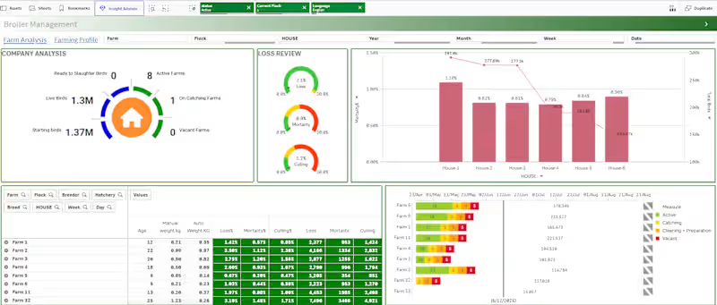
Broiler Management Dashboard Development
0
5
0
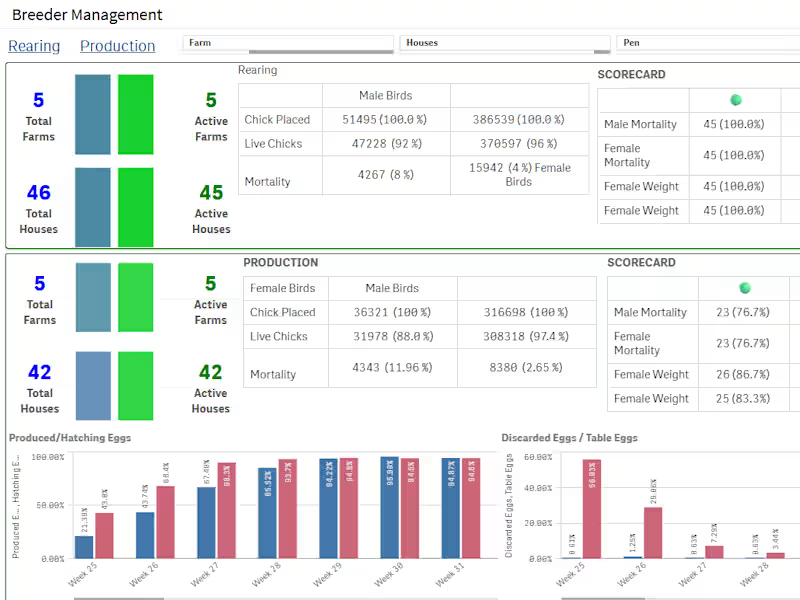
Breeder Farm Performance Dashboard
0
6
0
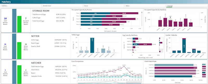
Hatchery Management Dashboard Development
0
4
View more โ
Data Visualizer
(2)
Follow
Message
Hamza Fahim
Karachi, Pakistan
Creative WEB3 Artist | Visualizer | UI Designer

New to Contra
Follow
Message
Creative WEB3 Artist | Visualizer | UI Designer

0
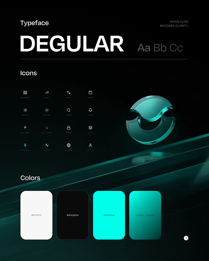
Orderflow | Crypto Trading UI/UX & Branding
0
3
0
AstraPay - Crypto Payment Card Brand Experience
0
0
0
MรD Brand Identity Development
0
0
2
Web3 UI/UX, branding, and product design built for real-world products. ORDER is one example of how I turn complex crypto platforms into clear, premium, and usable digital experiences. My work covers the complete visual journeyย from brand direction and product storytelling to dashboards, trading interfaces, design systems, and high-end campaign visuals. I help Web3, fintech, crypto, and AI brands create products that feel credible, differentiated, and ready for the market. Available for: โข Web3 and fintech UI/UX design โข Crypto dashboard and trading platform design โข Brand identity and visual systems โข Pitch decks and product presentations โข Creative direction and campaign visuals Building a Web3 or fintech product? Letโs create something people trust, understand, and remember. Full ORDER case study (https://www.behance.net/gallery/249388707/Orderflow-Crypto-Trading-UIUX-Branding)
2
115
Data Visualizer
(1)
Follow
Message
Explore people