AI Developer & ML Engineer: Top-notch Expertise
AI Developer & ML Engineer: Top-notch Expertise


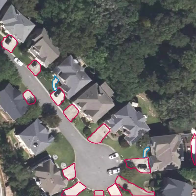
AI Developer Data Analyst and ML Expert
AI Developer Data Analyst and ML Expert

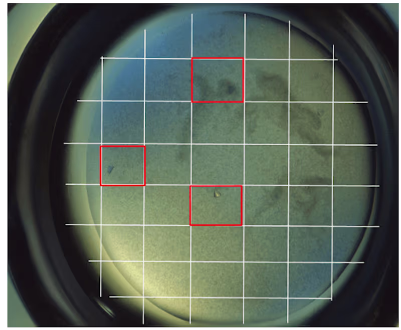
Data Scientist | Data Analyst | ML Engineer
Data Scientist | Data Analyst | ML Engineer
Top Rated Plus Freelancer & Top 1% Talent
- $5k+
- Earned
- 2x
- Hired
- 5.0
- Rating
- 16
- Followers
Top Rated Plus Freelancer & Top 1% Talent


AI Engineer and Machine Learning Expert

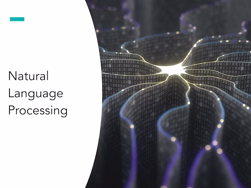
AI & Data Science Specialist | ML Engineer | Python Develope
AI & Data Science Specialist | ML Engineer | Python Develope

I build production-ready AI systems that actually ship
I build production-ready AI systems that actually ship


Machine Learning Engineer
Machine Learning Engineer


View more →