
KAZIM HAIDER SYED
Data Analyst | Logo Design | Video Editing | Frontend Dev |
New to Contra
KAZIM HAIDER is ready for their next project!
Dashboard Overview: A Three-Pillar System
The interface is divided into three functional tabs, providing a comprehensive view of the product lifecycle:
The Home Tab (Product Showcase): * Features a sleek carousel of iconic models like Air Jordan 1 Low SE, Jordan Aerospace 720, and Air Max 97.
Provides high-quality product imagery alongside narrative descriptions of the shoe's heritage and design features.
The Review Tab (Sales Performance):
Displays critical KPIs: Total Profit (reaching up to $1.21M for the Air Jordan 5 Retro), Total Units Sold, and User Ratings/Reviews.
Uses a "Sold Out" badge to visually highlight high-demand inventory.
The Analyse Tab (Geographic Insights):
Visualizes regional performance through "Units Sold by Region" line graphs and "Profit by Region" bar charts (categorized into South, Northeast, Southwest, and Midwest).
Key Insights for Portfolio Posting
If you are listing this project on Contra or LinkedIn, highlight these technical and business strengths:
Integrated UX/UI Design: The dashboard seamlessly transitions from a retail catalog to a data-heavy analytics tool, maintaining a consistent brand aesthetic.
Data-Driven Decision Making: By linking specific shoe models to regional profit data, the dashboard allows managers to see exactly where a product is trending (e.g., higher profit in the "South" vs. "Midwest").
Interactive Navigation: The bottom carousel serves as a global filter, allowing the user to switch products and instantly update the sales and geographic data across all tabs.
Technical Skillset Demonstrated
Data Visualization: Mastery of multi-series charts and KPI cards.
Frontend Design: Clean, "Nike-inspired" minimalist layout with high attention to white space and typography.
Business Intelligence: Creating a closed-loop system where product features are directly tied to financial outcomes.
0
62
Built an interactive sales dashboard to analyze Nike product performance.
Used Power BI to visualize trends, revenue, and customer insights.
Enabled data-driven decision-making through clear and actionable visuals.
0
98
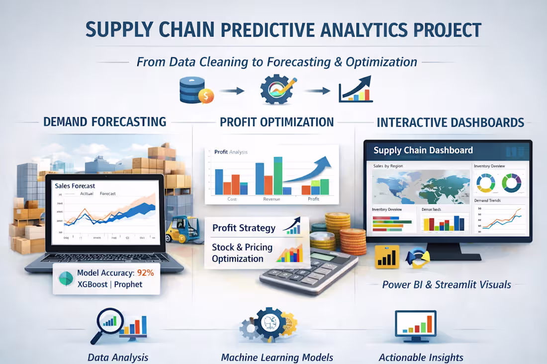
Predictive Analytics Dashboard
Dataset: DataCo Smart Supply Chain Dataset
Size: ~180,519 Rows | 53 Columns
🛠️ Phase 1: Tech Stack & Tools Used
This project was completed using industry-standard tools:
Data Manipulation: Pandas, NumPy
Visualization: Matplotlib, Seaborn (for static EDA) and Plotly Express (for interactive dashboards)
Machine Learning: Scikit-learn (for preprocessing and metrics), XGBoost (for advanced regression)
Forecasting: Facebook Prophet (for seasonality) and XGBoost (for demand volume prediction)
Deployment: Streamlit (to build the live BI dashboard)
🧹 Phase 2: Major Hurdles & Data Cleaning
The dataset was heavily corrupted, presenting several challenges:
Misplaced Data: City names like “São Paulo,” “Rio de Janeiro,” and “Grande del Norte” were incorrectly placed in the Order Status column.
Missing Statuses: Many rows had empty Order Status fields, while the actual status was found in Order State.
Solution: I developed a custom Restoration Engine that cleaned columns and relocated misplaced data to their correct fields (Order Region).
💰 Phase 3: Profit & Strategy Analysis
Beyond visualization, the project supported business decision-making:
Profit Analysis: Calculated profit margins for each product.
Price Optimization: Suggested a 5% price increase for high-selling products with margins below 10% to improve profitability.
🚀 Phase 4: Modeling & Predictions (Next 5 Months)
Advanced XGBoost models were used instead of basic regressions:
Demand Forecast: Predicted order volumes for the next five months to enhance inventory management.
Sales Trends: Optimized models to capture seasonality and trend effects on future sales.
🏭 Phase 5: The Final BI Dashboard
Built a complete interactive system using Streamlit:
11 Industry-Level Visualizations: Demand trends, top-selling products, regional sales, and late delivery root causes.
Interactive System: Management can use live filters to extract insights from over 100,000 rows of data.
🧠
I’ll help you extract business insights through data analysis, dashboards, and forecasting.
Here’s my portfolio: kazimhaidersyedportfolio.lovable.app (http://kazimhaidersyedportfolio.lovable.app)
0
27
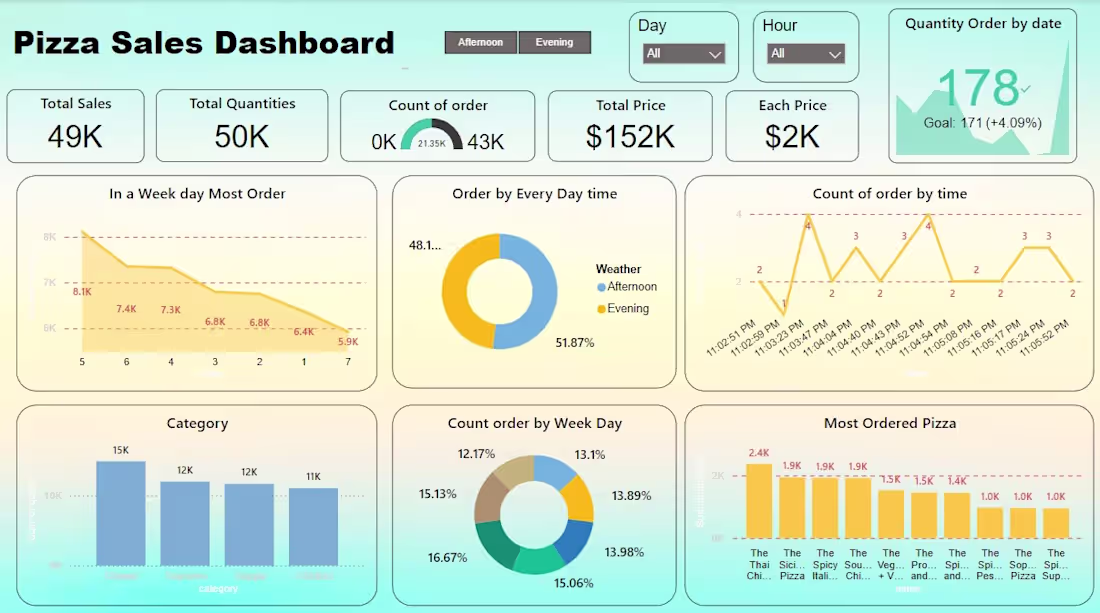
Project Title: Pizza Sales Insights Dashboard
Tools Used: Power BI | Excel | SQL | Data Cleaning
Project Overview
I transformed a complex dataset of pizza transactions into a high-impact, interactive dashboard designed to optimize restaurant operations. The goal was to identify peak ordering times, popular products, and sales trends to improve inventory management and staffing.
Key Features & Insights
Sales Performance Tracking: Real-time visibility into Total Sales ($152K) and order volumes to track growth against business goals.
Peak Time Analysis: Identified that orders peak significantly during the evening hours (51.87%), allowing for better staff scheduling.
Product Popularity: Segmented sales by category, showing that "Classic" pizzas drive the highest volume (15K orders).
Customer Behavior: Analyzed order patterns by day of the week, pinpointing high-demand days to optimize marketing spend.
The Technical Edge
To build this, I performed extensive Data Cleaning and transformation to ensure accuracy across thousands of rows. I focused on a "clean-UI" design approach to ensure that even non-technical stakeholders can find answers in seconds.
Why this matters for your business:
"Data is just numbers until you can see the story. I build dashboards that help you stop guessing and start growing based on facts."
0
57
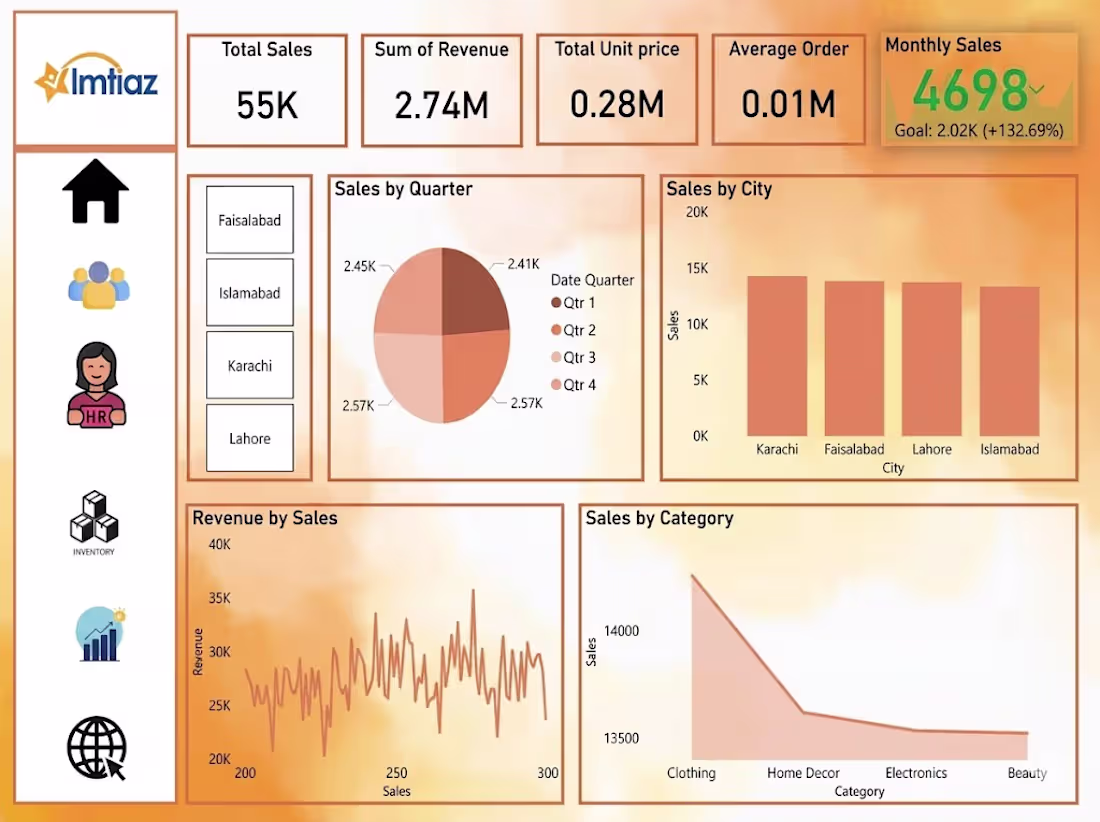
This is a professional business dashboard, titled for 'Imtiaz'. Let's break down the key performance indicators (KPIs) and data visualizations presented:
Summary (Top Banner):
Total Sales: 55K
Sum of Revenue: 2.74 Million (M)
Total Unit Price: 0.28 Million (M)
Average Order Value: 0.01 Million (M)
Monthly Sales (Highlight): 4698, which is +132.69% above the goal of 2.02K. This represents a very strong performance against target.
Key Visualizations:
Left Sidebar (Navigation/Icons): Features common navigation icons including Home, Team/Community, Human Resources (HR), Inventory management (boxes), Sales analysis (chart), and Global/Network access.
Left Filters: Specific location filters for Faisalabad, Islamabad, Karachi, and Lahore.
Sales by Quarter (Pie Chart): Shows the distribution of sales across the four quarters of the year. Sales are relatively balanced, with specific values (like 2.45K for Q1, 2.41K for Q2, and 2.57K for Q3 and Q4) provided for each segment.
Sales by City (Bar Chart): Ranks performance across four major cities. Karachi is the top performer (close to 20K sales), followed by Faisalabad, Lahore, and Islamabad, all performing within a similar range between 10K and 15K.
Revenue by Sales (Line Graph): A detailed trend line showing daily (or granular) fluctuations in revenue (y-axis) plotted against the sequential count of sales (x-axis, from 200 to over 300 sales transactions). The graph shows high volatility.
Sales by Category (Line/Area Chart): Shows sales performance by product category. It clearly indicates a high initial volume from 'Clothing', which then significantly drops and plateaus for 'Home Decor', 'Electronics', and 'Beauty' categories. This suggests clothing is the primary sales driver.
My portfolio: https://kazimhaidersyedportfolio.lovable.app/
0
37

Professional Brand Identity & Data Visualization Logos
Project Overview
I recently completed these two distinct logo concepts focusing on connectivity and growth. My goal was to create visual identities that are not only aesthetically pleasing but also communicate the core values of the brands they represent.
Design Breakdown
1. The "Network & Synergy" Logo (Blue Gradient)
Concept: This design represents a neural network or a decentralized system. The interconnected nodes signify collaboration, technology, and structure.
Style: Modern, tech-focused, with a clean blue gradient that builds trust and reliability.
Best for: SaaS platforms, AI startups, or Networking companies.
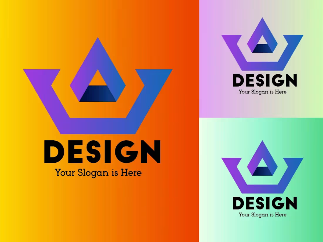
2. The "Growth Analytics" Logo (Orange/Yellow)
Concept: A combination of a bar chart and a rising trend line. It’s designed to visualize progress, success, and data-driven results.
Style: Vibrant and energetic. The orange tones evoke creativity and action.
Best for: Financial services, Marketing agencies, or Business consultancy firms.
My Design Process
Discovery: Understanding the client’s niche and target audience.
Sketching: Brainstorming multiple concepts to find the perfect geometric balance.
Execution: Using industry-standard tools to ensure high-resolution, scalable vector files.
Refinement: Iterating based on feedback to align with the brand's vision.
What I Offer
Custom Minimalist & Modern Logo Design
Full Brand Identity Kits
Source Files (AI, EPS, SVG, PNG)
Fast Communication & Quick Turnaround
Looking to elevate your brand? Let’s collaborate and turn your vision into a visual reality! DM me or invite me to your project.
0
21
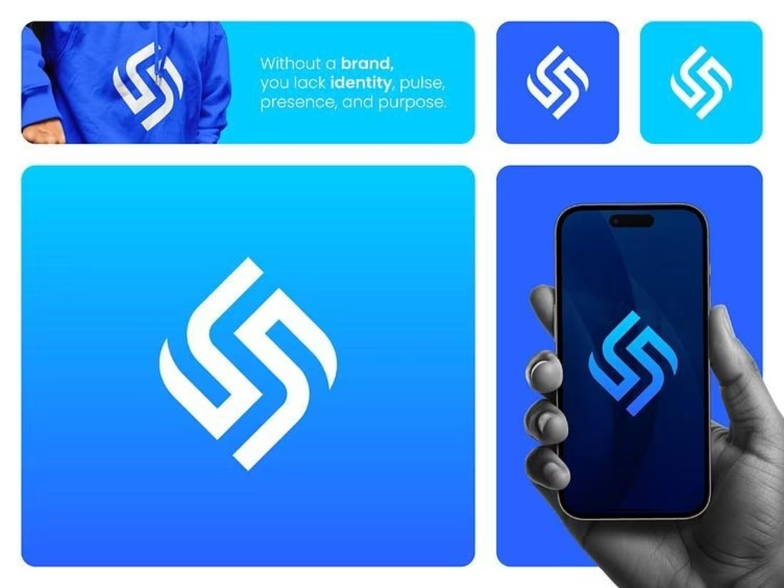
Dynamic Monogram & Lifestyle Brand Identity
Project Overview
A brand is more than just a logo; it’s an identity, a pulse, and a presence. In this project, I developed a Dynamic Monogram designed to be bold, scalable, and instantly recognizable. The goal was to create a visual mark that feels equally at home on a digital screen and on physical merchandise.
Design Concept: The "S" Monogram
Symbolism: The logo features a stylized, interlocking "S" (or dual-link) shape. It represents Fluidity, Connection, and Strength.
Geometry: Built on a grid system, the sharp angles combined with smooth curves create a sense of motion and modern sophistication.
Color Palette: I chose a high-contrast "Electric Blue" and "White" palette to evoke feelings of energy, professionalism, and clarity.
Key Features
Versatile Branding: As shown in the mockups, the logo maintains its integrity across different mediums—from mobile app icons to high-quality apparel (hoodies).
Adaptability: The mark is designed to work in solid colors, gradients, or as a cutout, making it incredibly easy for the brand to scale.
App-Ready: The clean, thick strokes ensure the logo remains legible even at small sizes, perfect for the modern digital ecosystem.
What I Delivered:
Logo Construction: Precise vector geometry.
Brand Application: Real-world mockups for digital and physical use.
Iconography: App icon variations for iOS/Android standards.
Brand Consistency: A visual language that communicates "Identity and Purpose."
Does your brand need a pulse? I specialize in creating identities that stand out and stay memorable. Let's build something great together. Invite me to your project!
0
21
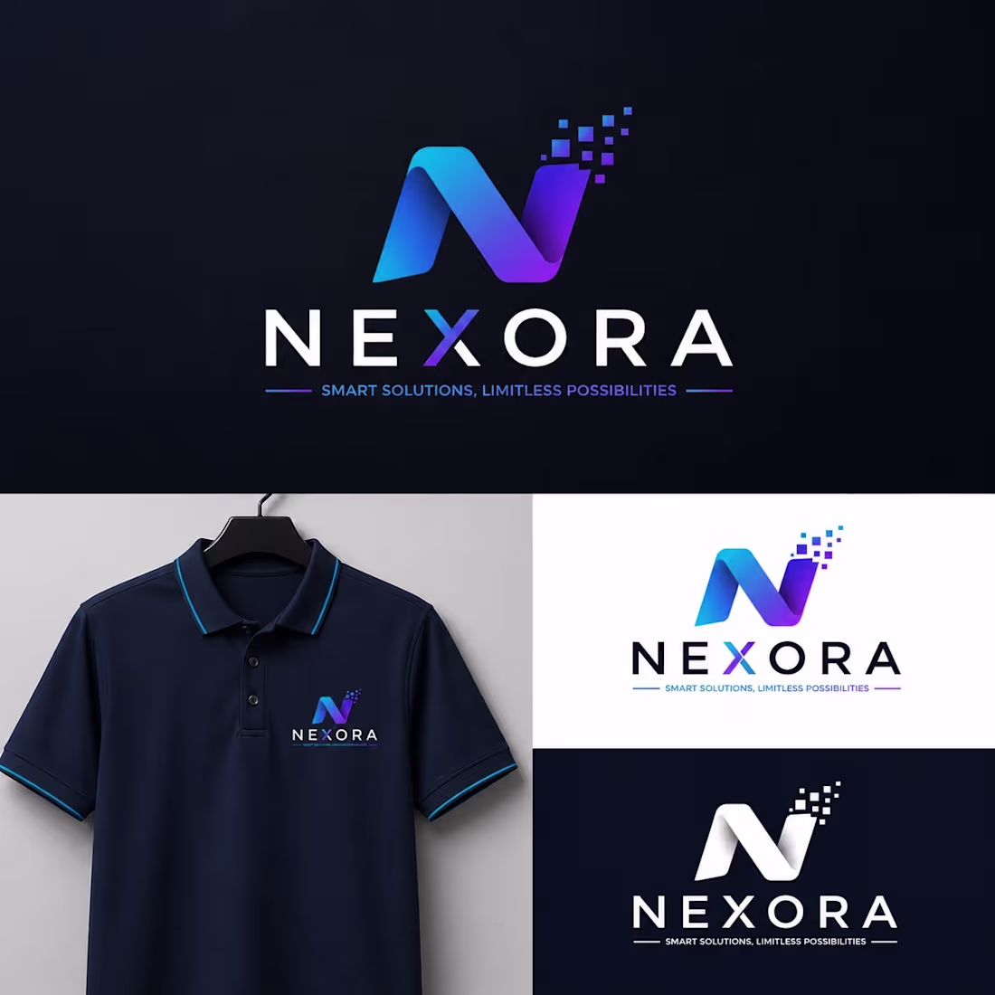
Futuristic Branding: NEXORA — Smart Solutions, Limitless Possibilities
Project Overview
Future ke solutions ko focus karte hue, main ne NEXORA ke liye ek bold aur adaptable brand identity create ki hai. Is ka aim aisi technology-focused company ko represent karna hai, jo innovation aur intelligence ko blend karti hai. Hum ne sirf aik logo design nahi kiya, balki poori conceptual imagery ready ki hai, take brand ke core message ko represent kiya ja sake.
Design Concept & Features
1. Nexora — The Fusion of Data and Connection
The "N" Symbol: Yeh logo concept hum ne "Digital Transformation" aur "Seamless Connection" ke idea pe based rakha hai. 'N' ke right edge pe pixel dots future data aur digital innovation ko present karte hain.
Pixel Dynamics: Pixels break ho kar right side move ho rahe hain, jo move fast aur forward innovation ko indicate karta hai.
Modern Typography: Company ka name simple aur structured typeface mein rakha gaya hai, jo trust aur accessibility create karta hai. 'N' aur 'X' alphabet ka cut tech vibe deta hai.
Key Brand Applications (The Versatility Test)
Tech-Driven App & Web Presence: Dynamic blue to purple gradient digital interfaces ke liye perfect hai, jaise apps aur websites par. Is mein trust aur sophistication hai.
Physical Products (Merchandise): Hum ne is identity ko practical applications ke liye test kiya hai. Is visual image mein, aap ek simple navy polo shirt par embroidery dekhte hain, jo premium corporate merchandise ke liye aik exemplary piece hai.
Monochrome Adaptability: Yeh identity black aur white background ke liye bhi perfectly adaptable hai. Agar client print-friendly aur multi-use designs talash kar rahe hain, to NEXORA visual mark har media format ke liye perfect choice hai.
Services We Provided:
Identity Conceptualization & Moodboard
Custom Vector Logo Design
Corporate Color Palette & Typography Guidelines
Brand Applications & Mockups for Digital/Print
Scalable Assets for Cross-Platform use
Ready to elevate your tech brand?
Let's collaborate! Agar aap ki company innovation, efficiency, aur progress ko define karti hai, toh chaliye aisi identity create karein jo aap ki unique values ke saath connect kare. DM me or invite me to your next project on Contra!
0
19
Abstract Geometric & Minimalist Brand Marks
Project Overview
In this project, I explored the intersection of geometry and minimalism to create versatile brand identities. My focus was on creating "Future-Proof" logos that remain impactful across both digital and physical mediums.
Logo Concepts & Design Logic
1. The "Aperture & Harmony" Floral Logo (Blue/Cyan)
Concept: This logo is a sophisticated blend of a floral motif and a digital aperture. It represents Unity, Precision, and Sustainable Growth. The symmetrical lines are engineered to provide a professional and perfectly balanced visual anchor for any brand.
Best For: Photography brands, Creative Agencies, Software Development firms, or Wellness startups.
Visual Style: Clean monoline strokes paired with a vibrant blue gradient for a modern, trustworthy, and tech-forward feel.
2. The "Geometric Apex" Logo (Purple/Blue Triangle)
Concept: This design serves as a symbol of Strength and Leadership. It features an abstract 'A' or an upward-pointing arrow, signifying continuous Success and Innovation. The geometric construction gives it a solid, architectural foundation.
Best For: Real Estate, Fintech, Construction, or any brand requiring a "Bold" and "Authoritative" market presence.
Visual Style: Sharp angles combined with a soft purple-to-blue gradient, creating a premium 3D depth effect that stands out in a crowded market.
Why Choose My Designs?
Versatility: These logos are meticulously tested to ensure they work perfectly on both dark and light backgrounds.
Scalability: Delivered as high-quality vector assets that remain pin-sharp, whether on a tiny favicon or a giant billboard.
Modern Aesthetic: Focused on high-end design trends that attract premium, top-tier clients.
Services Provided:
Initial Moodboard & Conceptualization
Custom Vector Logo Design
Strategic Color Palette Selection
Typography Pairing & Hierarchy
Social Media Ready Mockups
Ready to give your brand a new identity? Let’s discuss your vision and bring it to life. Send me an inquiry or invite me to your project!
0
19
I’ve recently updated my services as a Data Analyst. If you’re looking for data cleaning, dashboards, or insights, feel free to connect. I’d love to collaborate.
0
103
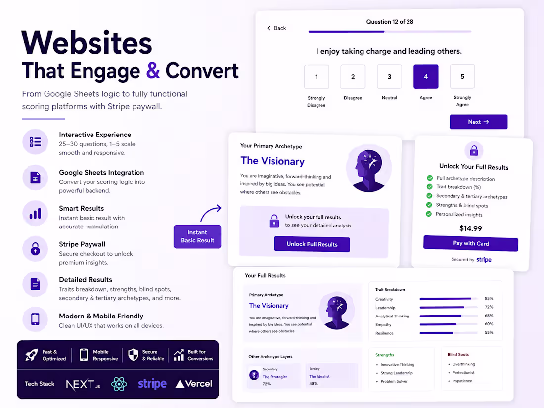
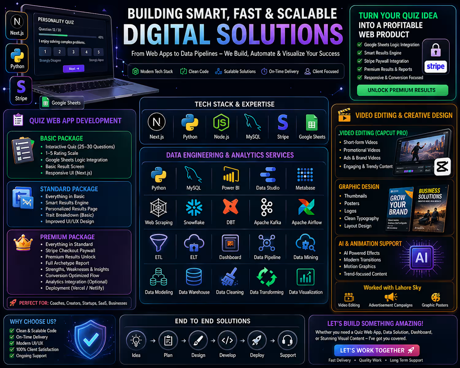
🚀 Web App Development Services (Quiz + Stripe + Google Sheets Integration)
I help founders, coaches, and creators turn quiz-based ideas into fast, scalable, and conversion-focused web applications.
If your quiz logic already exists in Google Sheets, I can transform it into a fully functional web product with a seamless monetization system.
🧩 Service Packages
🟢 Basic Package – Quiz Web App
Ideal for simple quiz websites
Includes:
Interactive quiz (25–30 structured questions)
1–5 rating scale system
Google Sheets logic integration
Basic result display screen
Fully responsive UI (mobile & desktop)
Clean frontend built with Next.js
👉 Best for: simple quizzes and lead generation tools
🔵 Standard Package – Quiz + Advanced Results System
For a more engaging and personalized experience
Includes everything in Basic, plus:
Smart result engine (archetype/category-based output)
Personalized results page
Basic trait breakdown visualization
Improved UI/UX design
Performance optimization
👉 Best for: coaches, personality tests, and funnel-based quizzes
🔴 Premium Package – Full Monetized Product (Stripe Integration)
Complete SaaS-style quiz system
Includes everything in Standard, plus:
🔐 Stripe Checkout paywall integration
Premium results unlock system
Dynamic results page featuring:
Full archetype report
Strengths & weaknesses
Trait percentage breakdown
Conversion-optimized user flow
Optional analytics integration
Deployment (Vercel / Netlify)
👉 Best for: creators selling digital reports, assessments, or SaaS products
⚙️ Tech Stack
Next.js (Frontend)
Google Sheets (Quiz logic / data source)
Node.js (Backend logic if required)
Stripe (Payments & subscriptions)
Vercel / Netlify (Deployment)
🎯 Optional Add-ons
Referral tracking (URL-based system)
Admin dashboard (users, analytics, sales tracking)
Email capture & automation
Google Analytics / PostHog integration
A/B testing for conversion optimization
⚡ Delivery Focus
Fast, optimized performance
Clean and modern UI design
Conversion-focused user experience
Scalable architecture
Production-ready deployment
💡 Example Use Cases
Personality tests
Coaching assessments
Lead generation funnels
Paid report generators
SaaS validation tools
see demo web/portfolio: https://kazimhaidersyedportfolio.lovable.app/
0
36
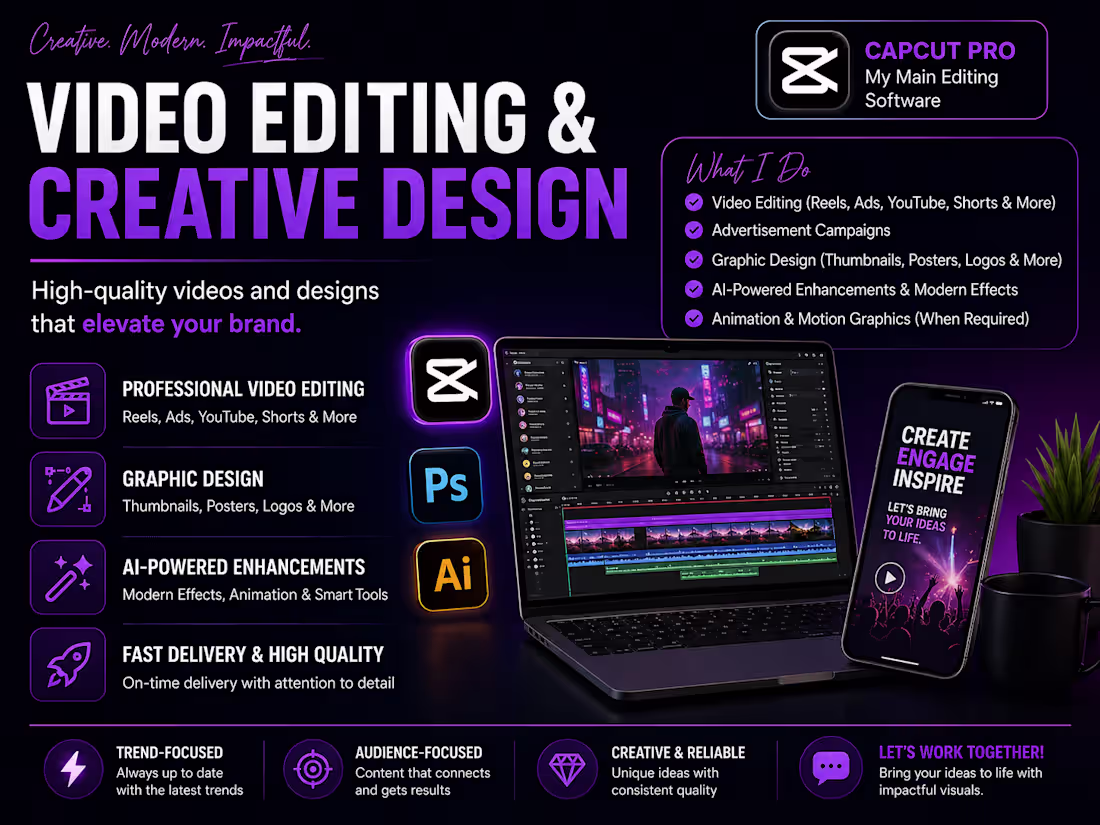
🚀 Service Update: Video Editing & Creative Design
I’m excited to share that I’ve updated my creative services on Contra!
I specialize in high-quality video editing using CapCut Pro, delivering engaging and polished content tailored for modern audiences. From short-form videos to promotional content, I focus on making visuals that stand out.
I’ve also worked with Lahore Sky, where I contributed to:
• Video editing
• Advertisement campaigns
• Graphic posters for brand growth
🎨 Beyond editing, I bring strong graphic design skills:
• Thumbnails
• Posters
• Logos
• Clean typography & layout design
🤖 I also leverage AI tools to enhance videos with modern effects and support animation needs — ensuring content stays aligned with current trends.
📌 My goal is simple:
To deliver content that is professional, visually appealing, and results-driven.
👉 If you’re looking for someone to bring your ideas to life, feel free to reach out — let’s work together!
🔗 Work reference:
https://www.instagram.com/lahoresky?igsh=MXB3dzRlbzRzNnpueg%3D%3D
0
45