Projects using Adobe Illustrator in IslamabadProjects using Adobe Illustrator in IslamabadHello community,
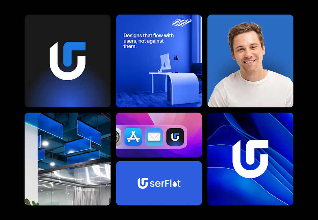
I’m excited to share my new brand identity case study for UserFlot, a design studio that focuses on creating user-centered digital experiences. The concept revolves around the idea of fluid design, visuals & interfaces that flow seamlessly with users, not against them.
For this project, I developed the logo system, color palette, typography, iconography, and brand visuals that reflect clarity, motion, and trust. The blue tones emphasize reliability and creativity, while the smooth gradients and curved elements represent effortless usability.
Would love to hear your thoughts and feedback! 💙 Turning Complex Software into Visual Sales Assets
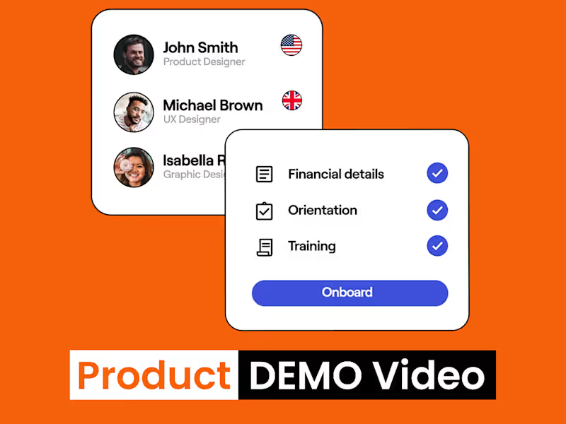
Generic templates don't convert savvy tech buyers. This premium SaaS explainer video was built to solve a specific problem: transforming complex, multi layered software features into a clear, high converting visual narrative that drives demo bookings.
Collaborating with a dedicated team, I led the motion design pipeline to create a polished, product led asset. Every transition, UI animation, and keyframe was engineered to hold attention, demonstrate immediate product value, and match the premium aesthetic expected by modern tech audiences.
The Goal: Reduce churn, explain complex UI seamlessly, and accelerate the sales cycle.
Specializations: SaaS Explainer Videos, 2D Motion Graphics, Product Demos
If your software is complicated but your value proposition shouldn't be, let's talk.
Explore my portfolio at muneebtalib.com (http://muneebtalib.com) or send a message directly on Contra to discuss how we can turn your product UI into a high converting growth tool.
Project: Award, Certification & Institutional Badge Collection
Scope: A range of recognition and badge marks across award, certification, education, event, and anniversary categories.
Delivered: Full-color and one-color variants, alternative web-safe formats where applicable, production-ready vector files (AI, EPS, SVG, PDF), transparent PNG exports.
Result: A demonstrated body of work across five distinct recognition-badge categories, each built for its specific real-world application, print, embroidery, signage, or digital.
Noor Afshan Al Aziz | Brand Identity Designer & Adobe Illustrator Production Specialist 🏷️ Brand Identity & Strategy: Meridian
💼 What They Do
Meridian is a digital wealth platform helping the next generation of inheritors manage, grow, and understand the wealth they’ve received — blending intelligent automation with real financial guidance.
🎯 Mission
To make inherited wealth feel less intimidating and more empowering — giving young wealth-holders clarity and control through smart, transparent technology.
👁️ Vision
A future where managing significant wealth doesn't require decades of experience — just the right platform.
👥 Target Audience
Next-gen inheritors (roughly 25–40): Individuals who have come into wealth (via family money, business sales, or inheritance) but weren't necessarily raised managing it. They are digital-natives, skeptical of stuffy old private banks, and desire a platform that feels modern yet deeply serious.
✨ Brand Personality
Clear — No jargon, no intimidation
Modern — Feels like a 2026 tech product, not a 1980s bank
Grounded — Trustworthy and secure (it's their family's money)
Empowering — Makes them feel in control, not lost
📍 Positioning Statement
For next-gen wealth inheritors who feel overwhelmed by managing money they didn't build themselves, Meridian is the wealth platform that turns confusion into clarity — unlike traditional private banks that speak in jargon and assume decades of experience.
🎨 Creative Directions
🏛️ Direction A — Modern Minimal
Palette: Deep navy, ivory, slate gray, muted gold
Brand Mark: A quiet, understated mark — thin ring with a single gold accent point.
Vibe: Feels like a private members' club, but digital. Best if leaning into "quiet confidence" over "flashy tech."
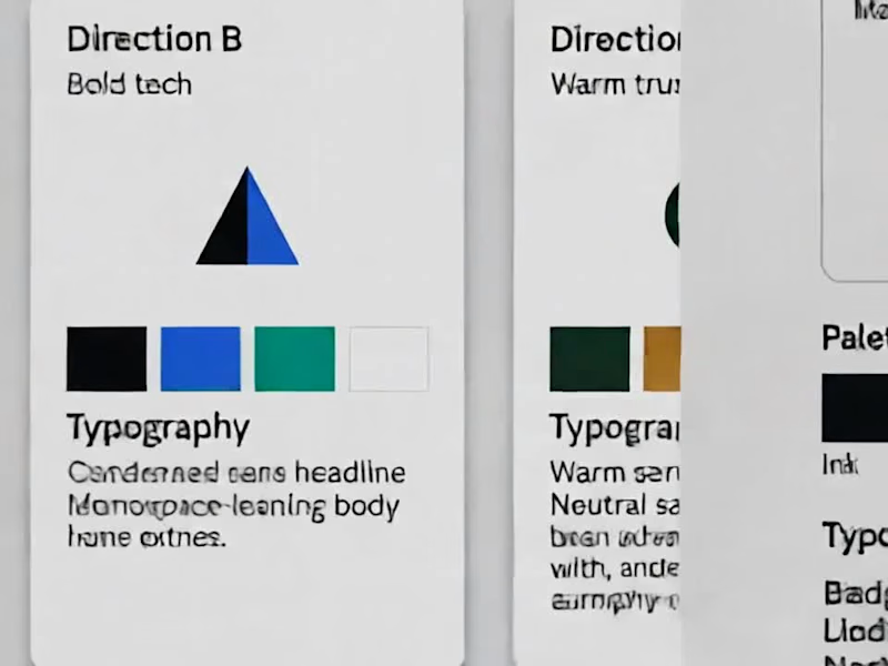
⚡ Direction B — Bold Tech
Palette: Ink black, electric blue, teal, ice white
Brand Mark: Angular, geometric mark — sharp overlapping shapes.
Vibe: Feels like a fintech product first, wealth platform second. Best to stand out from stuffy private banks entirely.
🌿 Direction C — Warm Trust
Palette: Forest green, warm gold, cream, charcoal
Brand Mark: Rounded, organic overlapping mark — feels human and approachable.
Vibe: Prioritizes the "empowering, not intimidating" side of the brand personality.
🔀 The Hybrid Direction (Blend of B & C)
This custom blend balances Direction B's structure with Direction C's warmth — sharp shapes softened by rounded edges, cool ink/teal grounded by warm gold and cream so it never feels cold or purely "fintech."
🎨 Locked-In Color Palette (5 Colors)
Ink (Deep Dark Base)
Teal (Modern Tech Accent)
Warm Gold (Elevated & Grounded)
Cream (Soft, Approachable Canvas)
Warm Gray (Neutral Balance)
📐 3 Mark Directions to Choose From
A triangle softened by an intersecting circle.
Two overlapping squares (one sharp corner + one rounded corner).
A simple two-bar mark (one straight bar + one rounded bar).
✍️ Typography Pairing
Headlines: Geometric Sans (Structure & Modernity)
Body Text: Neutral Sans (Readability & Clarity)
Quotes / Taglines: Warm Serif (The Human Touch)
📐 Logo Lockups & System
Primary Lockup: For most core use cases (Website header, pitch decks, business cards)
Stacked Lockup: Optimized for square and compact formats (App icon, social profile avatars)
Reversed Version: High-contrast variant for dark backgrounds, presentation decks, or dark-mode app UI
🎴 Real-World Application: Business Card
Front & Back Layout: Built using the exact palette and lockup rules — serving as proof that the visual system translates seamlessly beyond a logo on a white background into tactile, premium media.
📩 If you like my project, DM for interactive designs of your brands!