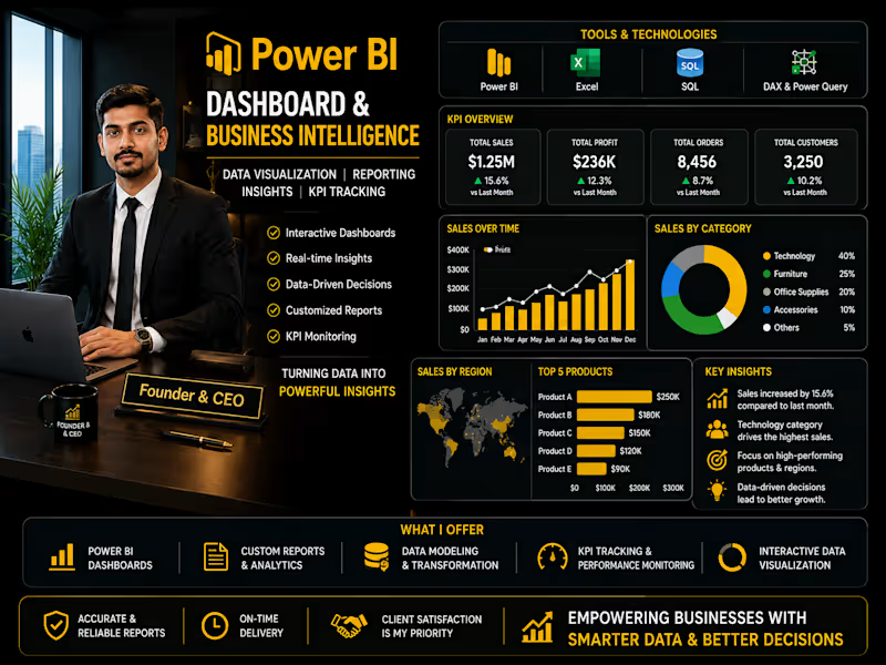
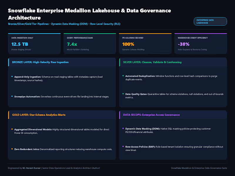
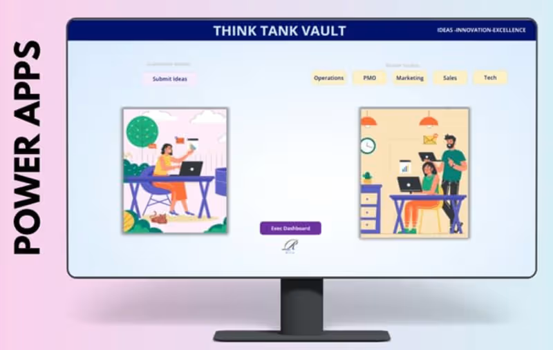
Projects using Microsoft Power BI in IndiaProjects using Microsoft Power BI in IndiaI specialize in transforming complex datasets into intuitive, visually compelling dashboards that drive strategic decision-making. With deep expertise in BI tools and data analytics, I design interactive, real-time reporting systems that help businesses uncover trends, monitor KPIs, and optimize performance. My approach combines data storytelling, clean UI/UX, and scalable architecture to deliver impactful insights.
🔹 My Project Portfolio:
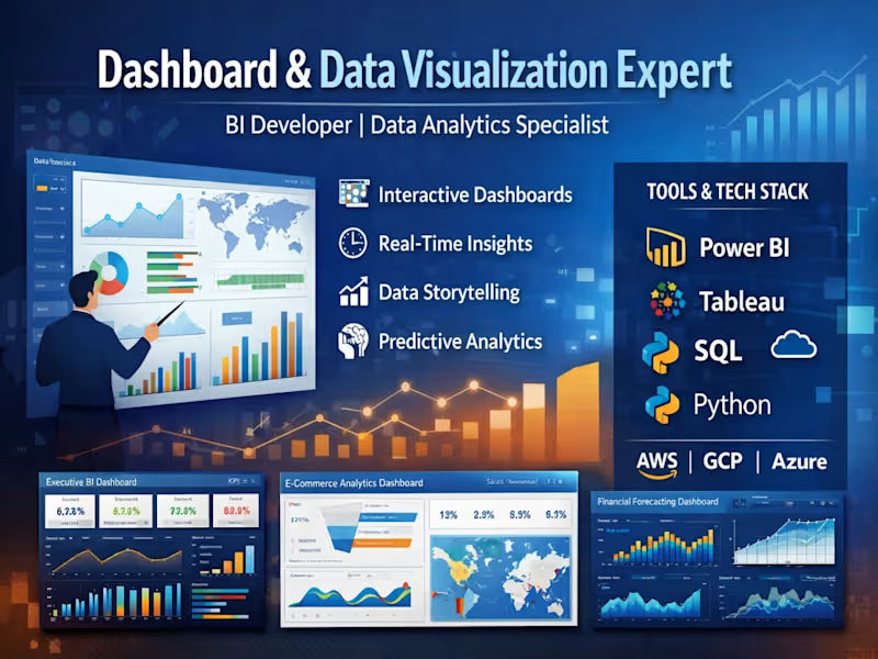
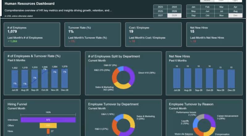
📊 1. Executive Business Intelligence Dashboard
Built a dynamic KPI dashboard for C-level executives
Integrated multiple data sources (CRM, ERP, marketing platforms)
Delivered real-time insights on revenue, growth, and performance
Tools: Power BI, SQL, Azure
📈 2. E-commerce Analytics Dashboard
Designed a dashboard tracking sales, customer behavior, and conversion rates
Implemented cohort analysis and funnel visualization
Improved marketing ROI tracking by 40%
Tools: Tableau, Python, Google Analytics
📉 3. Financial Performance & Forecasting Dashboard
Developed financial models and forecasting dashboards
Visualized cash flow, P&L, and budget vs actuals
Enabled data-driven financial planning
Tools: Power BI, Excel, DAX
📍 4. Operations & Supply Chain Dashboard
Created logistics tracking and inventory monitoring system
Real-time alerts for stock levels and delays
Reduced operational inefficiencies
Tools: Looker Studio, BigQuery
📊 5. AI-Powered Analytics Dashboard
Integrated machine learning predictions into dashboards
Automated anomaly detection and trend analysis
Delivered predictive insights for decision-making
Tools: Python, TensorFlow, Streamlit AI-Powered Geopolitical & Supply Network Exposure Intelligence Dashboard
Global supply chains are complex. Understanding where your business is exposed shouldn’t be.
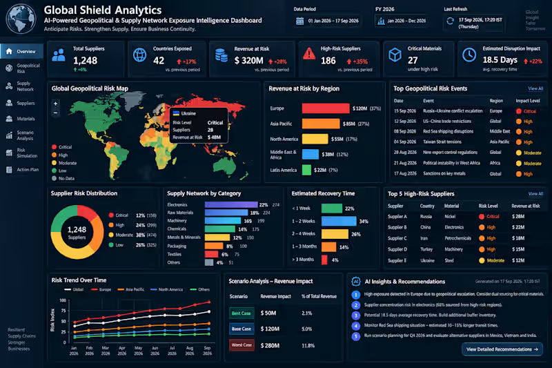
I designed Global Shield Analytics as an executive-level Power BI solution that connects geopolitical risk, supplier dependency, critical materials, operational disruption, recovery time, and financial exposure in one intelligent reporting environment.
Instead of simply showing what happened, the solution is designed to help leadership understand:
Where are we exposed? → What could be affected? → What could it cost? → How long could recovery take? → What should we investigate next?
What I Can Build for Your Business
Every organization has different data, KPIs, reporting processes, and decision-making requirements. I build the Power BI solution around your actual business needs, rather than forcing your data into a generic template.
Requirement Discovery
I understand your reporting challenges, business objectives, KPIs, stakeholders, existing reports, and required outcomes.
Data Preparation
I connect, clean, transform, and structure data from sources such as Excel, SQL, ERP, CRM, and other business systems using Power Query.
Data Modelling
I develop a scalable semantic model with relationships, dimensions, measures, and business logic designed around your reporting requirements.
DAX & KPI Development
I create the calculations required for your business — financial metrics, operational KPIs, supplier performance, risk indicators, trends, targets, and other decision metrics.
Power BI Dashboard Development
I transform the prepared data into a professional, interactive dashboard with executive KPIs, drill-down analysis, filters, trends, comparisons, risk views, and actionable insights.
Business Validation
I validate the calculations and outputs against the agreed requirements and source data so the final reporting solution is consistent and business-ready.
Performance Optimisation
I structure and optimise the model and report for better performance, usability, navigation, and scalability.
Final Delivery
I provide the completed Power BI solution with the agreed reporting structure, visuals, calculations, and handover documentation.
🔗 From Business Requirement to Final Intelligence
Requirement → Data → Power Query → Data Model → DAX → KPIs → Dashboard → Validation → Final Delivery
Whether your organization needs to replace manual Excel reporting, consolidate fragmented data, improve an existing Power BI environment, or build a new executive BI solution, the dashboard can be designed around the specific problem you need to solve.
The Business Value
The goal is not to create more charts.
The goal is to create a single, clear decision-support layer that helps teams understand complex business exposure faster and focus attention where it matters.
Power BI | Microsoft Fabric | SQL | Power Query | DAX | Data Modelling | Executive BI
📅 Dashboard Date: 17 September 2026
📊 Reporting Period: 01 January 2026 – 17 September 2026
🔄 Last Refresh: 17 September 2026, 17:20 IST
Have a Power BI or Business Intelligence requirement?
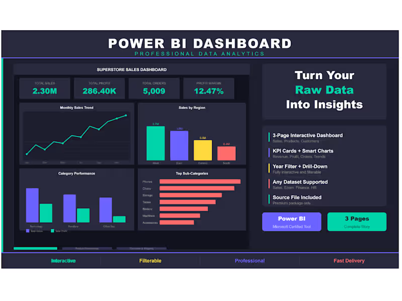
Share the business problem, reporting challenge, or data requirement. I can design and build the Power BI solution around it — from initial requirements through final delivery. Superstore Sales Dashboard — 3-Page Power BI Report
Built an interactive 3-page Power BI dashboard using
the Superstore Sales dataset (9,994 orders across USA).
Page 1 — Sales Overview: KPI cards, monthly trend,
regional breakdown, category performance.
Page 2 — Product Performance: Top products, category
donut, profit analysis, sales vs profit scatter.
Page 3 — Customer & Shipping: Segment breakdown,
top 10 customers, monthly growth, ship mode distribution.
Tools: Power BI, DAX, Superstore Dataset
Theme: Dark professional with interactive year filter. Data Analyst & Power Platform Specialist
📍 Mumbai, India | 📞 +91 7021027927 | ✉️ maheshkheder329@gmail.com (mailto:maheshkheder199@gmail.com)
Analytical and results-driven Data & MIS Specialist with 5+ years of experience optimizing reporting frameworks, automating complex workflows, and designing business intelligence solutions in the financial and insurance sectors. Skilled in transforming raw data into actionable insights using Power BI, SQL, Advanced Excel (VBA), and Power Automate. Recognized for delivering end-to-end data pipelines, custom approval workflows, and robust financial models.
Core Capabilities & Technical Toolkit
Business Intelligence & Dashboards: Power BI (Expert DAX, Power Query, Dynamic RLS), SAP BO, Trend & P&L Analysis
Database & Data Architecture: SQL (Data Modeling, Query Optimization, Joins, Data Validation), Dataverse, SharePoint Lists
Process Automation: Excel VBA Macros, Power Automate (Multi-stage Approval Workflows, Data Integration)
Analytics : Data Cleaning, Data Reconciliation, Python (Data Processing & Visualization) Power BI Sales Dashboard | Multi-Year Day-Range Analysis
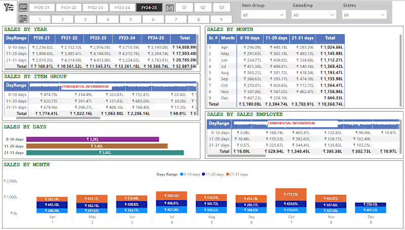
Built a fully interactive Power BI sales dashboard that breaks down revenue not just by the usual year/month/product view, but by a custom "day-range" pattern (0–10, 11–20, 21–31 days) giving management visibility into when within the month sales actually happen, which is critical for cash flow and production planning in trading/manufacturing businesses.
What the dashboard delivers:
5-year trend view : one-click tabs to switch between FY20-21 through FY24-25, with a running "Total" row and column so leadership sees both period and cumulative performance instantly
Quarter and month drill-down: Q1/Q2/Q3 buttons plus a 1–9 month strip let users move from annual to monthly granularity without leaving the page
Day-range breakdown by month : a dedicated matrix showing 0–10/11–20/21–31-day sales split for every month of the year, so seasonal and mid-month sales patterns are visible at a glance
Multi-dimensional filtering : global slicers for Item Group, Sales Employee, and State, so any table or chart on the page can be sliced by product line, individual salesperson, or region in real time
Item Group and Sales Employee performance matrices : day-range sales broken out per product category and per salesperson, useful for both inventory planning and sales incentive tracking
Visual summary charts : a horizontal bar chart totaling sales by day-range, and a color-coded combo chart showing the month-by-month day-range split side by side, so non-technical stakeholders get the story without reading tables
Consistent, presentation-ready formatting : currency in lakhs (₹L), color-coded day-range categories, and a clean header/navigation bar that makes the report feel like a finished product, not a raw data dump
Why this matters to a client:
This isn't just a report that shows totals : it's built to answer a specific business question (when in the month are we actually making money, and who/what is driving it) that standard "sales by month" dashboards miss. I design Power BI dashboards this way: starting from the business question a client actually needs answered, not just wiring up default visuals.