
Logo Designer | Minimal & Memorable Brand Identities
ADAB — a minimal Arabic-inspired logo concept.
This concept explores elegant Arabic lettering with a clean, modern and refined visual direction, designed to feel timeless and versatile.
Originally created as a practice concept, but now available for purchase. If this direction fits your brand, feel free to reach out — I can also customize it to suit your brand’s personality and needs.
Available at a friendly budget. ✨
4
2
239
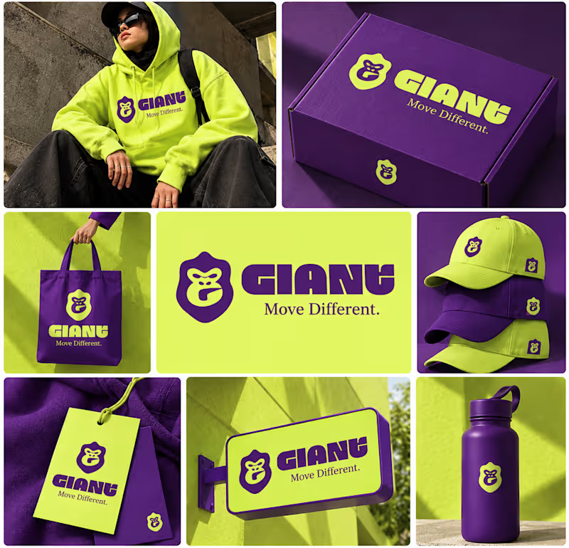
GIANT — Move Different.
Built around a bold gorilla mark, oversized typography, and an electric purple + neon-lime palette.
A streetwear identity designed to feel bold, rebellious, and instantly recognizable — from hoodies and caps to packaging, tags, and everyday brand details.
Concept branding project | Open for custom projects
12
10
934
Project Title
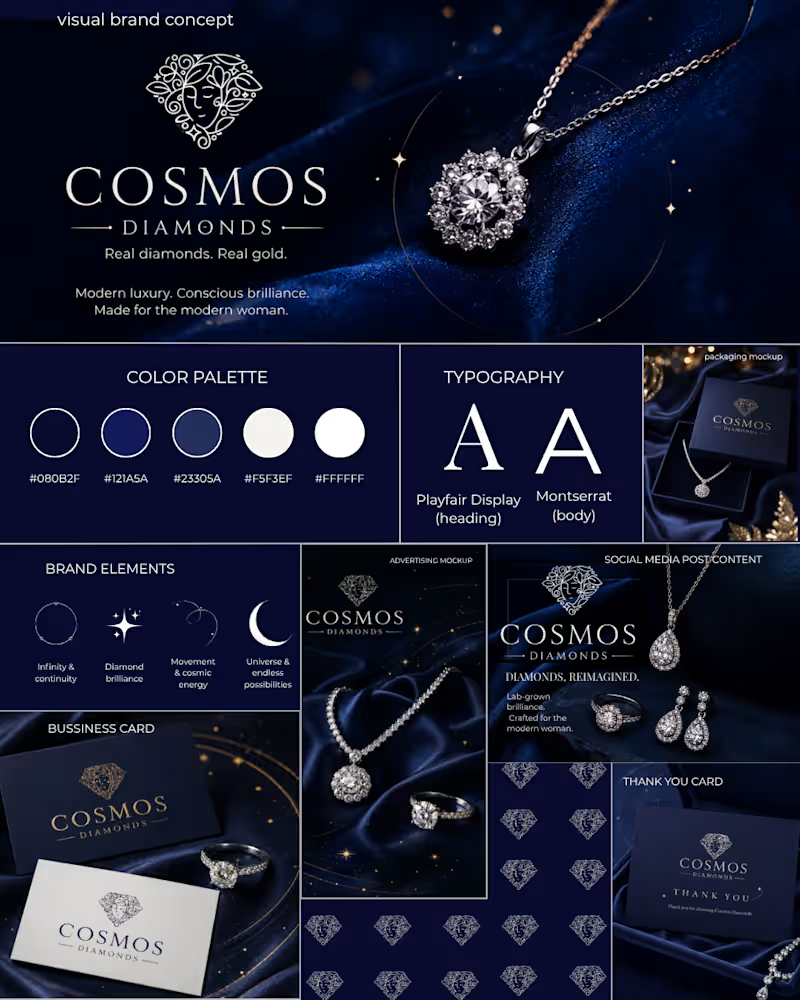
Cosmos Diamonds — Celestial Luxury | Visual Brand Concept
Description
The Story Behind the Concept
I came across Cosmos Diamonds and was inspired by its connection to diamonds, modern luxury, and the idea of the cosmos.
As a brand identity designer, I wanted to explore how the feeling of the infinite universe could be translated into a refined and cohesive visual direction for a jewellery brand.
I reached out to Cosmos Diamonds and shared my idea of creating a quick concept inspired by their brand. After receiving a response, I developed this self-initiated visual brand concept.
Creative Direction
The concept is built around four key ideas:
Orbit — representing infinity and continuity.
Stars — symbolising diamond brilliance.
Celestial Curves — representing movement and cosmic energy.
Diamond Brilliance — reflecting the beauty and refinement of jewellery.
Visual Identity Exploration
The concept explores:
Colour palette
Typography
Logo presentation
Celestial graphic elements
Brand pattern
Social media content
Advertising creative
Packaging concept
Business card
Thank-you card
The visual direction uses deep navy, blue and white tones to create a dark, elegant and celestial atmosphere while keeping the overall identity modern and premium.
Design Approach
My goal was not to completely redesign the existing brand, but to explore how its current visual language could be extended into a more cohesive visual system across different brand touchpoints.
Note
The Cosmos Diamonds logo shown in this concept belongs to the original brand and was not designed by me. I used it only for brand context and visual exploration. The logo was sourced from a publicly available profile image, so its resolution may appear lower in some parts of the presentation.
This is a self-initiated visual brand concept, not an official Cosmos Diamonds rebrand or commissioned client project.
1
115
SHIMMER — Logo Design Concept
A refined logo concept created for SHIMMER, an interior design education brand focused on making design learning approachable, inspiring, and accessible.
The identity explores the relationship between interior spaces, creativity, learning, and architectural forms through a minimal emblem and elegant typography.
I explored three logo variations to test different levels of visual storytelling and simplicity:
Concept 01: Symbol + wordmark — a more expressive and complete identity.
Concept 02: Integrated wordmark — subtle architectural elements incorporated directly into the lettering.
Concept 03: Standalone symbol — a minimal, versatile mark that focuses purely on the architectural form.
Which direction feels strongest to you — 01, 02, or 03?
I'd love to hear which style feels the most memorable, balanced, and suitable for the SHIMMER brand.
Tools: Inkscape
Project: Personal / Practice Branding Concept
Focus: Logo Design · Brand Identity · Typography · Minimalist Branding
1
142


Canva Designer | Social Media Posts & Posters
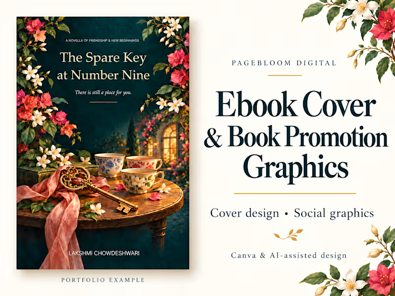
Working on a book and need a cover?
I’m offering ebook front-cover design and matching promotional graphics through PageBloom Digital.
I use Canva and AI-assisted tools to explore colours, typography, and layouts that suit your story and audience. The image shown is a sample from my own book project, The Spare Key at Number Nine.
Share your book title, genre, and ideas with me. We’ll agree on the scope, revisions, timeline, and price before starting.
View my service: https://contra.com/s/bBNk2vBc-ebook-cover-and-book-promotion-graphics
1
62
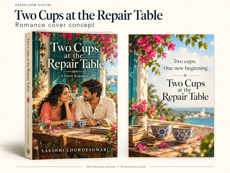
Two Cups at the Repair Table | Romance Cover & Promotion Concept
A self-directed design concept for my sweet romance, Two Cups at the Repair Table, pairing a paperback cover mockup with a matching promotional poster.
Deep teal, warm cream and coral flowers create a welcoming atmosphere. The couple, coastal setting and patterned teacups reflect the story’s themes of connection and new beginnings.
The coordinated layouts use clear typography and consistent colours to connect the book cover with its promotional material.
Created using AI-generated visuals for a portfolio concept. The paperback shown is a presentation mockup.
1
117
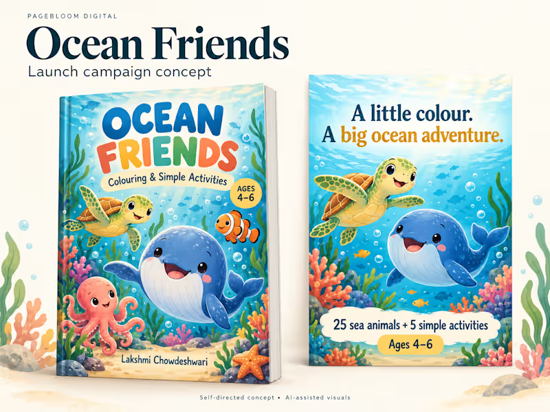
Ocean Friends | Children’s Book Launch Campaign Concept
A self-directed promotional concept for PageBloom Digital’s ocean-themed colouring and activity book for children aged 4–6.
This project pairs an alternative book cover mockup with a coordinated promotional poster. Bright underwater colours, friendly sea creatures and clear typography create a playful visual identity.
The layouts highlight the book’s 25 sea animals, five simple activities and recommended age range, helping parents quickly understand what’s inside.
Self-directed portfolio concept created using AI-generated visuals.
5
6
738
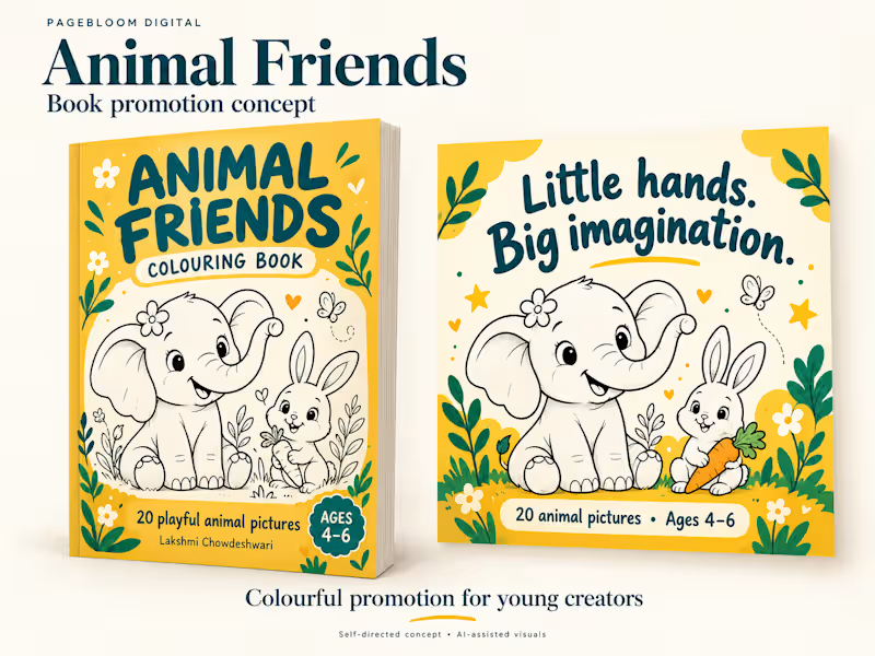
Animal Friends | Children’s Book Promotion Concept
A self-directed promotional concept for PageBloom Digital’s children’s colouring book, designed for ages 4–6.
This concept pairs an alternative book cover with a matching promotional poster. Cheerful yellow and teal colours, friendly animal illustrations and clear typography create a playful, coordinated presentation.
The design highlights the book’s age range and colouring activities, helping parents quickly understand the product.
Created using AI-generated visuals for a portfolio concept.
2
120

Gen Z Creativity for Memorable Brand Impact
Gen Z Creativity for Memorable Brand Impact


Web and Saas developer, marketing, Web designer

Overview
Smockshack is a dynamic online platform designed to deliver a seamless and engaging digital experience. This project involved the design and development of the brand’s website, reflecting its identity and core values.
Goal
The primary goal was to increase brand awareness and visibility for Smockshack, while creating an intuitive and comfortable user experience that keeps visitors engaged and encourages return visits.
What I Want to Achieve
The objective was to grow Smockshack’s client base by attracting new users through a visually appealing, user-friendly interface that effectively communicates the brand’s offerings and builds lasting customer relationships.
0
38

Overview
This portfolio serves as a curated representation of my professional work, showcasing my skills, expertise, and the value I bring to every project I undertake.
Goal
To present my work and experience to potential clients and collaborators, demonstrating my capabilities and establishing credibility within my field.
What I Want to Achieve
My primary objective is to attract and engage new clients by clearly communicating the quality and range of my work, ultimately expanding my professional network and client base.
Challenges
The development process presented several technical challenges, including debugging complex code issues and resolving compatibility conflicts that required careful troubleshooting and problem-solving.
Solutions/Outcome
Through systematic analysis and independent problem-solving, I successfully identified and resolved all technical issues, resulting in a fully functional and polished final product that met the intended objectives.
Feel free to let me know if you’d like any section adjusted to better reflect your experience!
0
31

Overview
A visually engaging burger brand website designed to showcase the menu, attract new customers, and create a seamless digital experience.
Goal
To increase customer engagement and brand visibility by delivering an intuitive, user-friendly website that makes browsing and ordering effortless.
Challenges
Operating in a highly saturated market with numerous competing burger brands, the primary challenge was differentiating the website through compelling design and a strong first impression — ensuring visitors stay engaged beyond the landing page.
Solutions/Outcome
A visually rich, high-impact website was delivered, featuring strong imagery and an appealing layout that effectively captures attention and reflects the brand’s identity. The final product successfully stands out in a competitive space while providing a smooth user experience.
0
35

“Redesigned the Galaxy Dental website’s landing page with a clean, modern layout, intuitive navigation, prominent call-to-action buttons (WhatsApp, Call, and Map), and a trust-building display of Google ratings — replacing the previous static promotional ad with a fully interactive and user-friendly digital experience.”
0
61

Hospitality & Brand Designer | Menus, Social Media & More
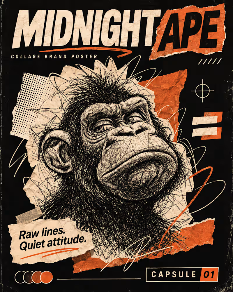
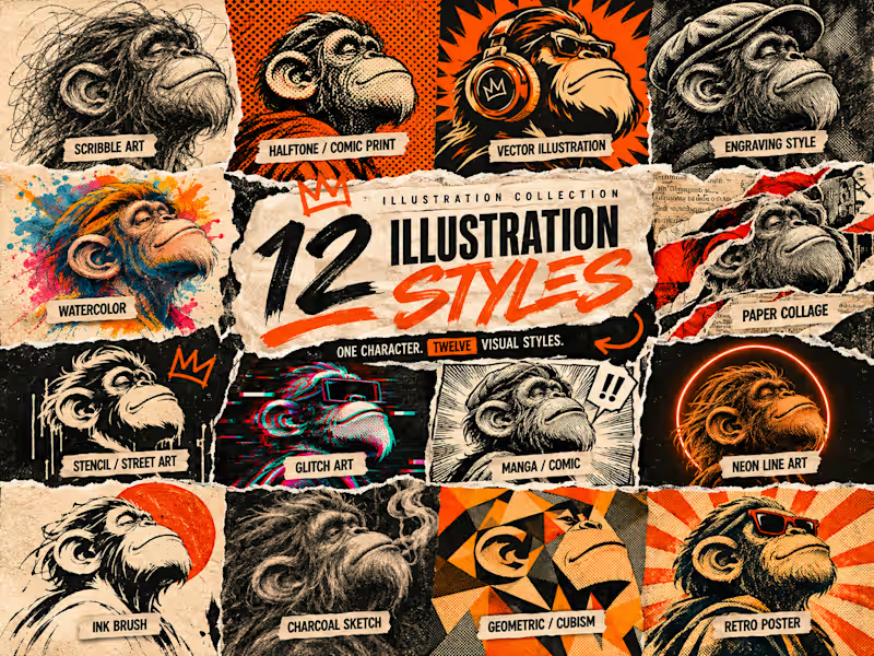
12 Illustration Styles. One Character. Endless Possibilities. 🎨
Exploring how a single character can transform through 12 different visual styles — from expressive ink sketches and traditional engraving to bold geometric forms, halftone textures, and digital glitch art.
Every style brings its own personality, technique, and visual language.
This exploration is all about creative versatility, experimentation, and the power of visual storytelling.
Which illustration style is your favourite?
#Illustration #GraphicDesign #CreativeStudio #VisualDesign #DigitalArt #IllustrationStyles #DesignExploration #ArtDirection #BrandDesign #Contra
0
95
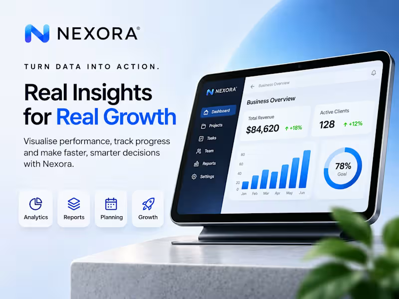
NEXORA | Premium B2B SaaS Social Media Design
A self-initiated portfolio concept created for NEXORA, a fictional software company focused on modern, professional B2B communication.
This project explores how clean layouts, structured typography, clear hierarchy, and consistent brand visuals can help a software brand appear more credible, polished, and visually engaging.
The design system was developed to present product messaging, promotional communication, and business-focused content in a way that feels clear, premium, and suitable for an international SaaS audience.
The project includes:
Branded social media post concepts
Clear and professional content layouts
Cohesive visual direction for digital marketing
Modern typography and balanced composition
Business-oriented design with a polished brand feel
The overall creative direction focuses on minimalism, readability, trust, and modern digital branding.
Services showcased: Social Media Design • Graphic Design • Brand Visuals • B2B Marketing Creatives
Project type: Independent fictional portfolio concept created to demonstrate professional design capabilities.
2
1
192
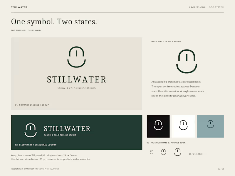
STILLWATER | Premium Wellness Brand Identity & Visual Design
A self-initiated brand identity concept for STILLWATER, a fictional luxury sauna and cold plunge studio inspired by Scandinavian minimalism, natural materials, and contemporary wellness culture.
The project explores how thoughtful branding can communicate tranquillity, sophistication, and a memorable customer experience.
The creative direction includes:
Minimalist logo and cohesive visual identity
Refined typography and an earthy colour palette
Premium wellness studio storefront concept
Elegant service and pricing card design
Branded social media promotional graphics
The visual system combines forest green, warm stone, soft ivory, and understated typography to create a calm, distinctive, and consistent brand experience.
Design approach: Minimalism • Modern Luxury • Visual Consistency • Brand Storytelling
Services showcased: Brand Identity • Logo Design • Graphic Design • Social Media Design • Promotional Materials
Project type: Independent fictional branding concept created to demonstrate professional design capabilities.
0
90

Video Editor | YouTube, TikTok & Instagram Reels | Thumbnail
- 1x
- Hired
- 5
- Followers
Video Editor | YouTube, TikTok & Instagram Reels | Thumbnail


Graphic designer !
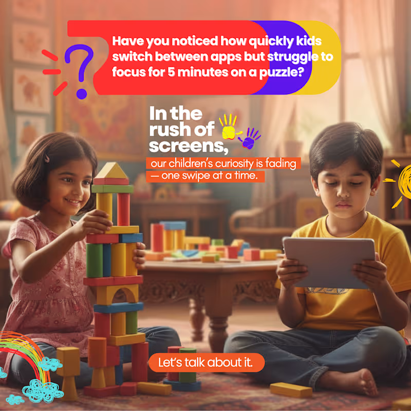
A social awareness creative exploring how excessive screen time can affect children’s curiosity, attention, and engagement with the world around them.
The challenge was to communicate a serious topic without making the design feel overly heavy or clinical. I used bright colors, expressive typography, playful illustrations, and contrasting imagery to create a visual that feels relevant to both parents and children.
The concept focuses on the contrast between hands-on play and screen time, using the visual story to encourage the viewer to pause and think about how children spend their time.
0
35

A healthcare-focused social media creative designed for Kashvi Hospitals to explain why knee pain can feel worse during winter.
The challenge was to turn medical information into something that could be understood quickly without making the design feel overly technical. I used a combination of medical imagery, visual callouts, arrows, icons, typography, and color-coded sections to break down the information into easily digestible points.
The goal was to create a graphic that was informative, visually engaging, and suitable for social media, while keeping the hospital's branding and contact information clear.
0
40

A promotional social media creative designed for RK Skin Laser & Hair Transplantation Clinic for International Yoga Day.
The goal was to create a clean, calming, and visually engaging design while keeping the clinic’s branding and contact information clear. I used a minimal layout, green tones, typography, and a central yoga visual to communicate the theme of wellness and balance.
0
42
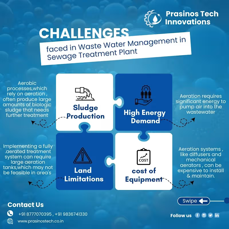
One of the more challenging creatives I worked on for Prasinos Tech Innovations — an innovation-focused company working in wastewater management.
The challenge was turning a content-heavy topic into a graphic that was easy to understand, visually engaging, and still professional. There wasn't much visual inspiration available online for this specific topic, so I had to build the visual direction from the content itself.
I explored ways to represent each challenge through puzzle-style layouts, icons, typography, visual hierarchy, and supporting illustrations, while keeping the overall design aligned with the brand.
The project pushed me to think beyond simply “making it look good” and focus on how design can make technical information easier to understand.
1
114

Crafting Unique Logos & Websites 🌐
Crafting Unique Logos & Websites 🌐


