Typography Projects in GujaratTypography Projects in GujaratI watched Apple's 108-second event (https://www.youtube.com/watch?v=mO8zBQqpTmY)recap and couldn't stop thinking about one thing.
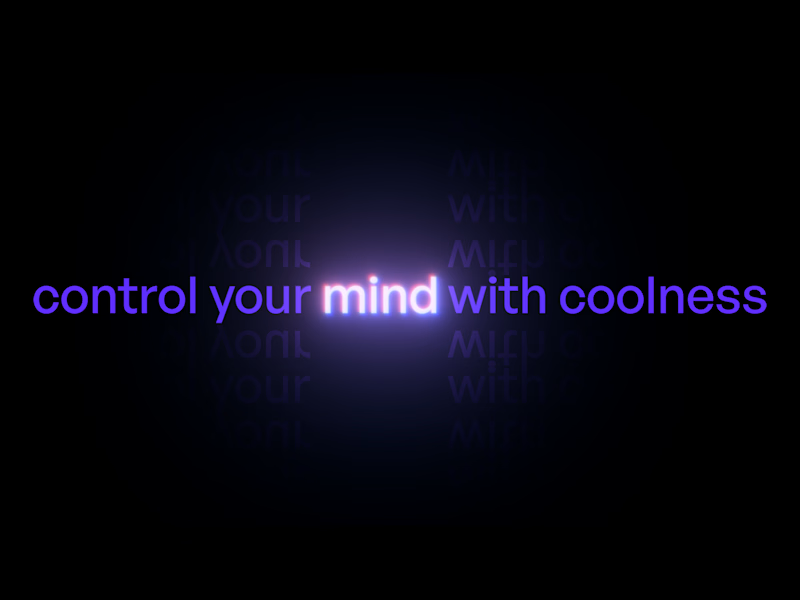
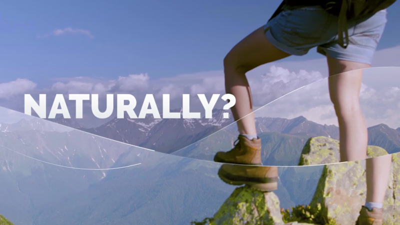
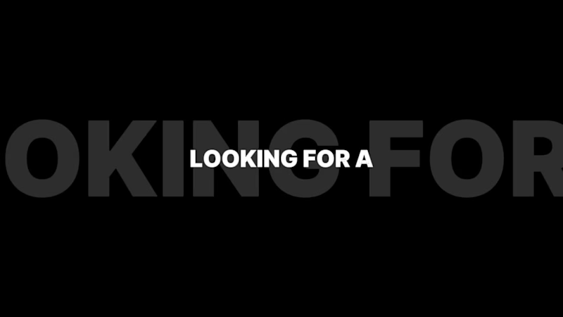
No voiceover. No presenter. Just words, motion, and rhythm.
Short sentences. Each one a beat. The entire year of Apple products - described in 108 seconds through kinetic typography alone.
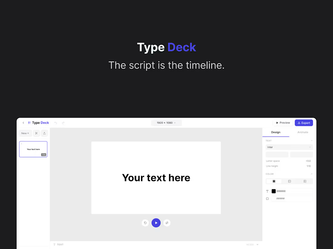
That moment became TypeDeck.
The idea: What if After Effects had a baby with PowerPoint - and it was actually simple enough for anyone to use in minutes?
No timeline. No keyframes. No layers. Just write your script and watch it become a film.
I Built the entire app UI and animation engine from prompt to code. The behavior-based animation architecture, the script editor, the rhythm strip, all of it with use of Figma Make.
What TypeDeck does:
→ Paste your script — every sentence auto-converts into an animated scene.
→ Copy a style with Ctrl+C, paste it across every slide with Ctrl+V.
→ Hook accent words with asterisks — they get a color treatment automatically.
→ Apply flat color, gradients, or drop in images and video as backgrounds.
→ Export and import projects. Built-in music. Everything in one place.
The problem it solves:
After Effects has a learning curve measured in months. Canva has templates but no motion depth. There's nothing in between that gives a founder, marketer, or creator the ability to make a genuinely beautiful motion video in under 20 minutes - until now.
TypeDeck is free to use. Start to create your stunning videos today.
https://www.figma.com/make/oK7XsVbAKpa4LulmGxJ5Py/TypeDeck?t=sKtdidrjE34hmLjQ-20&fullscreen=1
Video Demo:
https://www.loom.com/share/6d621cc245094653baef910544523072 School Brand Campaign - Creative Direction & Visual Design
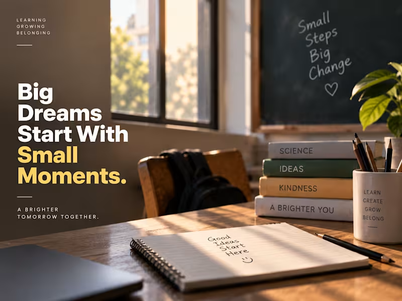
A premium visual campaign created for a modern school brand, combining cinematic photography, editorial typography, and thoughtful visual storytelling.
The concept focuses on themes of learning, character, curiosity, community, and a brighter future, transforming everyday school environments into aspirational brand moments.
From staircase metaphors and classroom details to bold architectural typography, each composition was designed to feel polished, contemporary, and emotionally engaging while maintaining a consistent visual identity.
Services: Art Direction · Graphic Design · Visual Storytelling · Typography · AI-Assisted Creative · Campaign Design
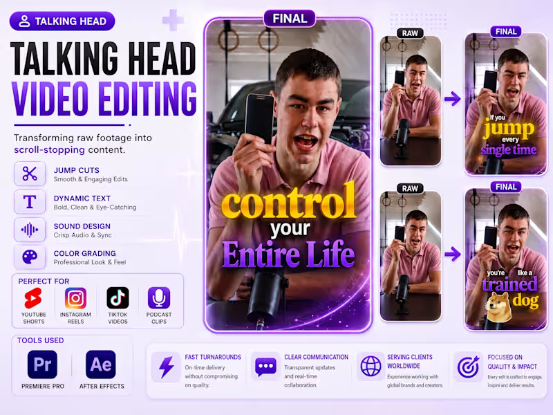
Concept: More Than a School. A Brighter Tomorrow. Transforming raw talking-head footage into engaging, high-retention short-form content designed for platforms like Instagram Reels, YouTube Shorts, and TikTok.
For this project, I focused on making the speaker’s delivery more dynamic through tight jump cuts, animated typography, highlighted keywords, visual emphasis, smooth pacing, and engaging transitions. I also added sound design, colour adjustments, and motion graphics to give the video a polished, professional look while keeping the viewer focused on the message.
Tools Used: Adobe Premiere Pro • After Effects
Focus: Talking Head Editing • Short-Form Video • Motion Graphics • Kinetic Typography • Social Media Content • Video Retention • Visual Storytelling SÓLUM — Mineral Skincare Brand Identity
SÓLUM is a premium mineral skincare brand built around a simple belief: some of the most powerful ingredients for skin already exist in the earth.
I developed this brand identity around the intersection of earth science and skin science, creating a visual language that feels precise, refined, and deeply connected to natural materials. Instead of following the typical organic skincare aesthetic, the direction takes inspiration from volcanic ash, geological formations, fractured stone, and mineral textures.
The SÓLUM logomark is built from a structured square divided by irregular, crack-like forms — a visual reference to fractured volcanic rock and cooling ash. The contrast between the controlled outer structure and organic internal fractures gives the mark a balance of precision and geological permanence.
The typography is clean and restrained, allowing the natural textures and imagery to carry the emotional character of the brand. A mineral-inspired visual system, paired with raw geological imagery and refined layouts, creates a sense of quiet luxury without feeling overly decorative.
The goal was to position SÓLUM as a skincare brand that feels scientific yet human, natural yet sophisticated, and rigorous without losing its connection to the earth.
Services
Brand Identity
Logo Design
Art Direction
Typography
Visual System
Brand Strategy
Packaging Direction
Tools
Adobe Illustrator
Adobe Photoshop
Adobe InDesign
Project Type
Branding / Visual Identity
FULL PROJECT : https://www.behance.net/gallery/254419423/SOLUM-Brand-Identity This poster on Mental Health explores one of the most important conversations of our time, mental health, through the medium of typography. The design uses a human silhouette constructed entirely from words: the very struggles, emotions, and conditions that people carry silently inside them. The face is made of words like depression, anxiety, stigma, isolation, loneliness, trauma, because what we see on the outside is always shaped by what is hidden within. Mental health is not a weakness, it is a conversation we need to have. This poster is dedicated to everyone who has ever fought a battle no one else could see.