The network for creativity
Join 1.25M professional creatives like you
Connect with clients, get discovered, and run your business 100% commission-free
Creatives on Contra have earned over $150M and we are just getting started
Back to feedPost

This design is a clean and modern book cover mockup created for a sales-focused brand. The main title “The Signature Sales Script” is bold and easy to read, with a mix of white and yellow text that makes it stand out clearly against the dark blue background.
The cover features a confident and friendly portrait of the author in the center, which helps build trust and connection with the audience. The background has a subtle pattern that adds depth without making the design look busy.
At the bottom, there is a strong yellow banner with the name “Eric Balance” and the subtitle “The Conscious Cash Flow Coach.” This section is designed to highlight the author’s identity and make it memorable.
The design is simple, professional, and focused on clarity. It works well for promoting a sales or business-related book because it feels trustworthy, bold, and easy to understand at a glance.
#freelancedesigner #branding #personalbranddesign



The network for creativity
Join 1.25M professional creatives like you
Connect with clients, get discovered, and run your business 100% commission-free
Creatives on Contra have earned over $150M and we are just getting started







Related posts


Another set of mockups for Bakedwell

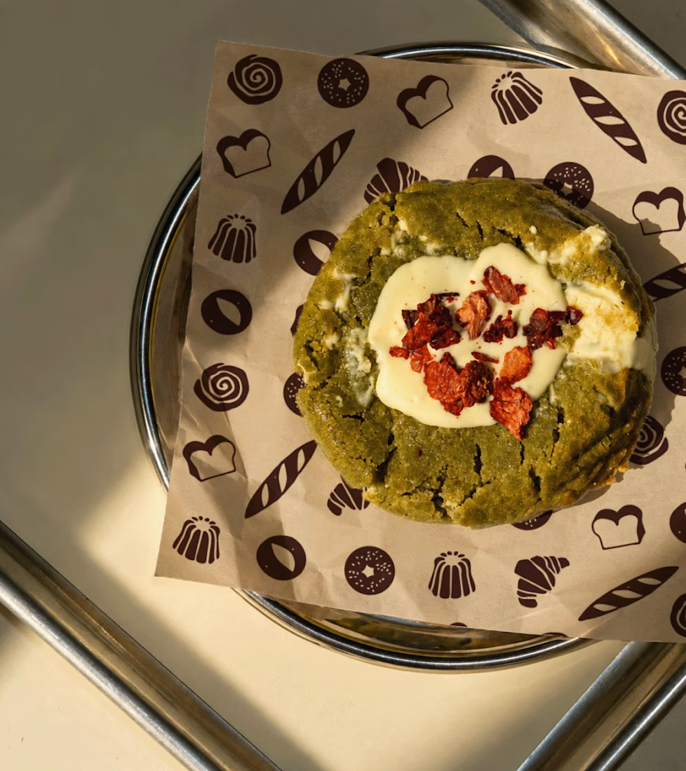
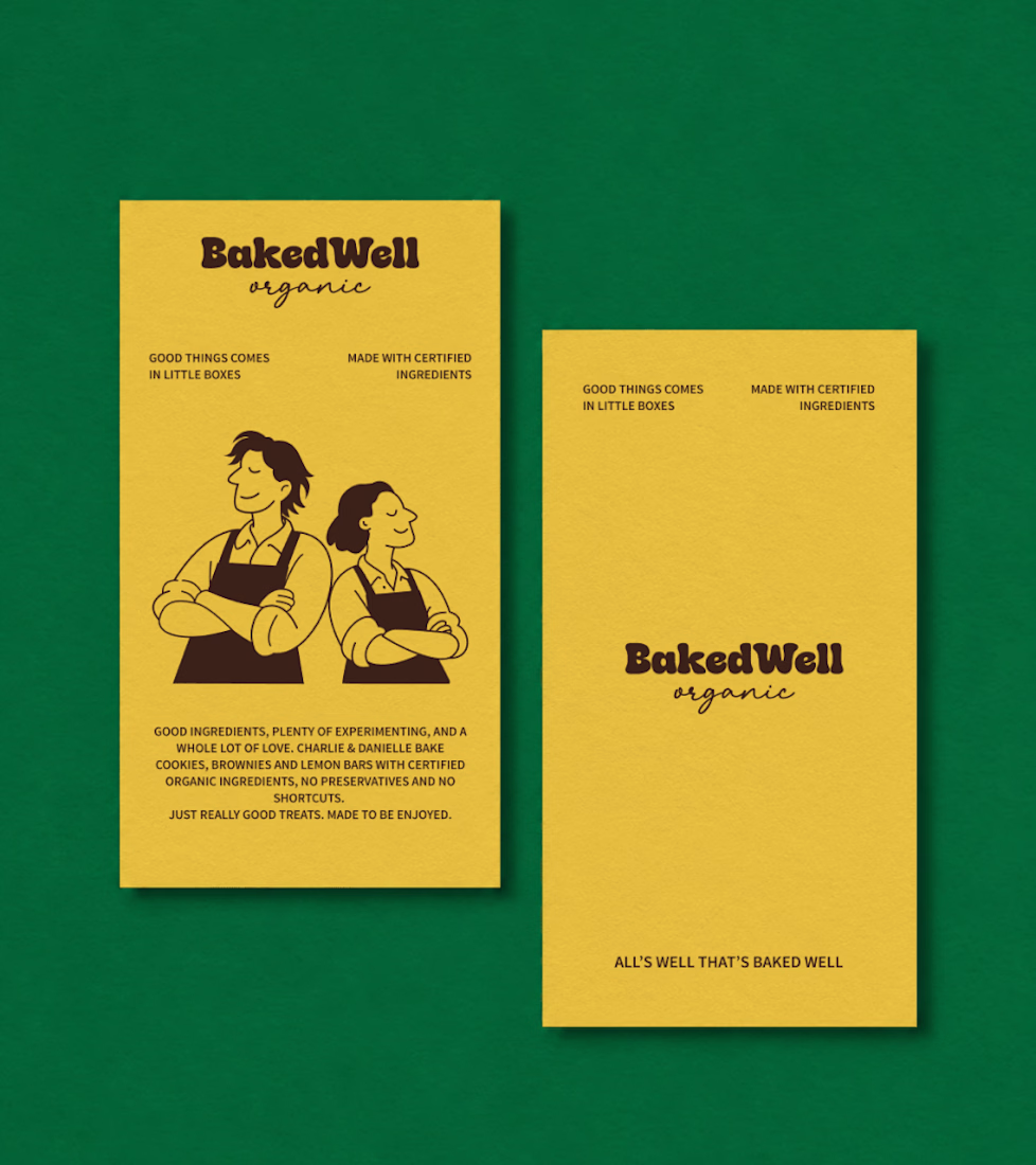
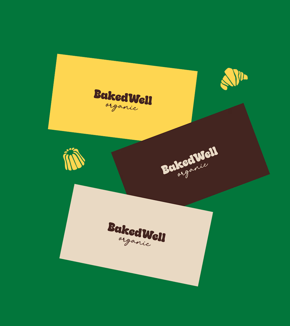


Forest green and mustard with the two bakers in flat illustration is a warm, confident pairing, and the cards read clearly. Contrarian take: the illustrated pair is the strongest asset here, stronger than the wordmark. If I owned BakedWell, I would put those two on the bag and the window and let the logo go smaller.

One brand, three different directions.
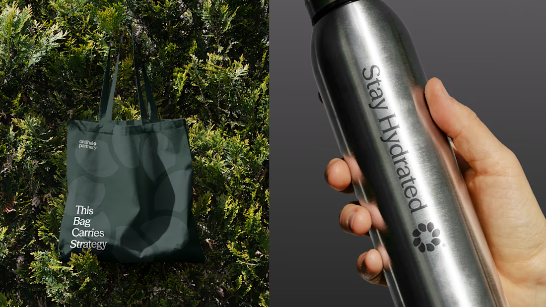
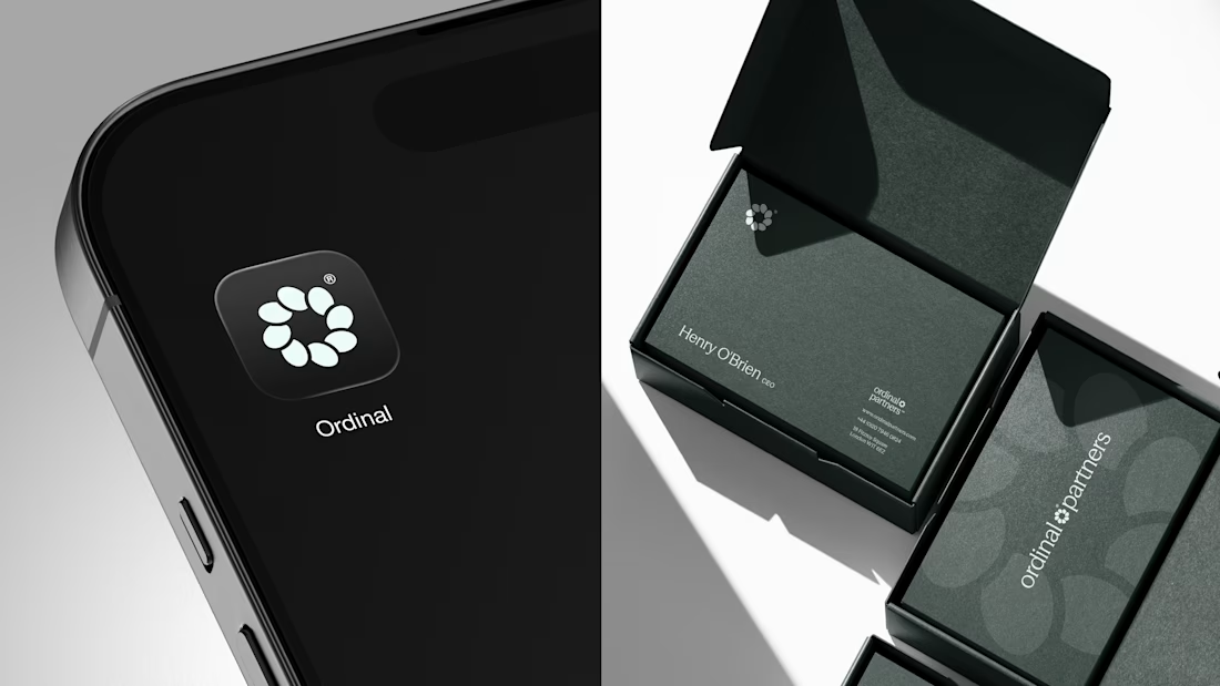
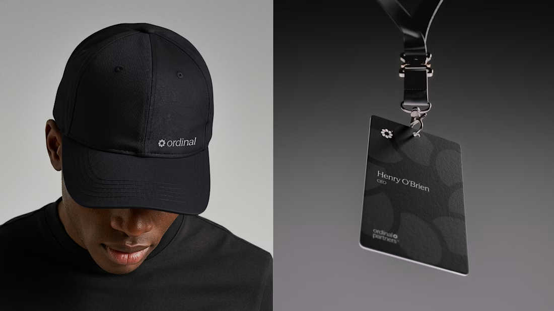
Sharing some of the logo exploration for Ordinal Partners.
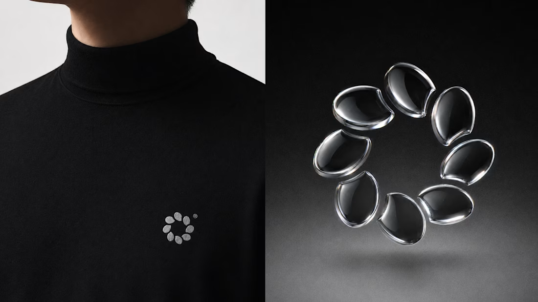

Visually appealing 🔥

Some more experimental futuristic typography story design for Bar LOQA.


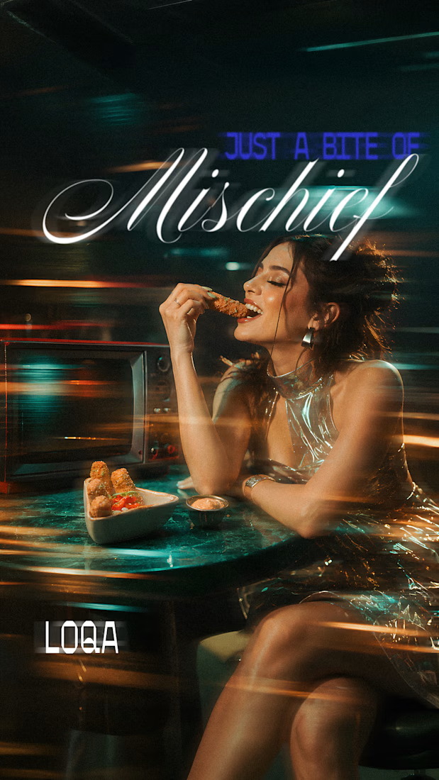
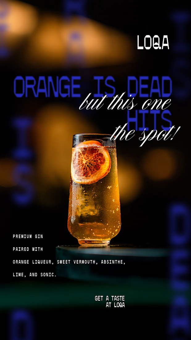
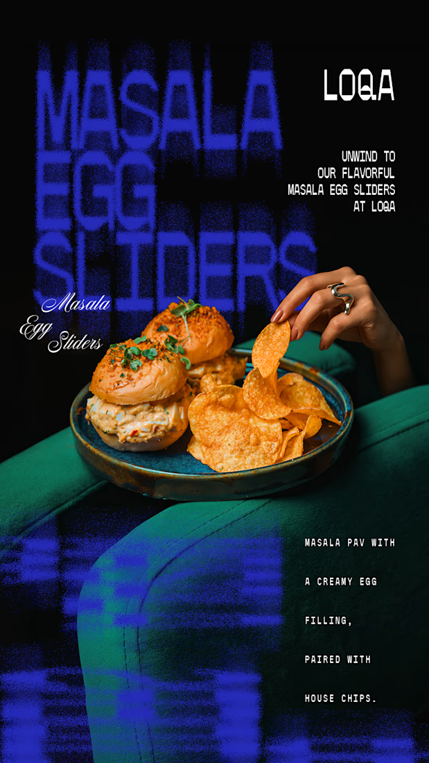
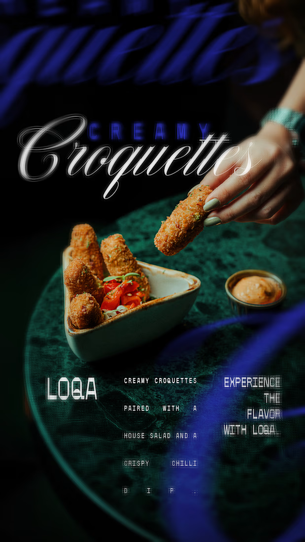

The script lettering over the cocktail sits in the glow without fighting the photo, while the sliders frame gets a much lighter touch. Do you place the type first and crop the image around it, or the other way round?