The network for creativity
Join 1.25M professional creatives like you
Connect with clients, get discovered, and run your business 100% commission-free
Creatives on Contra have earned over $150M and we are just getting started
Back to feedPost


School Brand Campaign - Creative Direction & Visual Design
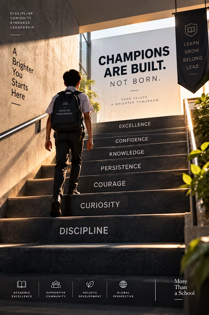
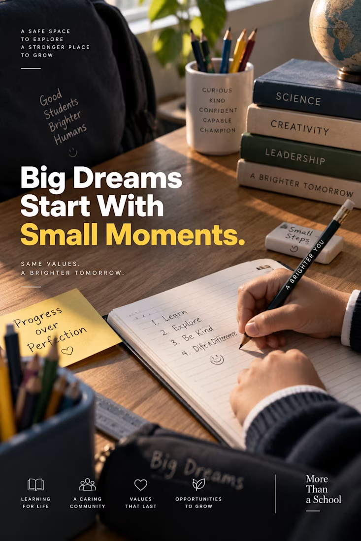
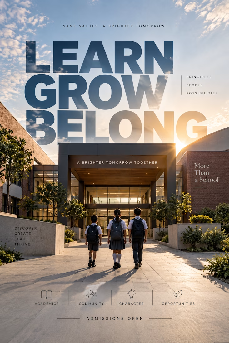
A premium visual campaign created for a modern school brand, combining cinematic photography, editorial typography, and thoughtful visual storytelling.
The concept focuses on themes of learning, character, curiosity, community, and a brighter future, transforming everyday school environments into aspirational brand moments.
From staircase metaphors and classroom details to bold architectural typography, each composition was designed to feel polished, contemporary, and emotionally engaging while maintaining a consistent visual identity.
Services: Art Direction · Graphic Design · Visual Storytelling · Typography · AI-Assisted Creative · Campaign Design
Concept: More Than a School. A Brighter Tomorrow.



The network for creativity
Join 1.25M professional creatives like you
Connect with clients, get discovered, and run your business 100% commission-free
Creatives on Contra have earned over $150M and we are just getting started







Related posts

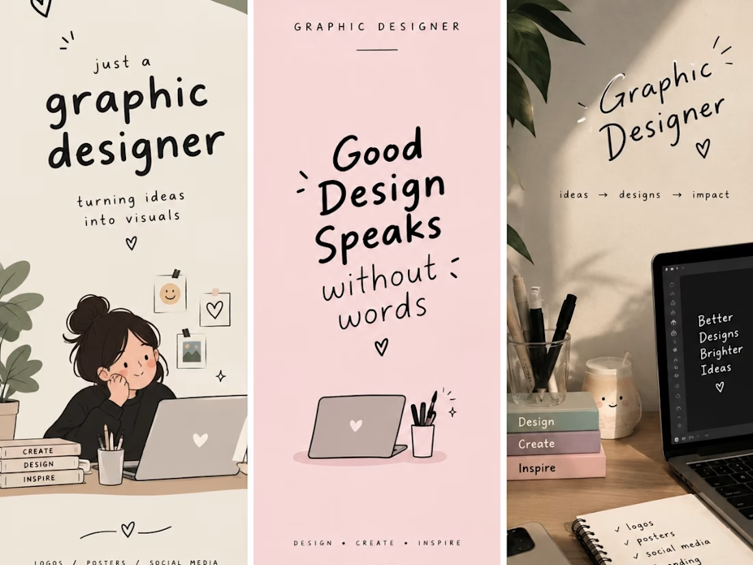
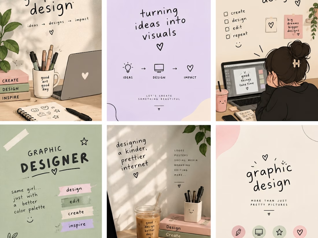
I am a creative graphic designer passionate about turning ideas into eye-catching designs. I create unique and professional designs, including logos, social media posts, business cards, posters, banners, and branding materials. My goal is to bring your vision to life through creativity, quality, and attention to detail. I believe every design tells a story, and I am here to make your brand stand out with beautiful and meaningful visuals. ✨🎨

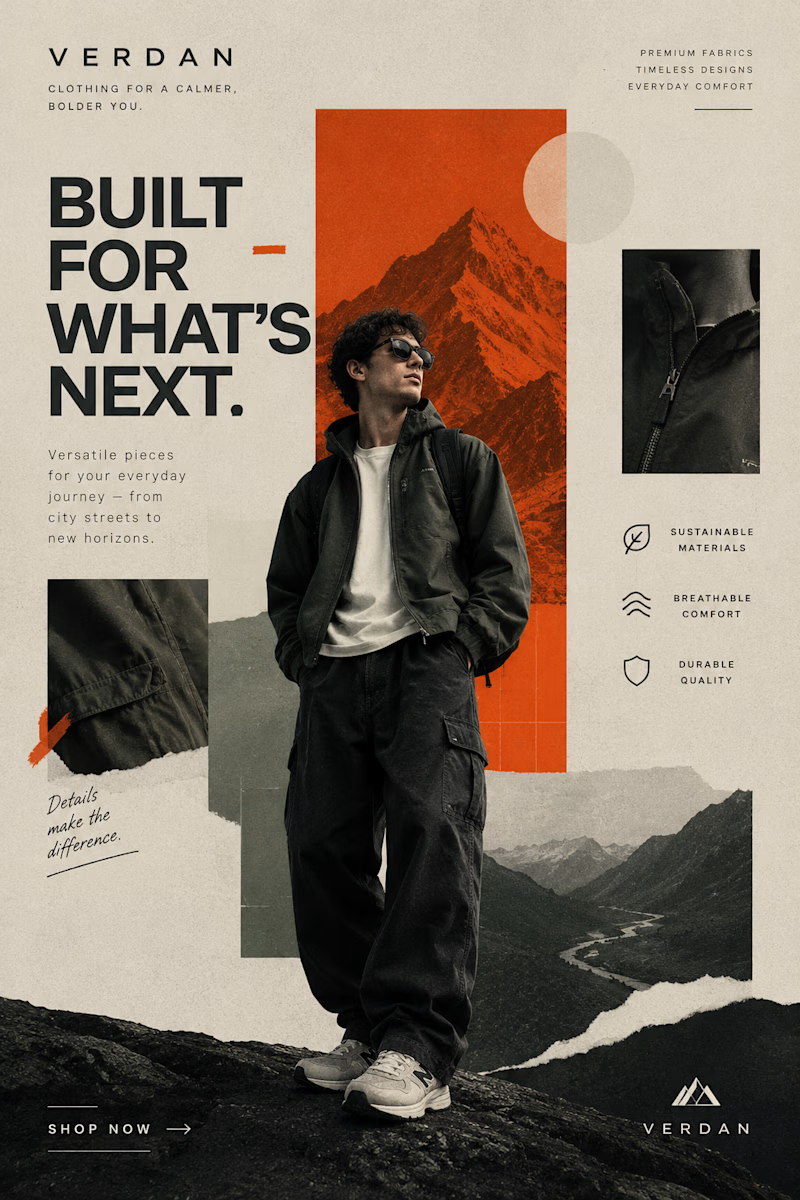
Two Brands. Two Completely Different Creative Directions. 🎨
A brand’s visual identity can change everything about how its products are perceived.
✨ Option A: Cinematic Minimalism — elegant, refined, and luxurious.
🔥 Option B: Modern Editorial Collage — bold, expressive, and adventurous.
Both styles tell a different story, but which one captures your attention?
Vote A or B in the poll and tell me what makes your choice stand out!
Need eye-catching advertisement designs for your brand, product, or social media campaign? I create custom ad creatives tailored to your brand’s identity, audience, and goals.
Have a project in mind? Explore my services on Contra and let's bring your ideas to life.
1 voted
14%

6 voted
86%
7 votes
Closed

Modern Collage is tough 💪🏽

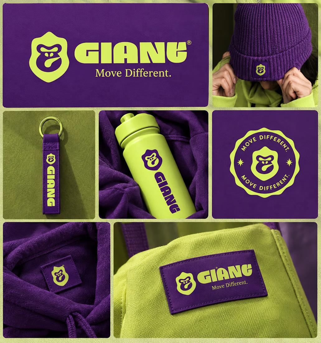
GIANT — Move Different.
Built around a bold gorilla mark, oversized typography, and an electric purple + neon-lime palette.
A streetwear identity designed to feel bold, rebellious, and instantly recognizable — from hoodies and caps to packaging, tags, and everyday brand details.
Concept branding project | Open for custom projects

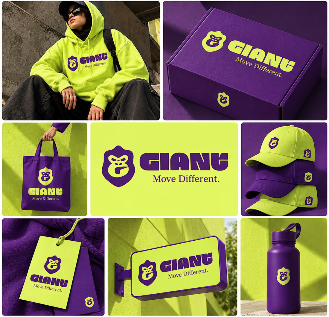

Using electric purple paired with neon lime is a high risk color choice that demands exceptional contrast management. Getting that balance right across different fabrics and lighting conditions is often where streetwear brand identities actually fail.