I make founder brands premium, trusted & story-led


I make founder brands premium, trusted & story-led


*Humanizing an AI Kid's Coffee Brand*
For this challenge, I developed a complete brand identity for a fictional kid's coffee brand (Детско Кафе- In Cyrillic alphabet as my primary script, I felt it would be a unique decision), documenting every stage of the creative process from exploration to execution. Using Envato as my primary creative toolkit, I explored multiple directions across logo design, visual identity, custom graphics and patterns, AI-assisted imagery, music and sound generation, packaging design, and a short animated brand story inspired by authentic photos from our family trips, transformed into playful doodle illustrations.
Throughout the project, I intentionally highlight the moments where human intuition made the difference, rejecting stronger looking but weaker concepts, redesigning typography and composition, solving real-world print and packaging challenges, building a cohesive visual system, and shaping a brand personality that feels playful, memorable, and emotionally authentic.
This isn't the story of what AI helped create, it's the story of the decisions that only a designer could make.
76
203
35.4K

Art Director and Brand Identity Designer
- $5k+
- Earned
- 11x
- Hired
- 5.0
- Rating
- 124
- Followers
Art Director and Brand Identity Designer


Design Partner for B2B Companies

Design Partner for B2B Companies


Go-to-Market Product Designer


Raise the bar. ✦ Perfect the rare.



Brand Designer | Brand Strategy & Visual Identity | Branding
- 24
- Followers
Brand Designer | Brand Strategy & Visual Identity | Branding
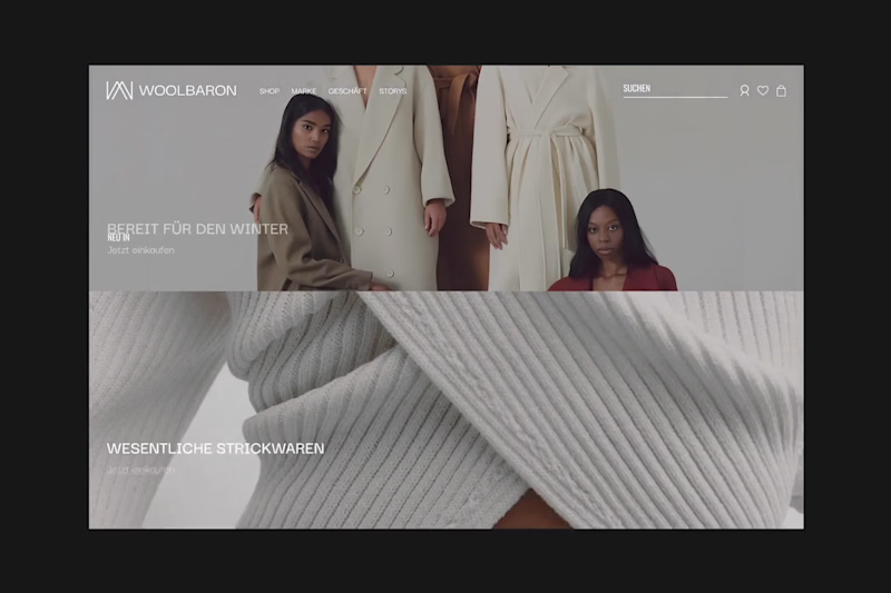
There’s a point where design stops trying.
And just fits.
Palette, typography, layout, everything holds the same tension. Just a brand that knows exactly what it is.
1
1
108
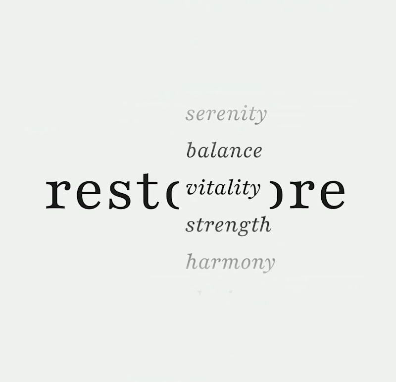
What if strength looked a bit quieter?
When working on Restore, the goal wasn’t to make it feel like “wellness.”
It was to make it feel like something people in high-pressure roles would actually trust.
So the system leans on restraint. A grounded serif to carry weight, paired with clean, clear type that keeps everything easy to move through.
7
162
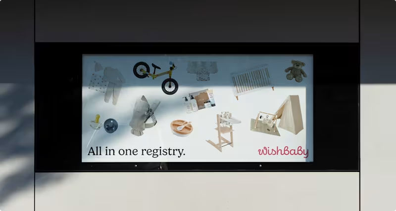
What does a baby registry look like when it actually feels calm?
For Wishbaby, the work wasn’t about adding more softness; it was about removing noise. Less “cute,” more clarity. Less scattered, more considered.
We designed a system that feels warm, but structured. Something that guides you without getting in the way.
Because when everything is in one place, it stops feeling like a task.
0
115
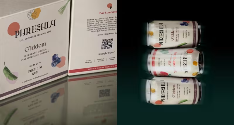
Can typography carry a whole package?
That was the starting point. Instead of building around graphics or effects, I let the type define the structure, how it sits, how it scales, how it holds everything together.
Once that was in place, the rest became a matter of restraint. Nothing needed to compete, just support.
It’s built so the packaging feels intentional the moment you see it.
1
136

UX/UI, Content & Graphic Designer and Marketing Specialist
New to Contra
UX/UI, Content & Graphic Designer and Marketing Specialist

Designing brands that transform business & experiences.
- 11
- Followers
Designing brands that transform business & experiences.

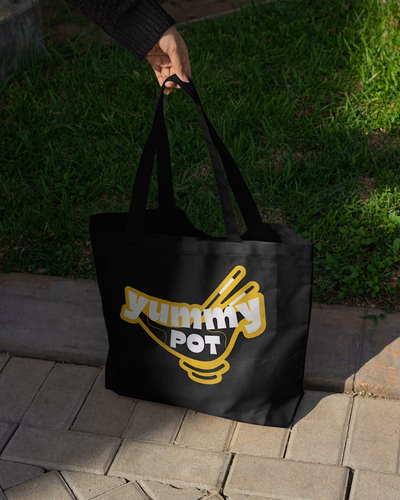
Yummy Pot - Branding & Identity 🍜
This project explores a playful and cohesive visual identity, with subtle Japanese-inspired elements (e.g. Kintsugi) integrated into the logo and overall style to give the brand personality and cultural reference.
We demonstrated brand applications across various touchpoints, from patterns and stickers to packaging and retail environments, showing how the identity comes to life in different contexts.
View the full case study [here] (https://contra.com/p/klFqlZqP-yummy-pot-visual-identity-design).
2
31
552
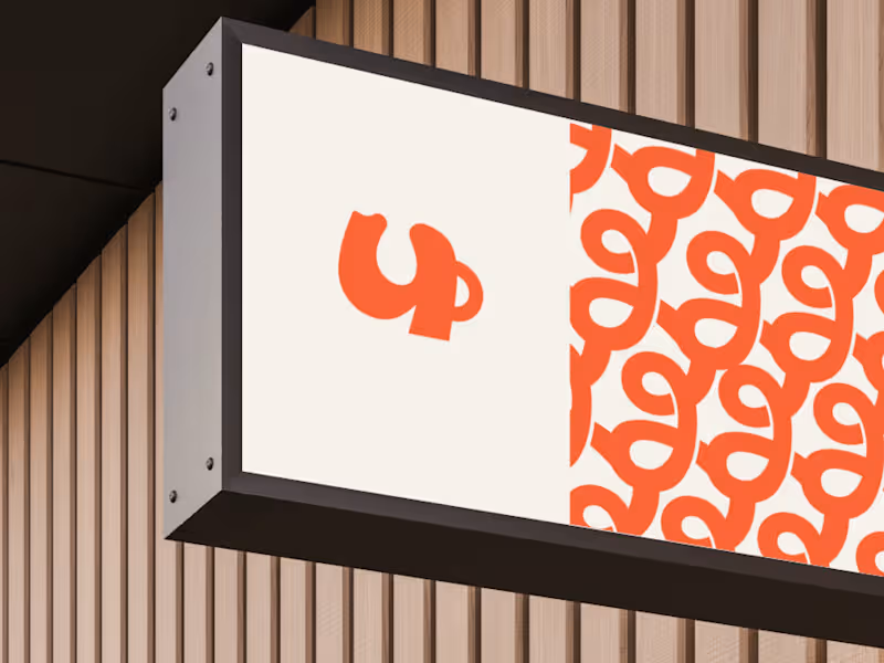
Branding & Packaging for CozyMug.
“Good design is when you stop adding and start refining.”
For this branding and packaging, the focus was on clarity, not complexity. Every element had to justify its place. The more we refined, the more we realised that simplicity isn’t the absence of design, it’s the result of it.
The challenge was knowing when to stop, when the design felt honest enough to stand on its own. Clean alignment, quiet hierarchy, and a lot of restraint made it what it is. ☕️☀️
Curious to know how do you decide when a design feels finished? 💬
5
46
904