TH'RST TRAP | Brand Identity & Packaging Design
Matej Dimoski
TH'RST TRAP | Brand Identity
& Packaging Design
THE BRIEF
Th'rst Trap entered with a single question: how do you make natural mineral water feel like a cultural object? They needed a visual identity that could compete in the lifestyle-hydration category alongside brands like Liquid Death — but with a completely different energy. Not aggression. Seduction. Not skulls and crossbones. Mythology and mystery.
The goal was to create packaging that a 22-year-old picks up because of how it looks
Visual Identity
Color System
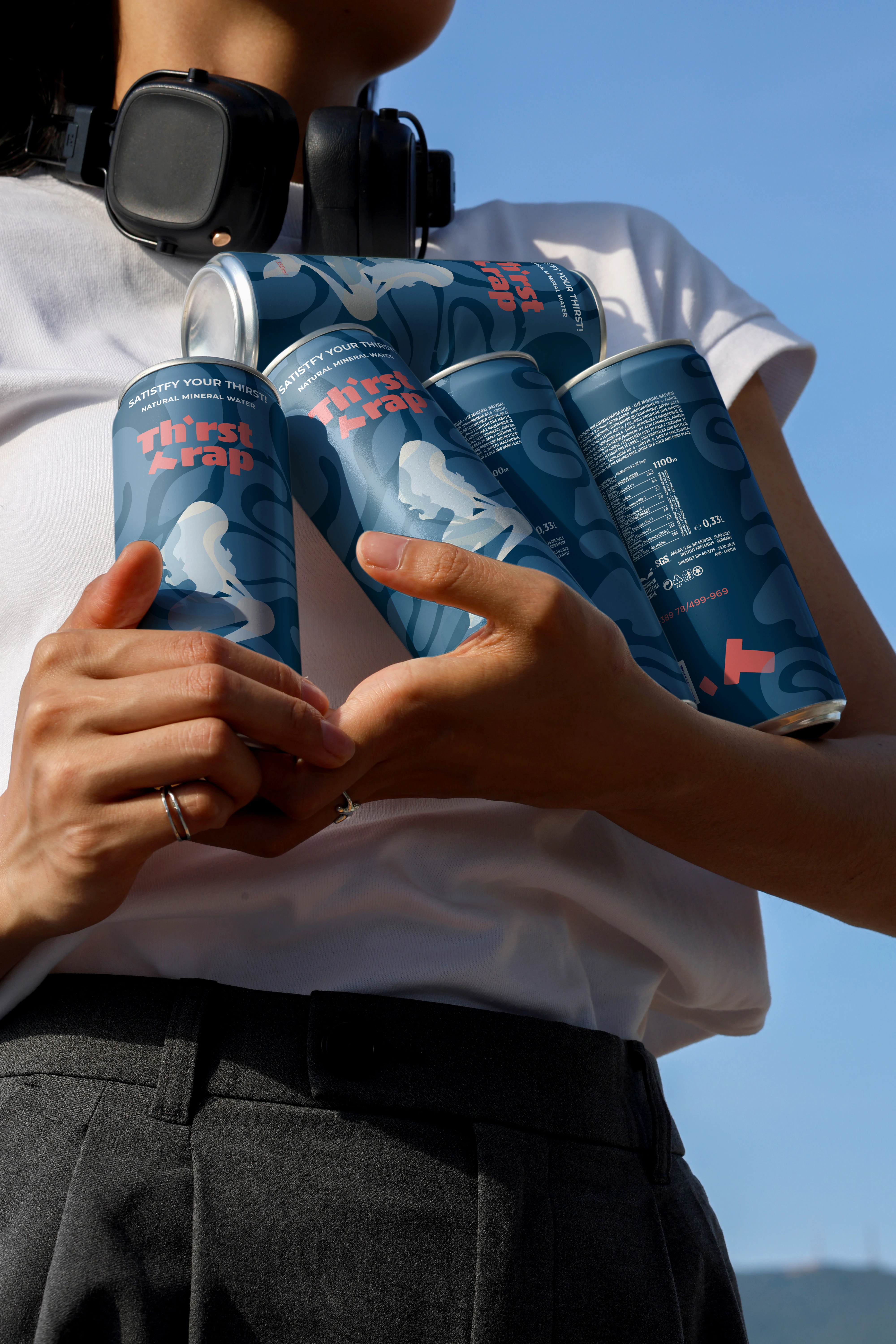
The palette is built around a deep oceanic navy as the dominant field, rich enough to read as premium, dark enough to give the can weight and shelf presence against the typical sky-blues and crystal-clears of the water category. A second layer of tonal blue swirls sits within the background, creating depth and organic movement across the entire can surface without competing with the foreground elements.
The accent color, a warm coral red - was chosen for maximum contrast against the navy. It carries the logotype, the volume callout, and small brand marks scattered across the can as geometric fragments. The red does double duty: it's the thing your eye hits first from five feet away, and it's the element that makes the can feel alive rather than static.
Typography
"Th'rst Trap" uses a stacked, condensed display typeface with an apostrophe replacing the missing 'i', mirroring how the name sounds when spoken fast. The logo block anchors the front face without dominating the illustration, reading immediately at arm's length. Supporting copy runs in a clean sans-serif along the top edge, quiet enough to let the illustration breathe.
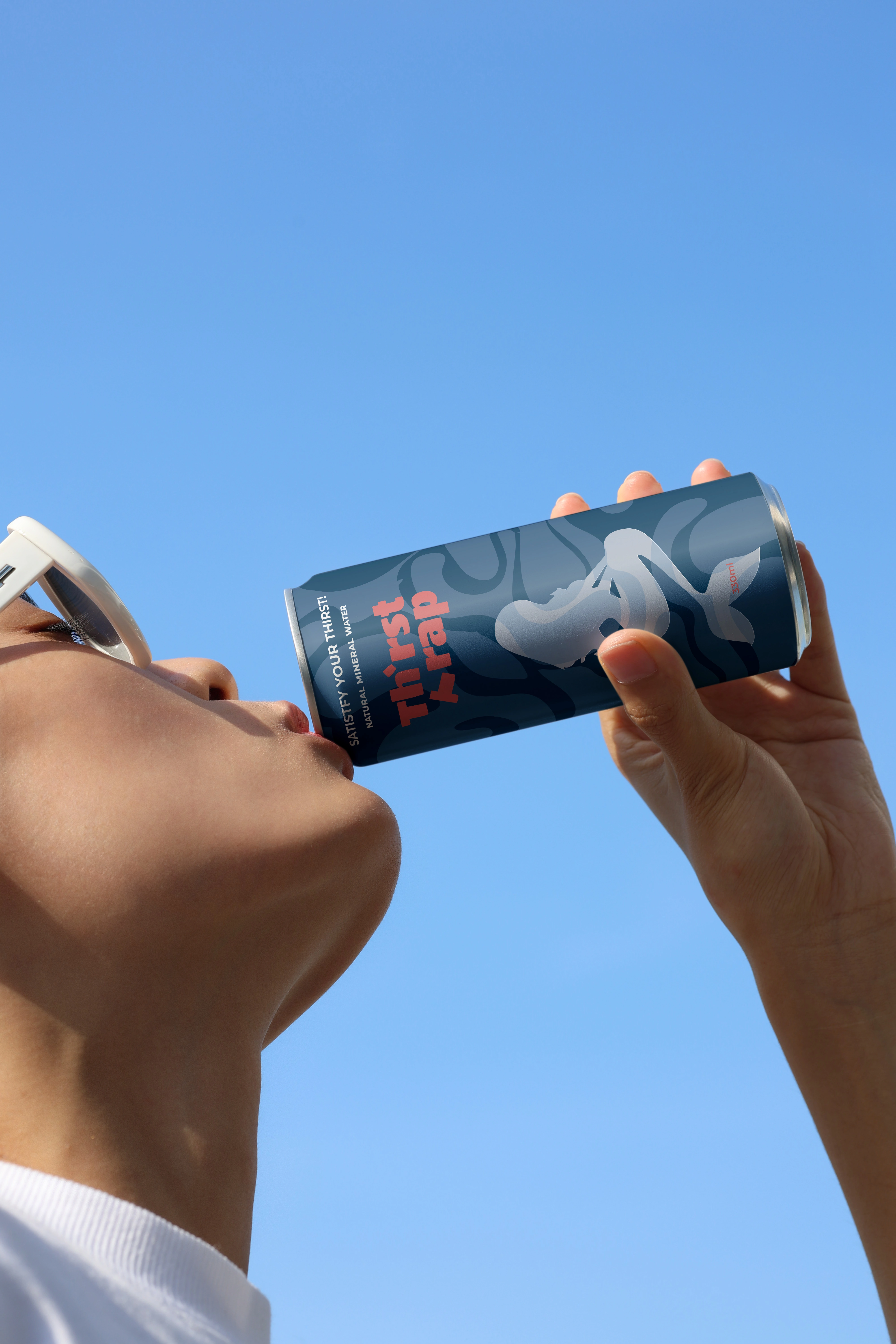
The Siren Illustration
A custom siren rendered in translucent white and pale blue, sitting within the background's tonal swirl pattern. She's not a mascot — she's an atmosphere. The figure wraps the can organically, working with the curvature of the aluminum so there's no dead side. Every rotation reveals something. The product photographs well from any angle, and a consumer holding the can always has something worth looking at under their hand.
Packaging Design
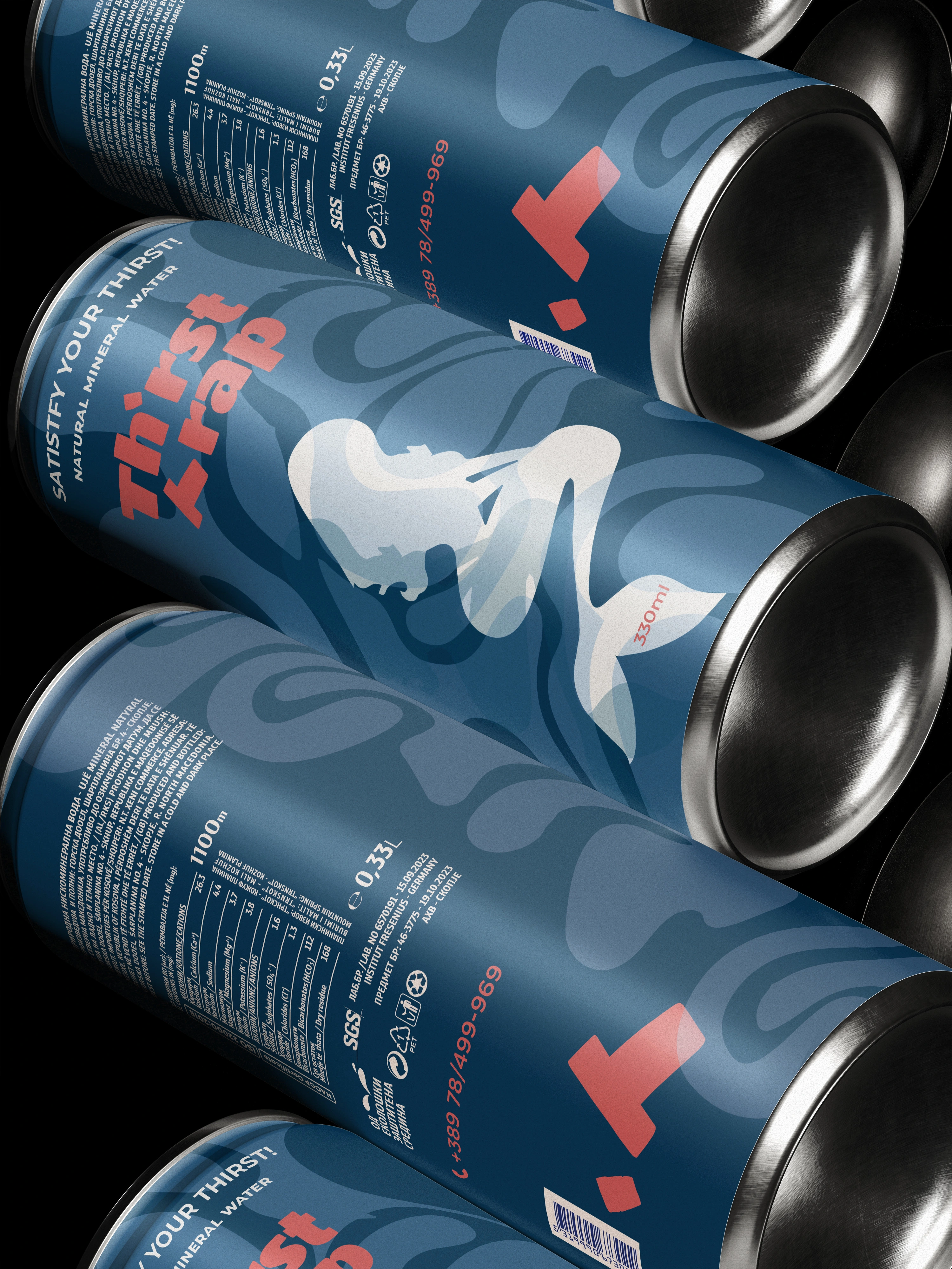
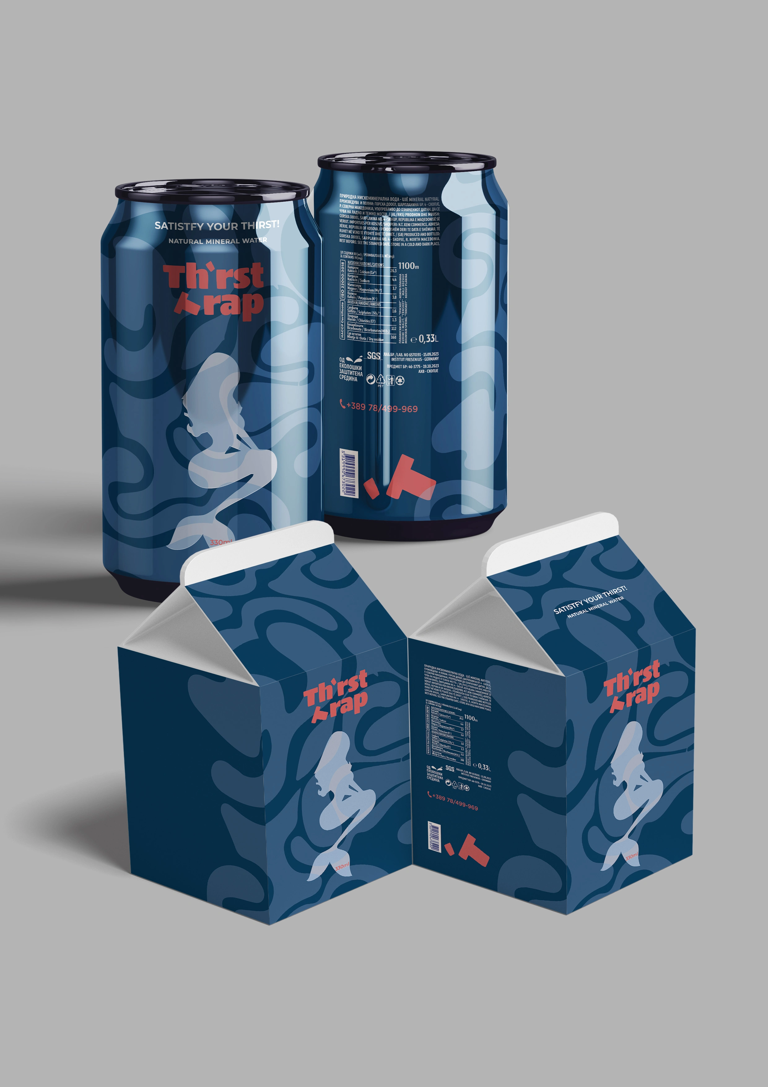
The Can | 330ml Slim
The full wrap design treats the entire aluminum surface as a single canvas. There's no white band at the top, no generic footer strip. Navy runs edge to edge, interrupted only by the pull tab and base. This is a deliberate choice, it makes the can feel monolithic and intentional, like an object rather than a container.
The back panel carries full regulatory and nutritional information, SGS certification marks, mineral composition data, and the 1100m source elevation, all set in a structured grid that maintains the brand's visual discipline even in the legally mandated fine print. The barcode, recycling symbols, and contact details are integrated into the layout rather than dropped into leftover space. Even the back of the can looks designed.
The Carrier Box
The packaging system extends to the carrier with full visual continuity. The same navy base, the same tonal swirl pattern, the same siren illustration and coral logotype, adapted for the flat panels of a carton rather than simply reprinted. The box feels like it belongs to the can. Pick one up off the shelf and you're already holding the brand before you've opened anything.
The packaging works at every distance, shelf presence from across the aisle, storytelling in the hand, and social shareability in a photo. That's not a coincidence. That's the entire point.
Like this project
Posted May 24, 2026
Designed a seductive visual identity and packaging for Th'rst Trap mineral water.
Likes
0
Views
2