Freelancers using HTML5 in Greater NoidaFreelancers using HTML5 in Greater Noida
Mobile App Architect • React Native Expert • 50+ App Shipped
$5k+
Earned
1x
Hired
5.0
Rating
20
Followers
Mobile App Architect • React Native Expert • 50+ App Shipped
TOP Shopify Developer | Framer Expert | CRO Expert|
5.0
Rating
5
Followers
TOP Shopify Developer | Framer Expert | CRO Expert|
HTML & Frontend Developer | Responsive Web Experiences
New to Contra
HTML & Frontend Developer | Responsive Web Experiences
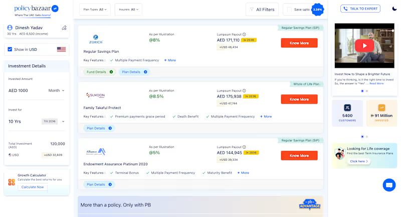
Cover image for Policybazaar UAE – Insurance Platform
Policybazaar UAE – Insurance Platform & Quote Journey UI Developed responsive Web UI for Policybazaar UAE’s insurance platform using HTML5, CSS3, Bootstrap and SCSS within a React-based application. Built responsive UI for the insurance landing page, including insurance category cards, promotional sections, banners, navigation and supporting content modules. Implemented reusable insurance product/category components for multiple insurance types including Health, Car, Life, Travel, Investment and other insurance products. Developed the quote listing interface displayed after users select an insurance product and complete the required details. Built reusable and modular insurance plan cards with conditional rendering for different plan types, insurers, pricing/payout information, key features and CTA states. Implemented UI for filters, plan-type selectors, insurer selectors, sorting/filter controls and responsive quote-listing layouts. Developed supporting UI components such as plan details, fund details, comparison-related actions, investment details, calculators, promotional cards and expert-contact sections. Worked on multi-step insurance user journeys from product selection → customer details → quote results → plan details / comparison interactions. Created reusable components and conditional UI patterns so the same component structure could support different insurance products, plans and dynamic data. Focused on responsive Web/mWeb layouts, pixel-accurate UI implementation, reusable CSS/SCSS architecture and cross-browser compatibility.
0
38
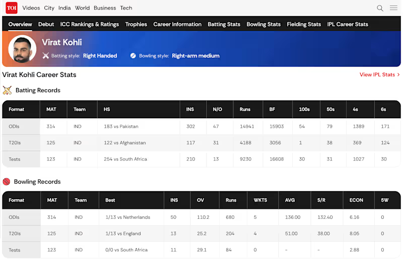
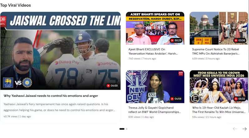
Cover image for TOI VideoShow – Responsive Video
TOI VideoShow – Responsive Video Detail & Content Platform UI Developed the responsive VideoShow detail-page UI for Times of India’s high-traffic Web/mWeb platform. Built the complete video-detail experience including video player, metadata, description, sharing actions, comments and recommended content. Developed a reusable and modular content-card component with conditional rendering to support multiple content types and layouts from a common component structure. Implemented the same reusable card architecture across Top Viral Videos, Short Videos, Related Articles and Recommended Playlist sections with different data, content and UI states. Built responsive featured-content layouts, including large lead cards combined with supporting cards and multi-column content grids. Developed horizontal/carousel-style sections for Short Videos and Related Articles, including navigation controls and responsive card behaviour. Integrated the Share Your Opinion / Comments UI into the VideoShow experience, including first-comment state and user interaction entry point. Implemented responsive video player controls, playback UI, overlays, metadata, CTA actions and supporting content sections. Worked on conditional UI rendering for different content formats while maintaining a consistent design system and reusable frontend architecture. Built the page for desktop, tablet and mobile Web/mWeb experiences, ensuring responsive layouts and component behaviour across screen sizes. Focused on pixel-accurate UI implementation, reusable components, CSS architecture, cross-browser compatibility and production-ready frontend development.
0
41
Product Designer & Frontend Dev for UI & 3D experiences
18
Followers
Product Designer & Frontend Dev for UI & 3D experiences
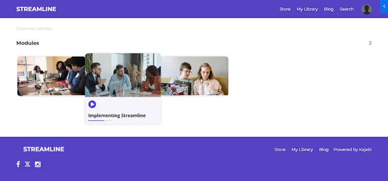
Kajabi Specialist |Custom Coding, Design, &Automation Expert
15x
Hired
5.0
Rating
22
Followers
Kajabi Specialist |Custom Coding, Design, &Automation Expert
HubSpot + Next.js Conversion-Focused Frontend Developer
2x
Hired
6
Followers
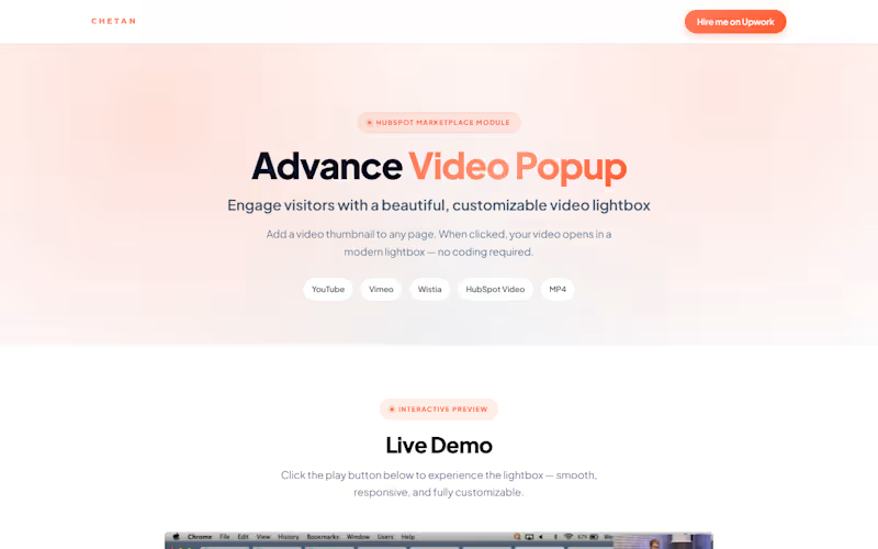
HubSpot + Next.js Conversion-Focused Frontend Developer
Full-Stack Developer building clean, scalable web apps & AI
New to Contra
Full-Stack Developer building clean, scalable web apps & AI
AI websites, automations & social content for brands
New to Contra
AI websites, automations & social content for brands
Cover image for Aesthetic clinics sell a feeling
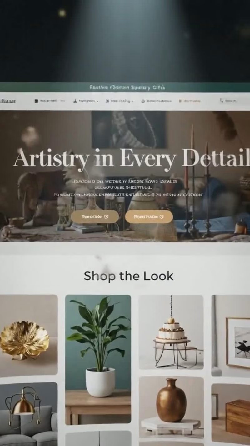
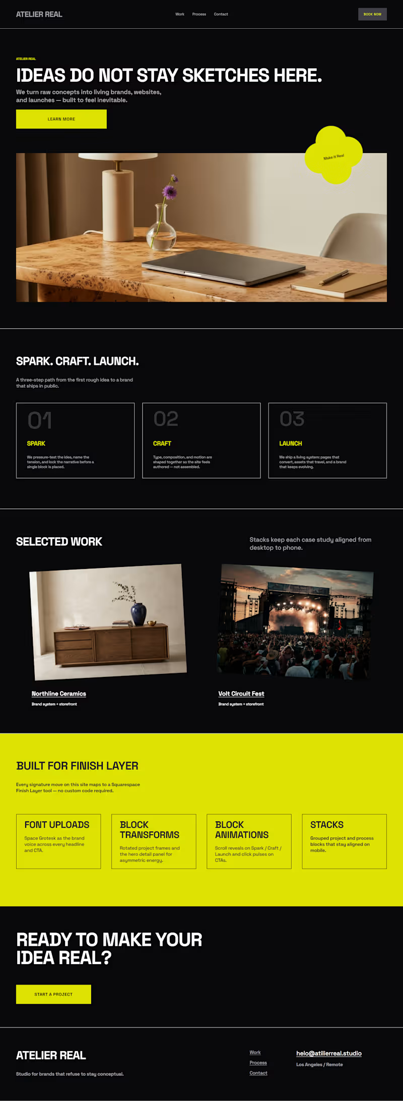
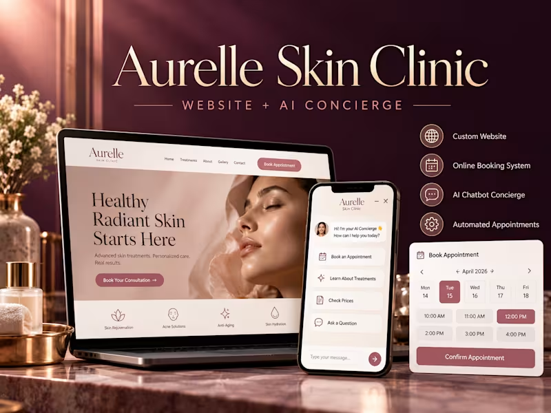
Aesthetic clinics sell a feeling before they sell a treatment, and most of their websites undercut that on arrival — stock gradients, hidden prices, a contact form that answers on Tuesday. Aurelle is my answer to what a premium aesthetic clinic's site should feel like, and what should happen when a visitor has a question at midnight. The brief I set myself Build a site that looks like the clinic charges what it charges, and that still does the unglamorous commercial work: state prices, show the doctors, answer the awkward questions, take the booking. Design approach Restraint over hard-sell. The palette is deep plum with muted rose and pearl — no clinical white, no neon gradients. Italiana for display type against Outfit for body copy: editorial rather than medical. Everything sits on generous spacing, because whitespace is what reads as expensive. A video hero, treated properly. The page opens on full-bleed treatment-room footage under a directional gradient, so the headline stays readable across the frame instead of fighting the video. The source clip was compressed from 28MB to under 1MB — a hero that takes eight seconds to load is worse than no hero at all. It respects reduced-motion and data-saver settings, falling back to a still. Prices stated, not hidden. Six treatments, each with its own photograph and a real starting price — anti-wrinkle from AED 1,200, HydraFacial from AED 750, laser from AED 300 per area. Aesthetic clinics hide prices out of fear; hiding them is what sends a nervous first-timer to whichever competitor answers the question. The people, before the procedures. Two named doctors with credentials and a stated philosophy, because in aesthetics the practitioner is the product. A three-step first visit. "No pressure, no upselling" is the section's opening line, written to defuse the single biggest reason people don't book a first aesthetic consultation. The AI concierge An assistant embedded in the page, trained on the clinic's own treatments, prices, downtime and hours. It handles the questions people are too embarrassed to phone about — does Botox hurt, what does laser actually cost, are you open Friday — and ends the conversation by offering a consultation slot with a named doctor. Anything medical gets routed to the team rather than answered. That boundary is deliberate: an AI that guesses about a patient's skin is a liability, not a feature. Honest-demo conventions The build carries a visible banner marking it as a Kavora Digital demo of a fictional clinic, the reviews are labelled as samples, and search indexing is off. A portfolio piece that could be mistaken for a real practice isn't a portfolio piece — it's a problem. Stack Hand-coded HTML and CSS · custom scripted assistant · ffmpeg for video optimisation · Google Fonts (Italiana, Outfit) · IntersectionObserver scroll reveals, CSS conic-gradient animated borders, cursor-tracked lighting What this demonstrates A clinic site can look editorial and still be a conversion instrument. The whole thing is one self-contained page — fast, mobile-first, no CMS to maintain — with an assistant layer that can sit on top of a clinic's existing website without rebuilding it.
0
15
Cover image for Most dental clinics in Dubai
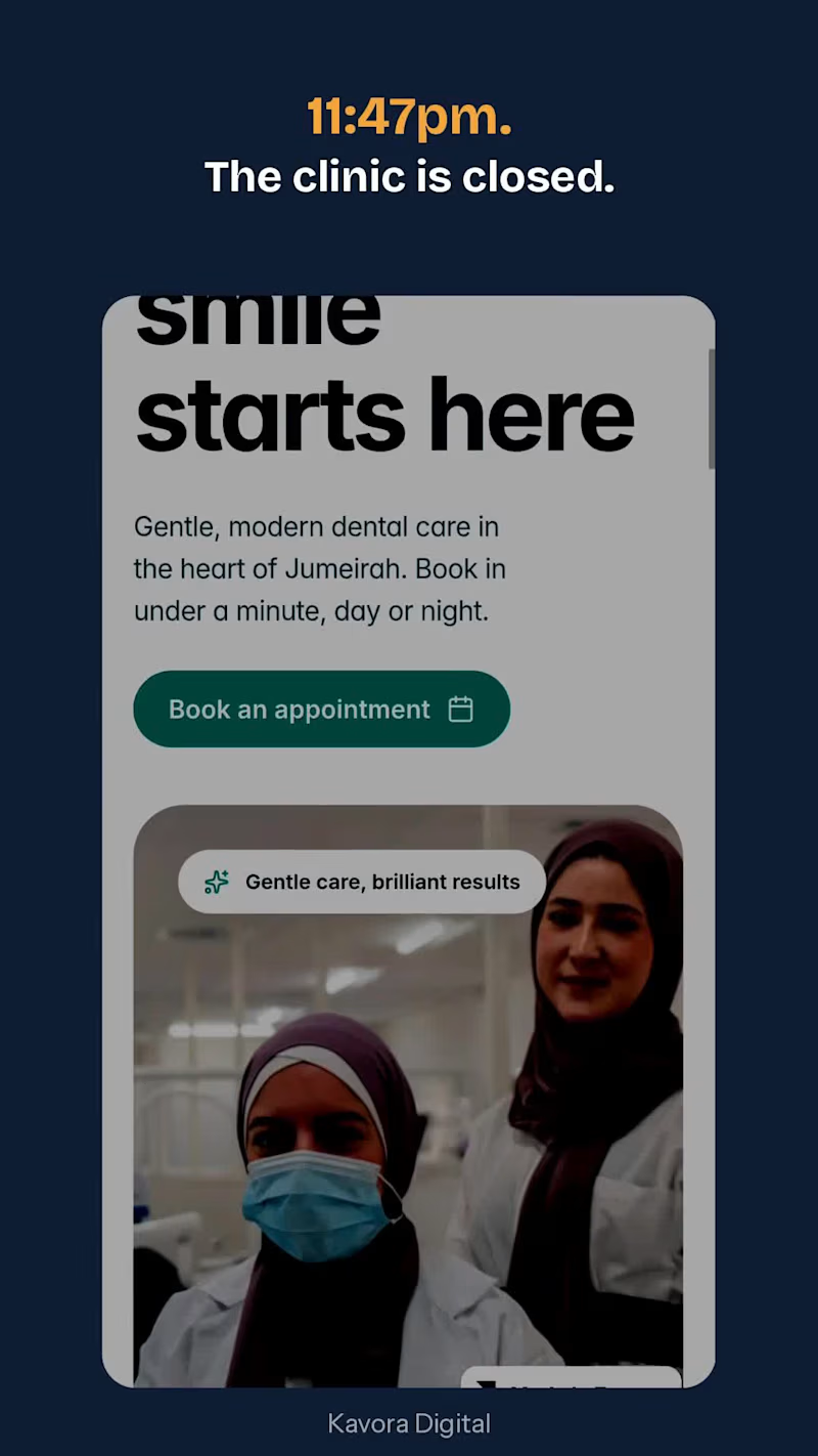
Most dental clinics in Dubai lose enquiries at the exact moment patients are most motivated: late at night, when the phone goes unanswered and the website has no way to reply. I built Bright Smile Dental as a working demonstration of the fix — a clinic website with an AI assistant sitting on top of it, answering questions instantly and guiding people to a booking. The problem I set out to solve A patient with tooth pain searches at 11pm. They land on a clinic site, can't find whether the clinic takes emergencies, can't tell what a consultation costs, and there's no one to ask. They close the tab and message the next clinic. The website was never the bottleneck — the silence after it was. What I built 1. The website A single-page clinic site designed around one job: get a nervous patient to book. Clean teal-and-white palette chosen for a calm, clinical feel rather than a salesy one. Sections cover treatments with transparent starting prices (check-up from AED 350, whitening from AED 1,200, implants from AED 4,500), a three-step "how booking works" explainer, team credentials, languages spoken (English, Arabic, Hindi, Russian), insurance and payment plans, and an FAQ written from the questions patients actually ask. 2. The AI assistant An assistant trained on the clinic's own content — treatments, prices, timings, insurance, emergency policy — embedded directly in the page. It answers in seconds, at any hour, and routes anything clinical to the team instead of guessing. Patients can ask "do you treat children?" or "what does a crown cost?" and get a real answer rather than a contact form. 3. The booking handoff The assistant doesn't just inform — it closes. Every conversation ends with a live booking link, so the patient goes from question to confirmed appointment inside one session, without a phone call. Design decisions worth noting Prices are shown openly. Clinics usually hide them; hiding them is what sends patients to a competitor who doesn't. The assistant is positioned as a front-desk aide, not a clinician. It answers logistics and hands over anything medical — the only responsible way to run AI in a healthcare setting. Built mobile-first: patients search for dental help on phones, usually in bed, usually in pain. The demo carries a visible banner stating the clinic is fictional, so nothing here can be mistaken for a real practice. Stack Framer (design and hosting) · Chatbase (AI assistant, trained on clinic content) · Calendly (booking) · custom embed to connect them What this demonstrates The whole system runs on tooling a small clinic can actually afford, deploys onto an existing website without rebuilding it, and needs no staff time to operate. Setup takes under a week.
0
23
Cover image for MORROW INK — PROBLEM &
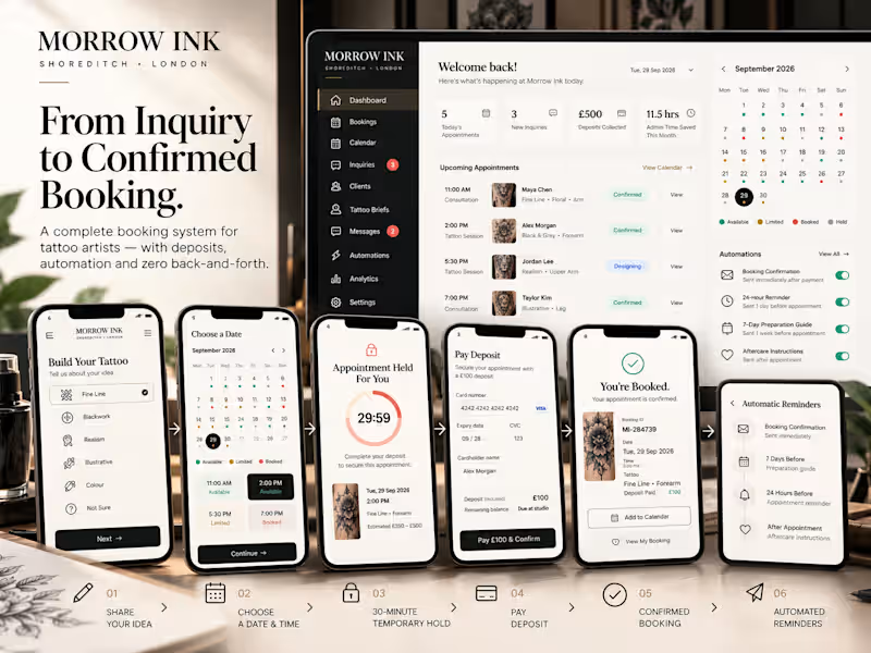
MORROW INK — PROBLEM & SOLUTION BRIEF Tagline: Your tattoo. Without the back-and-forth. WHAT IT IS Morrow Ink is a working web application for a premium independent tattoo studio. A client moves through one guided flow — describe the idea, get a price estimate, pick a real slot, pay the deposit, sign off the design, get aftercare — while the studio owner runs the whole business from a single dashboard. Every step that used to happen over weeks of direct messages now happens in one place, in minutes. THE PROBLEM IT SOLVES A typical independent tattoo artist spends a large share of their week on admin that creates no art and no income. Seven problems repeat with every enquiry: Endless DMs. Every enquiry asks the same questions — what style, what size, where on the body, when are you free, how much? Hours per week spent typing the same answers. Quotes written by hand. Pricing depends on memory and guesswork; estimates are inconsistent, and half of quoted clients never hear back or reply. Double bookings. Availability lives in the artist's head and scattered DMs. Two clients, one chair, one bad afternoon. No-shows. With nothing paid upfront, nothing stops a no-show — and a missed appointment wastes a whole session the studio could have sold. Design approval chaos. Designs are sent by message, replies get buried, and the artist starts a session unsure whether the client actually approved the artwork. Lost enquiries and admin. Interested people disappear into unread DMs. There is no record of who asked, what they wanted, or whether anyone followed up. Aftercare questions. The same care instructions are re-explained to every client, and there is no way to know who is actually following them. HOW MORROW INK SOLVES IT Endless DMs → an 8-step tattoo builder. Style, placement, size, colour, story, reference images, timing, contact. The client answers once, in a structured form — the artist receives a complete brief, not a message thread. Hand-written quotes → instant, rules-driven estimates. Pricing runs through a transparent rules engine and appears live as the client builds the brief — always clearly labelled as an estimate, never a guaranteed price. Double bookings → a real availability engine. Slots live in the database with a state (available / held / booked) and row-level locking. Two people selecting the same slot cannot both book it — the second is blocked, automatically. No-shows → deposits on every booking. Every booking is secured by a deposit. Clients can also pay in full upfront for a discount, or leave the balance to pay at the studio after the session — the choice is theirs; the studio is always covered by the deposit. Approval chaos → design sign-off in the client portal. Clients approve a design or request changes in one click, with a timestamp. The artist sees the decision in their dashboard instead of scrolling through messages. Lost enquiries → an enquiry CRM. Every enquiry and brief lands in the studio's pipeline with a status, so nothing is lost and follow-ups are visible, not remembered. Repeated aftercare → a self-serve aftercare guide. Do / Don't / What to expect, in the client's portal from the moment they book — the artist answers fewer repeated questions. Sealing it together: a 30-minute hold keeps a slot reserved while the client checks out (it releases itself if they walk away), a confirmation page issues a booking reference and a calendar file, automated confirmations, artist alerts and 24-hour / 7-day reminders are queued in the automations log, and the client portal shows the whole journey from idea to healed skin on one timeline. WHAT THE OWNER GETS BACK Fewer hours on admin. Briefs, estimates, confirmations and follow-ups are generated by the flow, not typed by hand. Fewer empty chairs. Every appointment is deposit-secured and reminder-covered; holds expire on their own. Nothing lost. Every enquiry, booking, design decision and payment state lives in one dashboard, not in a DM inbox. HONEST SCOPE, STATED PLAINLY Card payment is a clearly-labelled prototype screen (format checks only, no real money moves); confirmation and reminder emails are in-app previews until the studio connects its own sending domain; all studio, client and booking data in the demo is fictional. Everything else — accounts, real-time slot locking, holds, deposits, approvals, dashboards, CRM — runs for real on the live application.
0
128