The network for creativity
Join 1.25M professional creatives like you
Connect with clients, get discovered, and run your business 100% commission-free
Creatives on Contra have earned over $150M and we are just getting started
Back to feedPost

A business card designed to feel like an executive identity — not just stationery.
Designed for Victoria Ferrouss Bioenergy, this premium visiting card was created specifically for Founders, CEOs & CTOs — where the smallest brand touchpoint still needs to communicate authority, precision, and trust.
The direction combines deep forest green, brushed metallic gold, organic leaf detailing, and a flowing energy-inspired curve to reflect the intersection of clean energy, technology, and premium leadership.
But the goal wasn't simply to make it “look luxurious.”
Every detail was considered to make the card feel physically premium — from the rounded corners and tactile surface to the metallic foil treatment, selective embossing, refined spacing, and strong visual hierarchy.
The result is a brand touchpoint that feels established, intentional, and executive before a single conversation begins.
Clean Power. Elevated.
Designed for Victoria Ferrouss Bioenergy Private Limited.


The network for creativity
Join 1.25M professional creatives like you
Connect with clients, get discovered, and run your business 100% commission-free
Creatives on Contra have earned over $150M and we are just getting started
Related posts


Celvana brand identity & packaging for a red light therapy brand launching in the US.
The category is crowded with identical, unbranded panels. Celvana sells precision, so the brand had to look like medical equipment you can trust: clinical, exact and professional.
Brand identity case study
Packaging case study

This is high end branding

A cozy botanical shop that not only sells beautiful plants, but also takes care of yours while you’re away on a trip!
For the logo, I customized the typography to give it a soft, fluid effect inspired by growing branches and leaves.🌱


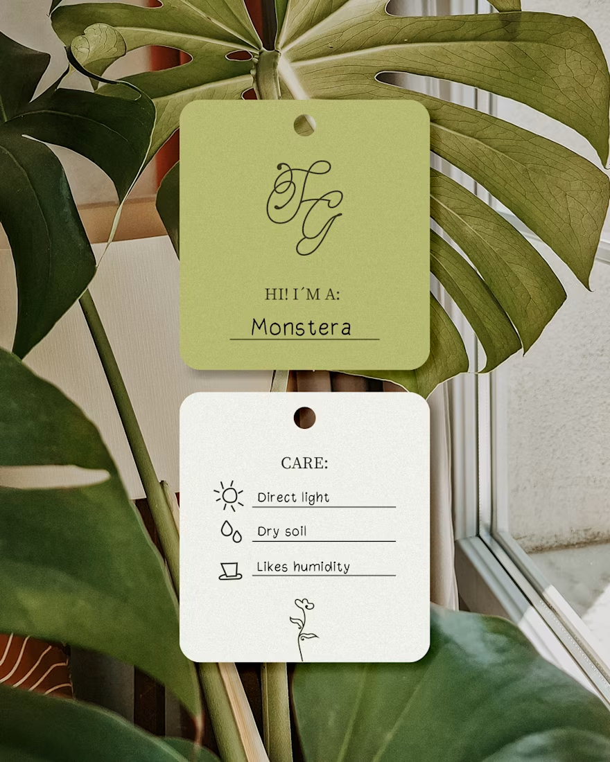

I like this calligraphy style.

Brand identity for Ekho an audio technology brand focused on creating tools that expand the possibilities of sound design while maintaining clarity and simplicity. Inspired by the concept of “echo,” the brand reflects depth, space, and transformation in sound, translated into a modern and minimal design approach.

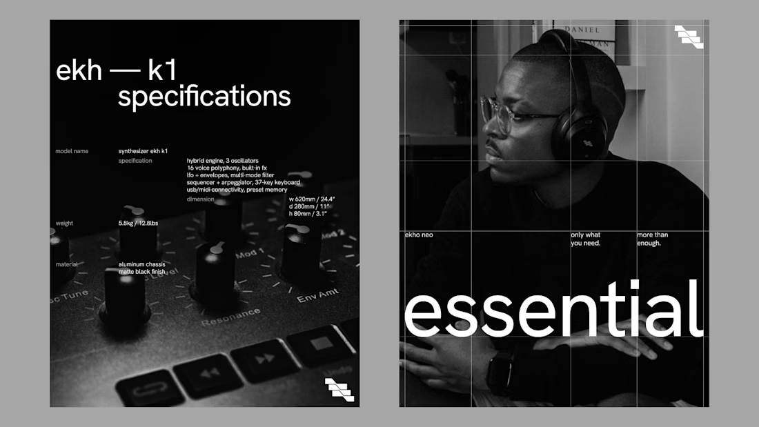
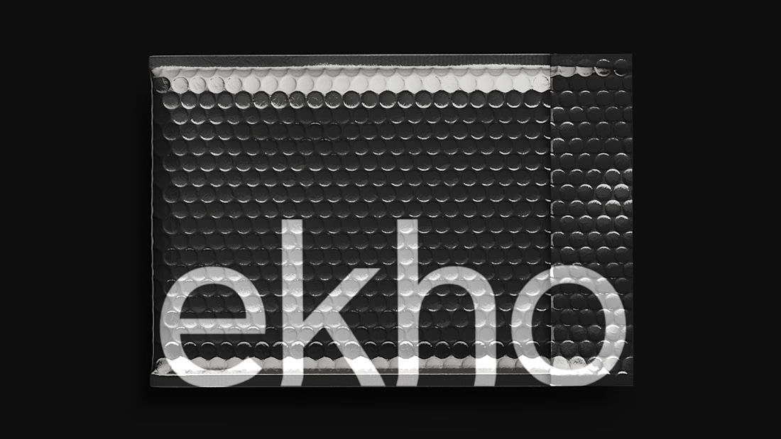
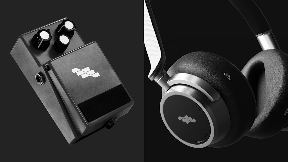
Top tier branding