The network for creativity
Join 1.25M professional creatives like you
Connect with clients, get discovered, and run your business 100% commission-free
Creatives on Contra have earned over $150M and we are just getting started
Back to feedPost

TOI Cricket – Player Stats & Profile Experience
Developed the responsive Player Profile and Career Statistics UI for Times of India’s Sports/Cricket platform.
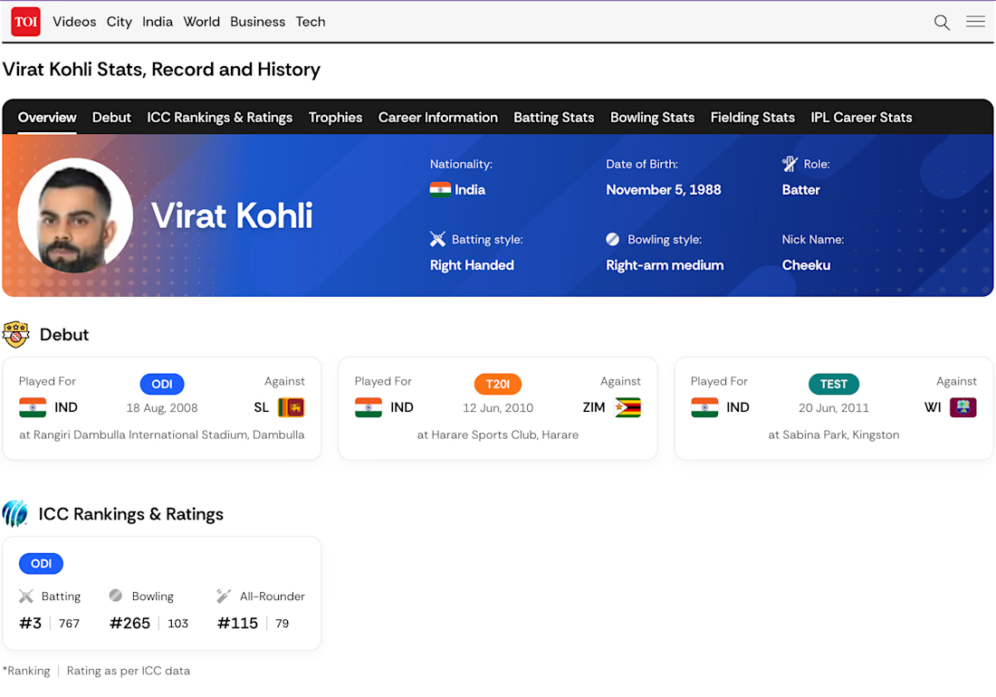
Built the complete player profile experience with player overview, nationality, role, batting/bowling style and profile information.
Implemented tab-based navigation for Overview, Debut, ICC Rankings & Ratings, Trophies, Career Information, Batting Stats, Bowling Stats, Fielding Stats and IPL Career Stats.
Developed structured debut cards covering ODI, T20I and Test career information.
Built UI for ICC rankings and ratings, trophy/achievement sections and career information.
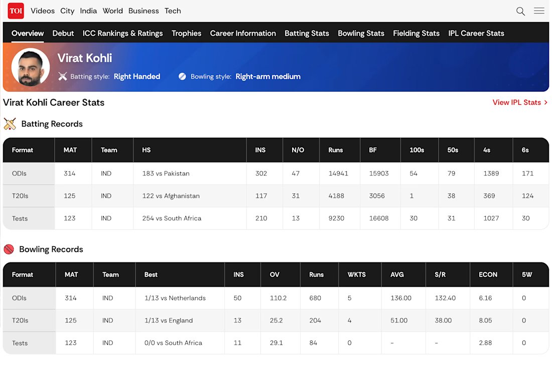
Developed responsive Batting, Bowling and Fielding Records using structured data tables for different cricket formats.
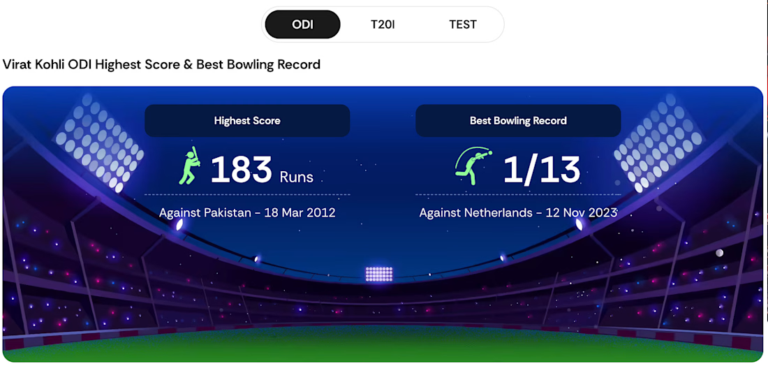
Created format-based statistics experience with ODI, T20I and Test views.
Built visual highlight sections for highest score and best bowling record, followed by recent performance and overall career statistics.
Implemented complex responsive tables and data-heavy layouts while maintaining readability across desktop and mobile screens.
Worked on reusable UI patterns, conditional states and responsive components for the broader TOI Sports platform.
Focused on pixel-accurate UI implementation, responsive behaviour, cross-browser compatibility and production-ready frontend styling.



The network for creativity
Join 1.25M professional creatives like you
Connect with clients, get discovered, and run your business 100% commission-free
Creatives on Contra have earned over $150M and we are just getting started



Related posts


I do my best work when I'm excited about it. This took me under 2h from start to finish. Might have to get more selective about the projects I take on from now on.


Looks so cool🔥I really wonder how you make all the characters and animations.

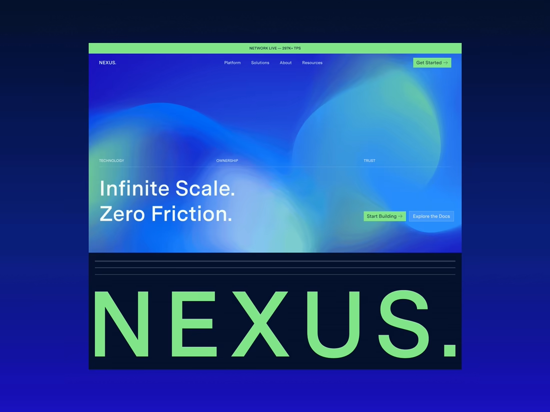
Happy to finally share the full NEXUS project 🙌
A few days ago I posted a small motion teaser. Now the whole thing is live on my profile: 12 pages designed in Figma, a design system, and a homepage I built in HTML, CSS and JS with every interaction working.


12 pages in Figma plus a design system, then hand coding the homepage with every interaction working is a great way to show the concept holds up, Sofiia. Nice to see the teaser turn into the full project.


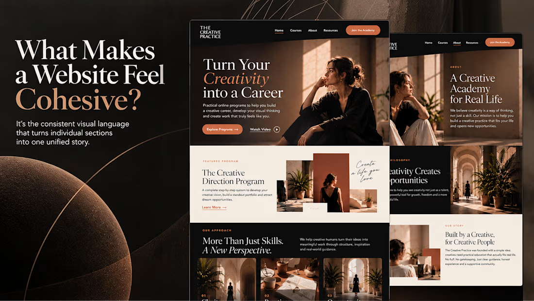
What makes a website feel cohesive?
It’s not just the colors.
It’s not just the typography.
And it’s definitely not about making every section look the same.
A cohesive website is built when every visual decision feels like part of the same story, from typography and imagery to spacing, buttons, cards, and even the smallest details.
The goal isn’t repetition.
It’s creating a visual language that people recognize and remember.
That’s when a website starts to feel like a brand, not just a collection of sections.
Well put, Serge. Consistent spacing, buttons and cards do more for that feeling than making sections match, and they are usually the first things to drift as a site grows.