Freelancers using HTML5 in Gatineau
Sign Up
Post a job
Sign Up
Log In
Filters
2
Projects
People
Luis Martinez
pro
Ottawa, Canada
Modern websites for brands who care about performance
1x
Hired
12
Followers
Follow
Message
Modern websites for brands who care about performance
0
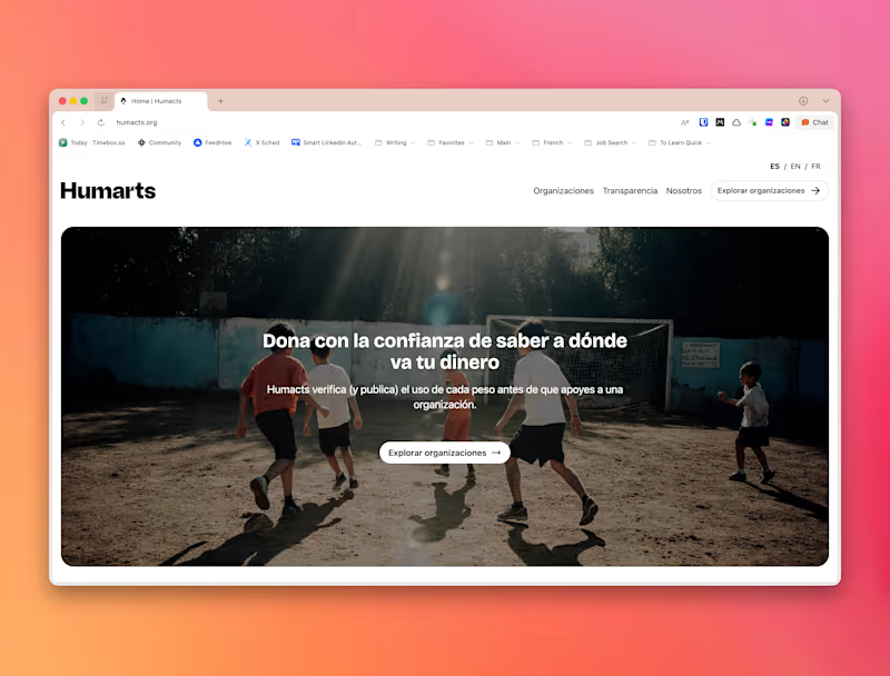
Humacts Website Design and Development
0
10
0
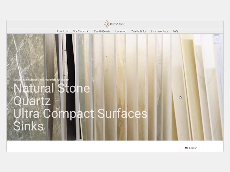
Blackstone Granite - Improving how a B2B materials website
0
3
3
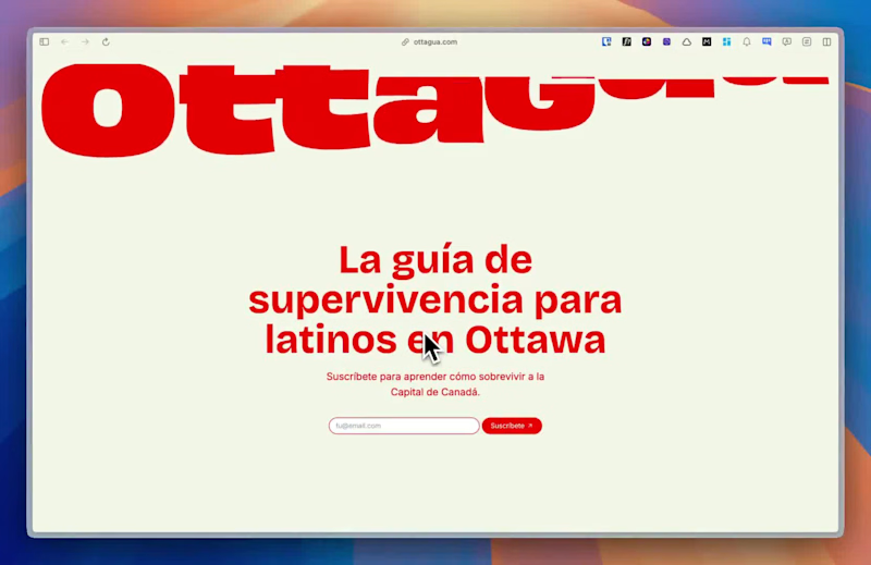
Ottagua – A Local Guide for Ottawa’s Latinx Community
3
144
0
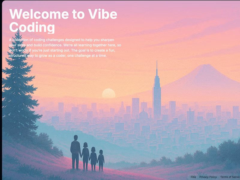
Vibe Coding Challenge – AI-Powered Coding Lessons
0
144
HTML5
(1)
Follow
Message
Faadil Boussari
pro
Gatineau, Canada
Product Designer · Framer · Brand Systems · Prototypes
14
Followers
Follow
Message
Product Designer · Framer · Brand Systems · Prototypes
1
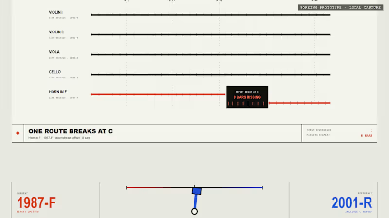
Before Bar One: The First Version Proved the Mechanism. Squarespace Turned It Into an Experience. Before Bar One did not begin as a website. It began as a small functional prototype for Day 3 of my 30 Days of Real Business Problems challenge. The original idea came from a very specific orchestral problem: Five musicians receive their parts and begin rehearsal together. Four parts continue normally from rehearsal mark C to rehearsal mark D. But in one edition, the Horn in F part contains eight missing bars. The page still looks complete. The paper is still ruled. The rehearsal continues. But one musical route has quietly disappeared. That first prototype was designed to prove a single interaction: The mechanism worked. Visitors could move from the fictional 1987-F field edition to the revised 2001-R edition and watch the orchestral route reconnect. But the experience still felt like a product demonstration. It explained the mechanism, but it did not yet feel like the kind of environment where someone might discover, inspect and interpret an edition discrepancy. For the Squarespace Make It Real Challenge, I decided not to replace the original idea with a more conventional brand website. I kept the interaction and rebuilt everything around it. The result is Before Bar One An Interactive Critical Archive. Rather than presenting the problem as a dashboard or software tool, the Squarespace experience treats it as a fictional archival incident. The visitor enters an editorial environment built around records, catalog references, edition controls, rehearsal routes, incident reports and constructed evidence. The visual system uses warm ivory, charcoal, archival brass, fault red and restoration mint. Editorial serif typography is paired with monospace archive labels, fine rules, stamps and catalog notation. The central question remains simple: What changes when the edition changes? In the 1987-F state, the Horn in F becomes silent between rehearsal marks C and D. The visitor can inspect: five orchestral routes; one interrupted path; eight empty measure cells; a ruled but unprinted passage; a tactile archive record; an unresolved incident status; a restoration diagram that remains incomplete. The part does not look damaged. That is the point. The issue is not the physical copy. The issue is the edition. When the visitor selects 2001-R, the archive changes with it. The missing measures return. The archive object is recatalogued. The incident status changes. The Horn in F route reconnects. The five parts arrive together again. The edition selector is therefore not simply a visual toggle. It becomes the central reading device for the entire experience. I also created a second page called The Reading Room. This page expands the interaction into a fuller archival consultation and includes: Archive Record 001; Archive Record 002; a direct edition comparison; an Incident Report; an Evidence Wall; a Build Record; the final closing notice. The Evidence Wall presents several fictional artifacts: a photographed leaf, a copyist-style marginal cue, a constructed sketch source, a restoration analysis tag and a transcribed cue sheet. All institutions, dates, editions, records and musical evidence in the project are explicitly labelled as fictional or constructed. The goal is not to imitate a real historical discovery, but to demonstrate how an edition-comparison workflow could be transformed into an interactive narrative. One of the most important additions came late in the process. I realized that visitors could see the missing passage, but they could not yet hear what it changed. So I created two versions of the same short orchestral rehearsal: Both versions use the same tempo, harmony, strings, duration and arrangement. The only intended difference is the Horn in F during the central eight-bar passage. In 1987-F, the strings continue while the horn disappears. In 2001-R, the horn remains present and rejoins the ensemble through the restored passage. These recordings were added through a native Squarespace Listening Station using Squarespace Audio Blocks. The visitor can now: Squarespace became more than the place where the prototype was published. It provided the structure for turning one interaction into a complete public experience: a clearer five-second introduction; a responsive editorial layout; a two-page narrative architecture; navigation between the Archive and Reading Room; native audio presentation; a stronger visual hierarchy; a final layer of polish and atmosphere. The core edition mechanism is implemented as a custom HTML and CSS interaction embedded within Squarespace. Around it, Squarespace provides the public-facing framework, page structure, responsive composition and native Listening Station that make the project feel complete. The transformation was not: It was: The original version proved that the idea could work. The Squarespace version gave the idea a world, a rhythm and a reason to explore it. Explore the project Interactive Critical Archive https://horse-grey-66kc.squarespace.com/before-bar-one The Reading Room https://horse-grey-66kc.squarespace.com/reading-room Password 1234 Original Day 3 prototype https://faadil1.github.io/before-bar-one/ The first version proved the mechanism. Squarespace turned it into a visual, editorial and audible experience. Before every rehearsal, check the edition. #SquarespaceChallenge #MakeItReal #Squarespace #FinishLayer #WebDesign #CreativeDevelopment #InteractionDesign #EditorialDesign #SoundDesign #UIUX #Contra
1
208
1
Day 15: PROOF IS BROKEN In 2007, Blendtec’s Will It Blend? turned extreme product demonstrations into proof. The formula was simple: Watch the video. Believe the product. But today, spectacular footage can be generated, enhanced, or fabricated. A visually impressive demonstration no longer guarantees credibility. So I explored a new business problem: How can a brand still prove product performance when video alone is no longer enough? I reimagined the campaign around a new question: WOULD YOU BELIEVE IT? The new concept introduces The Proof Room—a controlled testing environment where the object, process, camera angles, and physical result are all visibly documented. The campaign evolves from: Will it blend? to: Can the demonstration be verified? For this project, I created: an original-versus-reimagined campaign film; a complete storyboard; AI-generated product and motion sequences; a verification-based visual system; a campaign poster and thumbnail; sound design and final editing. The final idea:
1
32
4
REHEARSAL: The Room Has No Chalk Some conversations stay with us for days before they ever happen. We replay the possible replies. We soften what we need to say. We search for the perfect sentence until the moment passes. As an introvert, I know that feeling well. So I designed REHEARSAL, a preparation room for difficult real-world conversations. Most AI tools try to write the sentence for you. REHEARSAL refuses. You write the reply you are afraid to hear. You write your first, instinctive response. You identify the reflex behind it. The room contributes one structural constraint not a replacement sentence. Then you write again, entirely in your own words, and say it out loud. The central rule is simple: You write both sides. This room never writes for you. The visual world is built around the idea of The Black Floor: one person draws both sides of the conversation, while the room is only allowed to mark a limit. No chatbot. No generated dialogue. No emotional score. No simulated person on the other side. Because the real conversation does not happen inside the product. Practice here. Speak there. Designed and iterated in Flowstep, then developed into a working React experience. Flowstep: https://app.flowstep.ai/file?activeFileId=768ea904-4954-4f20-a863-8e68ccec1166 Live experience: https://rehearsal-psi.vercel.app #Flowstep #ProductDesign #UXDesign #InteractionDesign
2
4
88
2
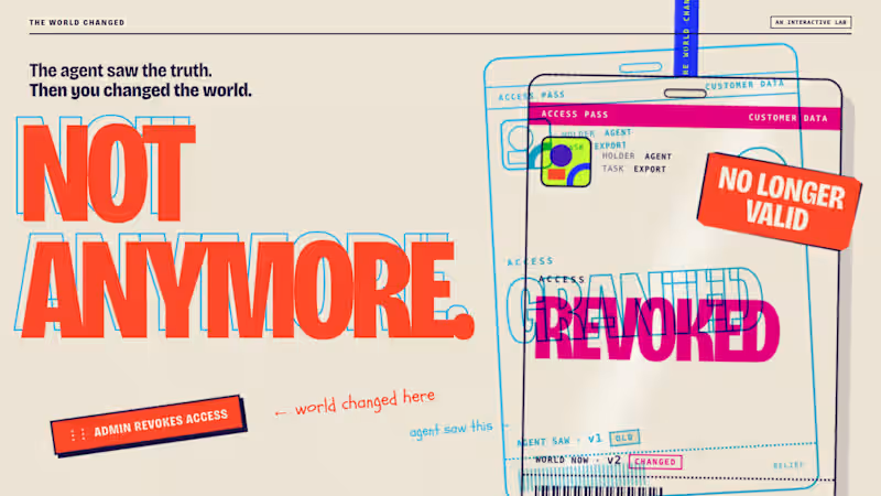
A request does not automatically change an agreement. Scope Accord is a five-state interaction prototype designed around a common service-project problem: a client may hear “already included,” while the provider means “additional scope, cost and time.” The proposed change remains structurally outside the current agreement until both parties express the same understanding of its impact. One request. Two interpretations. One visible boundary. Designed and built with React, TypeScript, CSS Grid and Playwright. Live prototype: https://scope-accord.vercel.app
2
23
HTML5
(1)
Follow
Message
Dmitriy Shin
Ottawa, Canada
Passionate and open-minded
Follow
Message
Passionate and open-minded
0
Portfolio Website
0
3
0
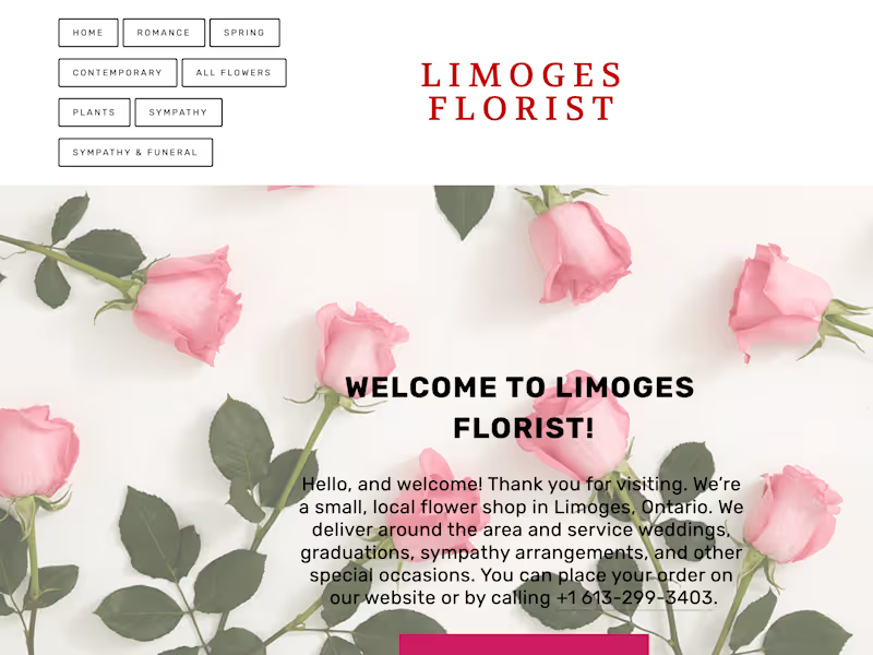
Limoges Florist
0
3
0
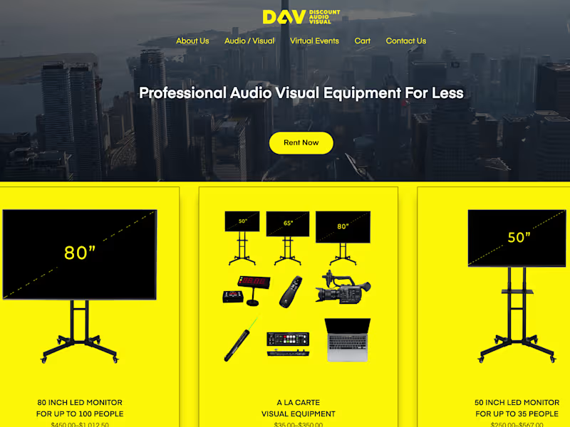
Discount Audio Visual
0
12
0
WalletCS
0
11
HTML5
(3)
Follow
Message
Ramzi El-Abed
Ottawa, Canada
Web Developer | Elearning Platform Administrator
Follow
Message
Web Developer | Elearning Platform Administrator
0
Optique SINAL : Login
0
3
0
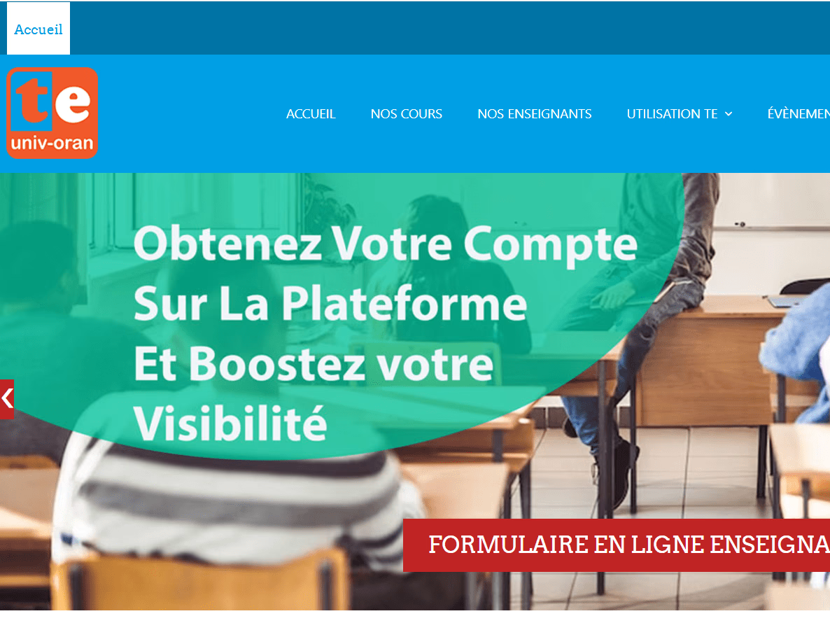
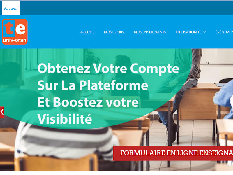
Plateforme Télé-Enseignement de l'Université Oran 1 Ahmed Ben Be
0
4
0
Wordpress Website
0
4
View more →
HTML5
(1)
Follow
Message
Explore people