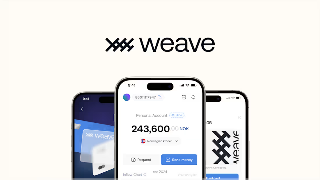
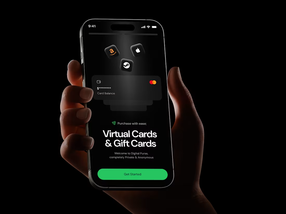
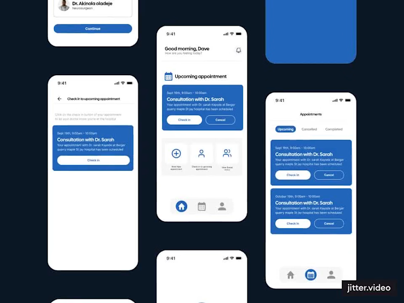
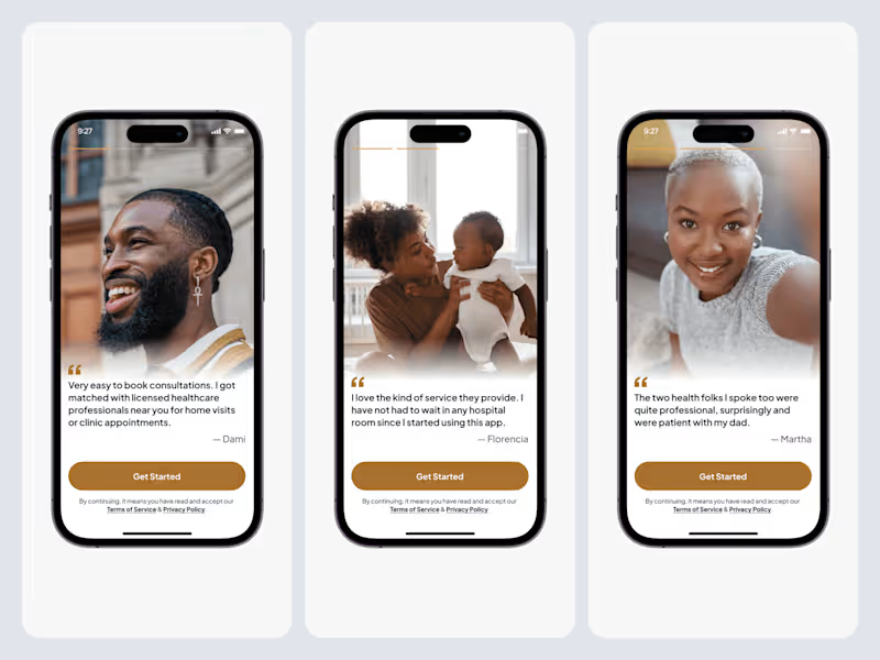
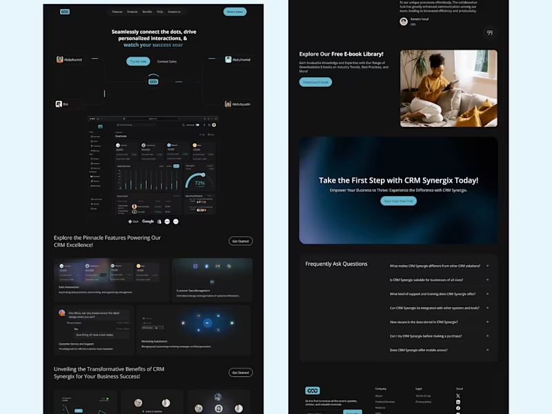
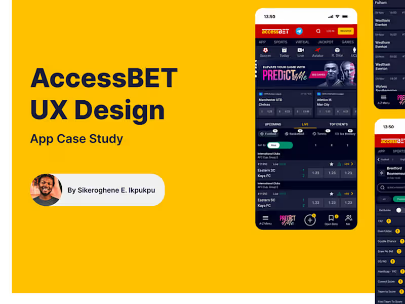
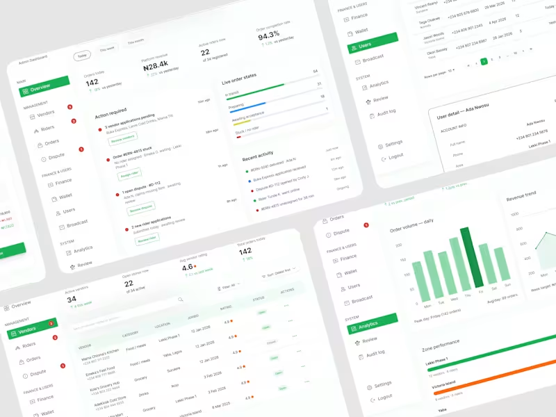
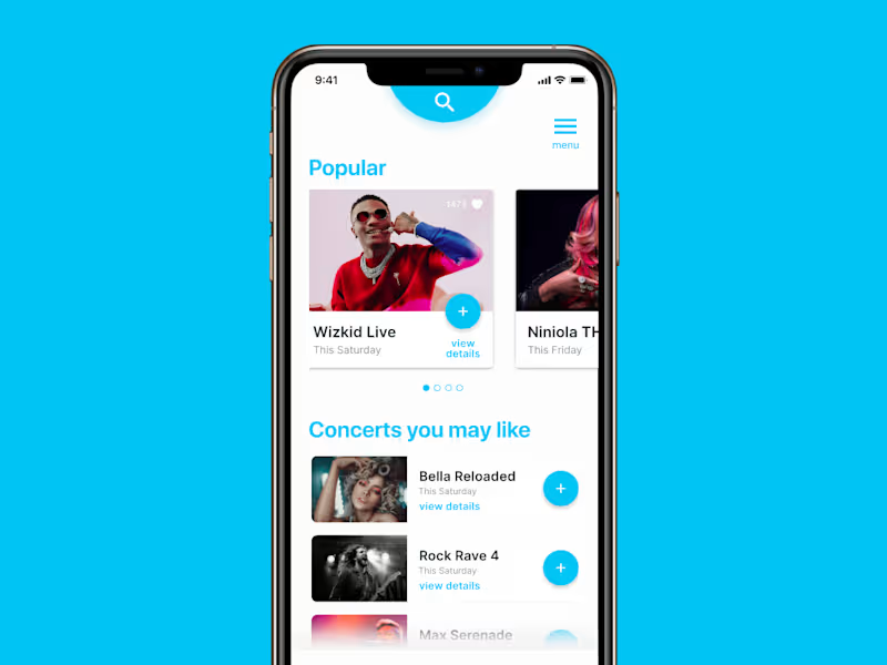
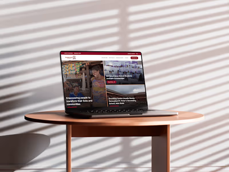
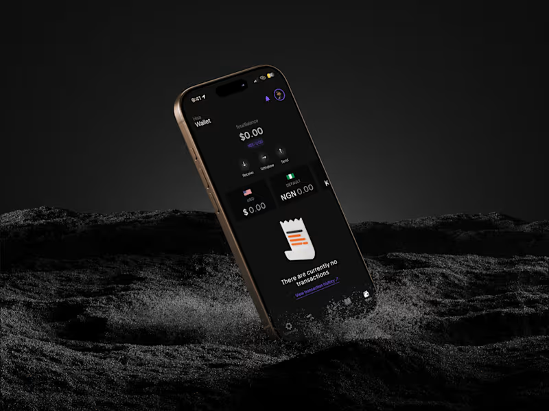
UX Research Projects in Federal Capital TerritoryUX Research Projects in Federal Capital TerritoryDesigned a complete hyperlocal marketplace platform that connects customers, vendors, riders, and administrators. Delivered end-to-end UX flows, wireframes, high-fidelity interfaces, design systems, and operational workflows covering ordering, delivery management, payouts, and platform administration. Practice makes perfect.
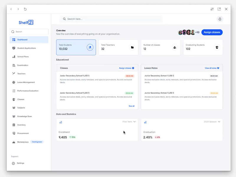
I say that because comparing how I used to design dashboards then and the way I design dashboards now, I see is growth.
I’ve always been one to run away from designing dashboards. They felt intimidating. I’ll say to myself, “too much data”, “too many decisions”, “too many ways to get it wrong”. But I’ve learned that growth doesn’t happen where we’re comfortable. So today, I decided to face that fear.
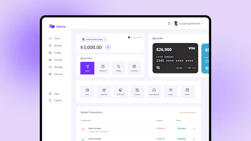
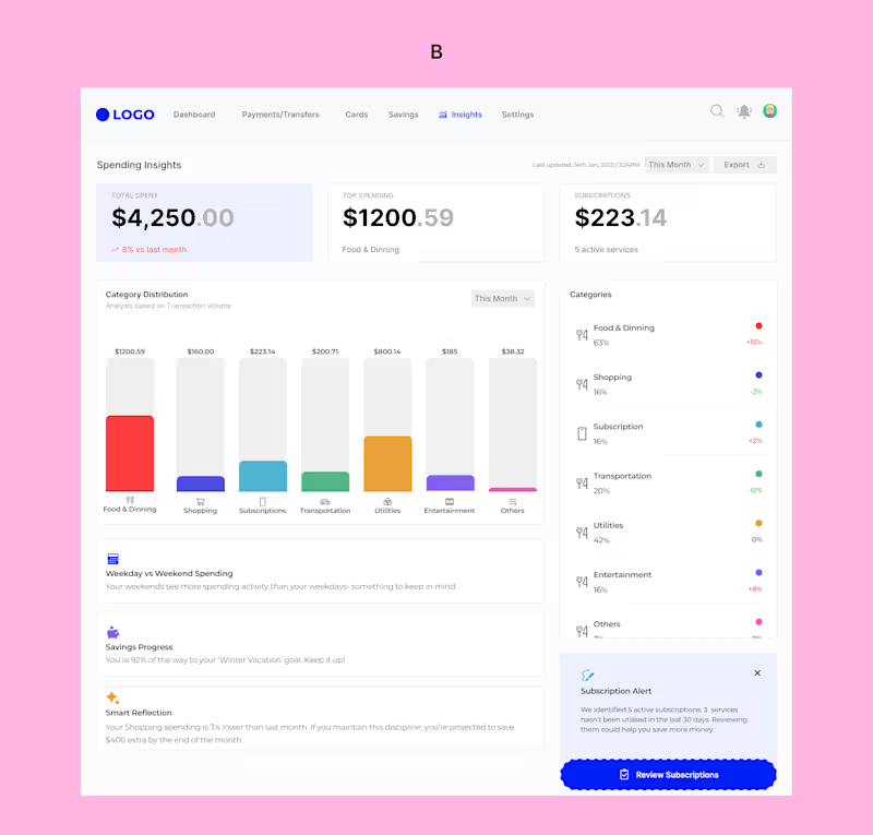
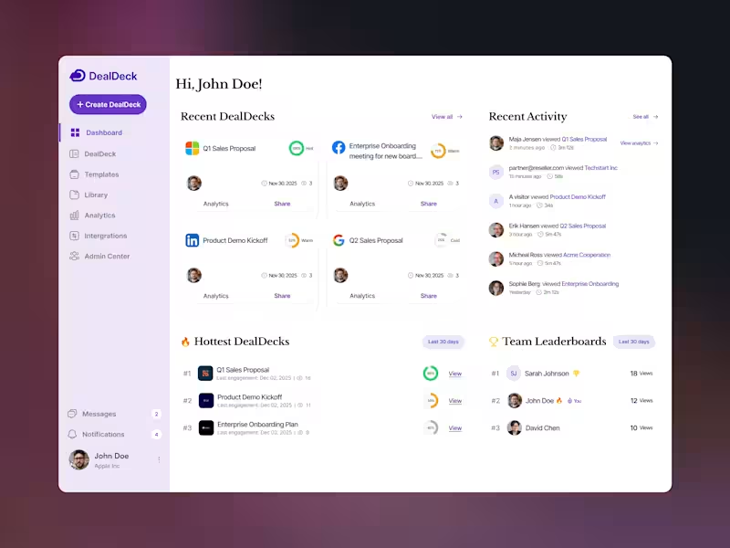
This wasn’t just about visuals, it was about designing understanding, not just data. I explored two different dashboard approaches, each solving the same problem in a slightly different way, because good UX isn’t always about one “perfect” solution, but about thoughtful trade-offs.
Which of the dashboards do you think has a better UX, A or B?