Grooming Centre Website Redesign
Anthony Jibueze
Empowering people for a better future
Grooming Centre is a Non-Governmental Organization dedicated to uplifting marginalized communities and advocating for social justice across Nigeria. They are committed to empowering individuals through innovative social support systems that create lasting positive change in their lives.'
Goal
The organization had an existing website but they needed an upgrade to reposition themselves, redefine their mission and goals and stay updated with modern design trends. They approached August Deep Technologies - as a leading web solutions agency, with their problem and we (with me as design lead) were able to deliver a solution that exceeded expectations and adhered to the agreed timeline.
Challenge
There were a lot of pages on the existing site about 50 and I had to redesign every single one plus add new pages for some of the new services they offered.
Solution
I performed my own UX audit of the old website. I used a plugin called Codia AI Web2Figma to transfer the old website from HTML to Figma design. I did this for most pages on the old website. Here are a few things I noted from a design and user experience point of view about the old site:
Low Contrast Icons
Loan section could look better
Boring footer
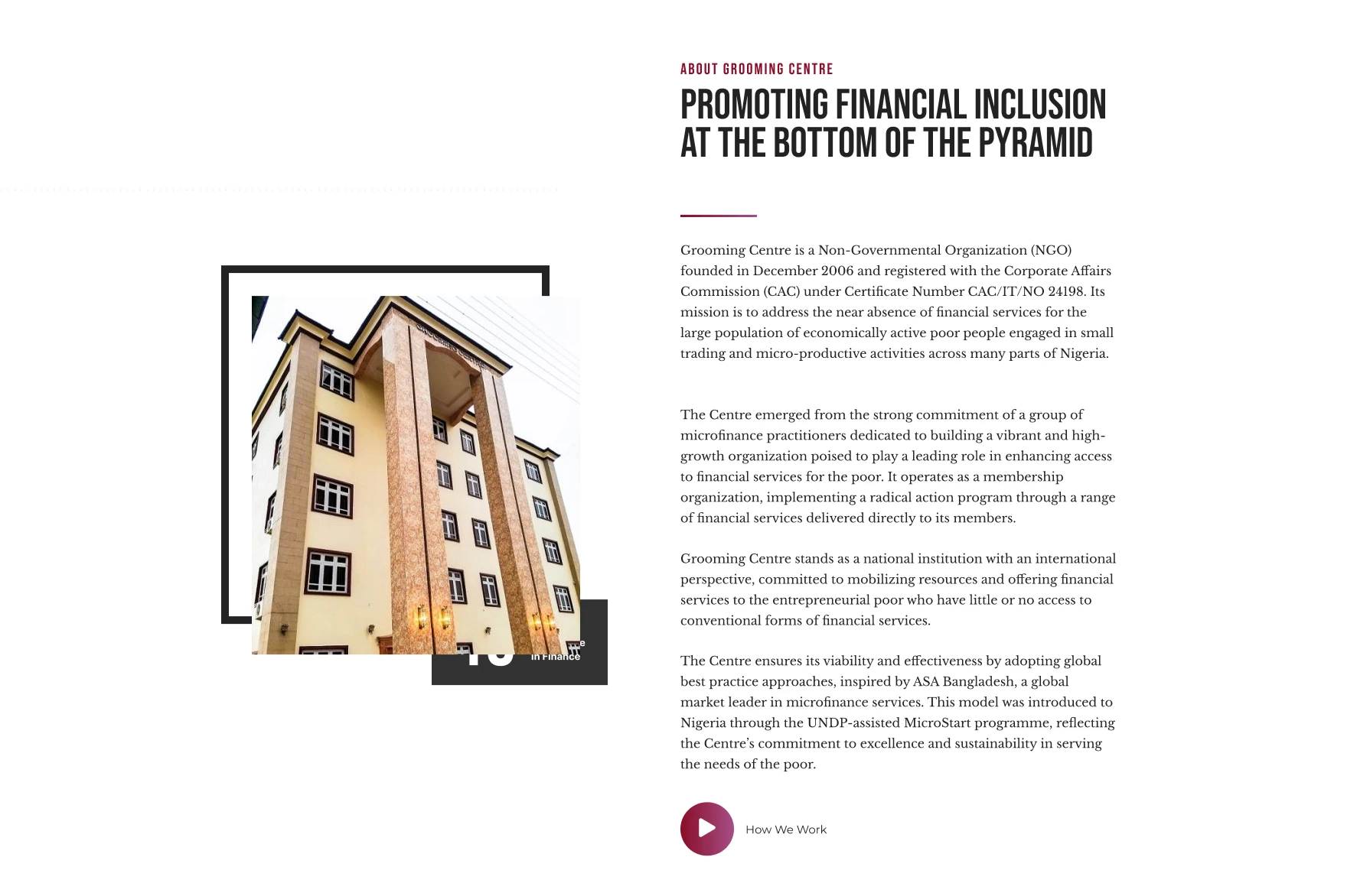
About section could be better
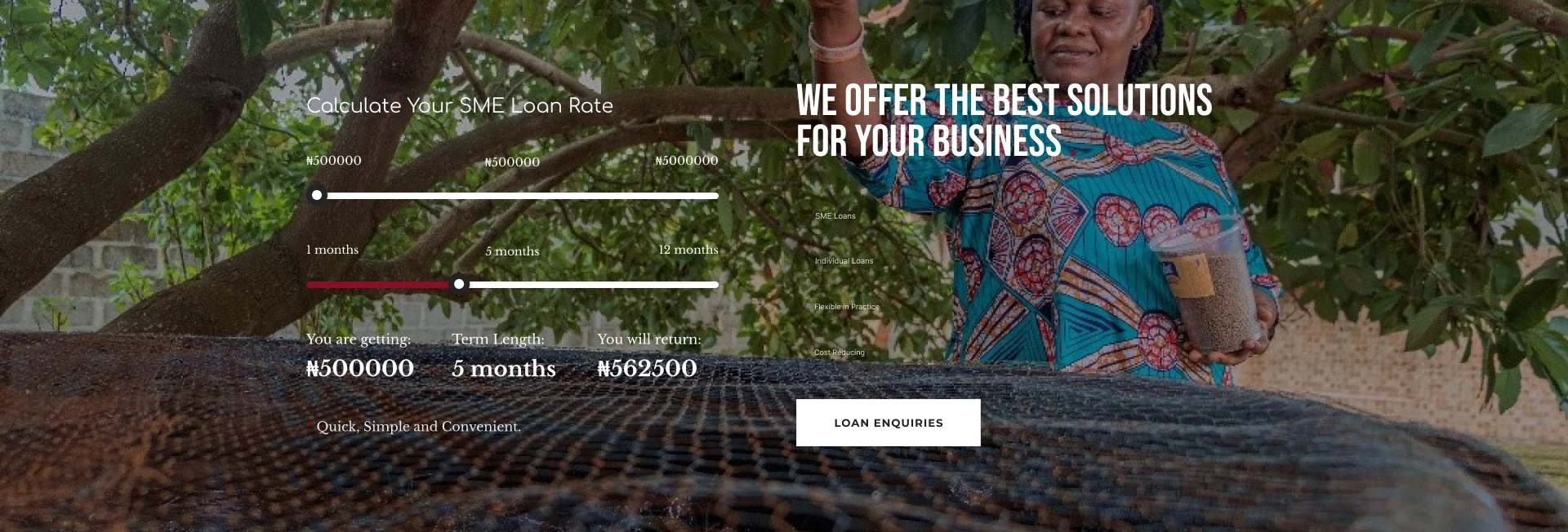
Loan rate calculator looks a bit disjointed
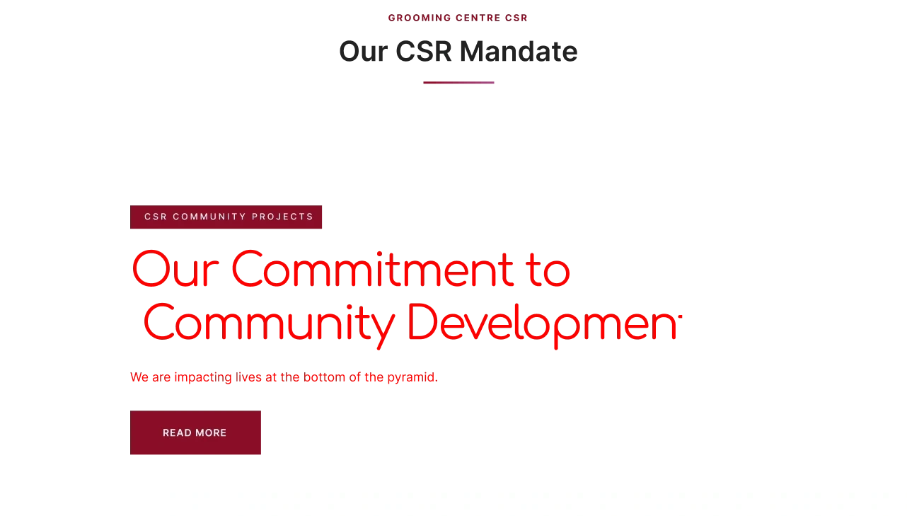
csr image also looks disjointed
Too many items in nav bar
Solution
Starting from the top
After completing the Audit, it was time to get to work on the new website as time was limited. I started with designing the reusable components that will be used across the website.
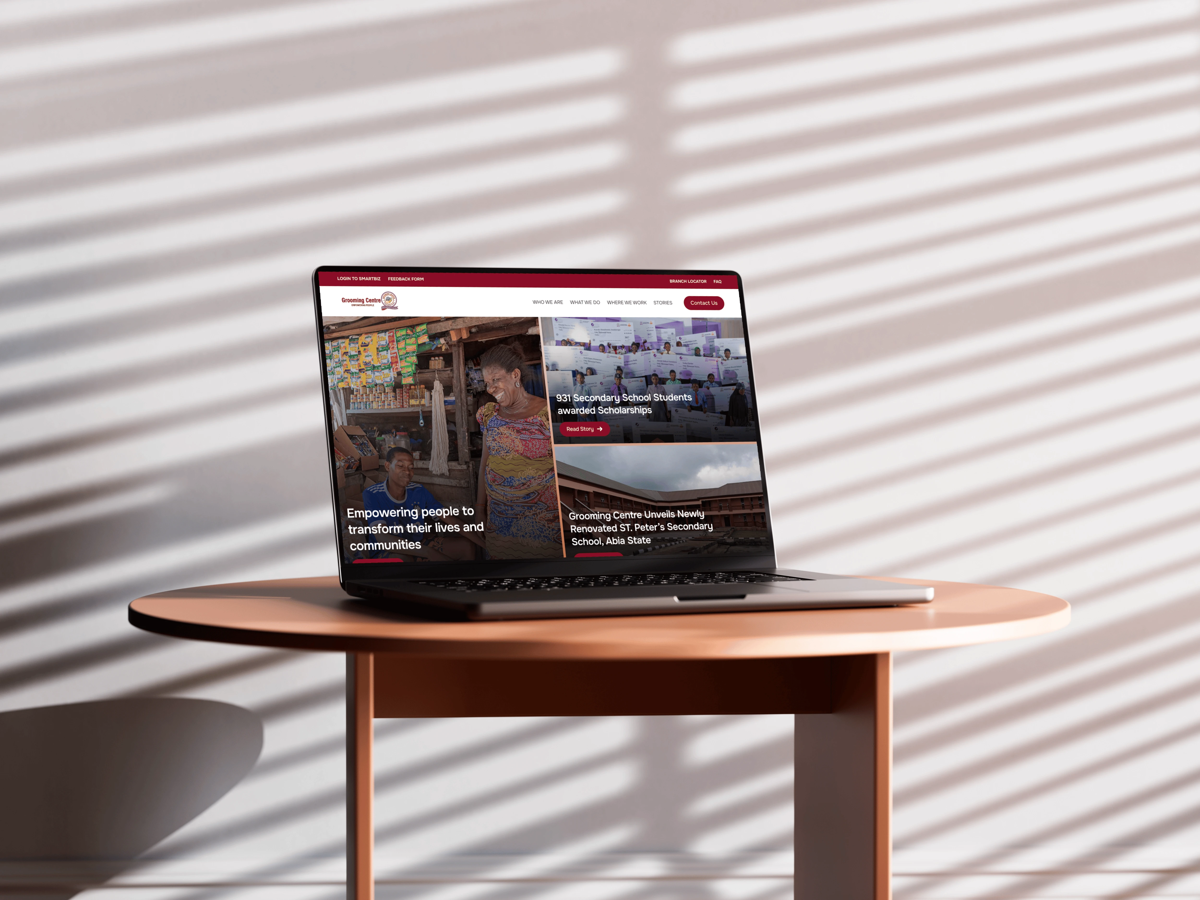
I started with the Navigation. I kept the double nav bar pattern from the old website; however, the nav items had changed following the new site structure in the PRD. Once I saw the layers of the new structure, I got a brilliant idea - Mega Menu.
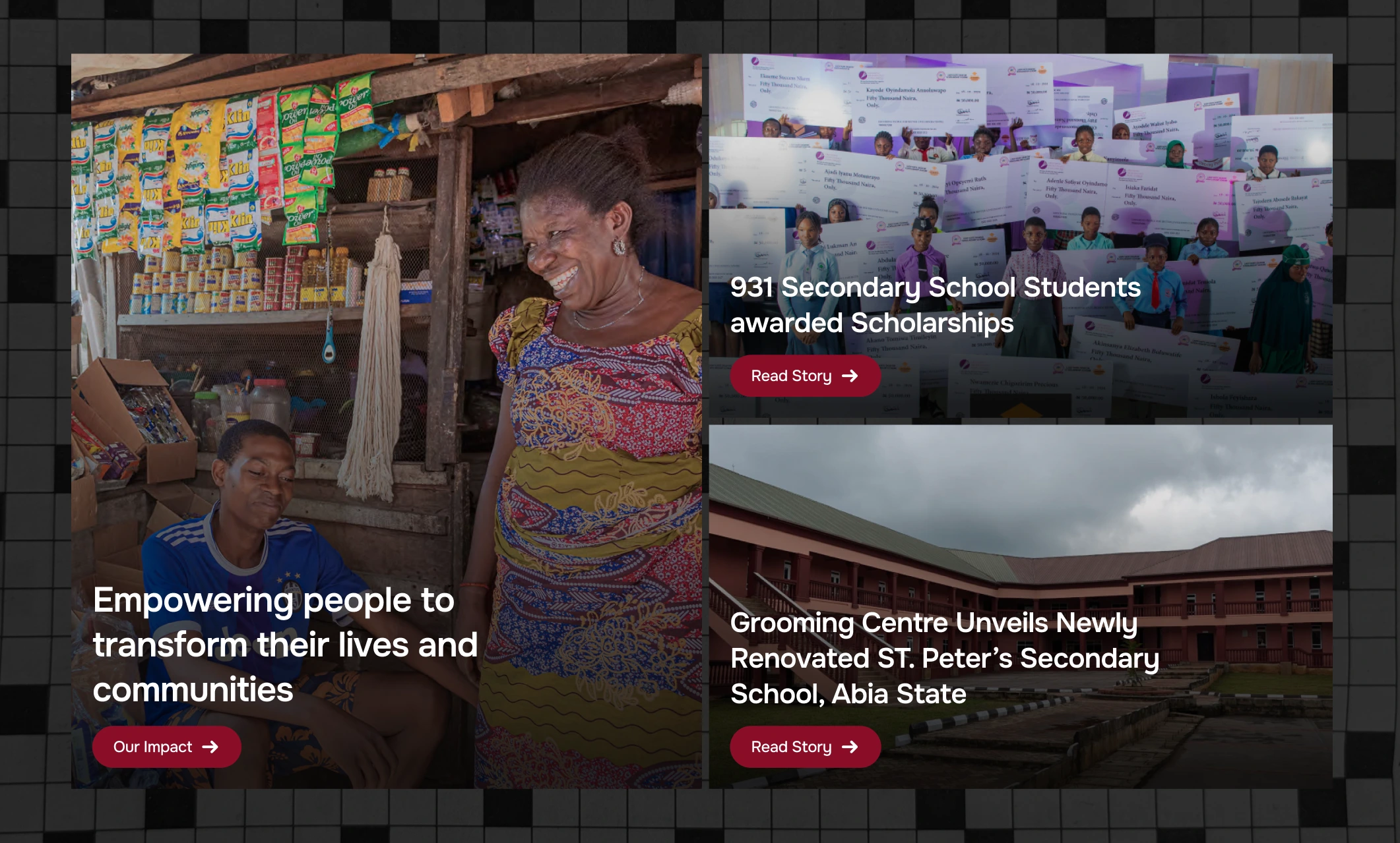
One of their main focus points was to showcase their impact through stories. This was hammered in the PRD and during meetings. I wanted that impact to attract people to read it, and what better way to do that than with a mega menu? I began sketching the best way to present the menu, and after a few attempts, I got it, as you can see below:
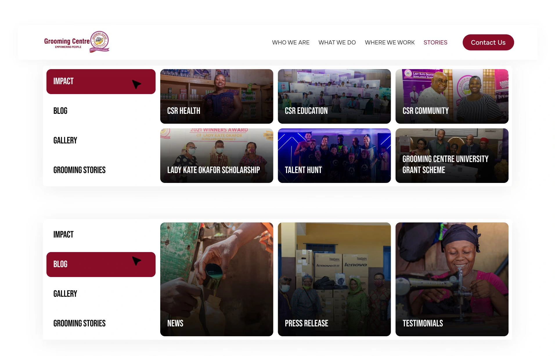
Mega menu under the stories nam item
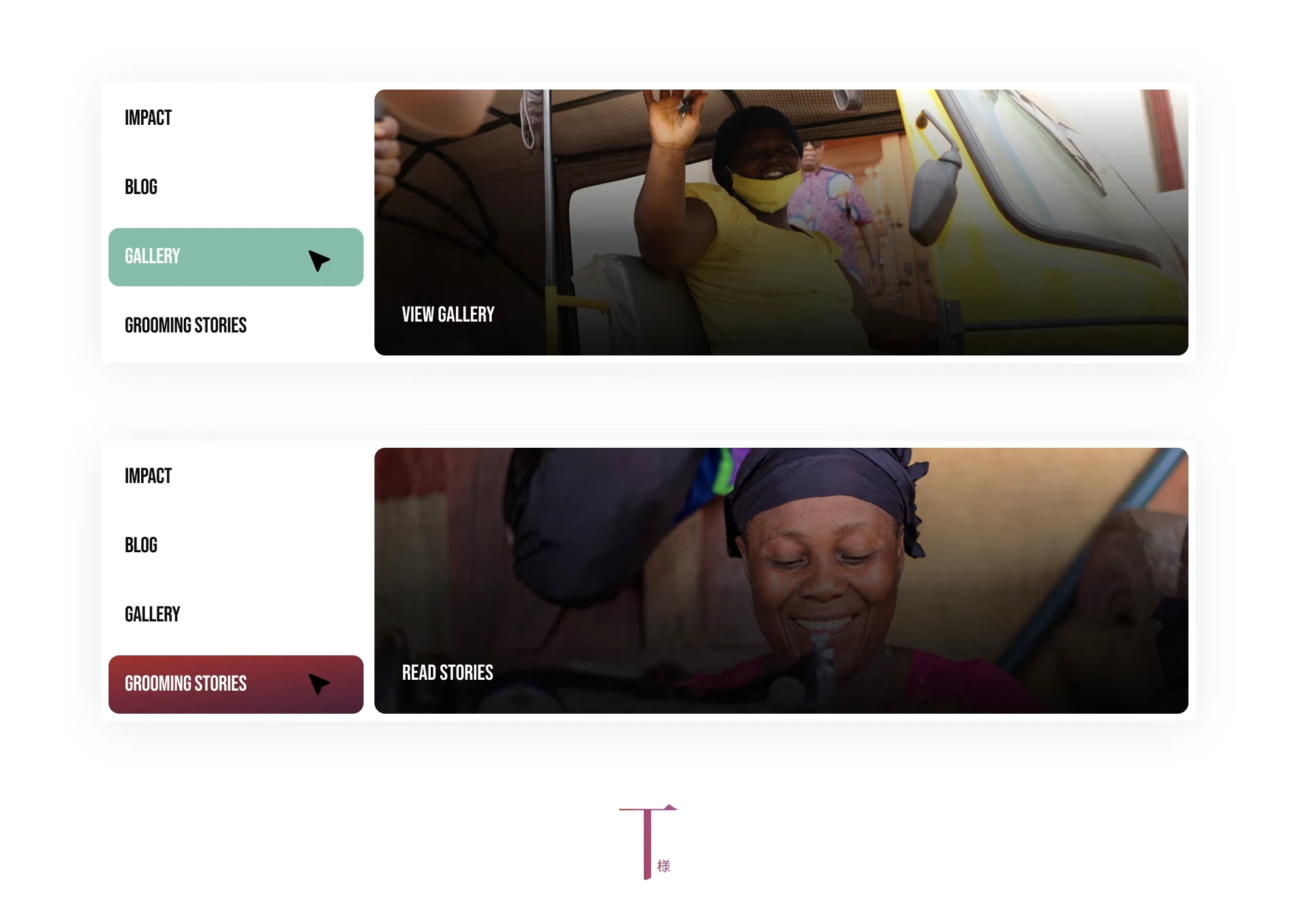
Mega menu
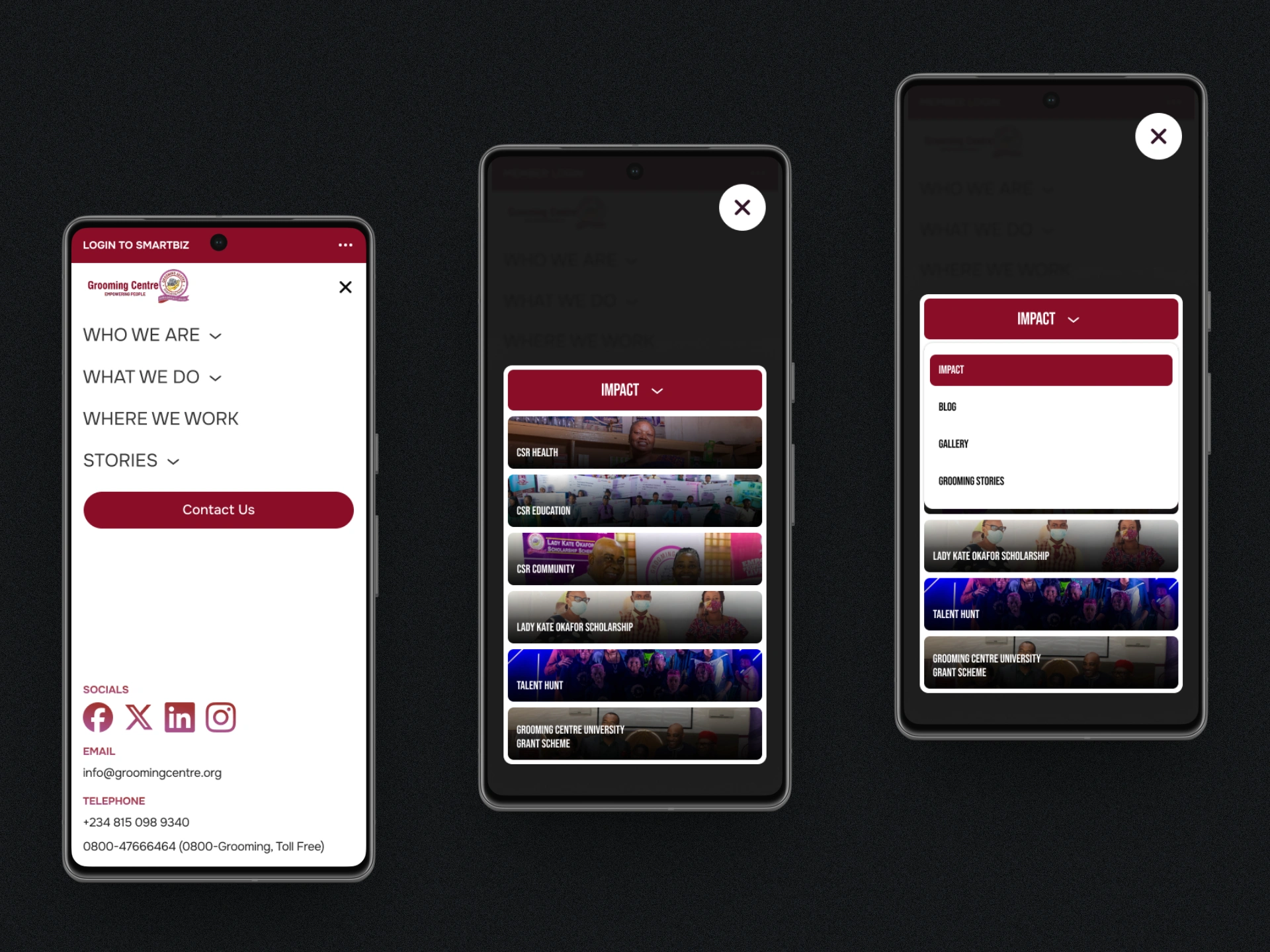
Mega menu on mobile
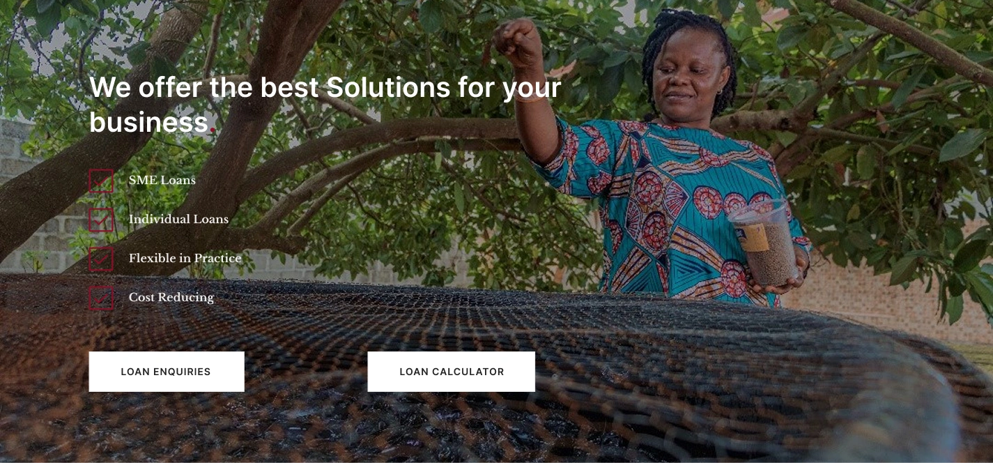
Hero Section
Originally, the Hero section was a slider, but later they wanted a grid, and that worked really well too.
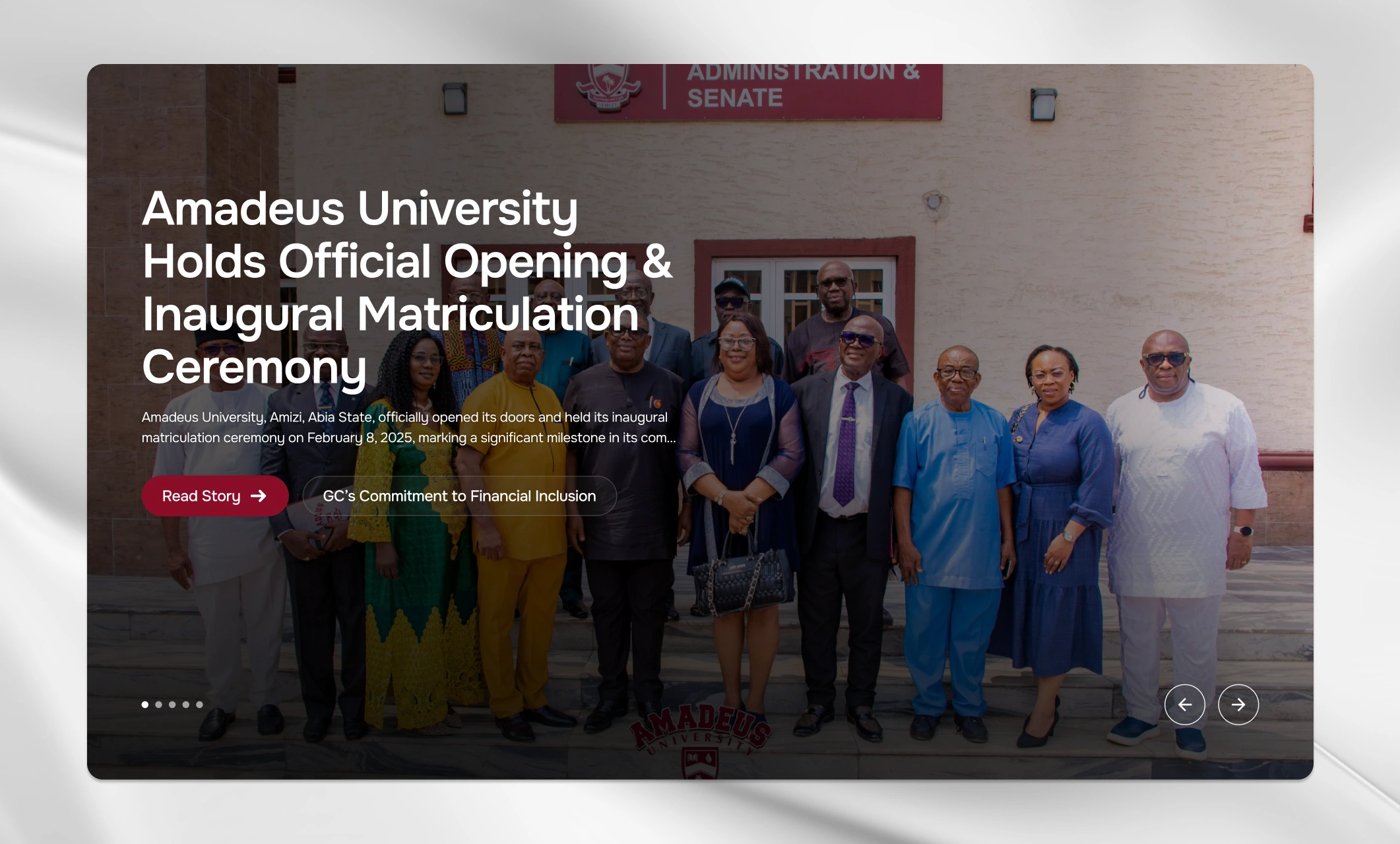
original slider hero
Grid hero section approved
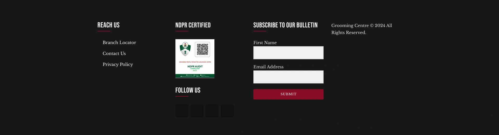
Footer
The new footer contained more information, a clearer navigation menu and contact information
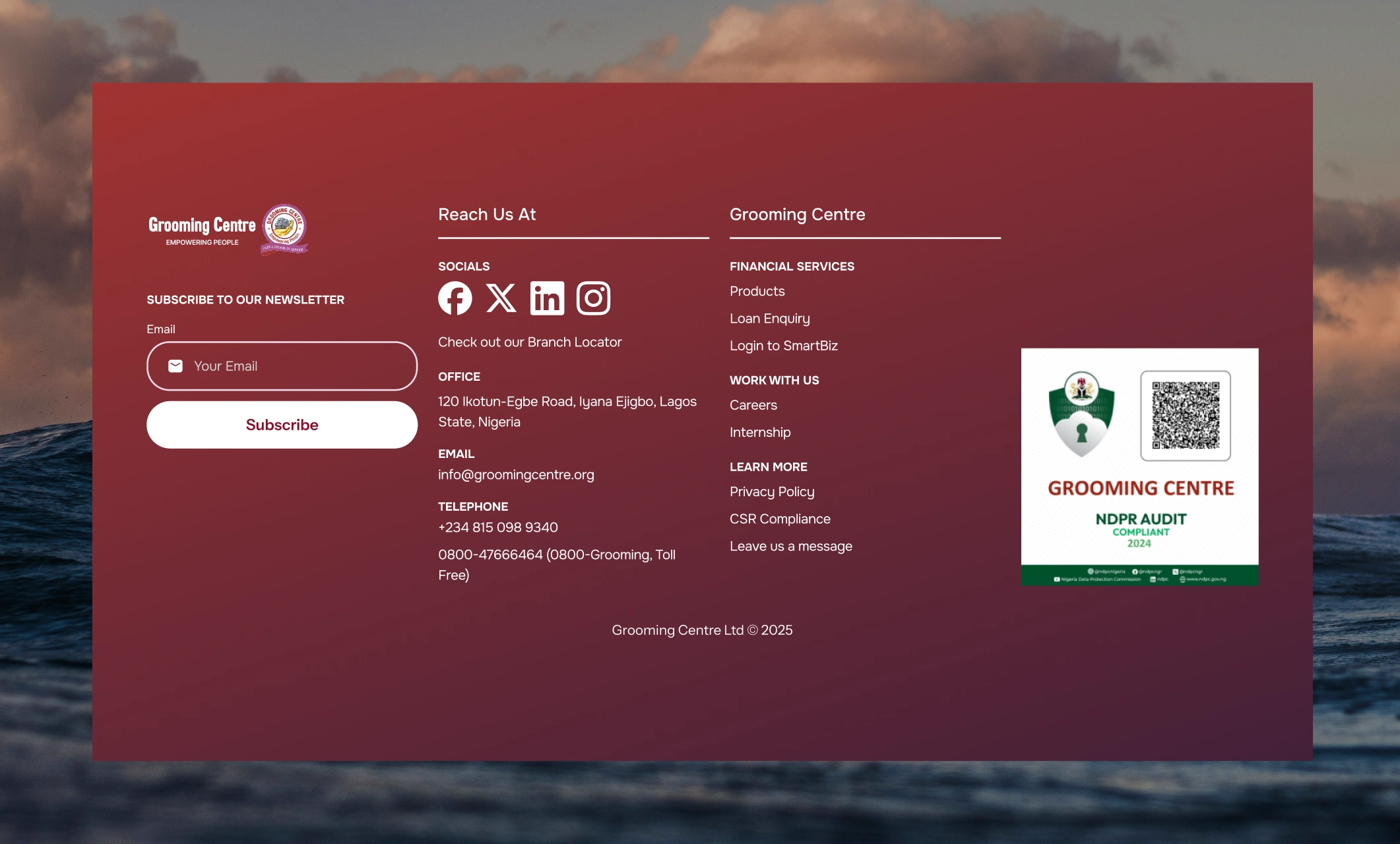
New foter
Favorite parts of the website
With those important areas sorted, I started working down the list of pages, consulting the PRD, checking the old site for content, creating a plethora of new layouts, and fitting in new images as we were being given through out the projects duration. There are a lot of pages and info on the website, and it took a lot of effort to meet the deadline, but I was able to deliver. These are my favorite parts of the site I worked on:
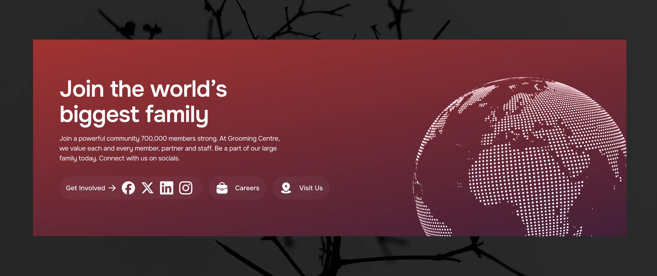
CTA (Call to Action)
A call to action for site visitors to support Grooming Centre. It allows them join Grooming Centre by interacting with the organization via socials, offering their services, or visiting physical branches. I love how the gradient and the image of the globe blend together to make it look beautiful.
About Us Grid
Telling the story of Grooming using images and numbers while incorporating their mission, vision, and a testimonial was a masterclass in layout. Really proud of this one.
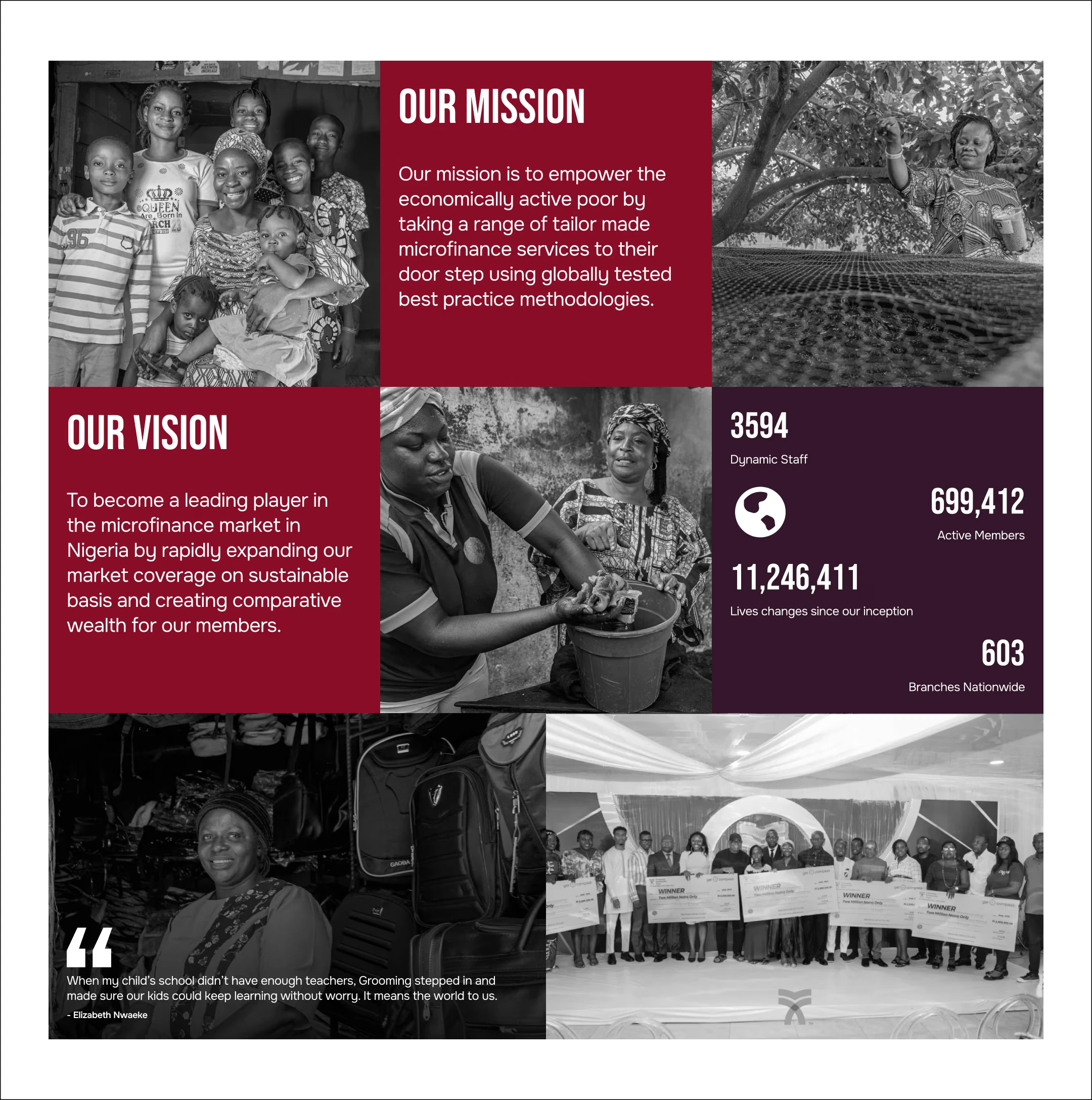
About Us Grid
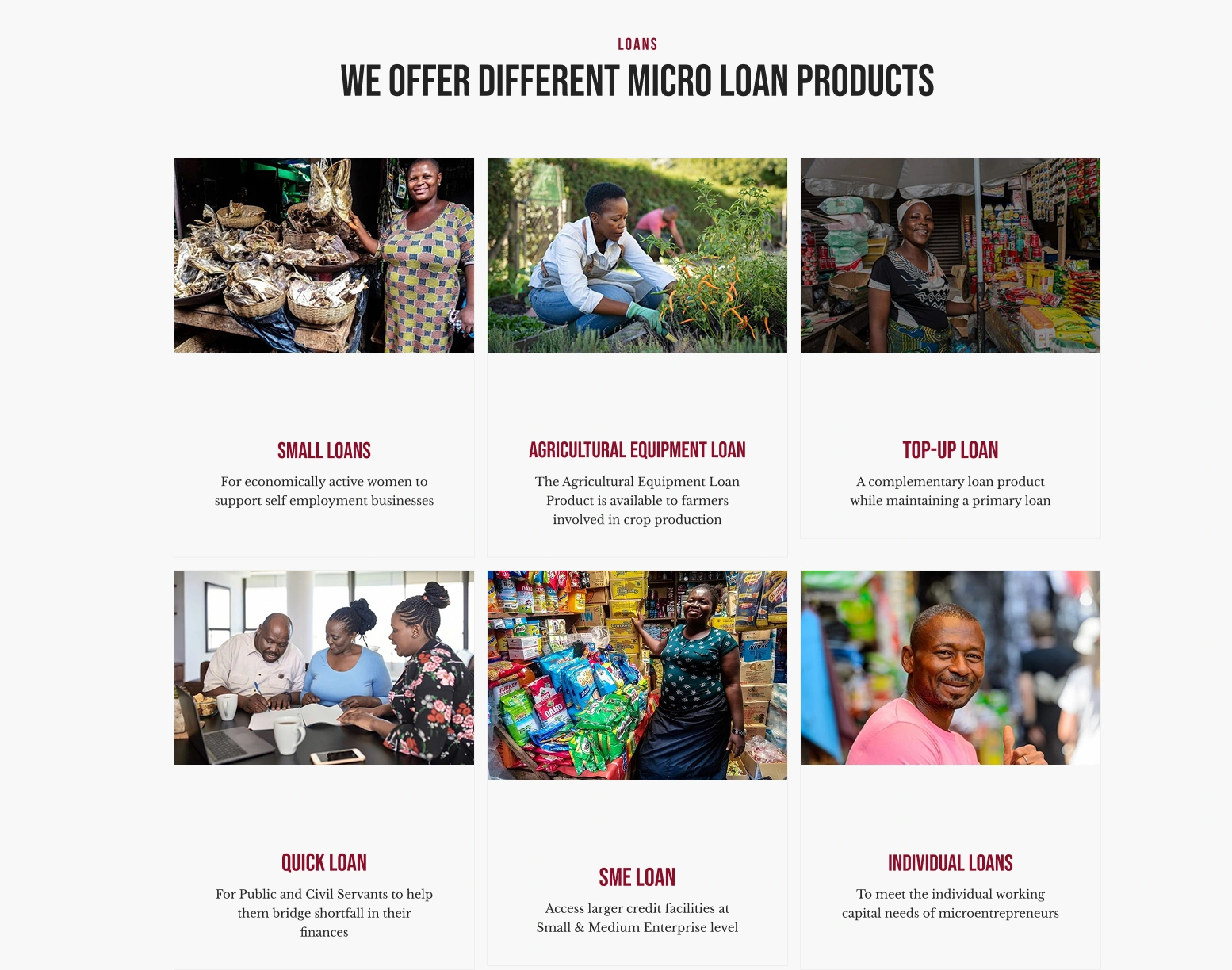
Product Card and Modal
I redesigned how the product grid looked and felt, giving it soft corners, a gradient overlay, and making it open to a modal instead of a full page with a blank layout like the old website.
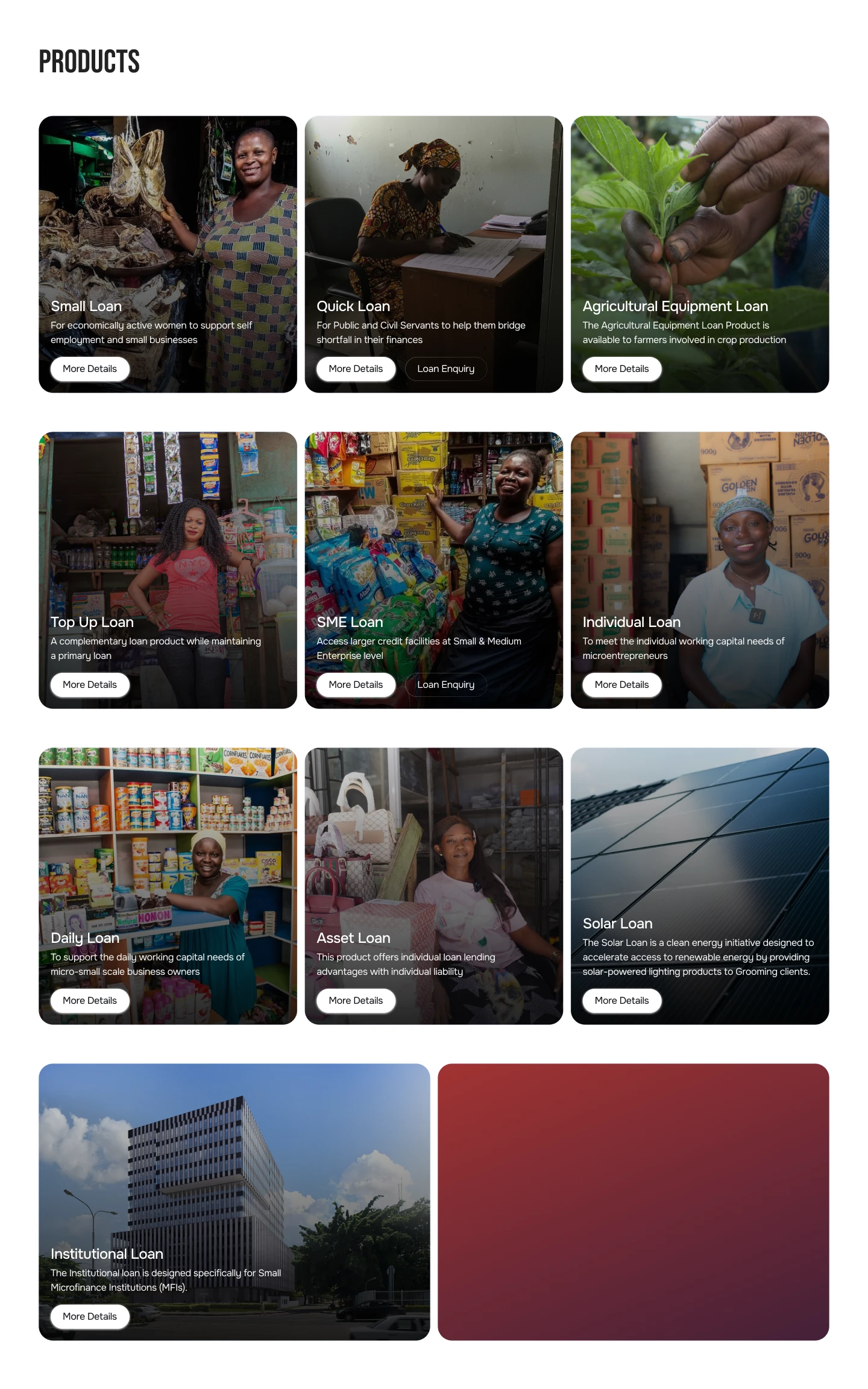
Product Cards
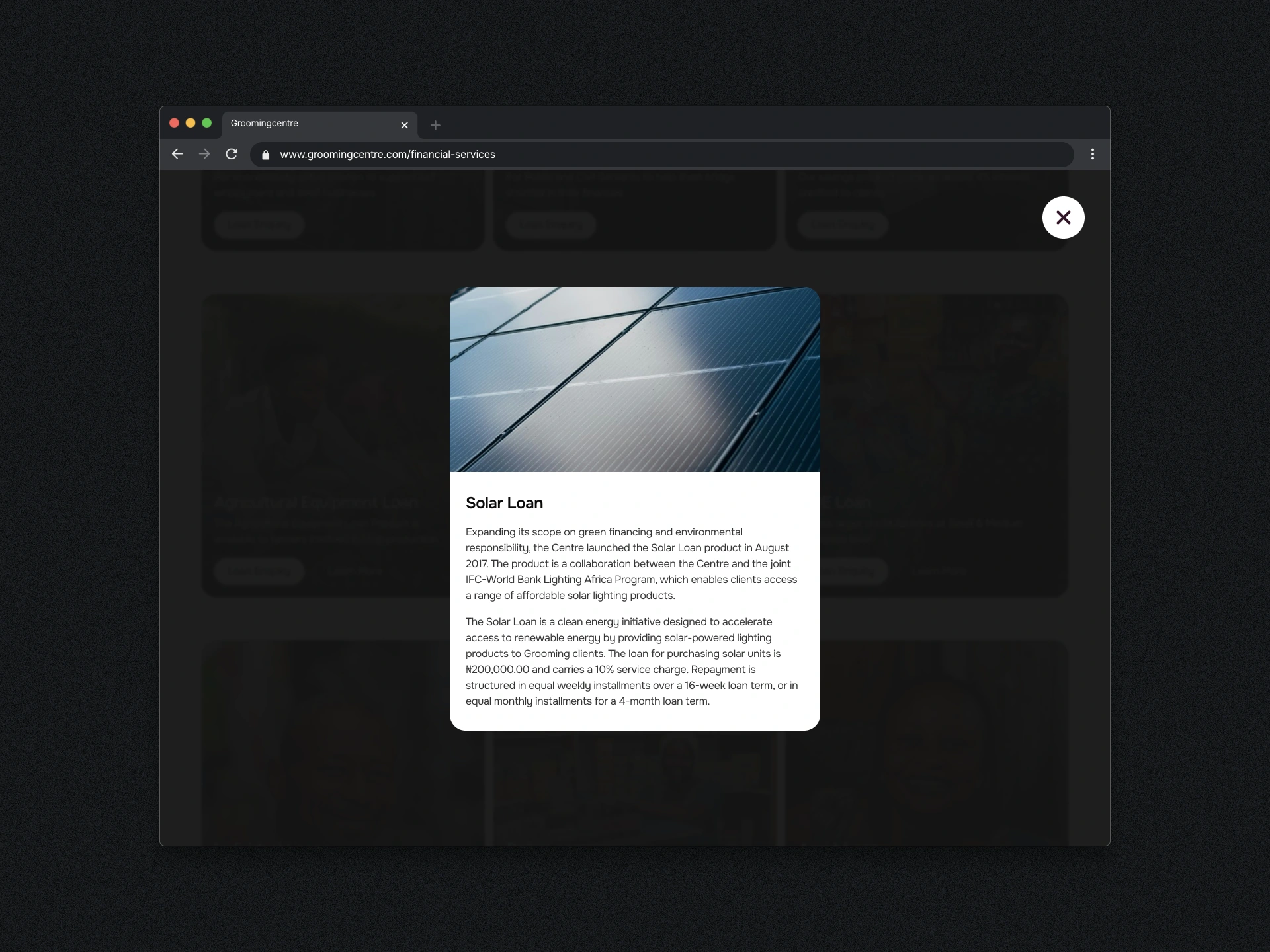
Product Modal
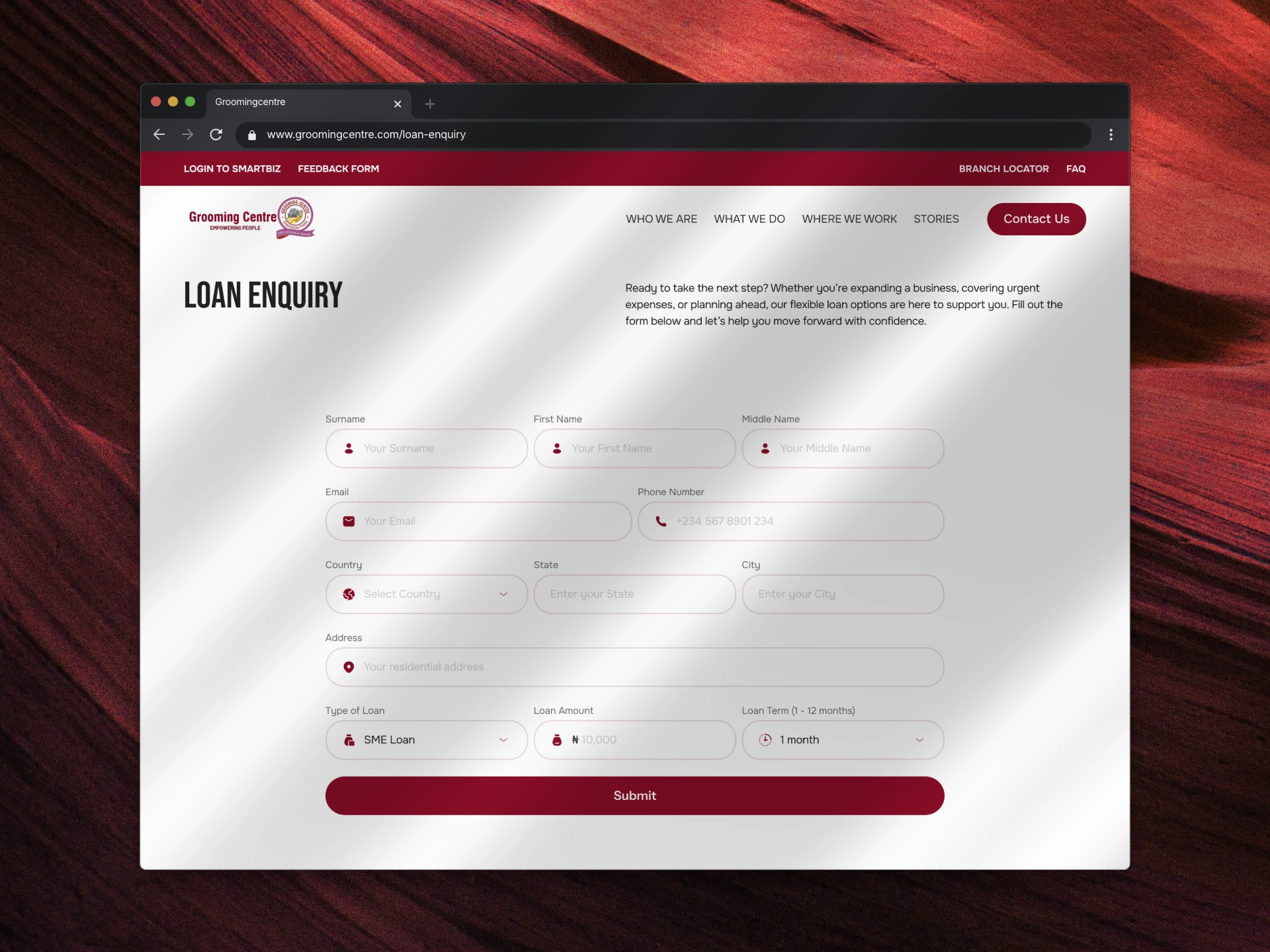
Loan Enquiry
Yes, it’s a form, but it was a great improvement on its former version. I designed it to be scannable, easy to fill by grouping fields semantically, and made it enjoyable by using easily identifiable and consistent icons.
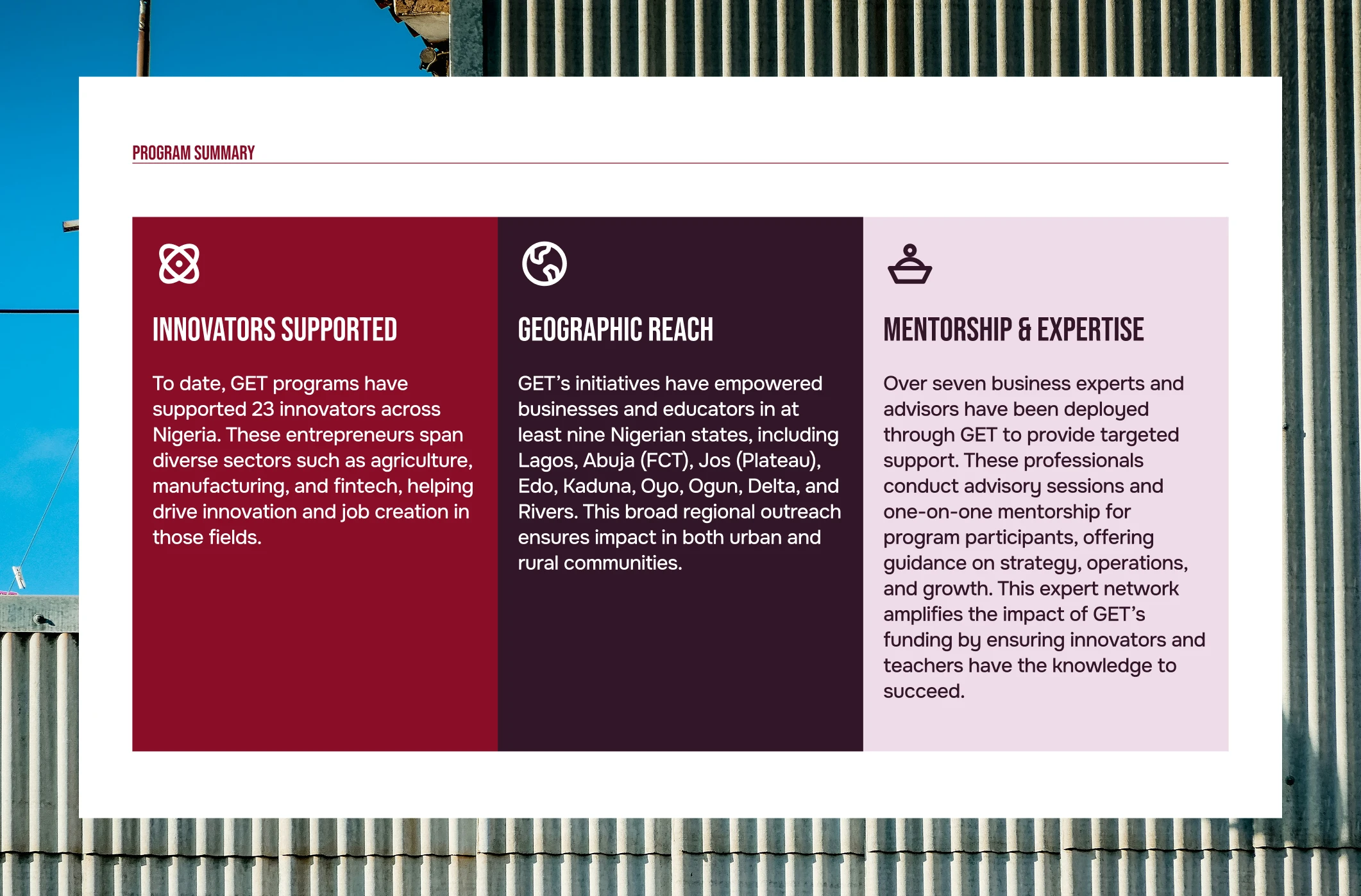
GET Program Summary
Simple solid grid with icons, but there’s something about the mix of colors here that I really love.
Conclusion
Honestly, there’s so much to love about how this website turned out. It’s easily one of the projects I’m most proud of—not just because it looks good, but because it feels right. Seeing the stakeholders’ reaction made all those late nights worth it. They were so impressed with the transformation that they moved a few more projects over to August Deep Technologies, which is the best kind of feedback we could ask for.
Visit Live Site
Looking to build a personal, studio, or business website that informs, creates trust in visitors and converts them to customers? Reach out to me now.
Like this project
Posted Mar 27, 2026
Redesigned Grooming Centre's website, enhancing UX and modernizing design.
Likes
1
Views
0
Timeline
Jul 7, 2025 - Aug 8, 2025
Clients
Grooming Centre