Product Design Projects in Federal Capital Territory
Product Design Projects in Federal Capital Territory
Sign Up
Post a job
Sign Up
Log In
Filters
2
Projects
People
Message
16
Abdul Ahmad
pro
Sugarbox App
16
166
Message
1
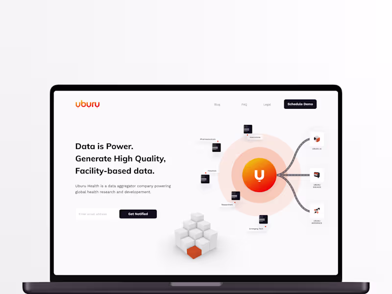
Chiedozie Okafor
Designing Uburu AI for African Health Data Accessibility
1
24
Message
0
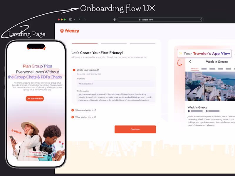
Moses & GrowthByDesign Team
Frienzy Pro Onboarding UX and Landing Page Design
0
27
Message
10
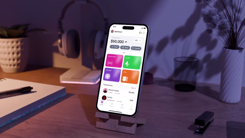
Shater Tsavsar
Fundify :: Fintech App
10
266
Message
3
Mustofa Al-Ameen Mustafa
pro
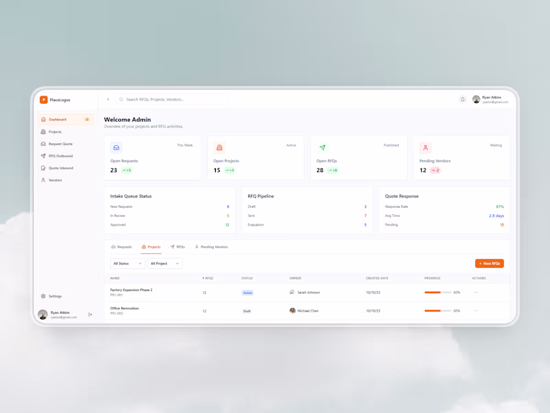
J.R. Merritt — Procurement Dashboard Redesign
3
54
Message
1
Timothy Exodus
pro
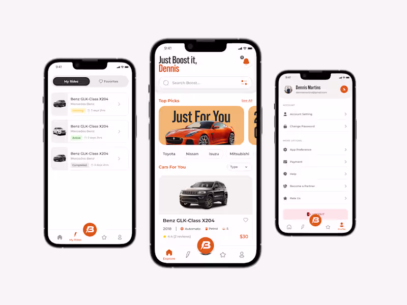
Car Rental Solution
1
26
Message
0
Hauwa Yusuf
pro
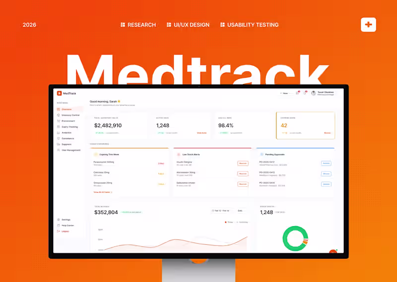
MedTrack: Pharmacy Inventory Dashboard
0
0
Message
2
Habiba Abdullahi 😎
pro
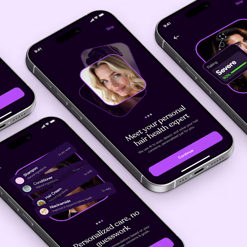
AI-Health Wellness Mobile App
2
121
Message
2
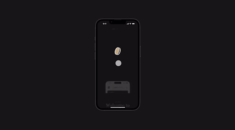
Charles Charlid
I created and animated these Coin and POS models in Blender and After Effects, but now I ended up with two variants. Which one do you prefer for a drop-down product showcase?
2
338
Message
1
almostbroke® Studio
Saving $6m through rapid explorations
1
12
Message
1
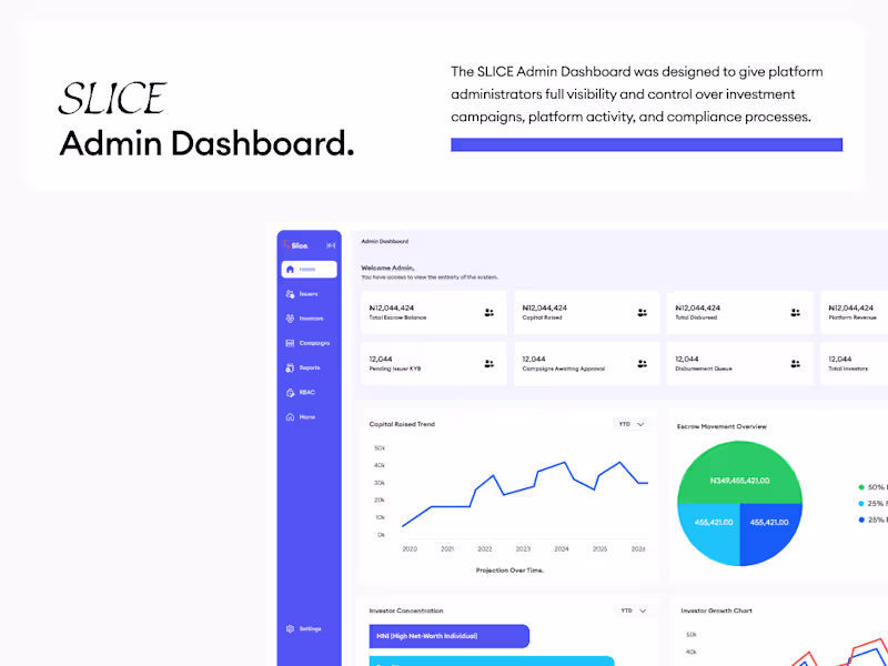
Eugene Adavore
pro
SLICE Admin Dashboard Design
1
4
Message
1
Paul Idenyi
I recently designed an eCommerce website for a fashion brand, Fashionista. The main thing I paid attention to was how people actually shop. When someone lands on a fashion site, they’re not trying to explore everything. They’re usually scanning quickly, looking for something that catches their eye. So the goal was to make it look so good and make people want to buy the moment they land. I kept the layout simple and clear and Bold, using strong product hierarchy The Products are easy to find, categories make sense, and made the product details page irrestible Every section had one job which is to guide the user closer to checkout So someone can go from landing on the site to finding something they like without overthinking it.
1
73
Message
1
Gabriel kayode
pro
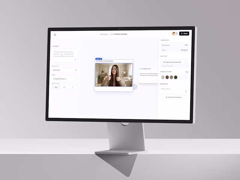
Designed an AI creator studio enhancing creative continuity.
1
2
Message
1
Joshua Ikhine
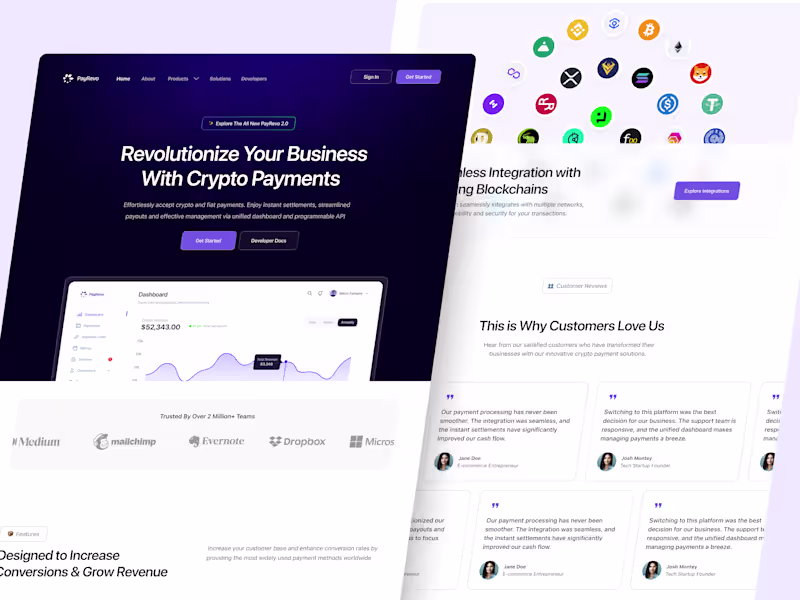
Payrevo - Website Design and Framer Development
1
4
Message
2
Toyin Daniel-Oluwagbiyi
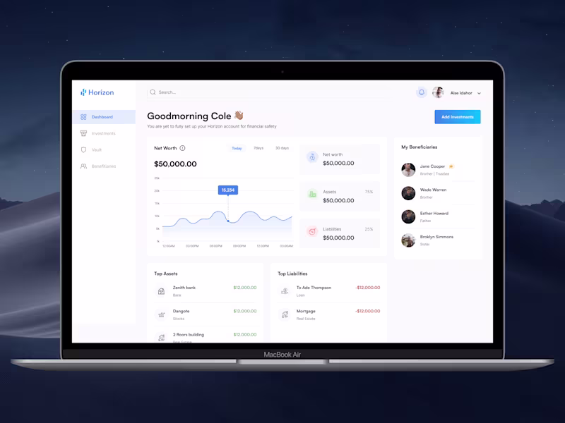
Horizon Digital Wealth Management Platform Design
1
2
5
Message
1
Daniel Andrew
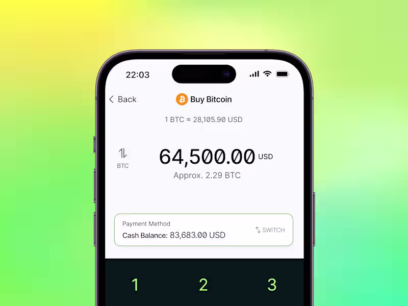
Speedy Wallet ⚡️
1
23
Explore projects