
Strategic & playful brand design for women-led brands✨🌸

Strategic & playful brand design for women-led brands✨🌸


Brand Designer, Illustrator, Motion Designer





Designing for connection ⋆˚꩜。

Designing for connection ⋆˚꩜。


Interactive / Animation / Web Development / Sound Design

Interactive / Animation / Web Development / Sound Design

Between Jan '22 and Aug '23, I teamed up with my friend Mike to create and animate 248 unique, hand-drawn and digitally painted isometric dioramas for a collection of digital artworks centered around a fictional place called Lyke Island.
What started as a creative side-experiment quickly grew into a full-scale world-building project – an intricate series of miniature environments that blend storytelling, pop culture, humour, and gamified collecting mechanics.
The project resonated far beyond what we expected, cultivating a passionate community of thousands of collectors!
A reminder that the tiniest spark can ignite entire worlds!
2
24
1.2K

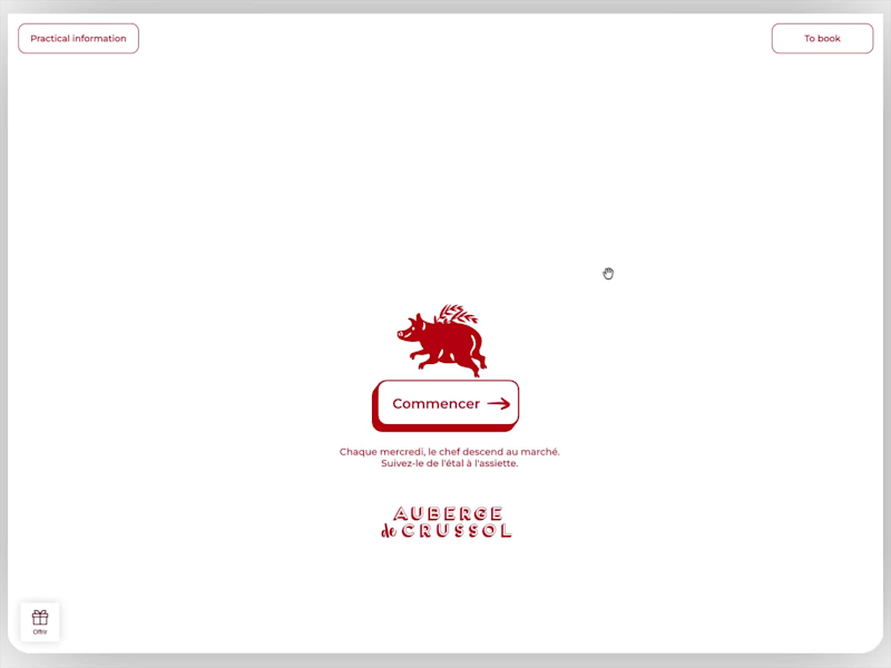
This summer I worked an interactive, animated webpage to showcase all the local producers who supply Auberge de crussol, unique French restaurant, in Saint-Péray, France.
The page was built entirely in @Rive, using the supplied vector illustrations to produce a series of animations and interactive moments that are triggered by the user's touch or cursor states.
Bespoke sound design was woven throughout the experience, with sound and movement tightly synchronised to add depth to the animation.
Credits:
Creative Director: @Bernard Magri
Rive Development, Animation, Sound Design: @Ashley Best
Additional Animation: @Gabriele Montinaro
Original Illustration: Le point D
(https://www.linkedin.com/company/le-point-d/)View the experience: Auberge de crussol (https://aubergedecrussol.com/)
27
79
3K
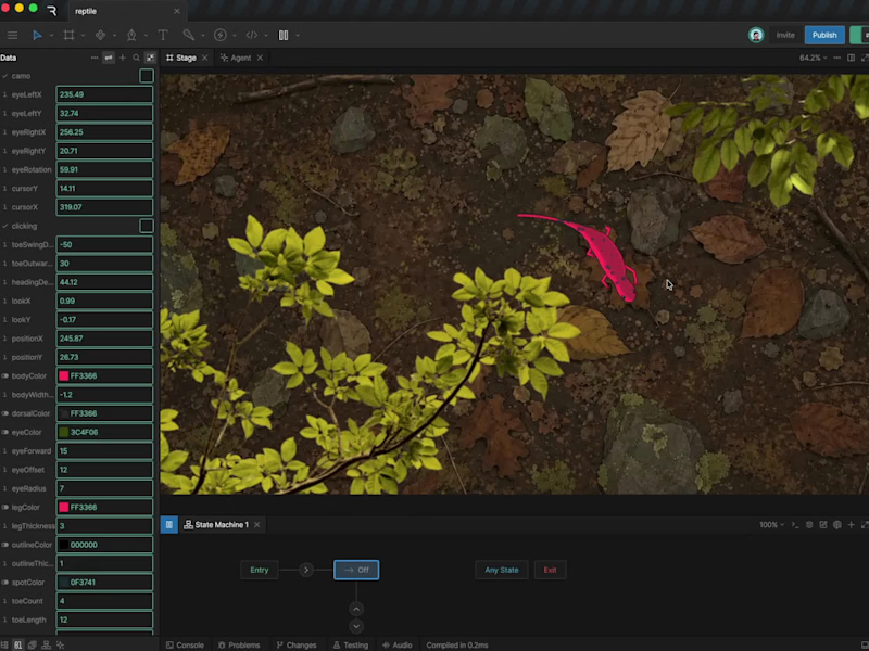
I've been locked-in on a big project, so I'm a late comer to this challenge, but I managed to carve out some time to create my entry!
Introducing: 'Luma', an inquisitive reptile who follows me around inside Rive! 🦎
Entirely script driven, she follows your cursor and can even change colour when she settles on her favourite rock.
It feels like the beginning of a little game I might have to keep developing!
Where should Luma go next?
60
202
9.1K


Design Partner for Frontier Tech



Creative Wizard for hire
Creative Wizard for hire


Design shapes the present, and Art nurtures our dreams. 💫
- 5.0
- Rating
- 18
- Followers
Design shapes the present, and Art nurtures our dreams. 💫


Seriously playful design.
- $1k+
- Earned
- 2x
- Hired
- 5.0
- Rating
- 91
- Followers
Seriously playful design.
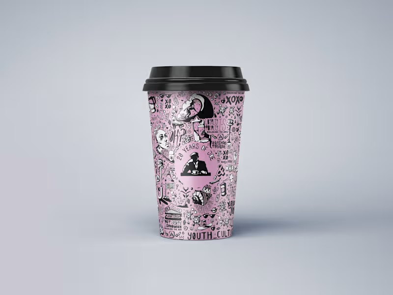
JOE & THE JUICE 20th Anniversary Artwork by FLM Studio (https://www.flm.studio)
To celebrate 20 years of JOE & THE JUICE, FLM Studio created a bold, hand-illustrated artwork celebrating two decades of energy, flavour and community, while staying rooted in JOE’s distinctive visual world.
Hand-drawn. Playful. Unapologetically indie. Packed with JOE-themed motifs, expressive characters and playful concepts, the artwork was designed to feel vibrant, energetic and unmistakably JOE.
A bespoke illustration created for JOE’s signature pink cups, with applications across packaging, social media and limited-edition merchandise.
#branding #branddesign #illustration #packaging #foodandbeverage
2
2
255
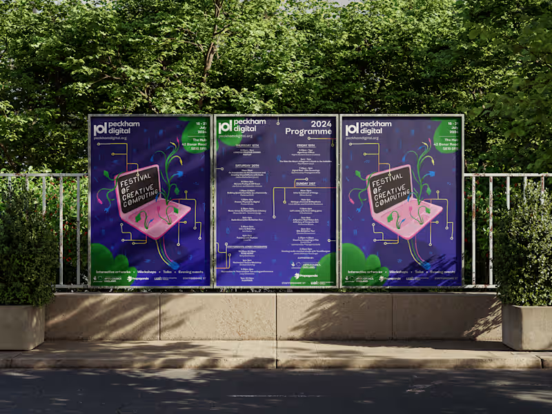
Peckham Digital (https://peckhamdigital.org) Festival of Creative Computing 2024 by FLM Studio (https://www.flm.studio)
Peckham Digital brings together artists, performers and creative technologists for a celebration of digital creativity in South East London. For its third edition, FLM Studio created an identity that brought creativity, humanity and computing together.
Entirely hand-drawn. Early digital graphics. Glitch aesthetics. DIY coding culture. The identity was designed to soften the often sterile feel of tech with something warmer, more expressive and human.
A flexible brand identity, custom illustration system, large-scale posters, signage and a full suite of social assets.
#campaignposter #posterdesign #brandidentity #illustration #festivalbranding
2
6
400
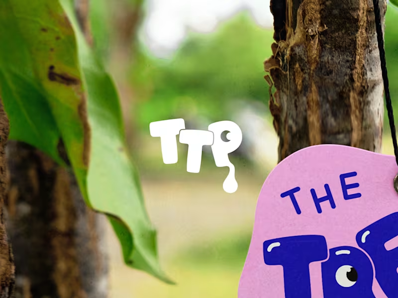
The Treat Plug Brand Identity | The UK's Favourite Freeze-Dried Sweets by FLM Studio
(https://www.linkedin.com/company/flm-studio/)The Treat Plug was born on TikTok back in 2020 with a product people were obsessed with, and a brand that hadn't been built yet. They came with a name, FLM Studio (https://www.linkedin.com/company/flm-studio/) built the rest.
Bold colour. Playful energy. A nostalgic hit with a modern edge. The identity was designed to stop the scroll and own a noisy market.
A full and comprehensive brand identity, custom illustrations, and pouch packaging from the ground up.
#branding (https://www.linkedin.com/search/results/all/?keywords=%23branding&origin=HASH_TAG_FROM_FEED) #branddesign (https://www.linkedin.com/search/results/all/?keywords=%23branddesign&origin=HASH_TAG_FROM_FEED) #brandidentity (https://www.linkedin.com/search/results/all/?keywords=%23brandidentity&origin=HASH_TAG_FROM_FEED) #packaging (https://www.linkedin.com/search/results/all/?keywords=%23packaging&origin=HASH_TAG_FROM_FEED) #packagingdesign (https://www.linkedin.com/search/results/all/?keywords=%23packagingdesign&origin=HASH_TAG_FROM_FEED)
6
19
1.5K
