Brand Design Projects in Doha
Brand Design Projects in Doha
Sign Up
Post a job
Sign Up
Log In
Filters
2
Projects
People
Message
4
Khaleed Ameen
pro
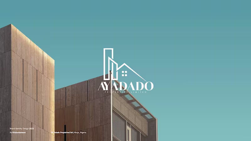
AY Adado Properties Ltd – Branding and Identity Design AY Adado Properties is a real estate and investment company redefining modern living in Africa. The brand was built around the idea of legacy—crafting homes and spaces that last generations. The visual identity blends strength and sophistication, with architectural precision and a timeless aesthetic inspired by modern minimalism and African heritage. This project focused on creating a brand that feels ambitious yet grounded. From the logo system to the color palette and typography, every detail was designed to reflect trust, craftsmanship, and vision. “Crafting Dreams. Building Legacies.” isn’t just a tagline—it’s the brand’s philosophy brought to life.
1
4
151
Message
0
Inch Graphica
pro
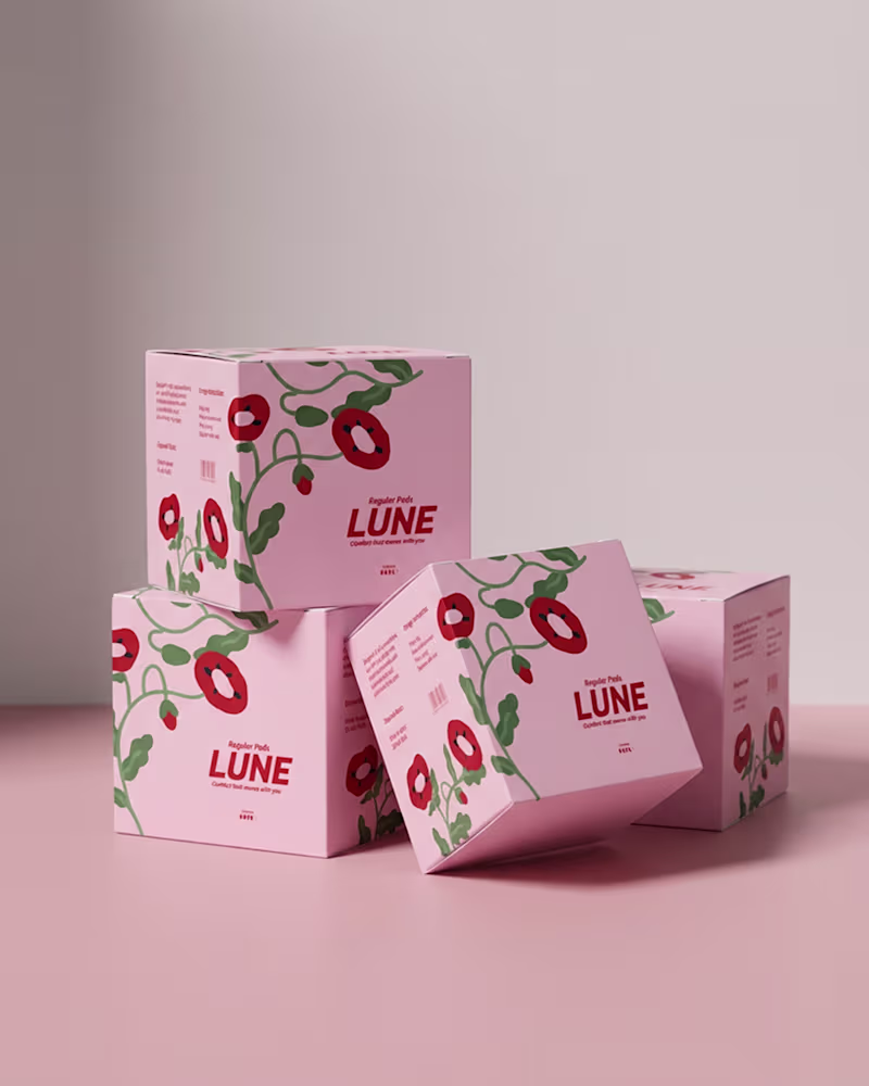
Design a Calm and Confident Brand Identity for LUNE Period Care
0
3
Message
0
Susana Fabre
pro
Souq Remix Collection: Tradition Meets Innovation
0
0
Message
2
Mohamed Greash
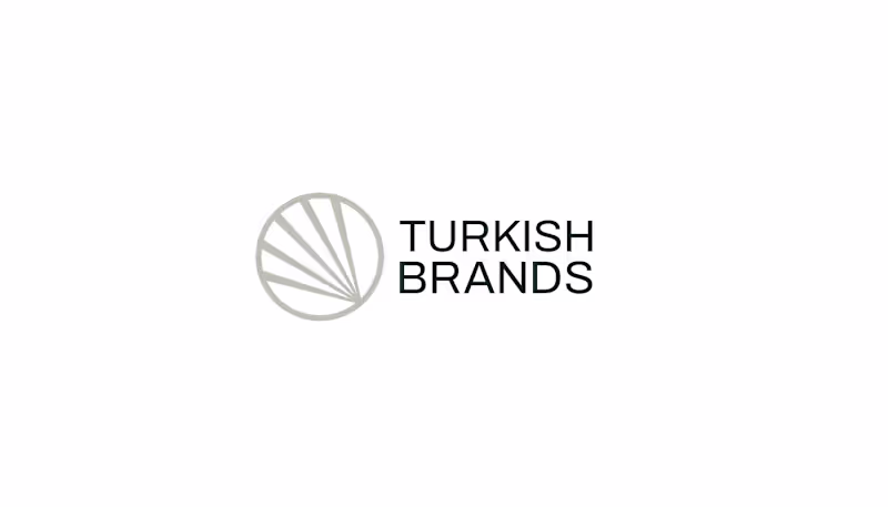
Turkish brands is more than just an ecommerce solution, It Provides every home with all it needs with a dedicated team to disassemble and install their products in various Arab countries. THE METAPHOR We start visual identity work with deep research of brand metaphors and attributes. Turkish Brands came up with ten main attributes to describe themselves, Our collaborative work led us to five main Products: Furniture, Kitchen gadgets, Carpets, Electrical Appliances, Decorations. THE Challenge The devil is in the details. To get the right feeling of a visual brand identity even the roundness of corners matters. And sometimes that leads to a design challenge, as it was in our case. The Icon is born to be sharp and edgy. Defining the shape took more time than usual, but at the end of the day we successfully overcame this challenge.
2
78
Message
0
Hiba Alouet
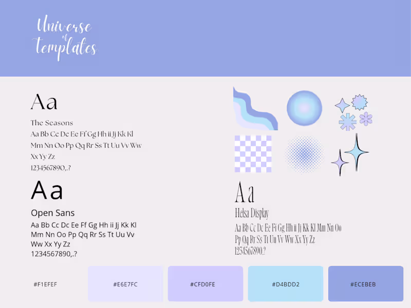
Branding & Social Media Design | Universe of Templates
0
13
Message
0
Salma Adam
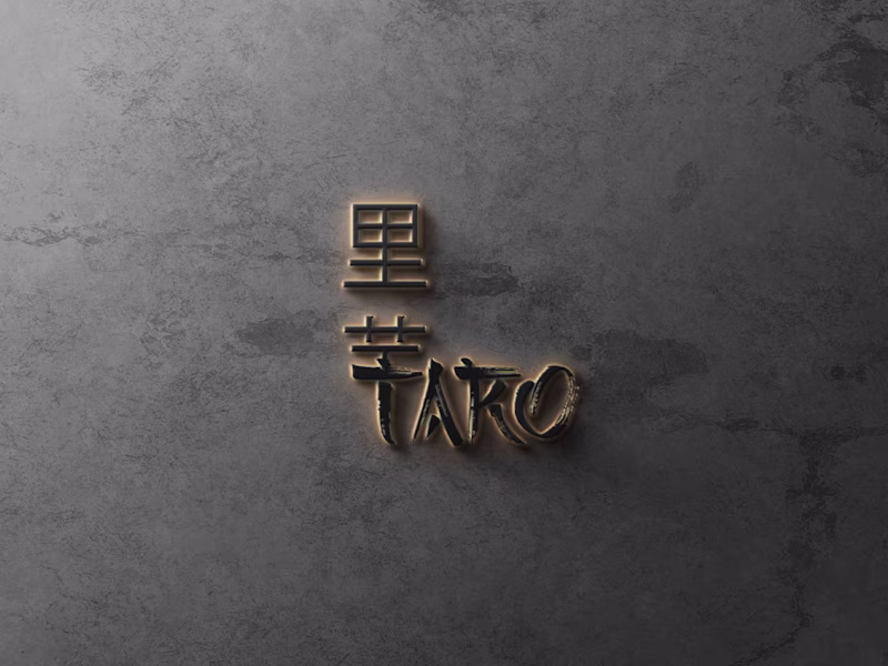
Taro Bakery
0
11
Message
0
Mark Ocharo
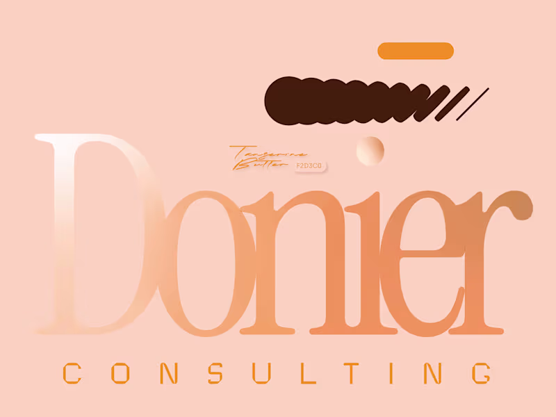
Donier Consulting
0
2
Message
0
Anfas Khan
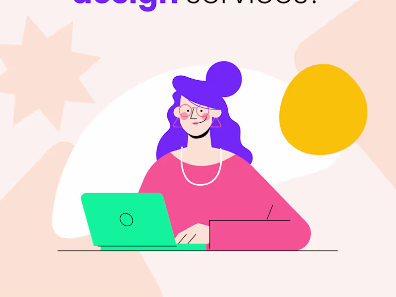
I will do Graphic design & Social Media Marketing
0
2
Message
0
Mahek Jamil
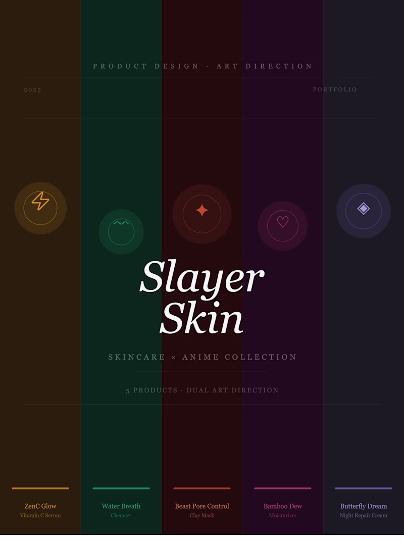
Slayer Skin | Skincare × Anime Product Design
0
3
Message
0
Asif Kazmi
Shapedbylish-Visual Identity
0
3
Message
0
Sayera | HOD
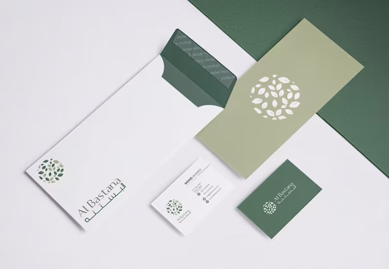
Al Bastana: Brand Guideline
0
13
Message
0
Kareem Magdi
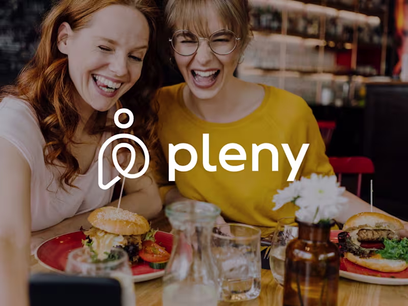
Pleny - Brand Identity
0
9
Message
0
Souhayb Graya
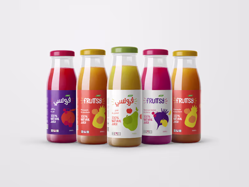
Fruitsy Juices Branding & Packaging :: Behance
0
4
Message
0
Khuloud SALIM
Fashion brand identity :: Behance
0
3
Message
1
Khaleed Ameen
pro
Khad Studio - Brand Identity
1
19
Message
0
Inch Graphica
pro
Designed a bold, high-energy identity
0
2
Explore projects