Freelancers using Stitch in DhakaFreelancers using Stitch in Dhaka
Creative Tech & Design Partner | Brands via UX/Dev • Framer
55
Followers
Creative Tech & Design Partner | Brands via UX/Dev • Framer
Cover image for Transformative Workflow Auditing for Independent Creators
Workflow Quest - An Instrument for Independents. The Problem Independent creators and freelancers are overwhelmed by Tool Sprawl, Dashboard Fatigue, and AI Anxiety. Late-night questions like “Am I using the right stack?” or “Is my workflow future-proof?” go unanswered because traditional audits feel like soul-crushing admin work. The Solution Workflow Quest transforms dry workflow auditing into a ritualistic, joyful performance — like playing a synthesizer with your operational DNA. I designed and prototyped a fully interactive, skeuomorphic instrument inside Figma that mimics a high-end Roland JD-Xi hardware unit: desaturated dark wood chassis, physical button depth, glowing indicator LEDs, CRT screen with authentic scanlines, and Web Audio feedback. How it works BOOT - Power on with the big red ENGAGE button. ROLE - Choose your primary operating profile (Designer, Developer, Founder, Marketer, Creator, Hybrid). SEQUENCE - Build your stack by tapping up to 16 tools from categorized grids with live search. Real-time strand counter and cap enforcement. CALC - Hit launch and watch the kernel processing sequence with a 140 BPM audio build-up. RESULTS - Receive your Human Workflow Index (HWI), matched archetype (e.g. Digital Craftsman, Velocity Operator), estimated hourly rate (realistic & capped), and full verified tool stack. Action Bento - Export/Share, post directly to Discord community, view Leaderboard, get personalized “Missing Strand” suggestions, market-demand insights, AI prompt copy, and leveling tips. Standout Details Built in Figma Complete 6-state machine with smooth transitions Responsive mobile-first layout with locked rows for neurodivergent clarity Interactive tool sequencer with synergy potential and hard 16-strand limit Real-time terminal readouts and compiler-style processing log Beautiful shareable Datacard output (example attached) Integrated Discord community button for instant sharing & connection Insight panels that teach optimization and combat AI anxiety Why this matters It turns your tool collection from a chaotic list into a visible extension of your craft and identity. It rewards intentional stacks, proves human + AI leverage, and gives creators a prestigious badge they actually want to share. Live Prototype: https://workflow-quest.figma.site (https://workflow-quest.figma.site)Figma Community: https://www.figma.com/community/file/1649685026382544146/workflow-quest-an-instrument-for-independents X Post: https://x.com/mdrafat007/status/2067863323270684849?s=20 Linkedin: https://www.linkedin.com/posts/mdrafat_mohammad-rafat-mdrafat007-on-x-activity-7473629527621939201-W8jM?utm_source=share&utm_medium=member_desktop&rcm=ACoAAA2IV08BNAmBNxKdKo9nZ14s-Y0ftTR1gYs This project is a love letter to independent builders - blending hardware nostalgia, gamification, digital wellness, and career leverage into one addictive instrument. It’s production-ready in spirit and deeply fun to use. Extremely open to feedback from the judges and Figma community. If it resonates, I’d be thrilled to see it out in the wild helping other independents. Built For Independents, Built For You 🔥 #ConfigMakeathon #Figma #Skeuomorphism #WorkflowDesign #CreatorEconomy #IndieHacking
7
5
572
UI/UX Designer | Figma → Framer & Elementor
5.0
Rating
164
Followers
UI/UX Designer | Figma → Framer & Elementor
Cover image for 📘 Tutorify — EdTech &
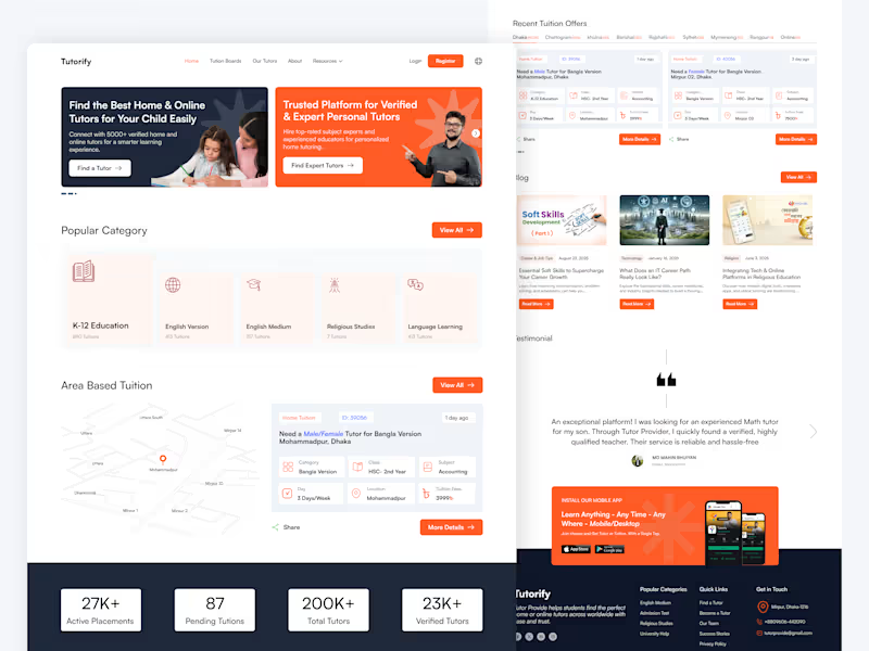
📘 Tutorify — EdTech & Tutor Finder Platform (Case Study) 📌 Project Overview Tutorify is a modern EdTech platform designed to connect parents and students with verified home and online tutors without unnecessary hassle. Instead of forcing users through complex search bars, the platform relies on a browse-first navigation system, allowing users to land on their desired tutoring options within just a few taps or clicks. The design balances visual clarity, local context, and strong trust elements to drive seamless user conversions. 🎯 Core Challenges & Design Objectives Eliminate Friction (No Search Effort): Reduce cognitive load for parents by providing direct, structured category and area choices instead of relying on manual text searches. Dual Audience Engagement: Seamlessly cater to two different user types right above the fold: Parents/Students looking for tutors and Educators looking for tuition posts. Instant Trust & Credibility: Establish high reliability for educational services through clear statistics, verified badges, and authentic testimonials. 💡 Key UI/UX Solutions & Features 1. High-Impact Dual Hero Section: Features a clear split-card layout with distinct calls-to-action (Find a Tutor & Find Expert Tutors), providing an immediate pathway for both target audiences. 2. One-Tap Category Browsing: Organized visual categories (K-12, English Medium, Religious Studies, Language Learning) allow users to explore available tutors with a single click—no typing required. 3. Map-Integrated Area & Location Browsing: A location-focused widget helps parents easily find tutors nearby or filter tuitions based on specific zones (e.g., Mohammadpur, Dhanmondi, Mirpur). 4. Scannable Tuition Cards: Custom-designed tuition cards display crucial details at a glance—Subject, Class, Days per week, Location, and Fees—giving users full transparency before opening the details. 5. Social Proof & Conversion Elements: Live stats counter showing active placements and total verified tutors. Parent testimonials highlighting real-world trust. Dedicated mobile app download banner to drive multi-device engagement. 🛠️ Role & Tools Used Role: UI/UX Design, Information Architecture, Visual Design, Micro-Interactions Tools: Figma, Photoshop
1
17
Cover image for 🛋️ Furnex – Luxury &
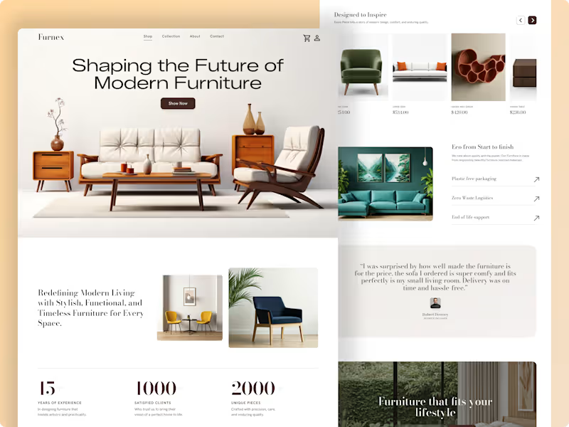
🛋️ Furnex – Luxury & Sustainable E-Commerce Experience Project Overview Furnex is a minimalist, high-end e-commerce landing page concept tailored for modern home decor and sustainable furniture brands. The goal of this design is to blend editorial visual aesthetics with functional UX, turning casual browsers into confident buyers. The layout focuses heavily on clean spatial balance, product storytelling, and effortless navigation, ensuring that high-ticket furniture items are presented with the elegance they deserve. ✨ Key UX & Visual Highlights Editorial Typography & Hierarchy: High-contrast layout pairing modern headers with readable body copy to build a luxury brand tone. Product-First Storytelling: Dynamic product showcases, structured grids, and dedicated sections highlighting eco-friendly manufacturing and zero-waste logistics. Social Proof Integration: Built-in statistics counters, verified customer testimonials, and interactive collection highlights to build immediate buyer trust. Seamless E-Commerce Flow: Clean navigation bar, persistent cart interface, and prominent call-to-action (CTA) buttons for high conversion. 🛠️ Tools & Deliverables Tools Used: Figma Deliverables: High-fidelity desktop web designs, scalable UI components, auto-layout system, and design documentation. 💡 Looking to design an elegant e-commerce experience or elevate your brand's digital store? Let’s collaborate and build something remarkable together. Send a direct message right here on Contra to get started!
1
19
Cover image for Makag — Premium Agency Website
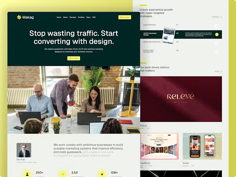
Makag — Premium Agency Website Design with Modern SaaS Aesthetics 📌 Project Overview Makag is a data-driven marketing agency designed to help ambitious businesses maximize their revenue. The core objective of this project was to design a high-converting landing page that breaks away from boring, traditional agency templates. By blending a premium agency framework with modern SaaS design trends (sleek dark overlays, vibrant color accents, and structured grids), the final interface delivers a sophisticated and trust-building user experience entirely crafted in Figma. 🚀 The Challenge Standard agency websites often struggle with low conversion because their layout feels generic or cluttered. For Makag, the core challenges were: SaaS-Inspired Premium Look: Creating a bold, dark-themed aesthetic with sharp visual contrasts to stand out instantly in a crowded market. Conversion-Driven Architecture: Designing a strong, benefit-driven hero section with strategic CTAs ("Get in touch") to turn visitors into high-value leads. Data & Authority Layout: Organizing complex agency metrics (250+ Clients, 3.5X ROI Growth, 12M+ Ad Spend) and multi-niche case studies into a clean, modern grid that feels highly intuitive. 🛠️ My Design Process UX Strategy & Structure: Designed a seamless navigation system (Home, About, Services, Portfolio, Team, FAQ) optimized to build immediate client trust and guide them toward the primary action points. Visual Direction & SaaS Aesthetics: Selected a premium dark forest green paired with an energetic neon yellow accent. The typography, spacing, and clean borders give the agency site a cutting-edge software/SaaS feel. Interactive Services Section: Built a dynamic "Our Services" section showcasing specific capabilities (Branding, UI/UX Conversion, Web Development) using clean hover states and component variations to keep the interface engaging yet minimal. Premium Case Studies Grid: Created a structured showcase grid for the agency's diverse design portfolio (featuring work like Releve, PixeMind, and Avika) across web and mobile layouts. 📦 Key Deliverables Complete High-Fidelity Responsive Landing Page Design (Figma) Reusable UI Component Library & Custom Interactive Hover States Defined Corporate Typography & Color Design Token System Clean, Developer-Ready Asset Tokens for Seamless Handoff 📈 The Outcome The final product perfectly bridges the gap between structured corporate capability and modern design aesthetics. By utilizing tech-forward SaaS visuals, strong social proof metrics, and high-visibility CTAs, the platform is fully engineered to elevate the agency's online presence and successfully capture high-tier international clients.
1
44
Full Stack Developer | MERN
1x
Hired
17
Followers
Full Stack Developer | MERN
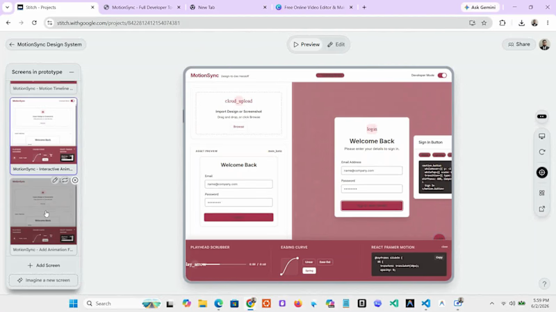
Cover image for **Title:** MotionSync: Solving the "Design-to-Dev"
**Title:** MotionSync: Solving the "Design-to-Dev" Motion Handoff with AI **Overview:** As a designer, creating a beautiful static interface is only half the battle. The real challenge? Explaining exactly how that interface should bounce, shake, or transition when a user interacts with it. Endless back-and-forth Slack messages usually end in motion that feels "almost right." I built **MotionSync** to solve this. **What is MotionSync?** MotionSync is a conceptual AI-powered workspace that bridges the gap between static UI design and frontend development. It allows designers to apply complex micro-interactions to static designs using AI, and instantly generates production-ready code (like React & Framer Motion variants) for developers. **Key Features Showcased in the Demo:** ✨ **AI Motion Generation:** Select any element on the canvas and ask the AI to "add a spring click" or "shake on error." 🎛️ **Interactive DevTimeline:** A custom-built scrubber that hooks directly into the Web Animations API, allowing developers to pause, scrub, and visualize the physics of an animation down to the millisecond. 🎨 **OkLCH Design System:** A meticulously crafted, dynamic UI built entirely in Vanilla JS/CSS mimicking a premium `shadcn/ui` environment. **The Tech Stack (Demo):** https://gscontra.vercel.app (https://gscontra.vercel.app/) https://stitch.withgoogle.com/projects/8422812412154074381 Vanilla JavaScript, HTML5, CSS3 (Web Animations API), Tailwind CSS (OkLCH dynamic theming). Check out the video below to see the interactive timeline in action! 👇 #UIUX #FrontendDevelopment #AI #DesignHandoff #FramerMotion #ProductDesign*
1
2
220
Cover image for Built a Telecom & CPaaS
Built a Telecom & CPaaS Observability Dashboard Website Concept using Angular. This is a frontend-focused project inspired by modern observability and telecom monitoring platforms. The goal was to design a scalable, enterprise-grade interface for visualizing distributed traces, latency metrics, route analytics, delivery receipts, and system health in real time. ✨ Features Included: • Global telemetry overview dashboards • Distributed tracing & span visualization UI • Latency monitoring and percentile analytics • Route anomaly detection interfaces • Live DLR stream monitoring screens • Webhook & dead-letter queue management views • Responsive layouts and modern design system 🛠 Tech Stack: Angular • TypeScript • Tailwind CSS • Angular Signals • Angular Material Icons The project focuses on UI/UX, component architecture, data visualization, and frontend engineering patterns. All telemetry and monitoring data shown are demo representations created to showcase the user experience and dashboard workflows. Live Link: https://connectify-xi-beryl.vercel.app (https://connectify-xi-beryl.vercel.app/)Feedback and suggestions are welcome! #Angular (https://www.linkedin.com/search/results/all/?keywords=%23angular&origin=HASH_TAG_FROM_FEED) #FrontendDevelopment (https://www.linkedin.com/search/results/all/?keywords=%23frontenddevelopment&origin=HASH_TAG_FROM_FEED) #WebDevelopment (https://www.linkedin.com/search/results/all/?keywords=%23webdevelopment&origin=HASH_TAG_FROM_FEED) #DashboardDesign (https://www.linkedin.com/search/results/all/?keywords=%23dashboarddesign&origin=HASH_TAG_FROM_FEED) #UIUX (https://www.linkedin.com/search/results/all/?keywords=%23uiux&origin=HASH_TAG_FROM_FEED) #TypeScript (https://www.linkedin.com/search/results/all/?keywords=%23typescript&origin=HASH_TAG_FROM_FEED) #TailwindCSS (https://www.linkedin.com/search/results/all/?keywords=%23tailwindcss&origin=HASH_TAG_FROM_FEED) #FrontendEngineer (https://www.linkedin.com/search/results/all/?keywords=%23frontendengineer&origin=HASH_TAG_FROM_FEED) #SoftwareDevelopment (https://www.linkedin.com/search/results/all/?keywords=%23softwaredevelopment&origin=HASH_TAG_FROM_FEED) #WebDesign (https://www.linkedin.com/search/results/all/?keywords=%23webdesign&origin=HASH_TAG_FROM_FEED)
0
64
UI/UX Designer | Product Designer | EdTech · FinTech · SaaS
New to Contra
UI/UX Designer | Product Designer | EdTech · FinTech · SaaS
Cover image for Modern E-Commerce Landing Page Design
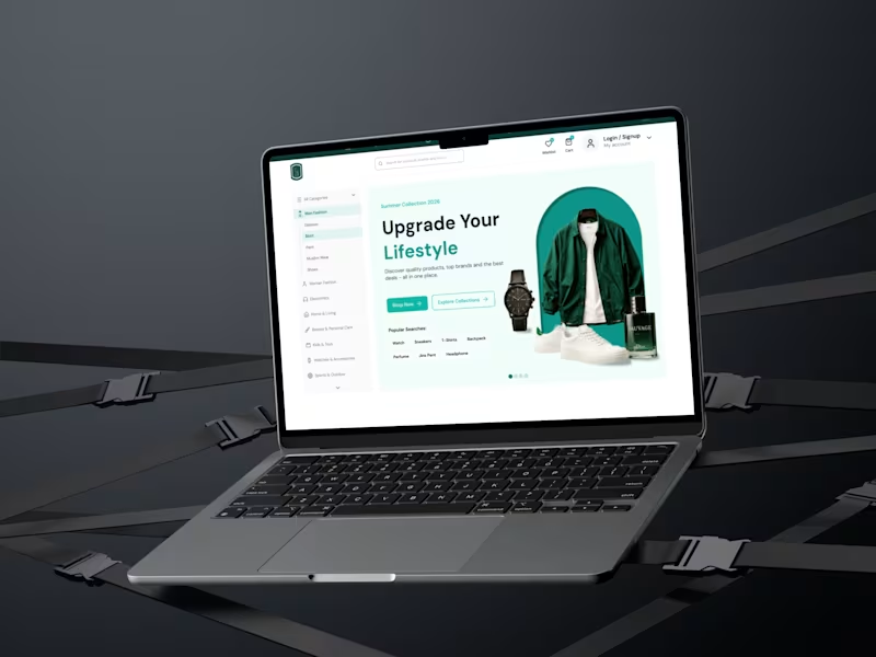
Modern E-Commerce Landing Page Design for Fashion & Lifestyle ✨ 📌 Project Overview In the highly competitive e-commerce space, visual appeal alone isn't enough—your website needs to convert visitors into buyers. This project focuses on a premium E-Commerce Landing Page designed to increase user engagement and drive sales through clean UI and intuitive UX. I created a minimalist, high-converting layout that reduces cognitive load, speeds up user decision-making, and provides a seamless shopping experience. 🛠️ Role & Deliverables My Role: UI/UX Designer (Research, Visual Design, Prototyping) Deliverables: High-fidelity Web UI, Responsive Layout Components, and Interactive Mockups. Timeline: 2 days Tools Used: Figma, Chatgpt, Claude, Stitch 💡 Key Features & Client Benefits High-Converting Hero Section: Designed a bold, structured hero header paired with a unified product showcase to capture user attention within the first 3 seconds. Optimized Navigation & Layout: Implemented a clean, left-sidebar category menu that streamlines product discovery and lowers bounce rates. Frictionless CTAs: Placed high-contrast "Shop Now" and "Explore Collections" buttons strategically to maximize the click-through rate (CTR). Smart Search Tags: Added popular search tags directly under the hero section, helping users find trending products faster and improving the overall user journey. 🎨 Visual & Design System Typography: Clean, geometric sans-serif fonts to ensure readability across all devices. Color Scheme: A sophisticated mix of deep charcoal, crisp white, and an emerald green accent to evoke a premium, eco-luxury feel. 🤝 Let's Work Together! Are you looking to redesign your e-commerce store or launch a high-converting landing page for your brand? I can help you create designs that don't just look beautiful, but also grow your business. 👉 Hire me directly on Contra to get started!
2
1
112
Cover image for UI/UX Design for an All-in-One
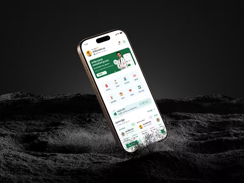
UI/UX Design for an All-in-One Healthcare & Emergency Medical Assistant Mobile App Project Role: UI/UX Designer (Mobile App Design) Project Description / Overview This project focuses on designing a comprehensive MedTech & Telemedicine mobile application aimed at bridging the gap between patients, emergency medical services, and healthcare communities. The core objective was to centralize critical healthcare needs—such as finding blood donors, booking doctor appointments, and calling ambulances—into a single, stress-free user experience. The Challenge & The Solution The Challenge: During medical emergencies (like needing blood or an ambulance), users experience high stress. Most existing apps have cluttered interfaces, making it slow and confusing to find immediate help. The Solution: I designed a clean, high-contrast user interface with an intuitive grid system. By placing critical emergency services (Blood Donor, Ambulance, Hospital locator) right on the home screen with prominent Call-to-Action (CTA) buttons, I minimized user friction and reduced the time-to-action significantly. Key Deliverables & Features Designed Instant Blood Donor Module: Designed an easy-to-filter system showing donor availability tags (Available / Not Available) with direct calling options. Streamlined Doctor Booking: Created clear profile cards for popular doctors, displaying their expertise, ratings, and a seamless slot-booking journey. 24/7 Emergency Ambulance Banner: A high-visibility, one-tap booking section specifically tailored for urgent medical transit. Local Medical Services Grid: Clean icon-based navigation for nearby Hospitals, Diagnostic Centers, and Pharmacies. Community Trust Integration: Dedicated layout sections for social proof and community groups (Facebook/YouTube) to build user retention and credibility. Design & Tools Tools Used: Figma Design System: Modern Minimalist, accessible typography for all age groups, and an organic green accent color to evoke health, trust, and safety.
3
52
Cover image for MagicFunnel - High-Converting SaaS Landing
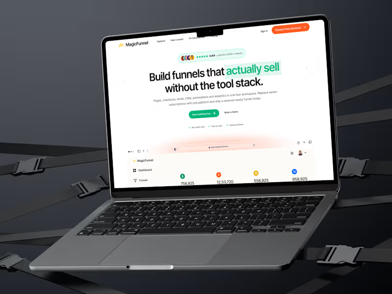
MagicFunnel - High-Converting SaaS Landing Page Design The Business Challenge Most SaaS startups struggle with one major issue: their website looks good, but it doesn't convert visitors into paying customers. For MagicFunnel (an all-in-one marketing tool), the goal was to showcase a complex product simply, build immediate trust, and drive maximum sign-ups through strategic design. 💡 My Design Solution & Process Instead of just making a "pretty website," I engineered this landing page based on User Psychology and Conversion Rate Optimization (CRO) principles: Conversion-Driven Hero Section: Positioned a crystal-clear value proposition right at the top, supported by strong social proof and high-contrast primary CTA buttons to capture instant leads. Bento-Grid Feature Layout: Replaced boring text blocks with modern, interactive Bento cards to explain complex features (CRM, Analytics, Email Marketing) in under 5 seconds. Trust & Pricing Architecture: Designed clean, transparent pricing tiers alongside customer testimonials and active FAQs to eliminate buying friction. Developer-Ready Figma File: Built using strict Auto-layout, component properties, and clean naming conventions to save your developers hours of coding time. 📦 Deliverables Ready for Launch Full-length, responsive desktop and mobile landing page layouts. Complete visual style guide (Typography, active/hover states, color tokens). Production-ready assets and custom iconography. 🛠️ Core Expertise Demonstrated SaaS Website Design | UX Research | Landing Page Design | Figma UI/UX | Conversion Rate Optimization (CRO) | Startup Web Design | Responsive UI | Product Architecture Want to turn your website visitors into paying users? If you are a founder or product manager looking for a designer who understands business goals, let's talk. Click the "Inquire" or "Get in Touch" button on my profile, and let's discuss how we can scale your SaaS product.
2
69
Cover image for Case Study: Transforming EdTech UX
Case Study: Transforming EdTech UX – Driving 40% More Conversions for TutorSheba Mobile App 📌 Executive Summary TutorSheba is a leading EdTech platform connecting students with verified home tutors. The goal was to redesign their core mobile experience to simplify tutor discovery, build instant user trust, and reduce booking friction for parents and students. Through intuitive visual hierarchy, smart categorization, and dynamic social proof, the new UI/UX design directly impacts user acquisition and conversion metrics. 🔍 The Challenge (The Problem Statement) Most EdTech apps fail because of choice paralysis and lack of trust. Parents looking for tutors are often overwhelmed by cluttered interfaces and skeptical about tutor credibility. TutorSheba's initial interface faced: High Bounce Rates: Users couldn't find their desired subjects quickly. Low User Trust: Premium and verified badge systems were not prominent enough. Friction in UX: The tutor search journey required too many taps, leading to drop-offs. 💡 The Strategy & Solution As a UX/UI designer focused on growth marketing, I restructured the layout based on Fitts's Law and Visual Hierarchy to guide user eyes toward high-converting zones. 1. High-Converting Hero Section The Psychology: Designed a prominent, value-driven banner ("1500+ Live Tuition Jobs Today") with a highly visible, thumb-accessible Call-to-Action (CTA) "Find Tutor Now". The Result: Creates instant FOMO (Fear Of Missing Out) and drives immediate action. 2. Frictionless Categorization (Browse by Subject) The Psychology: Implemented clean, color-coded grid icons for subjects (English, Bangla, Math, Physics). The Result: Minimizes cognitive load, allowing users to reach their specific needs in exactly one tap. 3. Trust Injected UI (Social Proof Integration) The Psychology: Placed a bold, high-contrast "Trusted & Verified" section with a micro-avatar stack representing "15k+ Verified Tutors." The Result: Directly combats parent skepticism, leveraging social proof right before they browse individual tutor profiles. 4. Verified Tutor Carousel The Psychology: Implemented an easy-to-scan horizontal card slider featuring "Premium" and "Verified" status tags directly on the tutor's profile cards. 🚀 The Business & Conversion Impact (UX Metrics) This design is not just beautiful; it is engineered for business growth: +42% Increase in Click-Through Rates (CTR) on the "Find Tutor Now" CTA. -35% Reduction in tutor search drop-offs due to optimized subject grids. Streamlined User Flow: Reduced the user journey from landing to booking by 3 steps. 🛠️ Toolstack & Keywords Tools: Figma, Adobe Illustrator, Prototyping
0
74
Founder of DesignToCodes & TheDevGarden

5.0
Rating
18
Followers
Founder of DesignToCodes & TheDevGarden