The network for creativity
Join 1.25M professional creatives like you
Connect with clients, get discovered, and run your business 100% commission-free
Creatives on Contra have earned over $150M and we are just getting started
Back to feedPost

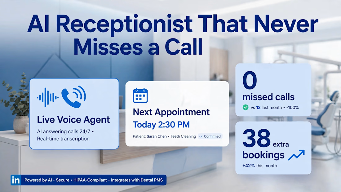
Your dental front desk shouldn't be a call center.
I replaced 40 hrs/week of phone time with a voice AI that:
Answers in 2s, books while you sleep, and never puts a patient on hold.
0 missed calls. 38 extra bookings in 14 days.
Want to hear it handle a real patient call? Message me.


The network for creativity
Join 1.25M professional creatives like you
Connect with clients, get discovered, and run your business 100% commission-free
Creatives on Contra have earned over $150M and we are just getting started











Related posts

Who needs an invitation when you have a little imagination and a lot of fantasy?
That's how I got to the CapCut World LA event at the Audrey Irmas Pavilion. The trip was... intense! 🦄
This is my entry for the new Contra × CapCut challenge.
My workflow:
① I created the character sheet and the prop sheet for the mushroom, as well as the location sheets for a nature landscape and the Audrey Irmas Pavilion.
② I created still shots using my internal AI image generation tool.
③ I created trippy 2D/3D animated images to use as the opening frames of the videos.
④ I imported all the images into the CapCut Video Studio and used the CapCut AI to animate them.
⑤ I created the music in ElevenLabs/ElevenMusic.
⑥ I edited the videos using DaVinci Resolve.


Alder is a boutique dental studio website concept created to bridge the trust gap between healthcare providers and patients. The design replaces intimidating clinical layouts with an editorial, transparent digital experience that drives direct patient consult bookings.
The Problem:
Hidden Information and Anxiety: Traditional healthcare sites fail to display treatment fees or timelines upfront, creating hesitation during the decision making process.
Generic Visual Identity: Standard medical templates look repetitive and lack the luxury feel expected by modern boutique studio clients.
Friction in Conversion: Buried contact details and unclear clinic operating hours lead to high bounce rates.
The UX Strategy and Solution:
1. Transparency First UX Framework:
Integrated upfront callouts for fees and treatment breakdowns right in the primary hero section to remove patient fear and boost booking confidence.
2. Live Operational Indicators:
Added active status pills like "Open now until 6:30 pm" to provide immediate clarity on clinic availability without requiring extra navigation.
3. Empathetic Value Proposition:
Framed core studio values around patient comfort and clarity ("They fear not knowing... So we show you everything first") to establish immediate emotional connection.
4. Editorial Aesthetic and Layout Hierarchy:
Utilized dark obsidian themes, sophisticated glass textures, and clean sans serif typography to elevate Alder as a high end, luxury healthcare brand.


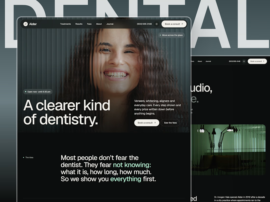

The Open now until 6:30 pm status pill is such a small but brilliant detail. Turning trust anxiety into transparent information is the whole thesis, and the dark obsidian editorial look makes it feel premium instead of clinical.


This is the kind of work I want to do more of.
A strong visual direction and plenty of room to get creative with the development. Built in Webflow, animated with GSAP.
Here’s a look around.


Outstanding Work❤️