The network for creativity
Join 1.25M professional creatives like you
Connect with clients, get discovered, and run your business 100% commission-free
Creatives on Contra have earned over $150M and we are just getting started
Back to feedPost

Your website has the right to remain silent.Unfortunately, so do your enquiries.
⚖️ If finding your contact button takes six pages and a witness statement, something needs to change.
So I put a website on trial.
The charges? Hiding the next step. Turning a simple purchase into homework.
Mistaking confusion for “exclusivity.”
Behind the courtroom jokes is a practical design principle: people should understand what you offer, why it matters and what to do next.
This MONOFORM concept explores that through architectural imagery, detailed product layouts and a clearer mobile experience.
I design and build with Framer, Webflow and Next.js.
Planning a launch or redesign? Send me your current website and what you need it to do.
What website feature deserves a day in court?
My vote: pop-ups that appear before you’ve read a single sentence.
MONOFORM is a fictional brand concept.
#WebDesign #Framer #Webflow #Nextjs


I don't think that the website has the right to remain silent honestly. Otherwise - why do you do it, right? Although I bet it was a rethorical!

Spot on. The 'mystery meat navigation' that hides the contact button is definitely guilty. Love the courtroom analogy—great way to highlight standard UX principles!
The network for creativity
Join 1.25M professional creatives like you
Connect with clients, get discovered, and run your business 100% commission-free
Creatives on Contra have earned over $150M and we are just getting started











Related posts

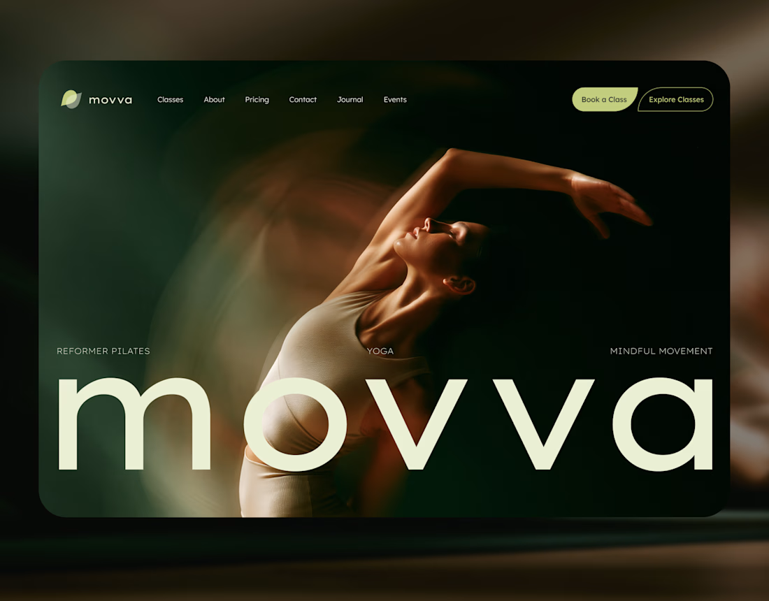
MOVVA is now featured on Contra 🤍
I’m especially happy about this because working on this template was a creative outlet for me.
I wanted to build something useful for a business: a website that covers what a studio needs when it opens, from an easy-to-use schedule to clearly structured class information, with a solid foundation for SEO.
At the same time, I wanted it to feel beautiful. To bring a sense of movement, lightness, and the joy of taking a class into the design. To capture that friendly atmosphere that makes you want to walk into a studio and give it a try.
Thank you, Contra team!


Huge congrats on getting featured! 🤍 MOVVA looks stunning - love the mindful movement vibe and that hero image. Super useful concept for studios. Well deserved feature!

This is wild to me!
I have worked so hard to build this profile and it just goes to show that you really do get out what you put in. Work has really picked up since I worked on my discovery score and the right clients seem to be finding their way to me. Couldn't be happier.

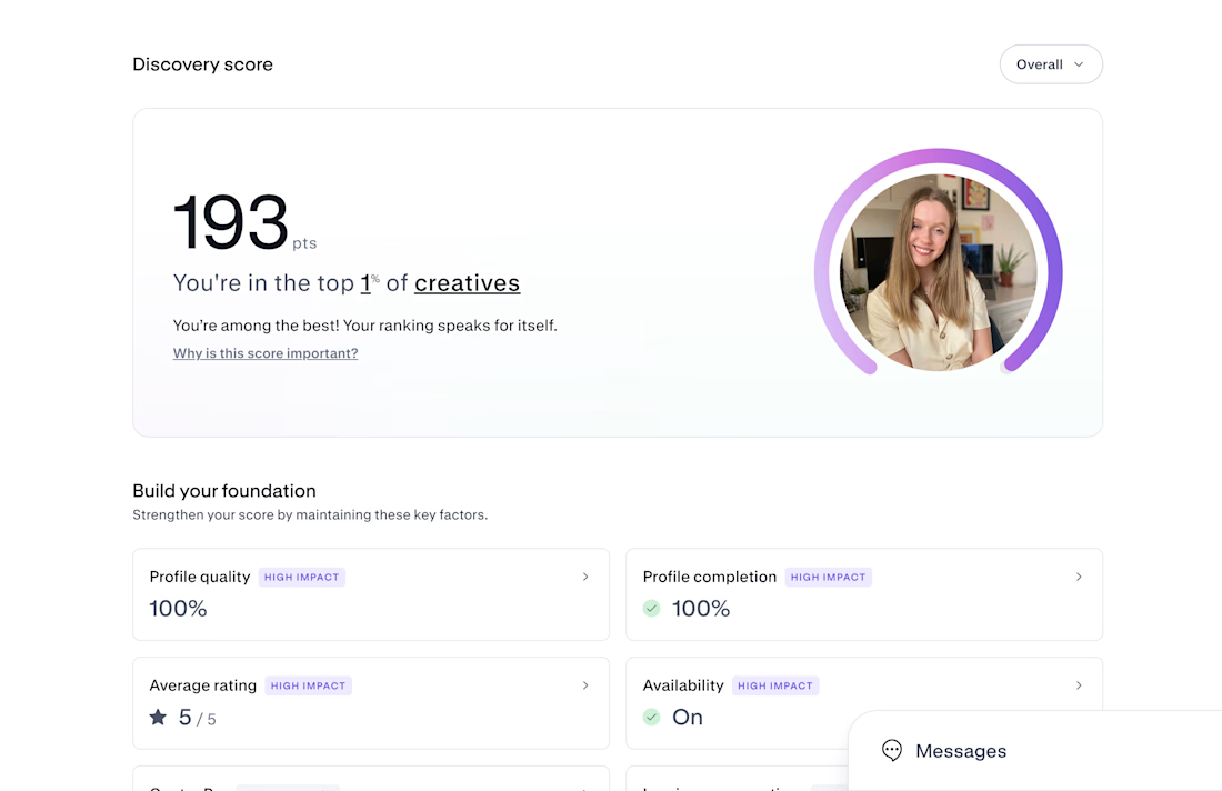

Congrats on Top 1% — that's huge! 193 is wild. If you don't mind sharing, what moved the needle most for your discovery score? Was it profile completion, case studies, or just consistent posting? Trying to build mine from scratch right now.


This UI was really great nice job Piotr🔥🔥🔥