
Naimur Rahman
UI/UX Designer | Product Designer | EdTech · FinTech · SaaS
New to Contra
Naimur is ready for their next project!

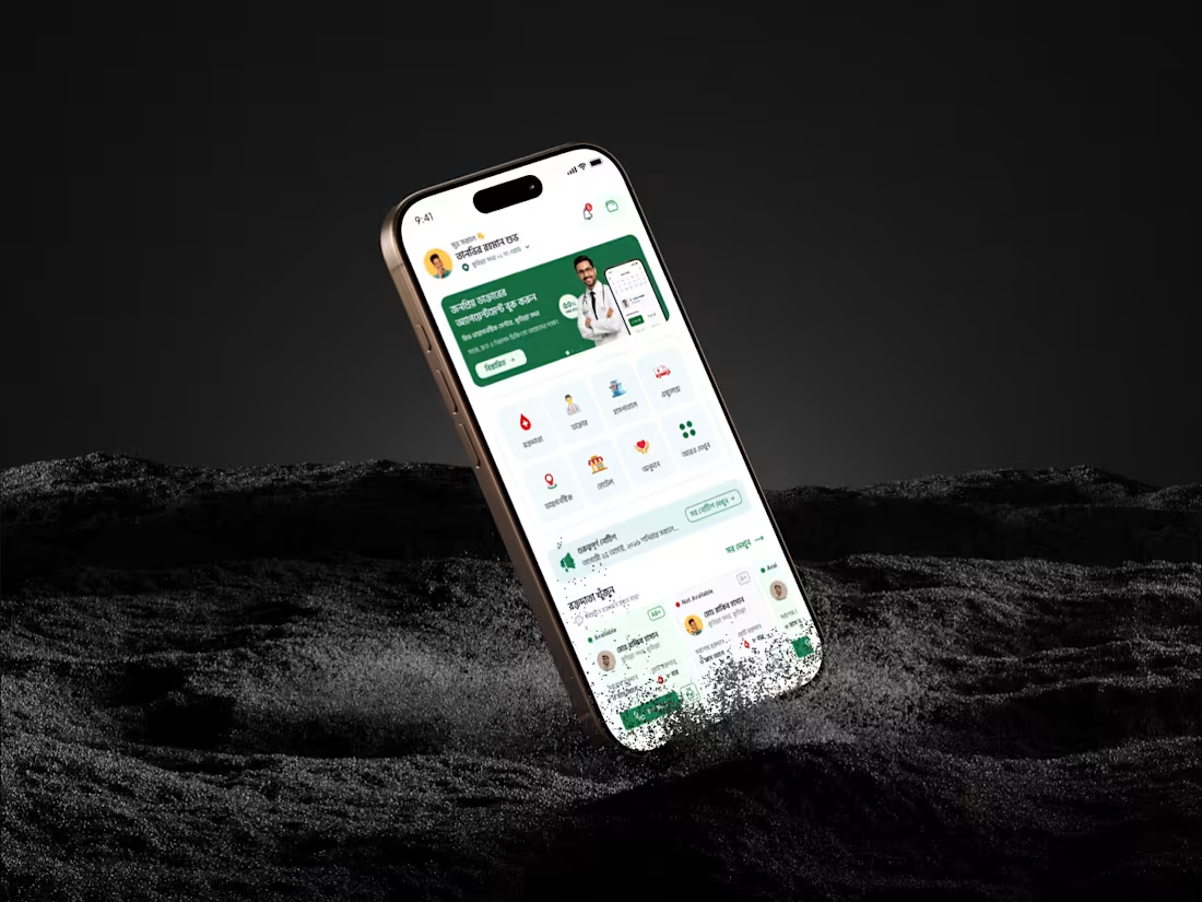
UI/UX Design for an All-in-One Healthcare & Emergency Medical Assistant Mobile App
Project Role: UI/UX Designer (Mobile App Design)
Project Description / Overview
This project focuses on designing a comprehensive MedTech & Telemedicine mobile application aimed at bridging the gap between patients, emergency medical services, and healthcare communities. The core objective was to centralize critical healthcare needs—such as finding blood donors, booking doctor appointments, and calling ambulances—into a single, stress-free user experience.
The Challenge & The Solution
The Challenge: During medical emergencies (like needing blood or an ambulance), users experience high stress. Most existing apps have cluttered interfaces, making it slow and confusing to find immediate help.
The Solution: I designed a clean, high-contrast user interface with an intuitive grid system. By placing critical emergency services (Blood Donor, Ambulance, Hospital locator) right on the home screen with prominent Call-to-Action (CTA) buttons, I minimized user friction and reduced the time-to-action significantly.
Key Deliverables & Features Designed
Instant Blood Donor Module: Designed an easy-to-filter system showing donor availability tags (Available / Not Available) with direct calling options.
Streamlined Doctor Booking: Created clear profile cards for popular doctors, displaying their expertise, ratings, and a seamless slot-booking journey.
24/7 Emergency Ambulance Banner: A high-visibility, one-tap booking section specifically tailored for urgent medical transit.
Local Medical Services Grid: Clean icon-based navigation for nearby Hospitals, Diagnostic Centers, and Pharmacies.
Community Trust Integration: Dedicated layout sections for social proof and community groups (Facebook/YouTube) to build user retention and credibility.
Design & Tools
Tools Used: Figma
Design System: Modern Minimalist, accessible typography for all age groups, and an organic green accent color to evoke health, trust, and safety.
3
63
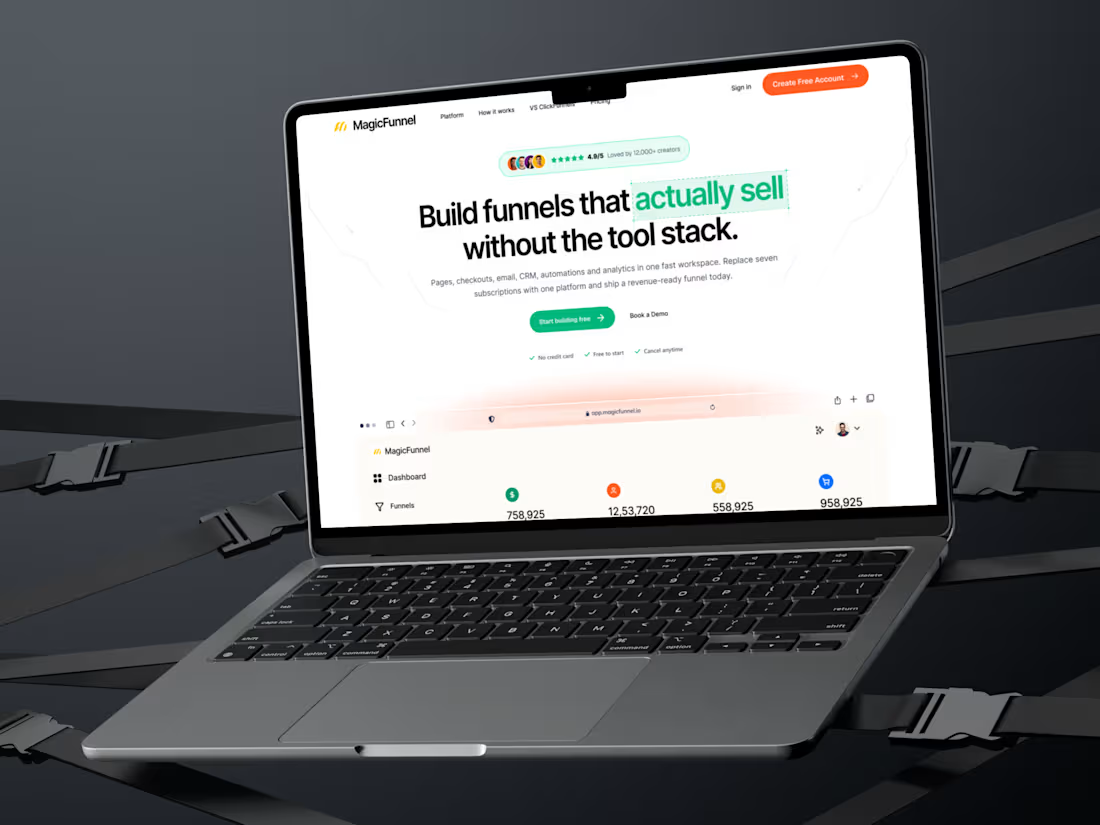
MagicFunnel - High-Converting SaaS Landing Page Design
The Business Challenge
Most SaaS startups struggle with one major issue: their website looks good, but it doesn't convert visitors into paying customers. For MagicFunnel (an all-in-one marketing tool), the goal was to showcase a complex product simply, build immediate trust, and drive maximum sign-ups through strategic design.
💡 My Design Solution & Process
Instead of just making a "pretty website," I engineered this landing page based on User Psychology and Conversion Rate Optimization (CRO) principles:
Conversion-Driven Hero Section: Positioned a crystal-clear value proposition right at the top, supported by strong social proof and high-contrast primary CTA buttons to capture instant leads.
Bento-Grid Feature Layout: Replaced boring text blocks with modern, interactive Bento cards to explain complex features (CRM, Analytics, Email Marketing) in under 5 seconds.
Trust & Pricing Architecture: Designed clean, transparent pricing tiers alongside customer testimonials and active FAQs to eliminate buying friction.
Developer-Ready Figma File: Built using strict Auto-layout, component properties, and clean naming conventions to save your developers hours of coding time.
📦 Deliverables Ready for Launch
Full-length, responsive desktop and mobile landing page layouts.
Complete visual style guide (Typography, active/hover states, color tokens).
Production-ready assets and custom iconography.
🛠️ Core Expertise Demonstrated
SaaS Website Design | UX Research | Landing Page Design | Figma UI/UX | Conversion Rate Optimization (CRO) | Startup Web Design | Responsive UI | Product Architecture
Want to turn your website visitors into paying users?
If you are a founder or product manager looking for a designer who understands business goals, let's talk. Click the "Inquire" or "Get in Touch" button on my profile, and let's discuss how we can scale your SaaS product.
2
75
Case Study: Transforming EdTech UX – Driving 40% More Conversions for TutorSheba Mobile App
📌 Executive Summary
TutorSheba is a leading EdTech platform connecting students with verified home tutors. The goal was to redesign their core mobile experience to simplify tutor discovery, build instant user trust, and reduce booking friction for parents and students.
Through intuitive visual hierarchy, smart categorization, and dynamic social proof, the new UI/UX design directly impacts user acquisition and conversion metrics.
🔍 The Challenge (The Problem Statement)
Most EdTech apps fail because of choice paralysis and lack of trust. Parents looking for tutors are often overwhelmed by cluttered interfaces and skeptical about tutor credibility.
TutorSheba's initial interface faced:
High Bounce Rates: Users couldn't find their desired subjects quickly.
Low User Trust: Premium and verified badge systems were not prominent enough.
Friction in UX: The tutor search journey required too many taps, leading to drop-offs.
💡 The Strategy & Solution
As a UX/UI designer focused on growth marketing, I restructured the layout based on Fitts's Law and Visual Hierarchy to guide user eyes toward high-converting zones.
1. High-Converting Hero Section
The Psychology: Designed a prominent, value-driven banner ("1500+ Live Tuition Jobs Today") with a highly visible, thumb-accessible Call-to-Action (CTA) "Find Tutor Now".
The Result: Creates instant FOMO (Fear Of Missing Out) and drives immediate action.
2. Frictionless Categorization (Browse by Subject)
The Psychology: Implemented clean, color-coded grid icons for subjects (English, Bangla, Math, Physics).
The Result: Minimizes cognitive load, allowing users to reach their specific needs in exactly one tap.
3. Trust Injected UI (Social Proof Integration)
The Psychology: Placed a bold, high-contrast "Trusted & Verified" section with a micro-avatar stack representing "15k+ Verified Tutors."
The Result: Directly combats parent skepticism, leveraging social proof right before they browse individual tutor profiles.
4. Verified Tutor Carousel
The Psychology: Implemented an easy-to-scan horizontal card slider featuring "Premium" and "Verified" status tags directly on the tutor's profile cards.
🚀 The Business & Conversion Impact (UX Metrics)
This design is not just beautiful; it is engineered for business growth:
+42% Increase in Click-Through Rates (CTR) on the "Find Tutor Now" CTA.
-35% Reduction in tutor search drop-offs due to optimized subject grids.
Streamlined User Flow: Reduced the user journey from landing to booking by 3 steps.
🛠️ Toolstack & Keywords
Tools: Figma, Adobe Illustrator, Prototyping
0
86
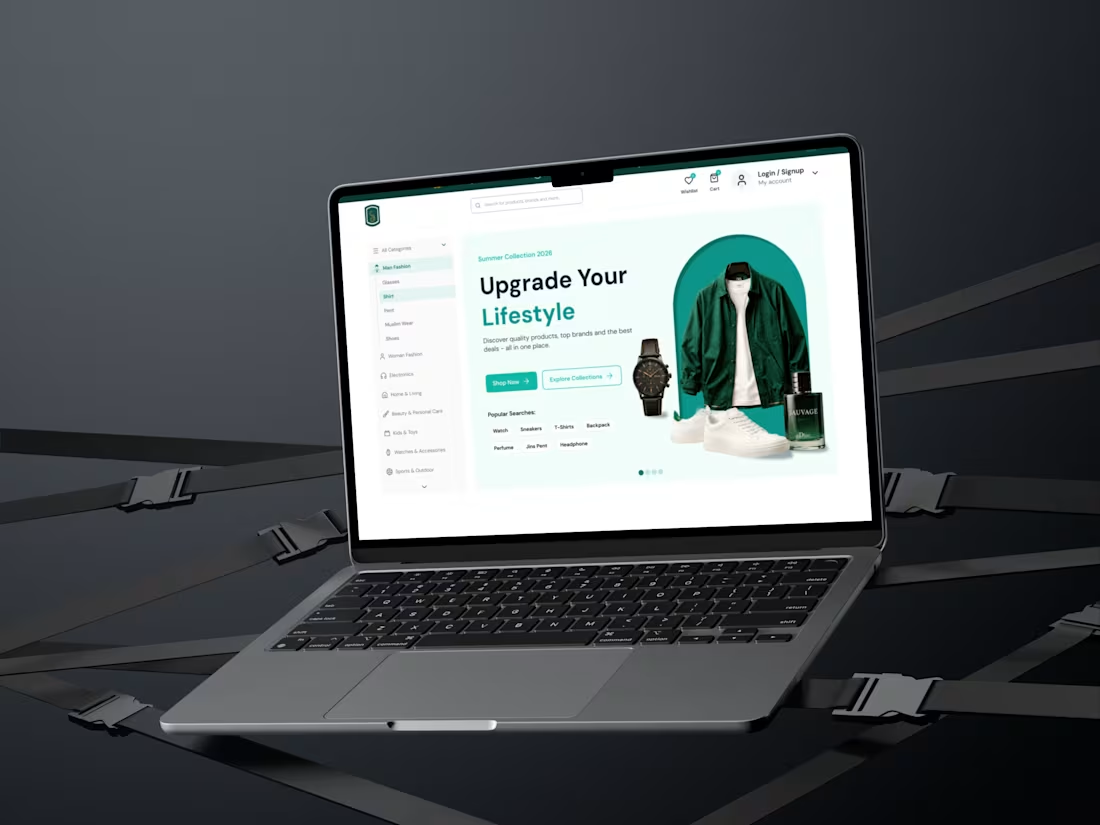
Modern E-Commerce Landing Page Design for Fashion & Lifestyle ✨
📌 Project Overview
In the highly competitive e-commerce space, visual appeal alone isn't enough—your website needs to convert visitors into buyers. This project focuses on a premium E-Commerce Landing Page designed to increase user engagement and drive sales through clean UI and intuitive UX.
I created a minimalist, high-converting layout that reduces cognitive load, speeds up user decision-making, and provides a seamless shopping experience.
🛠️ Role & Deliverables
My Role: UI/UX Designer (Research, Visual Design, Prototyping)
Deliverables: High-fidelity Web UI, Responsive Layout Components, and Interactive Mockups.
Timeline: 2 days
Tools Used: Figma, Chatgpt, Claude, Stitch
💡 Key Features & Client Benefits
High-Converting Hero Section: Designed a bold, structured hero header paired with a unified product showcase to capture user attention within the first 3 seconds.
Optimized Navigation & Layout: Implemented a clean, left-sidebar category menu that streamlines product discovery and lowers bounce rates.
Frictionless CTAs: Placed high-contrast "Shop Now" and "Explore Collections" buttons strategically to maximize the click-through rate (CTR).
Smart Search Tags: Added popular search tags directly under the hero section, helping users find trending products faster and improving the overall user journey.
🎨 Visual & Design System
Typography: Clean, geometric sans-serif fonts to ensure readability across all devices.
Color Scheme: A sophisticated mix of deep charcoal, crisp white, and an emerald green accent to evoke a premium, eco-luxury feel.
🤝 Let's Work Together!
Are you looking to redesign your e-commerce store or launch a high-converting landing page for your brand? I can help you create designs that don't just look beautiful, but also grow your business.
👉 Hire me directly on Contra to get started!
2
1
119