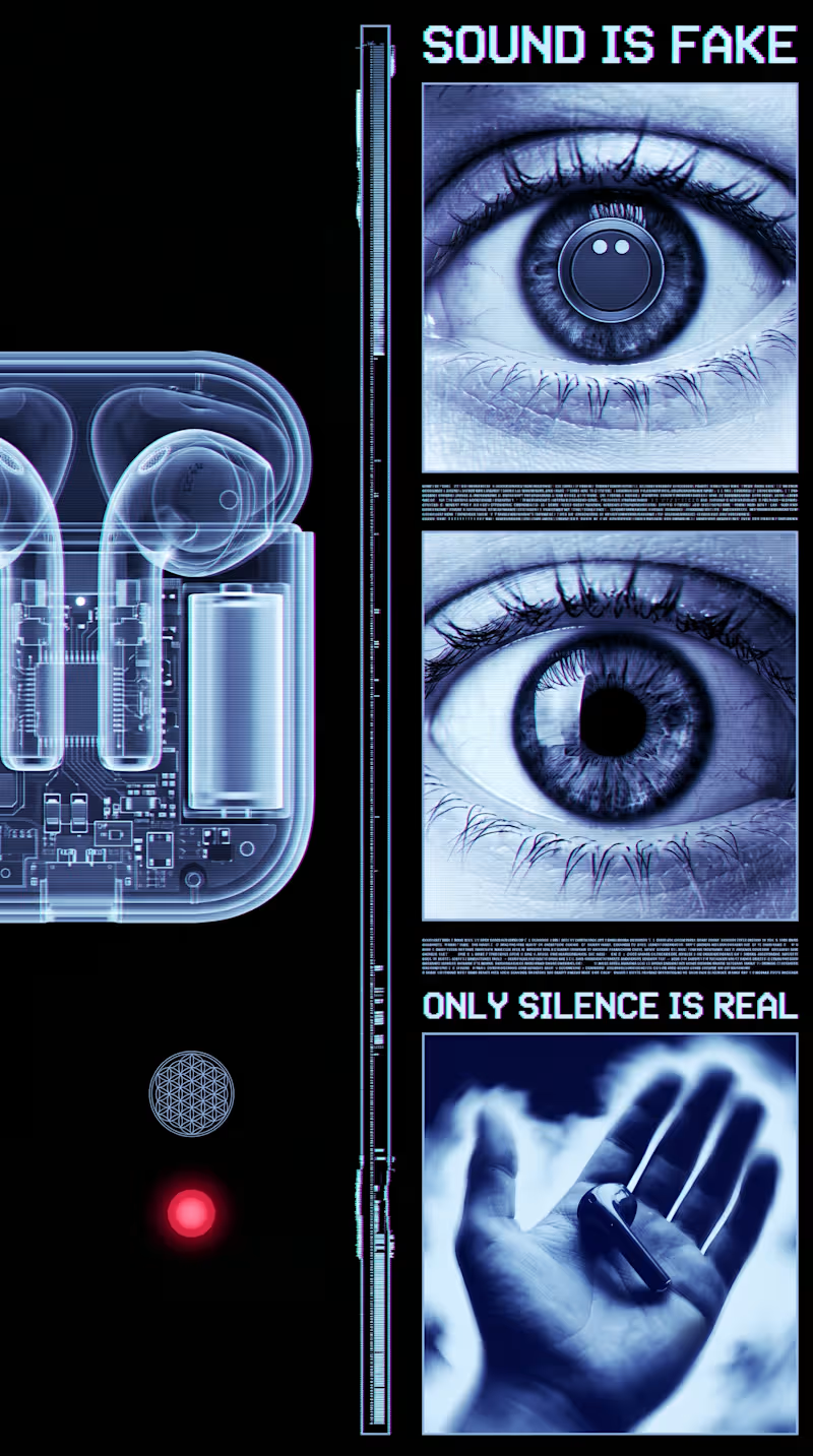
Projects using Adobe After Effects in DelhiProjects using Adobe After Effects in DelhiThe eye itself is the anchor of the whole piece. Eyes are one of the few images the human brain is hardwired to fixate on instantly, infants track eyes within days of birth, so opening on one guarantees attention before any concept lands. But this isn't just an eye, it's an eye in monochrome cyan with scanlines crossing it, which reads as a "broken sensor" rather than a living organ. That's an important distinction psychologically: a closed eye suggests sleep or death, a crying eye suggests pain, but a glitching eye suggests something stranger, that the very apparatus of seeing has been compromised. It puts the viewer in the position of distrusting their own perception, which is a deeply uncomfortable, almost vertiginous feeling.
The chromatic aberration and scanlines aren't just texture, they're borrowed directly from broken transmission, old televisions losing signal, damaged VHS tape, dying CRT monitors. Visually this maps onto a very specific cultural memory of "something is wrong with the feed" and the brain reads that as urgency even without conscious recognition. It's the same instinct that makes static on a baby monitor unsettling, the noise itself implies a connection that's failing.
The sacred geometry, the flower of life, the circular mandala-like patterns, functions almost as a counterweight to the digital decay. These shapes carry thousands of years of association with order, cosmic structure, and meaning-making. Placing them inside a corrupted, glitching frame creates a quiet tension between the eternal and the failing, like ancient wisdom trying to transmit itself through a dying machine. That contrast is what gives the piece its cult or ritual undertone rather than just feeling like generic tech-glitch art.
The text fragments work almost like intrusive thoughts. Short, declarative, ungrounded statements like "reality is false" mimic the kind of thought spirals people experience during anxiety or derealization episodes, where the mind starts questioning the basic premise of experience itself. Presented in a flickering, semi-corrupted font, the text doesn't feel authoritative, it feels like something glitching its way into consciousness rather than a calm statement of fact, which makes it feel more like a symptom than a slogan.
The hand, when it enters in the product version, is the emotional pivot point. After several seconds of synthetic, ocular, mechanical imagery, a hand is the most embodied, human, tactile thing you can introduce. Psychologically it signals safety and agency, hands are how humans manipulate and trust the physical world, so the moment it appears the entire emotional register shifts from disorientation toward groundedness. That's why placing the product literally into an open palm lands as resolution rather than just product placement, it's mimicking the felt sense of coming back into your body after a dissociative moment.
And the product itself, glowing, transparent, suspended in light, benefits from all of that buildup by contrast. Because everything preceding it has felt corrupted or untrustworthy, the object that finally appears clean, intentional, and stable reads as desirable almost by relief alone. It's less "look how cool this is" and more "finally, something solid," which is a much stickier emotional hook than straightforward aspirational advertising usually achieves.