Projects using Figma in Cordoba
Projects using Figma in Cordoba
Sign Up
Post a job
Sign Up
Log In
Filters
2
Projects
People
Message
0
Octavio Ruggieri
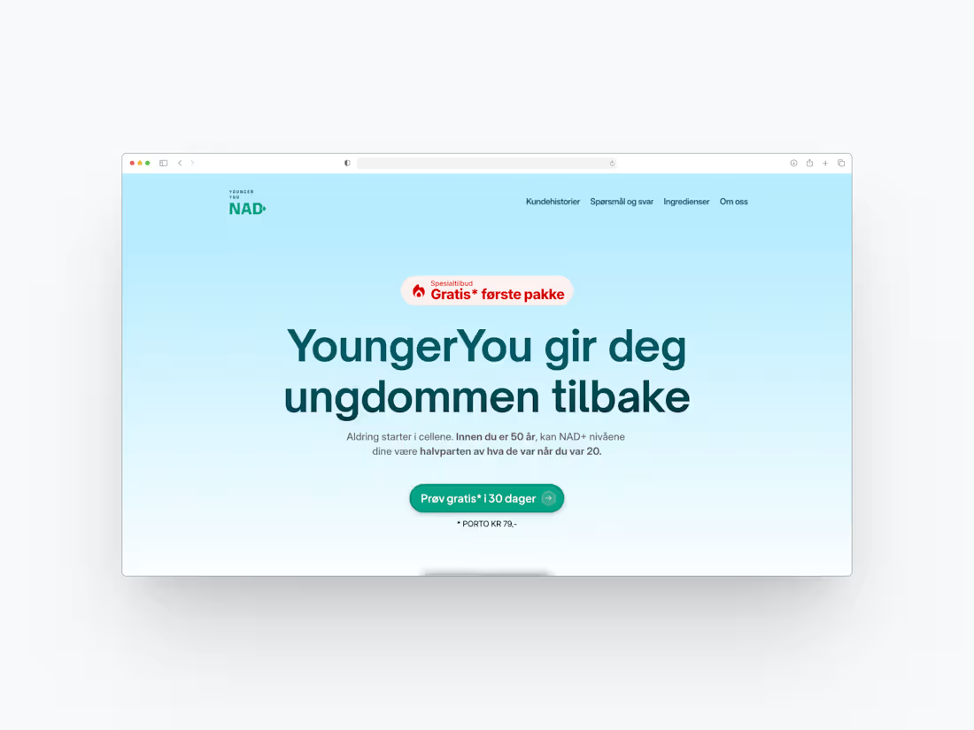
Nad-pluss Landing Page (Framer development + design)
0
26
Message
0
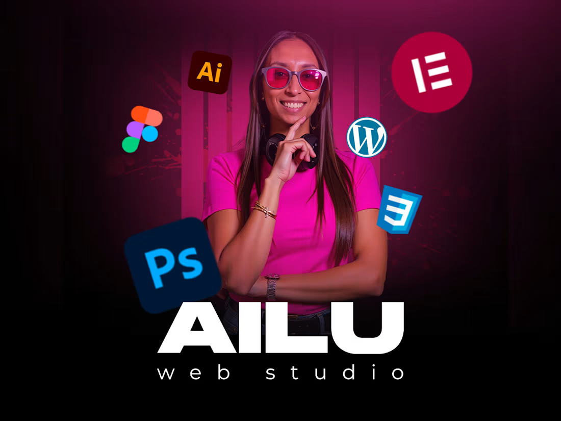
Ailén Hernandez
Ailu | Visual Identity for Personal Brands
0
4
Message
0
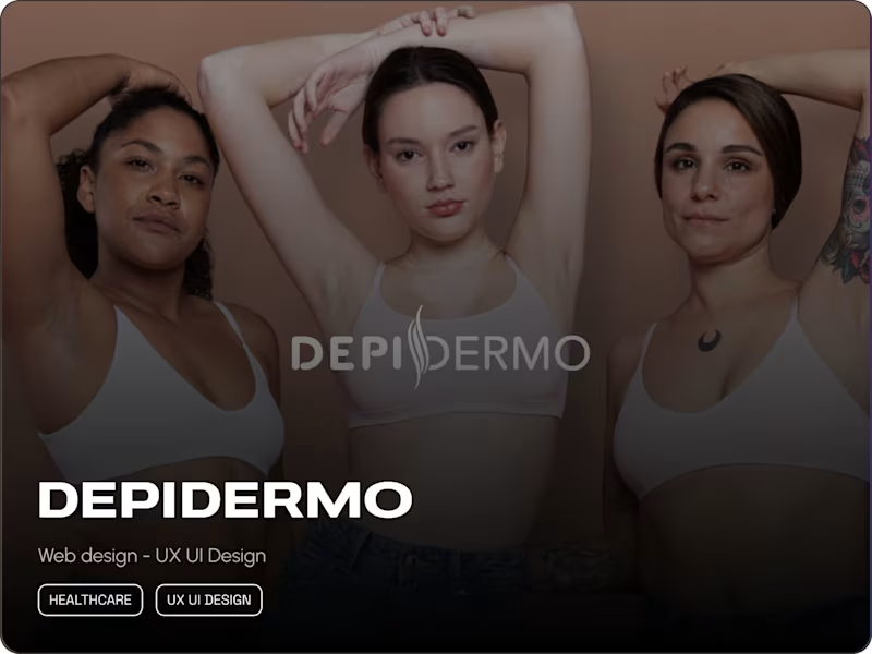
Lucas Rey
Depidermo - Landing page
0
9
Message
0
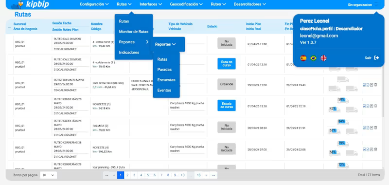
Leonel Perez
KipBip Logistics WebApp
0
13
Message
2
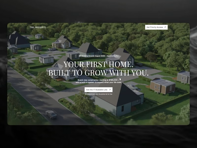
Kali Franzone
The Preserve — Lead Generation Landing Page
2
9
Message
0
Leandro Henflen
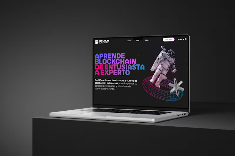
ICP.Hub Latam (Coming Soon)
0
69
Message
0
Lautaro Rolfo
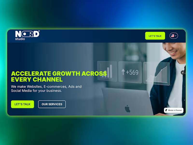
This project is a high-converting landing page built for an advertising agency, designed with a structured conversion funnel to guide users toward a single objective: submitting their information through a lead form. The page strategically presents the agency’s value proposition, builds trust, and reduces friction before driving users to a clear and focused call-to-action. All form submissions are automatically connected to a Google Sheets database, enabling streamlined lead management and real-time tracking. The landing page was fully designed and developed in Framer, optimized for paid traffic campaigns and direct-response advertising, ensuring speed, responsiveness, and performance across devices.
0
94
Message
1
Emiliano Martinez Navarro
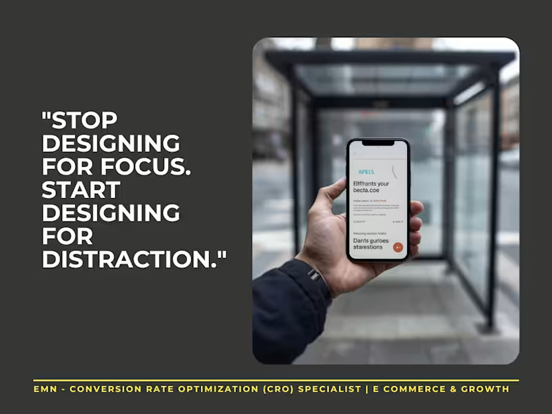
Mobile UX isn’t about aesthetics. It’s about survival. In an ultra-distracted world, your site is browsed in crosswalks and waiting lines. If it’s not built for chaos, you’re losing money. 💸 3 Rules for Mobile CRO: The Single-Thumb Rule: Important buttons must be within thumb-reach. If they need two hands, they’re gone. 👎 Visual Honesty: Kill the fluff. Show the product, the price, and the CTA immediately. No distractions. 🎯 Micro-Moment Speed: If it’s slower than a traffic light change, they’ve already closed the tab. 🚦 Your site needs to sell to someone with 10 seconds of attention. Are you converting those moments, or letting them slip away? 📱✨
1
57
Message
7
Bong Studio
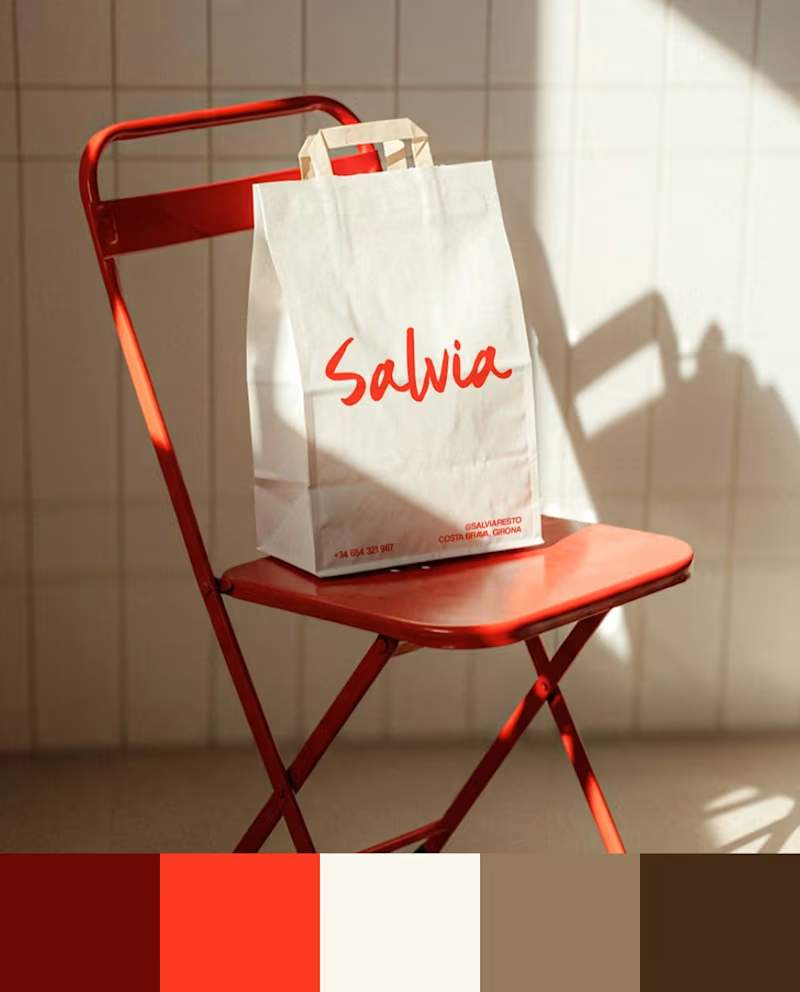
When we design color, the first question is where the brand is going to live and what it’s competing against visually. Azulejo’s cobalt blue carries the Spanish ceramics that give it its name. Salvia’s red comes from their original food truck — it already set them apart before they had a storefront. In Broots’ segment, brown and beige had saturated the shelf, so we went with green and pink. Tu Tarta’s orange is visible from a block away. Here are the palettes from 4 recent projects. Different industries, different problems, different answers. #Branding #BrandDesign #BrandStrategy #ColorPalette
1
7
181
Message
0
Agostina Boris
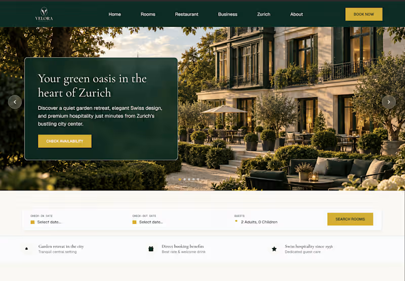
Velora: Hotel Website Redesign Concept
0
1
Message
0
Axel Rodriguez
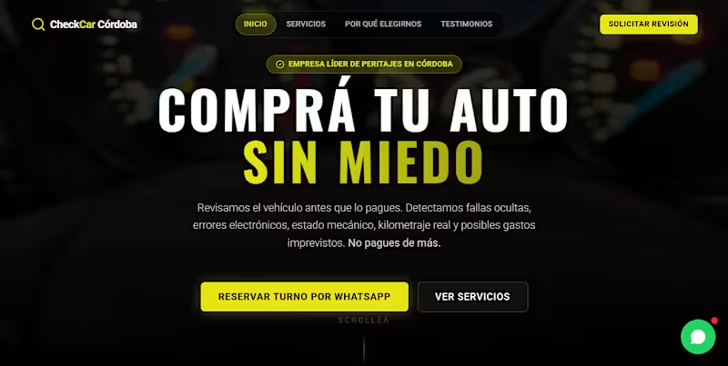
Landing page for a car inspection company
0
51
Message
0
Ignacio Graglia
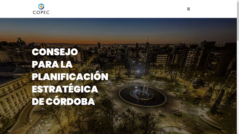
COPEC - New website
0
27
Message
0
Eli Cho
LA based video production studio website [coming soon]
0
16
Message
0
Lucas Leonardo Ciancaglini
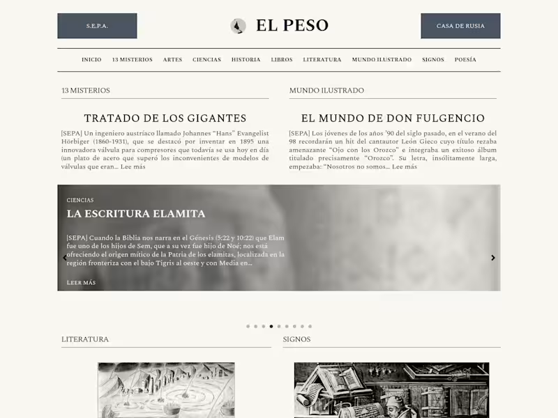
El Peso
0
6
Message
0
Lautaro Gallardo
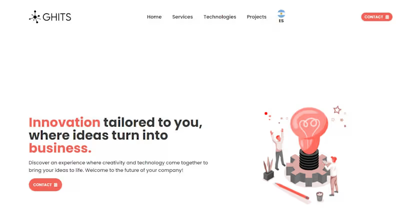
GHITS Landing Page
0
9
Message
0
Julian Pugliese
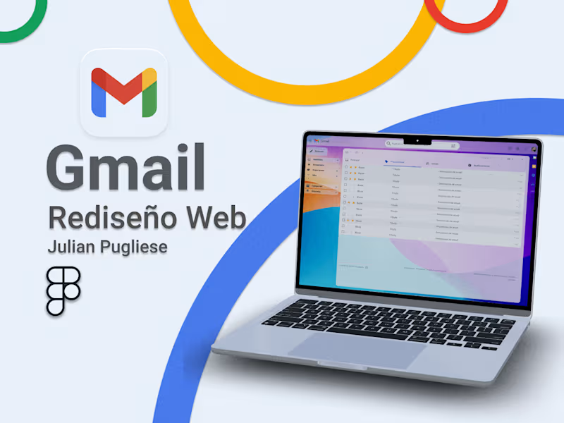
Case Study: Gmail, Redesign UX/UI :: Behance
0
9
Explore projects
![Cover image for LA based video production studio website [coming soon]](https://media.contra.com/image/upload/q_auto:good,w_800/t7jad8ami9oc4ruji4v7.avif)