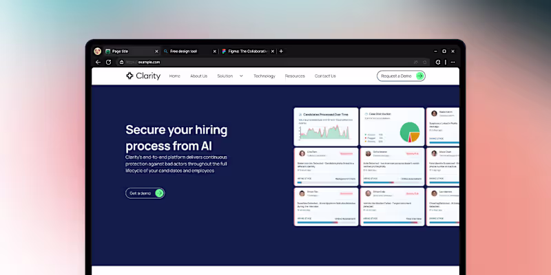
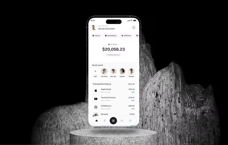
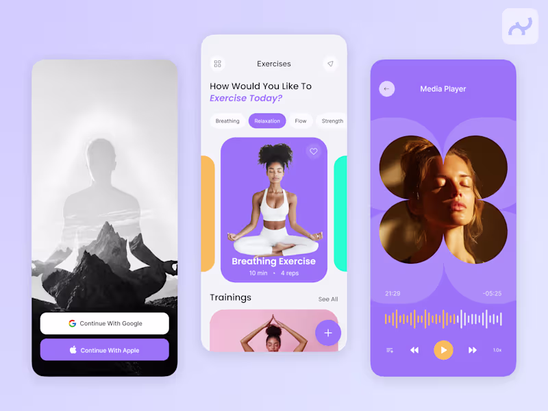
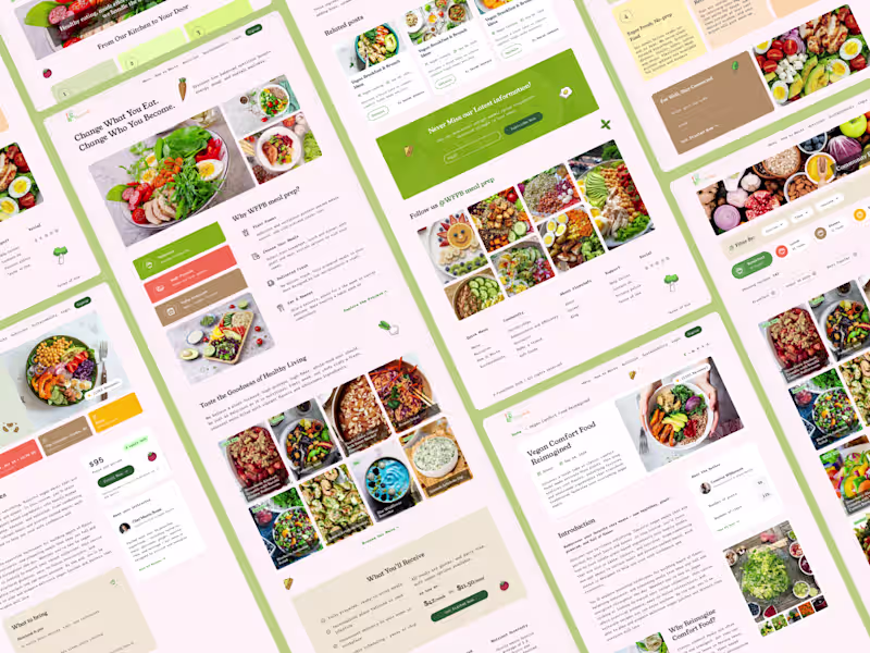
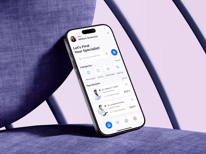
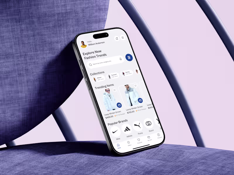
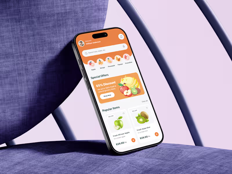
Crafting User-Friendly Designs with Framer & Figma
Crafting User-Friendly Designs with Framer & Figma
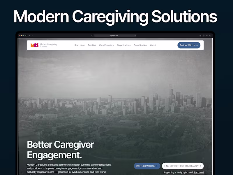
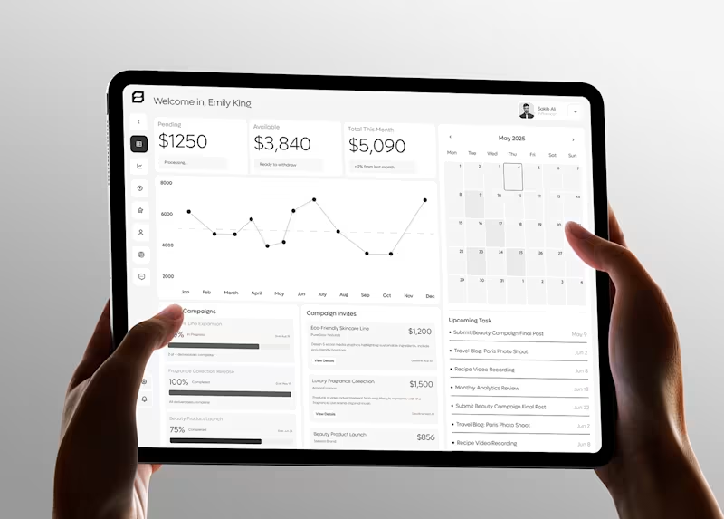
Branding | Product Design | Website design | MVP Design
- $25k+
- Earned
- 2x
- Hired
- 5.0
- Rating
- 16
- Followers
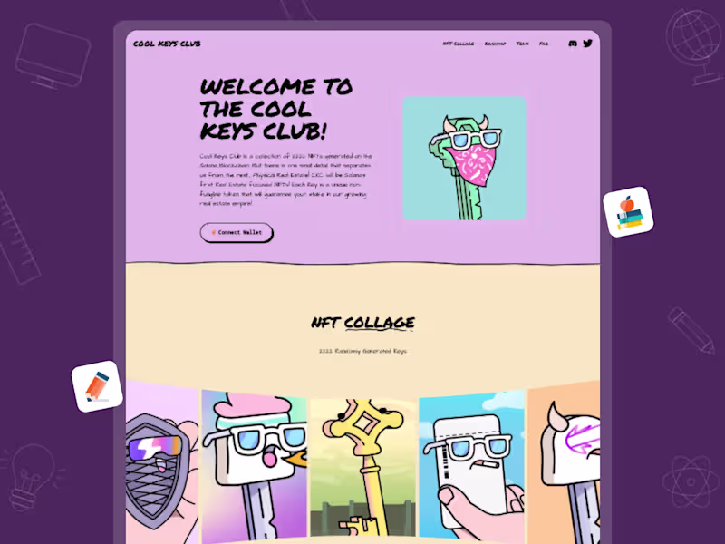
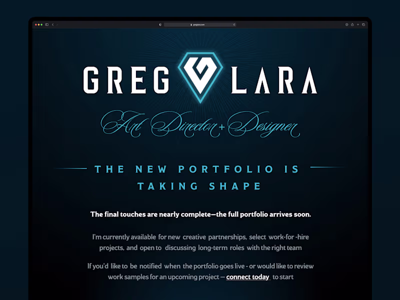
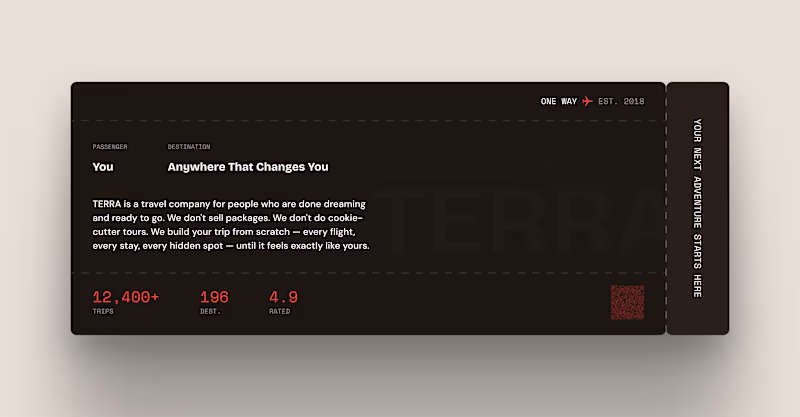
Branding | Product Design | Website design | MVP Design

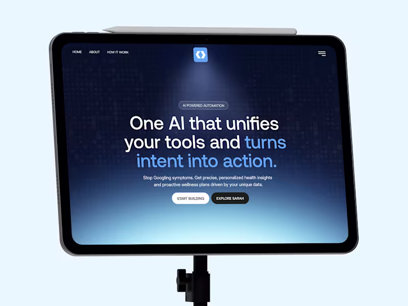
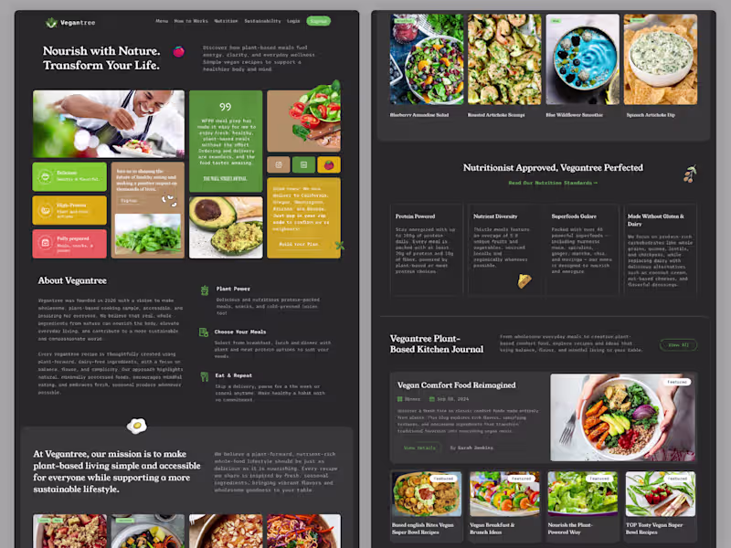
Creative Brand & UI/UX Designer 🎨✨
- $1k+
- Earned
- 1x
- Hired
- 5.0
- Rating
- 10
- Followers
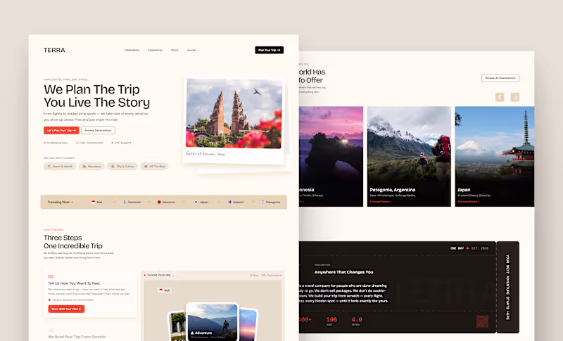
Creative Brand & UI/UX Designer 🎨✨


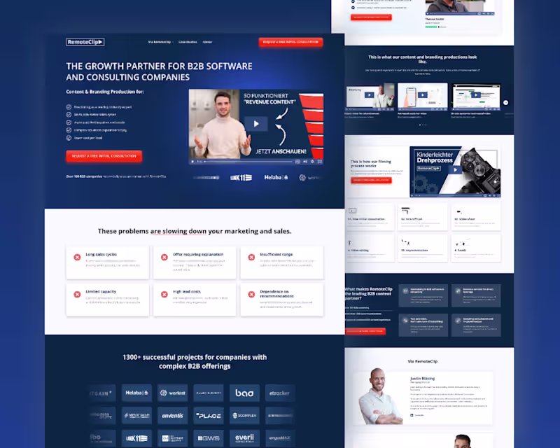
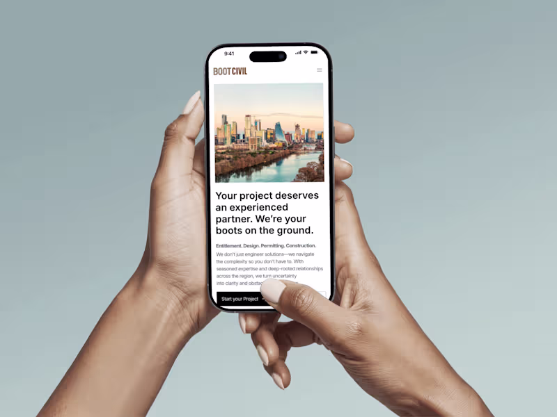
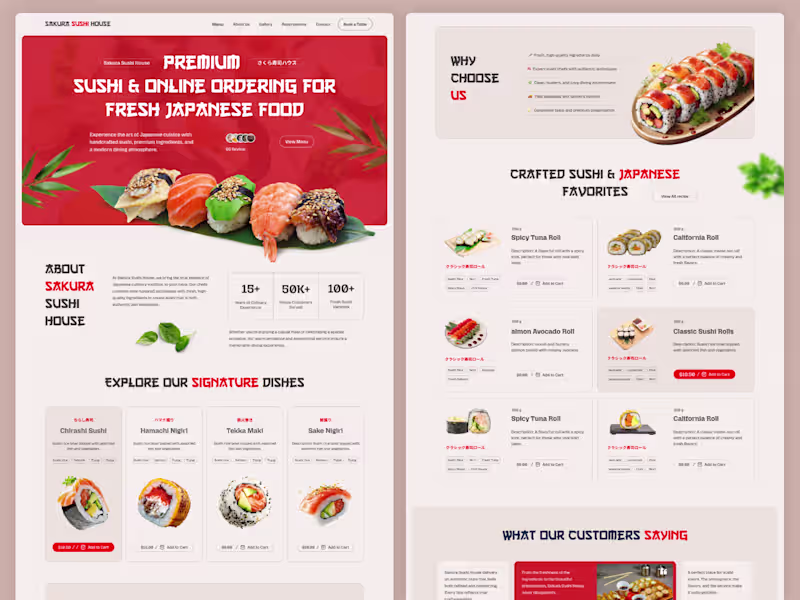
UI UX Designer, Websites & Mobile Apps Designer
- 5.0
- Rating
- 60
- Followers
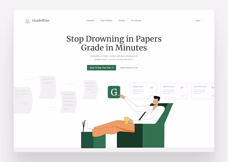
UI UX Designer, Websites & Mobile Apps Designer
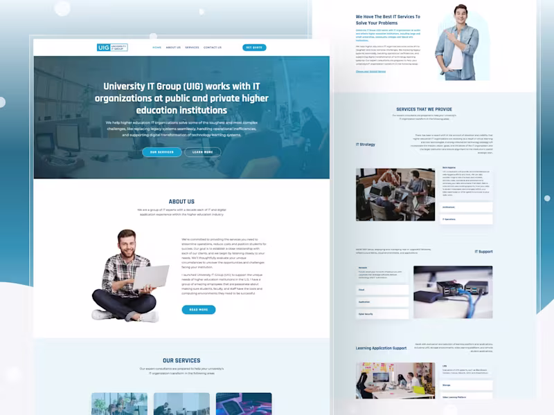
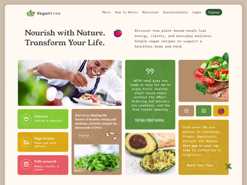
UI UX designer | UI/UX Design | Webflow | Figma | Framer
- 5.0
- Rating
- 126
- Followers
UI UX designer | UI/UX Design | Webflow | Figma | Framer
Product Design | Website design

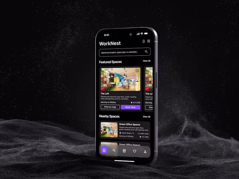
Figma Mobile App UI UX Designer | App Designer iOS, Android
New to Contra
Figma Mobile App UI UX Designer | App Designer iOS, Android
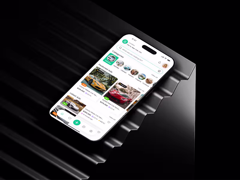
Best Webflow & Framer Developer in the town
Best Webflow & Framer Developer in the town