The network for creativity
Join 1.25M professional creatives like you
Connect with clients, get discovered, and run your business 100% commission-free
Creatives on Contra have earned over $150M and we are just getting started
Back to feedPost
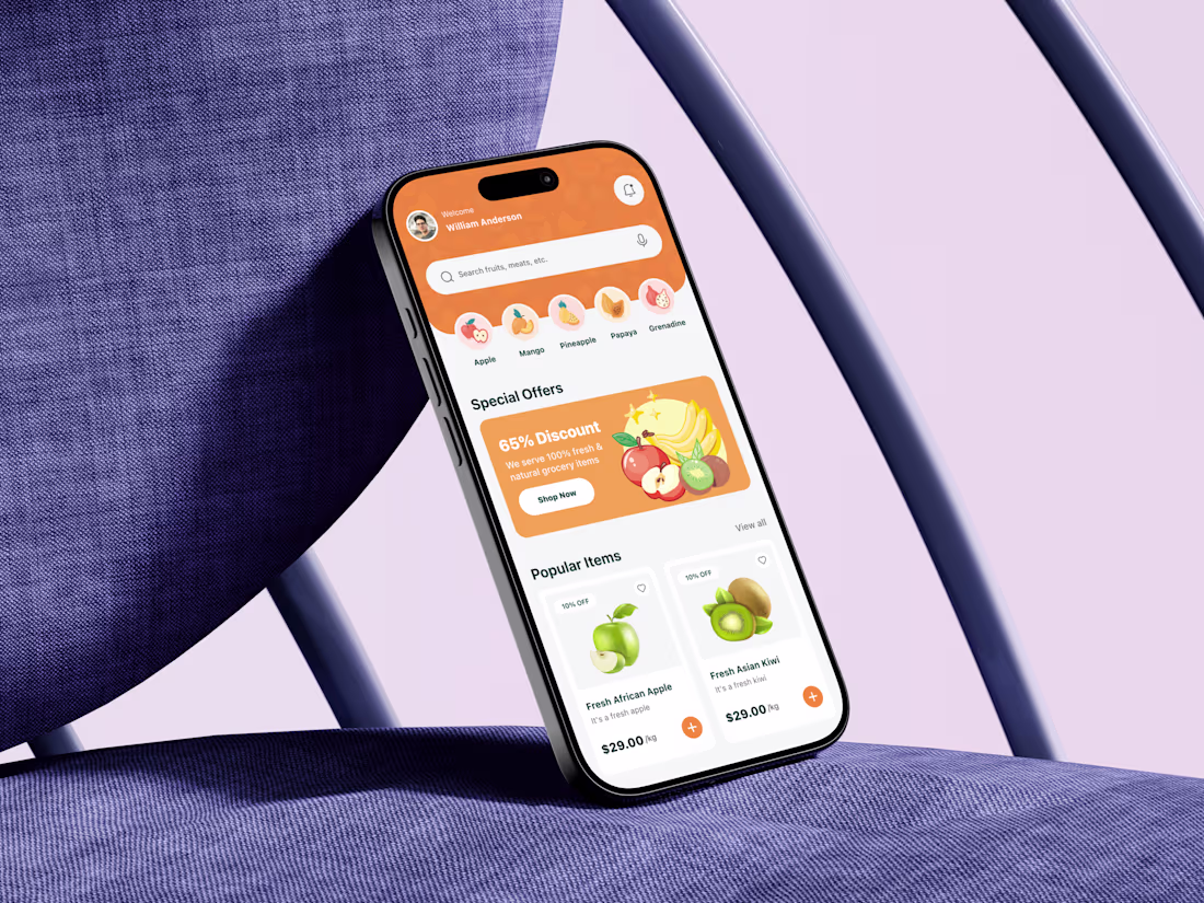
This grocery delivery mobile app home screen was designed by starting with a simple question: how do users decide what to buy in under 10 seconds?
The core challenge was cognitive overload. Grocery apps often fail because they throw too many products, banners, and categories at users at once. To solve this, I designed the layout to follow a clear visual hierarchy. The personalized greeting builds trust immediately, while the search bar and category icons reduce decision friction by letting users jump straight to intent-driven actions.
Special offers are placed above the fold with bold contrast to capture attention without overwhelming the screen. Product cards focus on scannability first: image, name, price, discount, and a clear add action. No unnecessary details interrupt the buying flow.
The network for creativity
Join 1.25M professional creatives like you
Connect with clients, get discovered, and run your business 100% commission-free
Creatives on Contra have earned over $150M and we are just getting started
Related posts
Amazing!
👋 Hey, we’re Lynksen.
We build digital products and websites that don’t just work - they win hearts.
For 5+ years, we’ve been the go-to team for startups and brands chasing big ideas - turning raw sparks into products that fuel millions of daily clicks, swipes, and sign-ups.
We move fast, combining product thinking, clear UX, and real business needs to create smooth, high-converting products for brands ready to make an impact.
👉 Have a project idea? We are available for new projects hello@lynksen.com or DM us!
post is awesome love the person who edited it lol
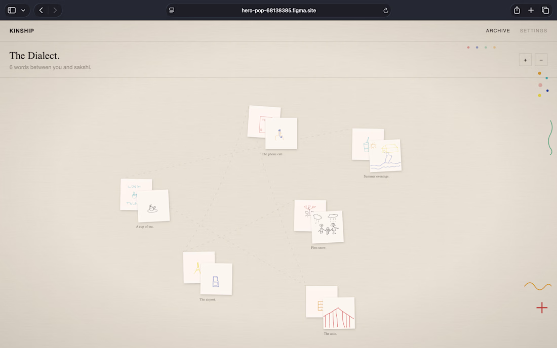
I built something for my mom.
We talk every day. But we've never made anything together. Not once.
So I built KINSHIP — a place where two people across any generation gap build a private visual language that only they share.
No typing. No reacting. Just drawing.
You arrive. Type your name. That's the door. A prompt surfaces — "the kitchen table" — and you both draw blind. Neither sees the other's version until both submit.
Then the screen goes dark. Both drawings develop slowly, like photographs in a darkroom. Hers. Mine. Same word. Different worlds.
Over time the archive grows. Every word you've ever drawn together. Your private dialect. Nobody else has this. Nobody else ever could.
We have six words now. And I know her better than years of conversation ever showed me. MAMA LOVED IT.
TRY IT : HERE
This isn't a design tool. It's a correspondence. A private language. Proof that you finally understand each other. It works for parents and kids, mentors and students, grandparents and grandchildren — any two people across a generation gap.
Built in @Figma Make with React, Supabase, and an old notebook aesthetic (cream paper, ink strokes, hand-drawn feel).
KINSHIP — a language only two people speak.
Love the design
Trending
Claude
Claude has entered the design space. How are you using Claude Design?
Contra University
Learn from expert creatives how to earn more using next-gen AI tools.
MagicPath
The canvas is infinite, and exploration is becoming the workflow. How are you using MagicPath?
creativeaiflow
Creative AI workflows are evolving. What tools do you use, and what are their strengths and weaknesses?
freelancerlife
Freelancer life is wins, pivots, and everything in between. What’s yours right now?