





SaaS UI/UX Designer for B2B ESG Compliance & Data Management Platform
SaaS design, SaaS UI/UX, B2B SaaS platform, SaaS dashboard design, SaaS workflow automation, SaaS product UI, enterprise SaaS UX, SaaS reporting software, SaaS data visualization, ESG SaaS platform, sustainability SaaS tools, SaaS compliance dashboard, SaaS product experience, B2B product design, SaaS onboarding flow, SaaS application design, SaaS automation solutions, SaaS product dashboards, enterprise SaaS UX, SaaS data management, SaaS analytics dashboard, SaaS workflow design, SaaS usability testing.
3
13
350



Construction Schedule Intelligence Dashboard | Interactive Demo
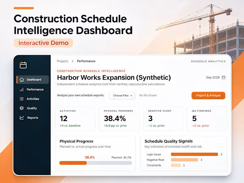
This video demonstrates an interactive, local-first construction schedule analytics dashboard designed to process Primavera P6 XER files, evaluate project performance, and identify scheduling risks.
Using the Harbor Works Expansion synthetic project, the walkthrough highlights how construction schedule data is transformed into measurable performance insights.
What the Video Demonstrates
Schedule Data Processing: An interactive dashboard populated with construction activity data and project scheduling information.
Project Health Metrics: 12 activities, 38.4% calculated physical progress, 3 negative-float activities, and 5 automated quality assurance findings.
Performance Visualization: Interactive progress tracking comparing 38.4% completion against a 33% baseline target.
Schedule Risk Detection: Identification of negative float and scheduling quality issues requiring attention.
Data Export: CSV and JSON export capabilities for sharing activity records and calculated results.
The demonstration showcases how automated schedule analysis can support faster project reviews, clearer performance reporting, and more informed project controls decisions.
0
20
