
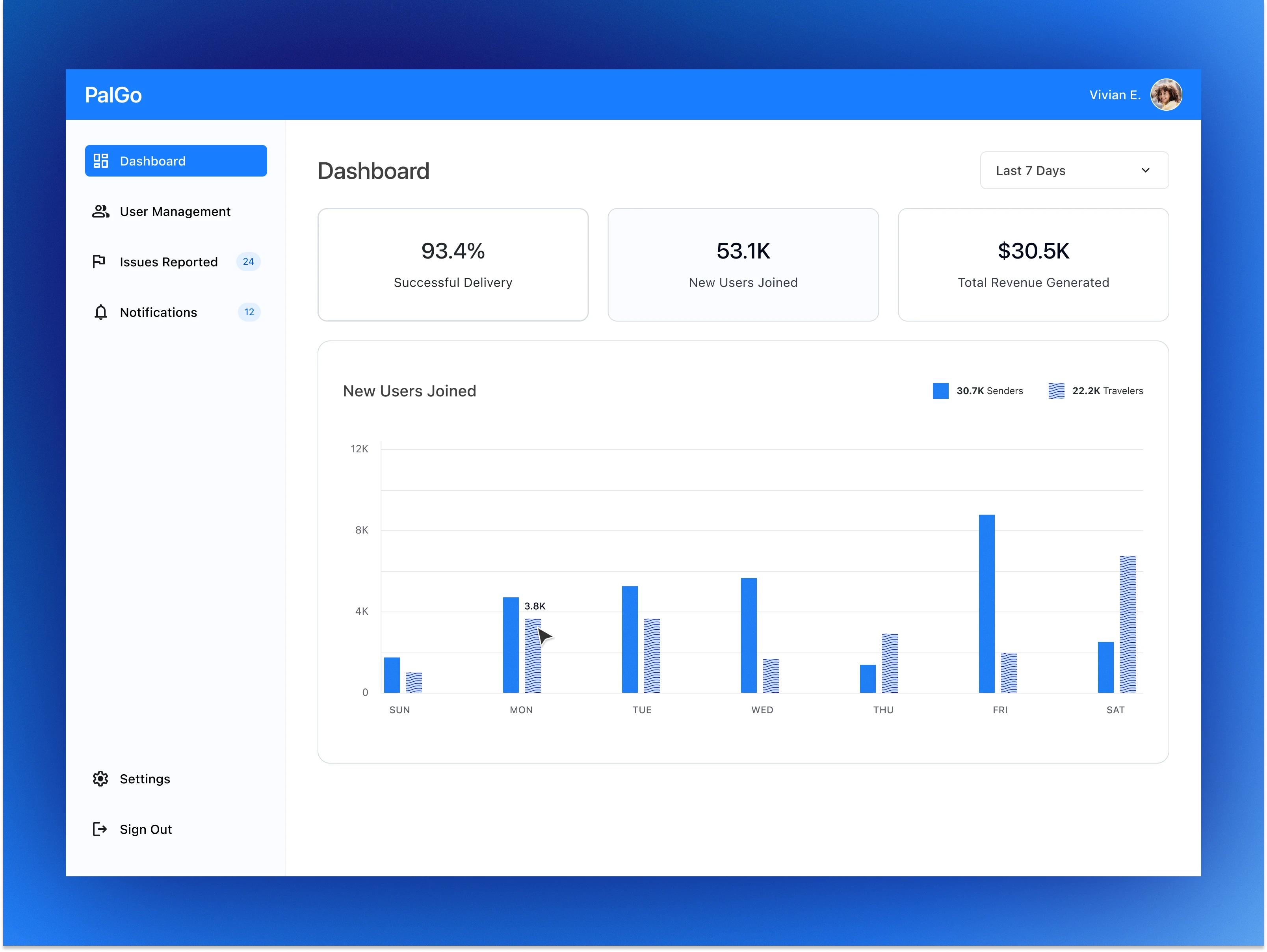
Color contrast isn’t enough on its own, so I’m trying out textures as a second cue to improve accessibility.
What are the best practices for using patterns to support users who can’t rely on color alone without making the chart feel busy or distracting?
0 likes · 1 view · Nov 26, 2025
Color contrast isn’t enough on its own, so I’m trying out textures as a second cue to improve accessibility. What are the best practices for using patterns ...

