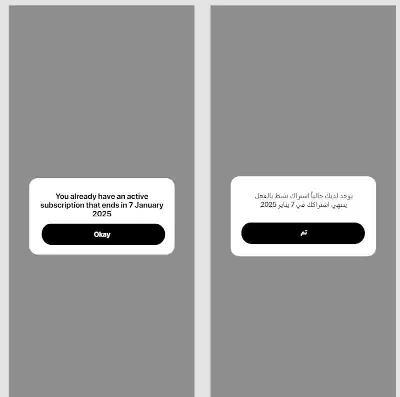



Safi which means "Pure" in Arabic
Concept: Safi is a car wash app. Users pick a package, drop a location, schedule a time, and a washer arrives wherever the car is parked
Problem: Traditional car washes mean driving, queuing, and waiting. Informal mobile washers (found via WhatsApp) lack quality control, fixed pricing, or scheduling:
Category: Lifestyle
Seasonal connection Spring in Cairo means khamaseen which is dusty winds that coat parked cars overnight. The "Spring Fresh" onboarding promo and bloom-themed confirmation screen lean into the season when your car needs Safi the most
Monetization: Pay-per-wash with 2 options from $10 to 20$ and telling the user that the taxes are free, plus selling other products that can be used in cars representing our brand like car air freshener
Safi is a new mobile-native build for this challenge
App name: Safi
Project Link
(https://bubble.io/page?id=mohamedliethy7&app_type=mobile&tab=Design&name=On-boarding)Preview Link
(https://mohamedliethy7.bubbleapps.io/version-test/api/1.1/mobile/preview?debug_mode=true&preview_view=On-boarding)"I’m having trouble sharing the app preview. I’d really appreciate it if someone could help me with this"
1
276

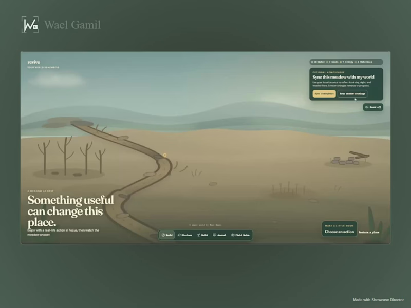
What if your progress wasn’t another streak, chart, or number? 🌱
I built Revive for the Replit Buildathon — a small living world that changes when you do something useful in real life.
Focus, move, or do something good for the planet → earn resources → restore the stream, grow wildflowers, bring back the grove, build a quiet reading nook, and slowly watch life return.
The world also remembers what you’ve done through a journal, unlockable wildlife, local weather/day-night syncing, and a calming soundscape that becomes richer as the meadow comes back to life.
The part I enjoyed most was making the environment itself the progress system instead of putting everything behind dashboards and stats.
Built with Replit
1
2
923
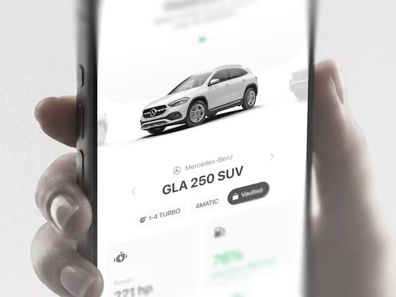
AutoVault: Automotive mobile app ui design
What it had to do: Hold everything a car generates: records, maintenance, documents. Tell the driver what needs attention. Legible for older drivers.
Decisions: clarity over decoration, for example in the fuel component i had fancier explorations but i went with the most clear and readable option.
1
148