
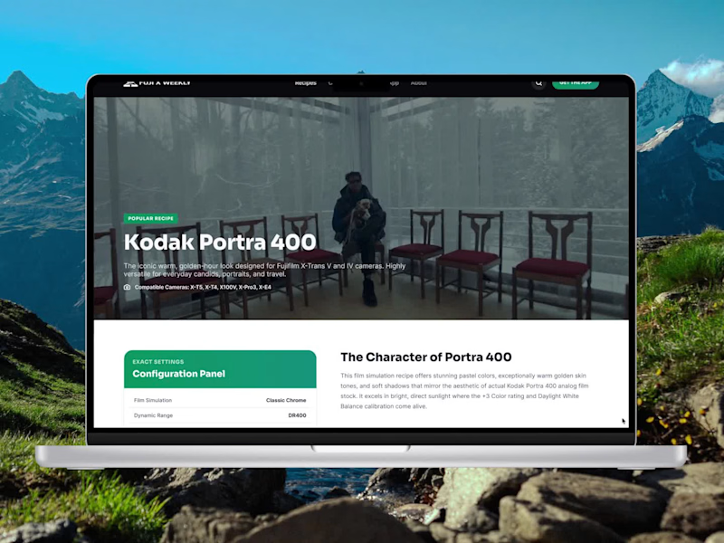
Redesigned Fuji X Weekly to make discovering film simulation recipes feel easier, faster, and a lot more visual. The goal was to keep the character of the site while giving the experience a cleaner and more modern structure.
I focused on simplifying navigation, improving content hierarchy, and making recipe discovery feel more intuitive across the homepage, camera pages, recipe library, blog, and individual recipe pages. I also wanted the photography to play a bigger role in the overall experience.
This was a fun exercise in balancing usability with a strong visual identity, especially for a platform built around photography and Fujifilm enthusiasts.
2
3
291


I met this client when I started sharing my work, and I was completely amazed by how we ended up working together. That’s when I realized how powerful sharing my work and valuing my skills can be.
I’m happy with how the website turned out, but we’re still continuously improving it. This is a great way to build trust and nurture our relationship.
2
1
232