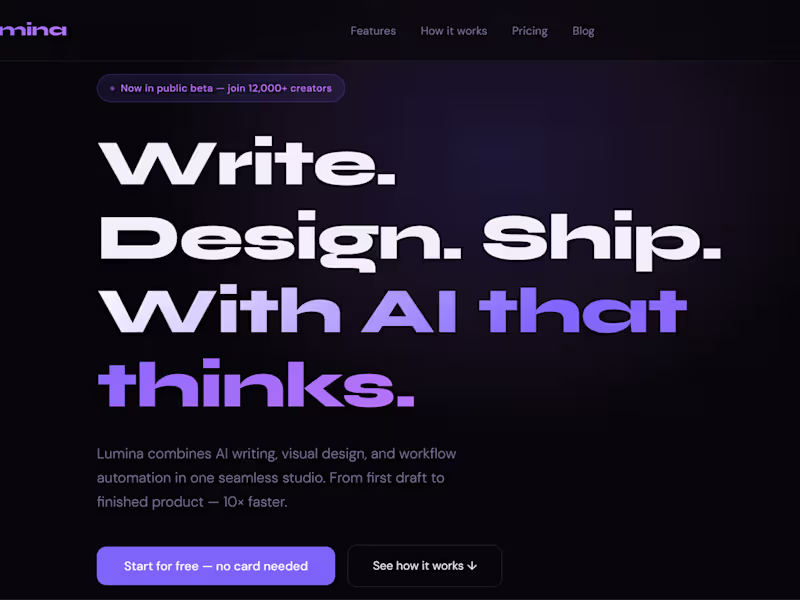
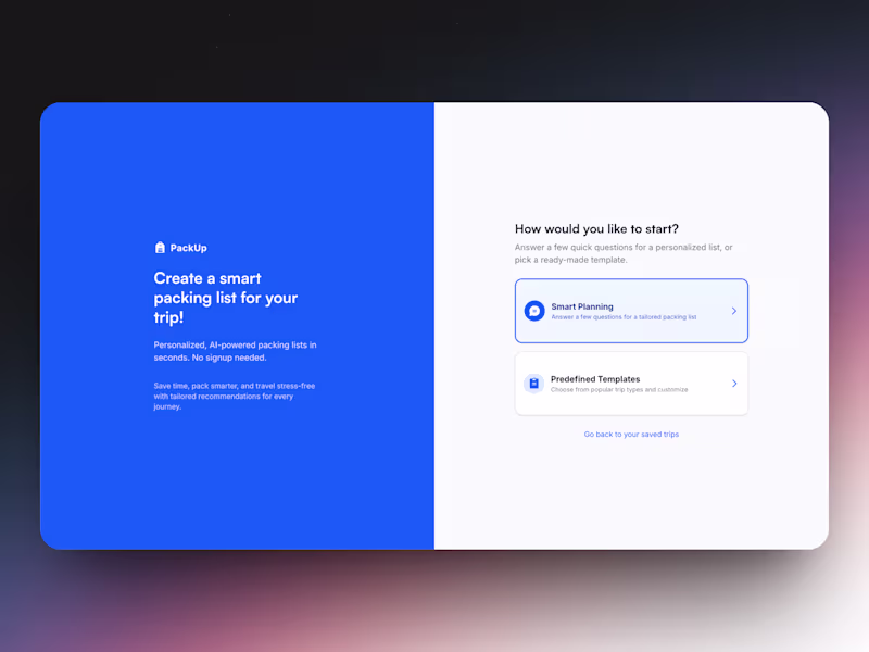
Crafting Seamless Website Experiences 🌐
Crafting Seamless Website Experiences 🌐
UI/UX & Web Designer | Figma · Mobile Apps · SaaS Websites


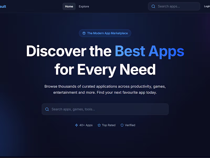
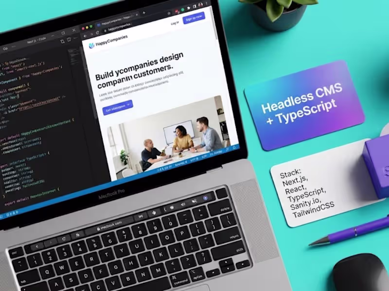
Paving the gap between design and development
Paving the gap between design and development

MVP specialist | Indie Maker | v0 ambassador
- $5k+
- Earned
- 2x
- Hired
- 5.0
- Rating
- 11
- Followers
MVP specialist | Indie Maker | v0 ambassador
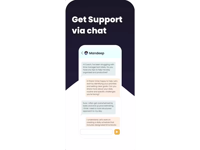
Founding AI Engineer, Agents, Automation, Cloud, Full-Stack
- $1k+
- Earned
- 8x
- Hired
- 4.7
- Rating
- 49
- Followers
Founding AI Engineer, Agents, Automation, Cloud, Full-Stack


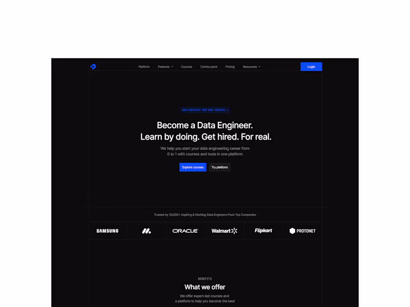
Full-Stack AI Engineer | Next.js + Supabase + TS
- 5.0
- Rating
- 2
- Followers
Full-Stack AI Engineer | Next.js + Supabase + TS
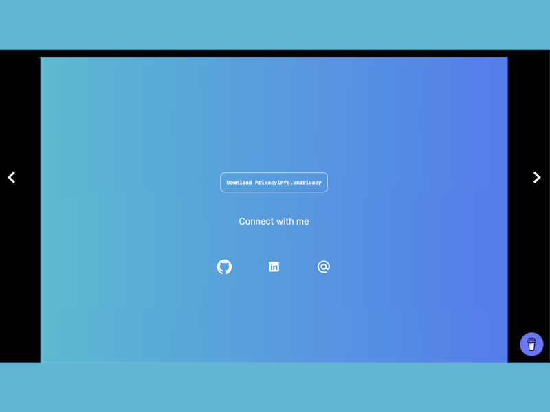
Mobile App Expert | iOS & RN Specialist | Framer Expert 📱
Mobile App Expert | iOS & RN Specialist | Framer Expert 📱

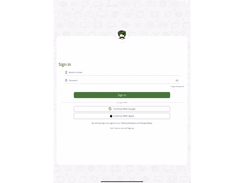
Product designer & no-code developer
Product designer & no-code developer

View more →