The network for creativity
Join 1.25M professional creatives like you
Connect with clients, get discovered, and run your business 100% commission-free
Creatives on Contra have earned over $150M and we are just getting started
Back to feedPost


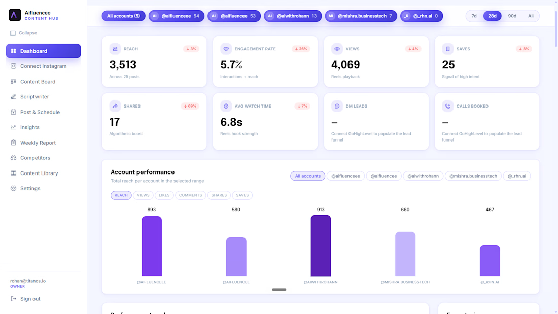
Built an AI-powered content hub for Instagram creators and agencies managing reach, engagement, scheduling, and DM leads across multiple accounts from one clean dashboard.
Aifluencee tracks real-time metrics (reach, engagement rate, watch time, saves, shares), generates scripts with AI, benchmarks competitors, and surfaces weekly performance reports so creators spend less time analyzing and more time creating.
From multi-account Instagram connect to automated content scheduling and DM-to-lead tracking, every feature is designed around one goal: turning content into clients.


The network for creativity
Join 1.25M professional creatives like you
Connect with clients, get discovered, and run your business 100% commission-free
Creatives on Contra have earned over $150M and we are just getting started




Related posts


🫡


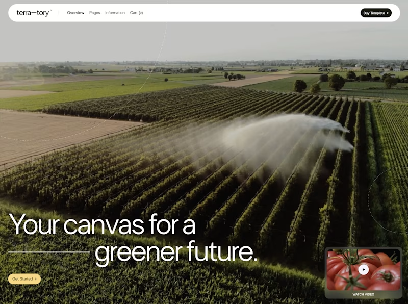
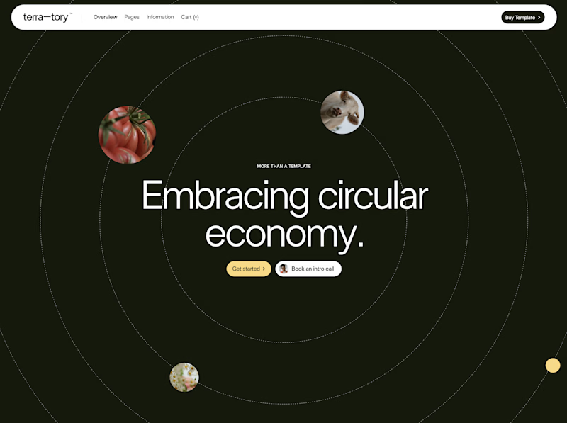
You only get to keep one. Which stays?
The circular layout has a bit of playfulness to it. The landscape gives you a much bigger sense of place.
I can see a case for both. Curious where you land.
93 voted
78%
27 voted
22%
120 votes
Closed

I'd keep the landscape one honestly, that sense of scale feels right for anything talking about sustainability at an industry level. Did the client push back on the crop at all, or were they on board with circular from the start?

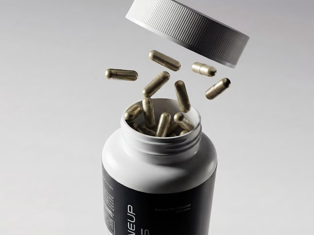
Hot take: hair growth products don't have to look like medicine to work like it.
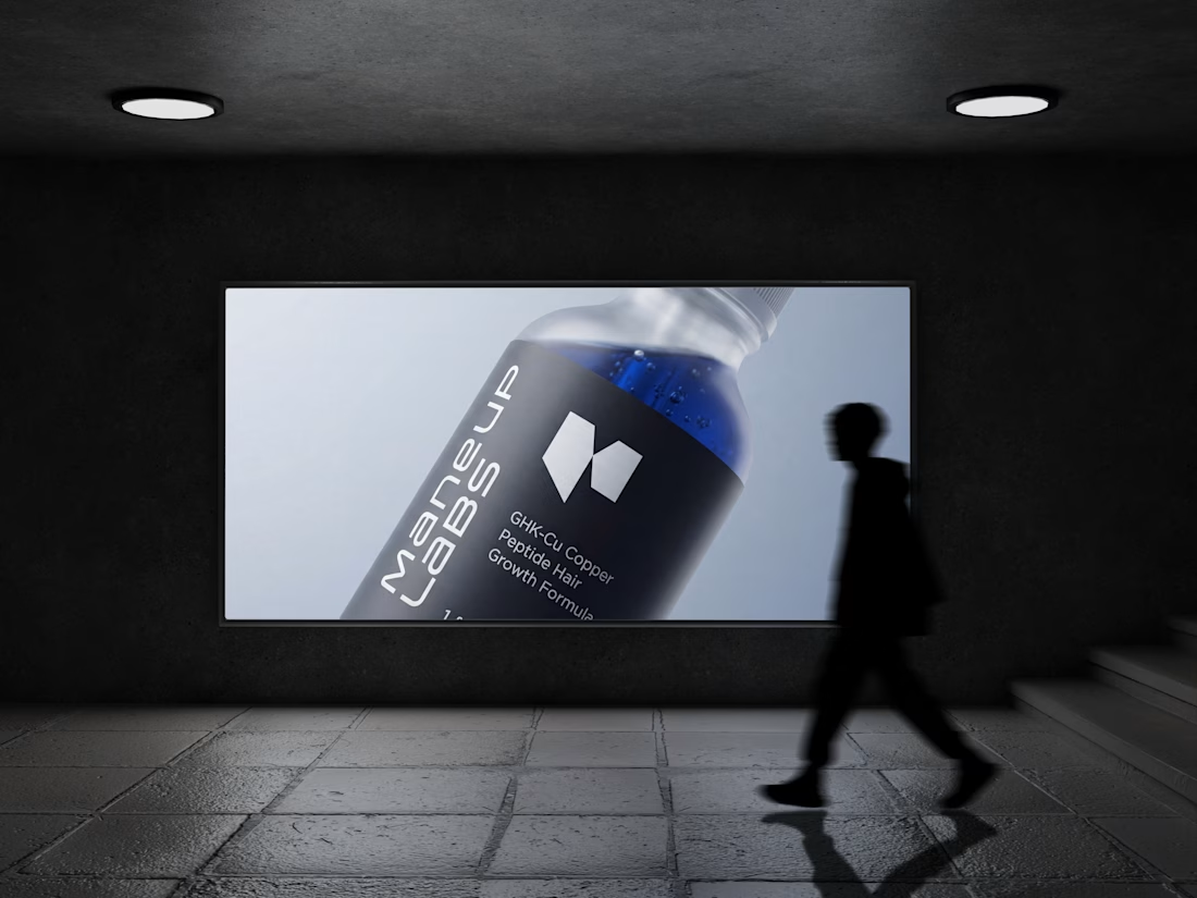
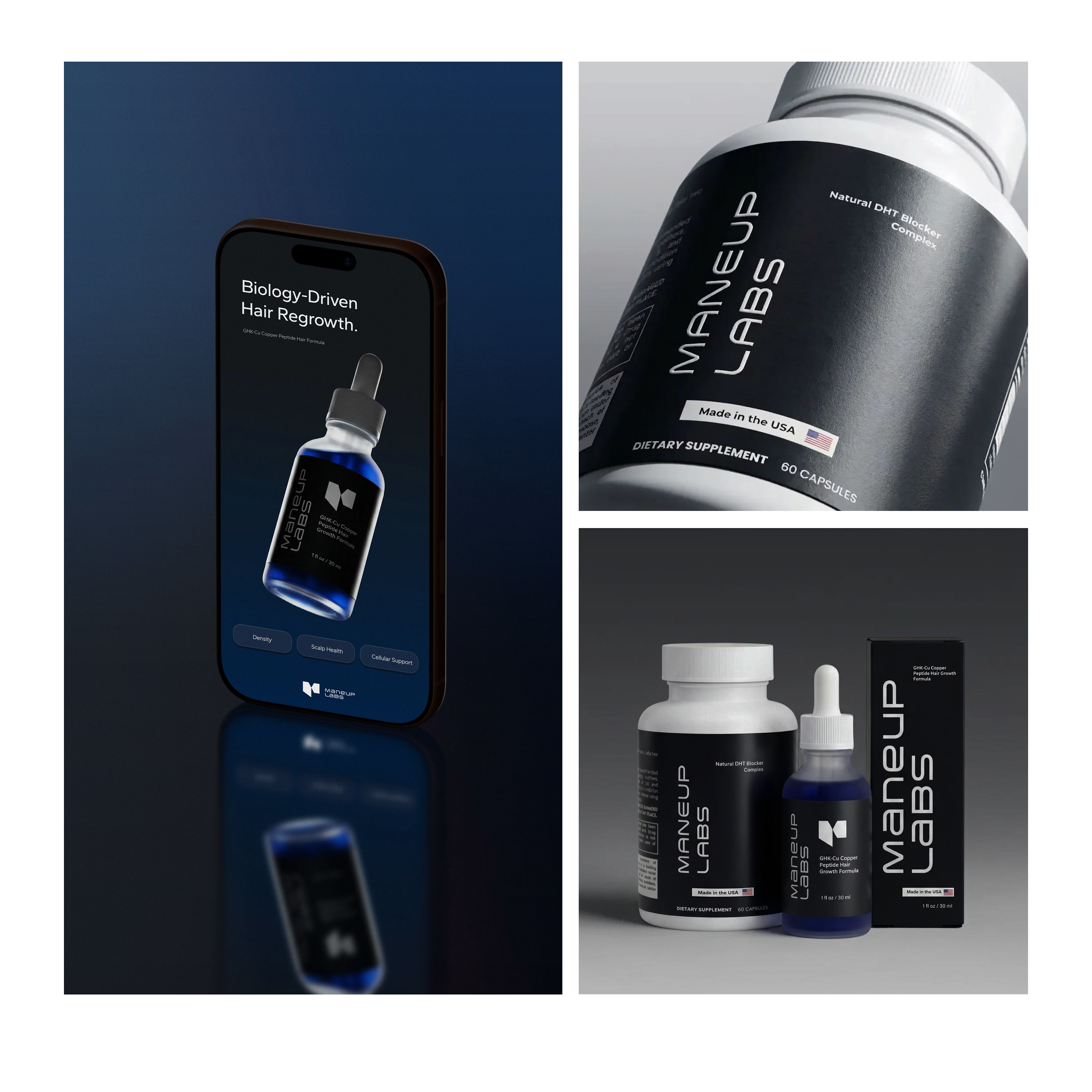
Most brands in this category go clinical white and blue, it reads safe, but it also reads like something you'd hide in a drawer, not something you'd want visible on your sink. For Maneup Labs, I went almost fully black instead.
That was a real risk. In a category this saturated with sterile, pharmacy-white packaging, going dark could just as easily read cold, or get lost next to competitors leaning into "clean = trustworthy." But it did the opposite: next to every clinical-looking bottle on the shelf, black reads premium, not medicinal, closer to what you'd expect from a grooming or fragrance brand than a hair-loss aisle.
That's the audience shift the whole rebrand was built around, not the guy who wants to feel like he's medicating something, but the guy who wants a product that looks like it belongs on his counter.
Would a bottle like this make it out of your bathroom cabinet and onto your sink?


Looks amazing! 💙


