
Sreeraj H
UI/UX & Web Designer | Figma · Mobile Apps · SaaS Websites
New to Contra
Sreeraj is ready for their next project!
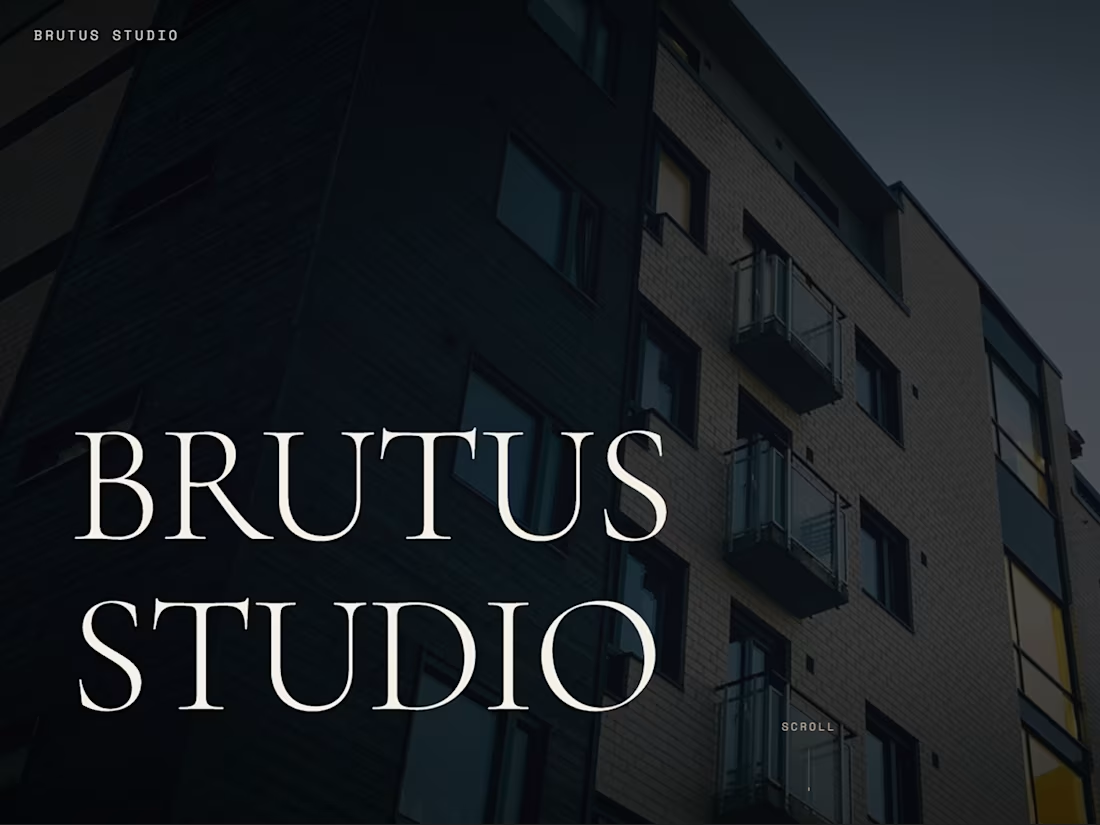
Brutus Studio is a concept website for a high-end architecture firm that operates at the intersection of silence, material truth, and brutalist design philosophy.
This project was a deliberate departure from safe, minimal design. The brief was to create something bold, editorial, and unapologetically raw.
What I designed and built:
Cinematic full-screen hero with building photography
Work portfolio grid with hover interactions
Studio philosophy and team section
Services page with editorial layout
Contact section with clean form
Serif headline typography against dark, moody backgrounds
Design approach:
Brutalist web design principles — oversized type, stark contrast, intentional tension between elements. No gradients, no rounded corners, no soft touches. The design communicates exactly what the brand stands for: architecture that doesn't compromise.
1
59
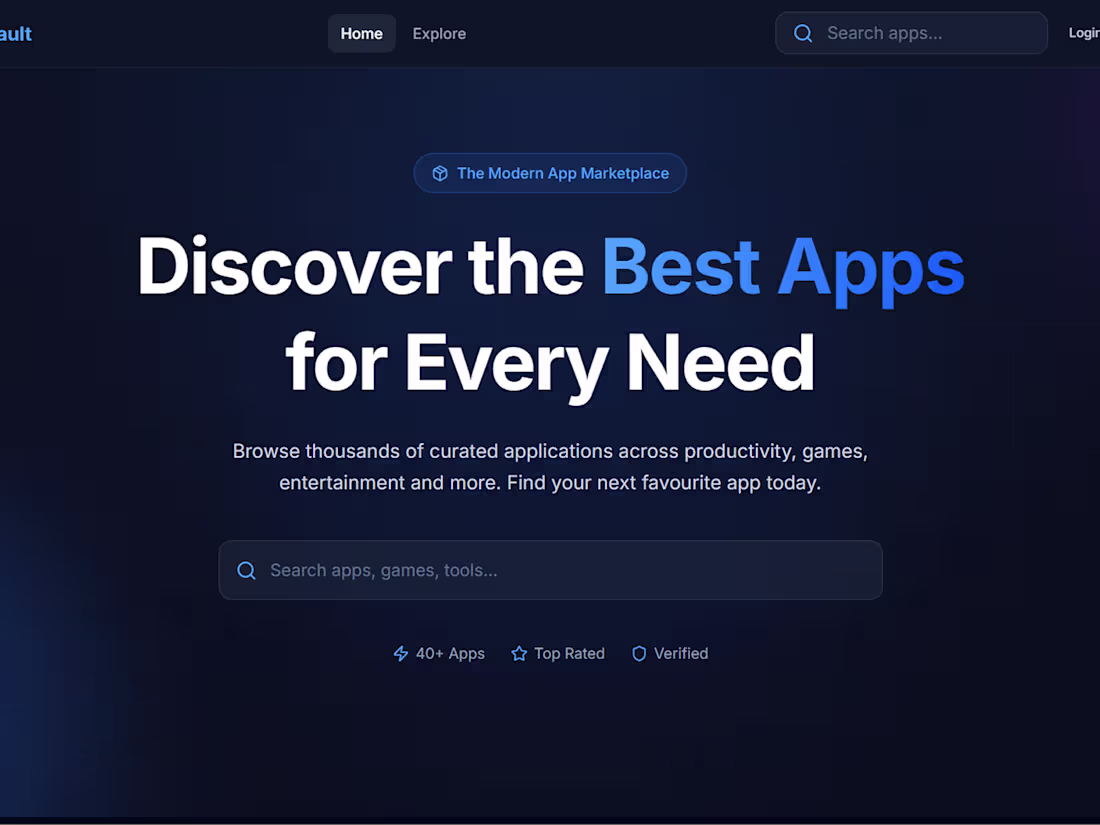
AppVault is a full-stack app marketplace — a Play Store-style platform where users can discover, search, and explore curated applications across productivity, games, entertainment, and more.
This went beyond a design exercise. AppVault is a working product with real functionality built in.
What I designed and built:
Home page with hero, search bar, and category filters
Explore page with app grid and sorting options
Individual app detail pages
User authentication (Login / Sign Up)
Database integration for app listings
Dark UI with blue accent throughout for a modern tech feel
Design approach:
The design prioritises discoverability and speed. Users should be able to find what they need in under 3 clicks. The dark theme reduces visual fatigue for a browsing-heavy experience.
1
73
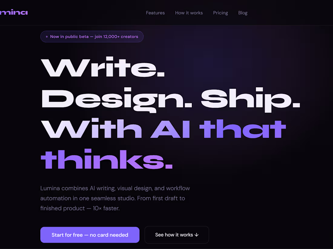
Lumina is a landing page for an AI-powered writing, design, and workflow automation tool. The brief was to design a page that communicates power and speed while driving free trial signups.
This is a conversion-focused design — every section was built with a clear purpose: hook, explain, build trust, convert.
What I designed and built:
Bold hero section with dual CTA buttons
Features section with icon-led benefit blocks
"How it works" step-by-step breakdown
Pricing tiers with highlighted recommended plan
Social proof / testimonials section
Sticky navigation with Sign In + Start Free CTA
Design approach:
Deep black background with purple and white type creates a modern, high-energy SaaS aesthetic. Large display typography commands attention immediately. The layout guides the eye downward toward conversion without feeling pushy.
1
69
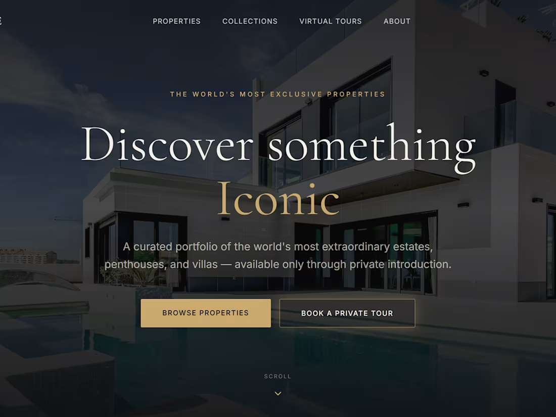
Luxe Estate is a luxury real estate platform designed for high-net-worth buyers looking for exclusive estates, penthouses, and villas available only through private introduction.
The goal was to create a digital experience that matches the prestige of the properties themselves — cinematic, elegant, and restrained.
What I designed and built:
Full-screen hero with animated WebGL background
Properties and Collections browsing pages
Virtual Tours section with immersive layout
Contact and private inquiry flow
Refined typography pairing (serif + uppercase tracking)
Gold and dark navy color palette for premium feel
Design approach:
Every design decision was made to communicate exclusivity. No clutter, no bright colors, no generic layouts. The site feels like walking into a private gallery — intentional and calm.
1
70
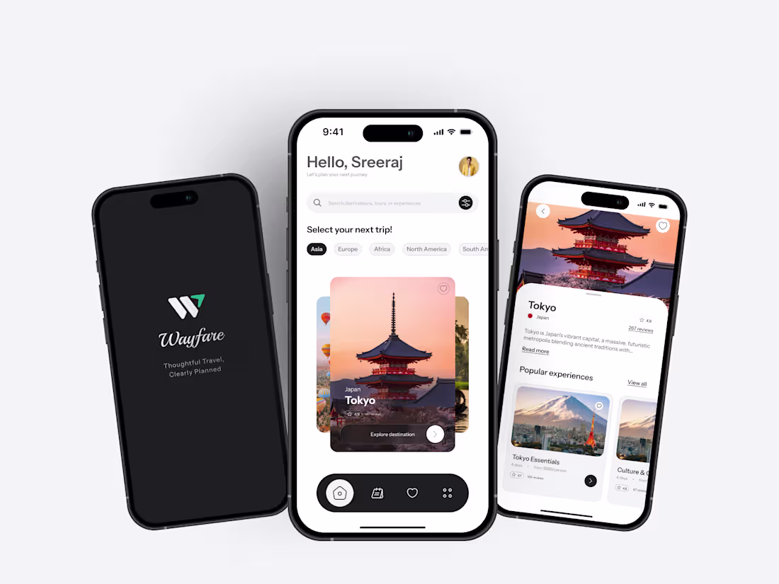
Wayfare is a travel planning app designed to simplify the entire trip journey — from destination discovery to booking confirmation — in one seamless mobile experience.
The design focuses on reducing the friction travelers face when jumping between multiple apps for flights, hotels, and itineraries. Wayfare brings it all together with a clean, intuitive flow.
What I designed:
Destination discovery feed with curated recommendations
Trip planning dashboard with itinerary builder
Flight and hotel search with filter options
Booking confirmation flow with clear status indicators
Profile and saved trips management
Smooth bottom navigation for quick switching between sections
Design approach:
Warm tones and immersive destination photography were used to evoke wanderlust while keeping the UI functional and easy to navigate. Typography and spacing were
1
75
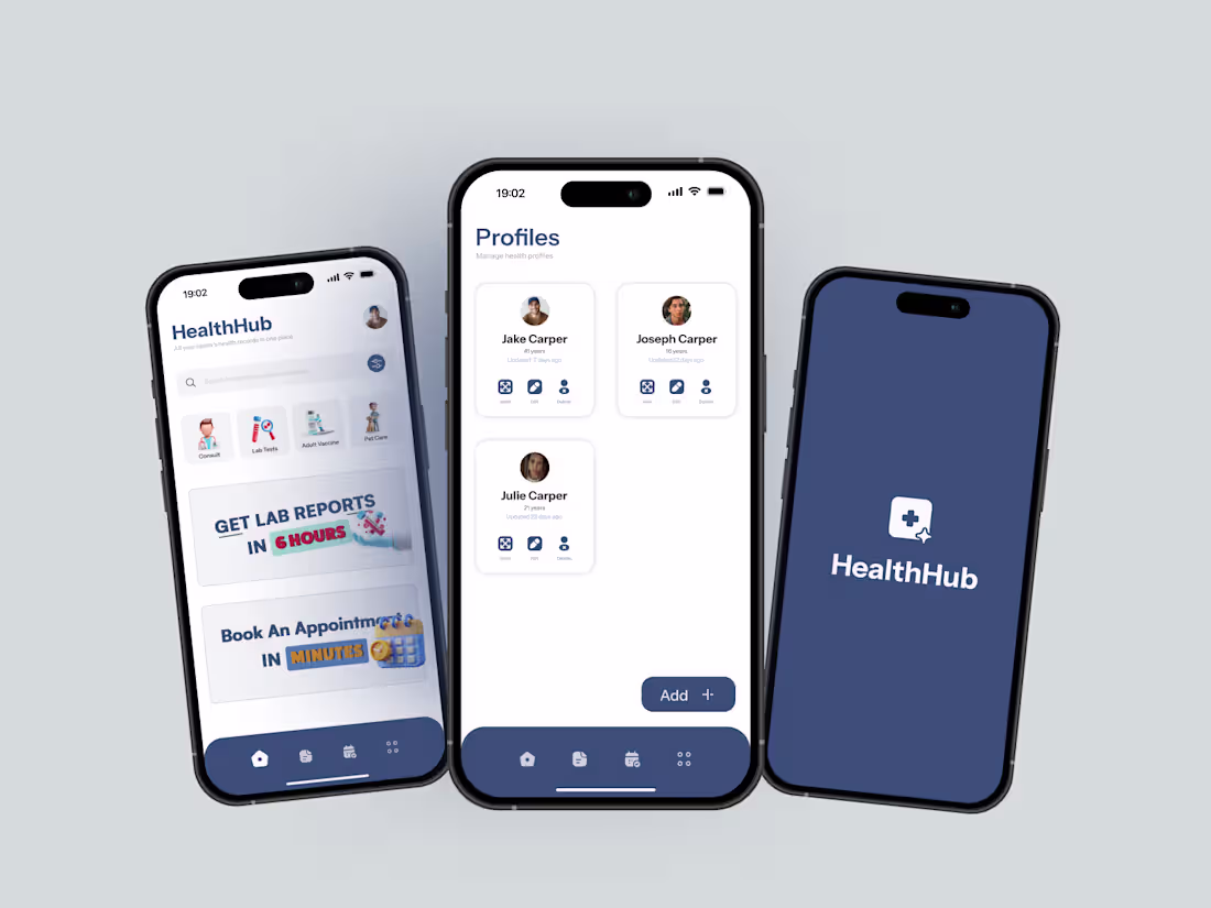
HealthHub is a mobile app designed to help families manage health records, track appointments, and access lab reports — all in one place.
The goal was to simplify a traditionally fragmented experience: people juggling multiple hospital apps, paper records, and missed follow-ups. HealthHub brings it all under one clean, trustworthy interface.
What I designed:
Home dashboard with quick-access health actions
Family profile management — add and switch between members
Health records section with categorized document storage
Lab report tracking with status indicators
Appointment booking flow with date and time selection
Clean bottom navigation for easy one-handed use
Design approach:
The UI uses a deep navy and white palette to communicate trust and medical credibility, while keeping the layout simple enough for all age groups to use comfortably. Every screen was designed with clarity first — no clutter, no confusion.
Tools used: Figma
Deliverables: UI screens, user flows, component system
0
70