









Your Agile AI-Native Partner: Product Design & Development
- $10k+
- Earned
- 11x
- Hired
- 5.0
- Rating
- 53
- Followers
Your Agile AI-Native Partner: Product Design & Development
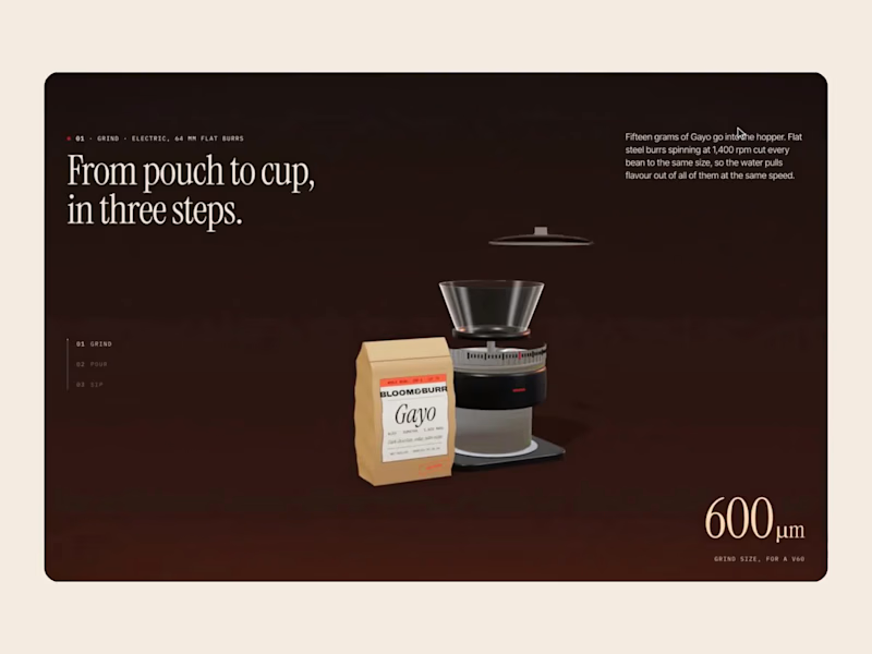
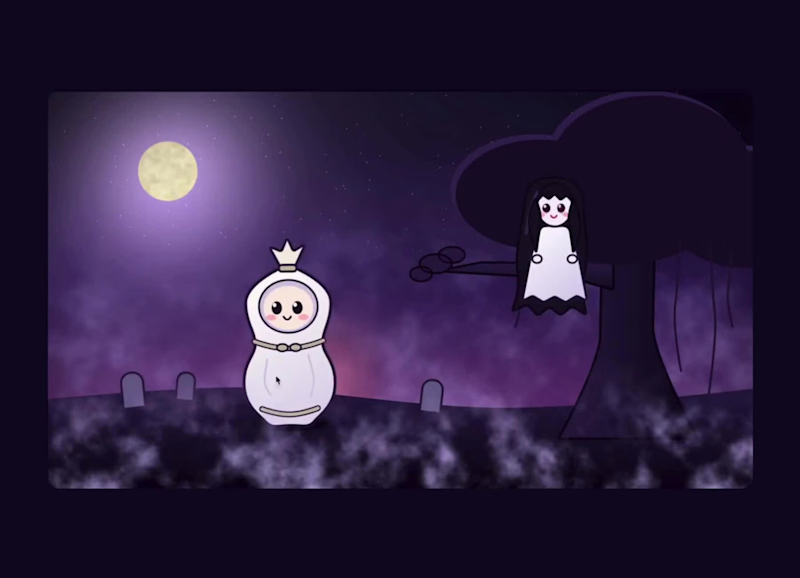
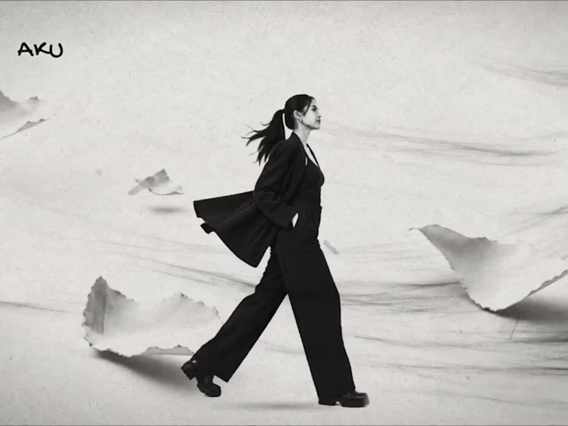
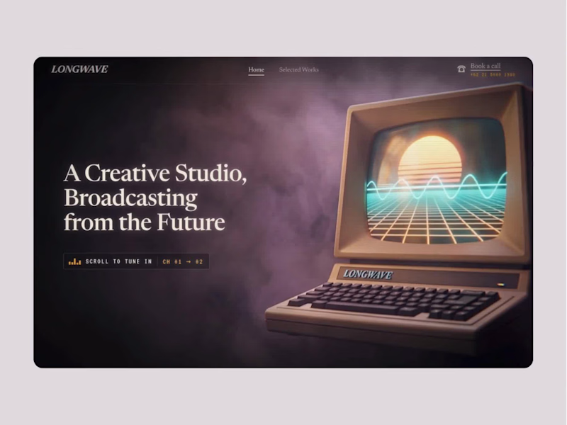
Remember Version A from our last JEV judgement experiment (https://on.contra.com/HwjnJF)?
Before putting it through JEV, we tested Claude Opus 5.5 by giving it only Version B as the source and asking it to build a second iteration from there.
We wanted to see how quickly and precisely it could push an existing direction further with minimal manual input, while still staying close to the original.
Here’s the result!
1
2
469

Digital Product Design for SaaS & Tech Companies
Digital Product Design for SaaS & Tech Companies



Brand Identity Designer
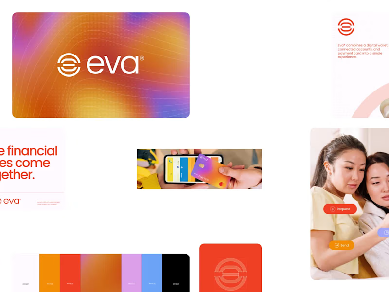
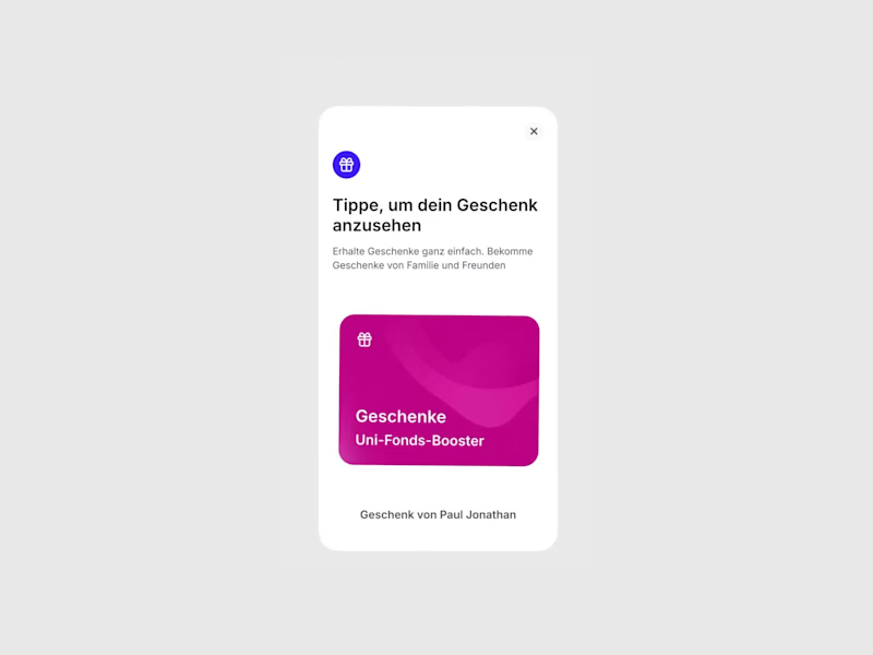
Introducing EVA, a digital wallet and payment ecosystem designed to make money movement feel effortless. The logo concept explores connection, simplicity, and fluidity through a minimal geometric symbol built for a modern financial experience.
Money, connected.
3
3
218


UI/UX Designer · Framer Expert · AI Builder
UI/UX Designer · Framer Expert · AI Builder


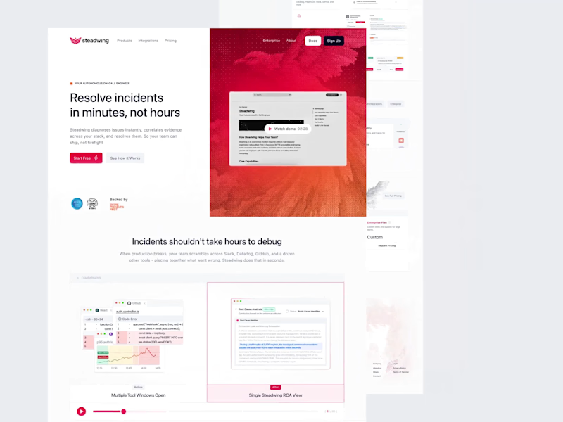
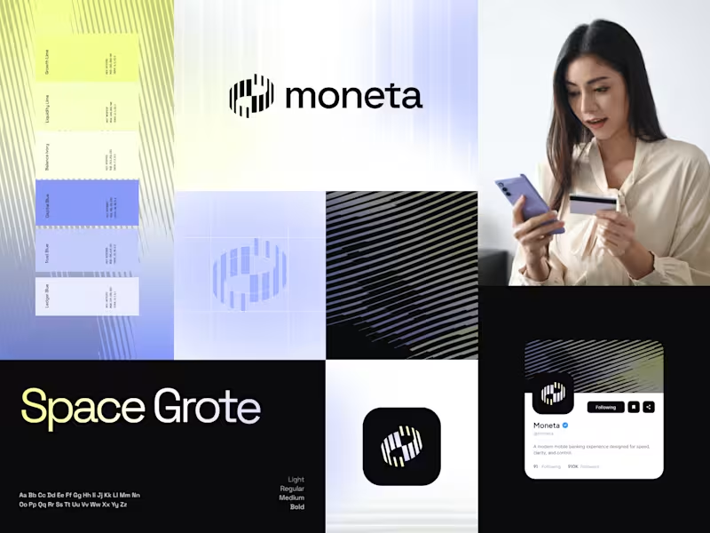
Hi guys, recently i designed a Finance Landing Page called Ascone. What do you think?
Want to build it right the first time? DM me - let’s talk strategy. 🤝
14
13
510


Branding Identity Designer
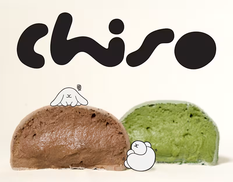
Chiso | Branding & Packaging Design
A good brand is more than what meets the eye. It's how every little detail comes together.
For Chiso, we explored a visual direction inspired by Japanese aesthetics, bringing together a distinctive logotype, soft visual elements, and thoughtfully designed packaging for mochi and soy milk.
From the typography to the packaging details, each element was designed to create a consistent identity that feels fresh, playful, and effortlessly recognizable.
A simple idea, thoughtfully brought to life.
0
12
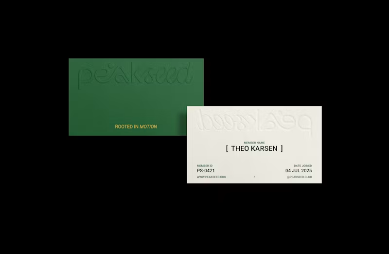
Peak Seed | Brand Identity
Inspired by the trail culture and alpine landscapes of Chamonix, France, Peak Seed is a mountain running community that sees running as more than a pursuit of performance. It is a continuous journey of movement, awareness, and connection with nature, ourselves, and one another.
The logotype combines organic typography with a defined geometric structure, balancing fluidity with precision. Its flowing curves and connected letterforms draw inspiration from the rhythm of each stride, the breath that sustains it, and the ever-changing contours of mountain trails.
The resulting identity reflects Peak Seed’s philosophy: moving freely while staying grounded, embracing the journey while remaining consistent, and finding connection along every path.
Have a brand in mind? Let’s build something meaningful together.
0
56

Framer Expert | UI/UX Designer with 3+ years experience
Framer Expert | UI/UX Designer with 3+ years experience


Designed a website for Nalaka, a social initiative that sails across Indonesia to support local businesses and community programs.
My focus was to blend storytelling with clarity, creating a design that feels human, but still drives action.
If you’re building something meaningful and need a designer to help tell your story, I’d love to connect.
1
0
257

