Freelance React Native Developers in Bangladesh
Sign Up
Post a job
Sign Up
Log In
Filters
2
Projects
People
Orbix Studio
max
Dhaka, Bangladesh
UX-led product design & dev agency for b2b saas and AI
$25k+
Earned
169
Followers
expert
Follow
Message
UX-led product design & dev agency for b2b saas and AI
0
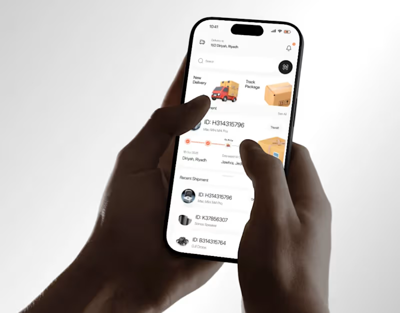
Couriq Delivery UI UX | Mobile App | Orbix Studio
0
10
18
Most people know how much they earn. Very few know how well they're actually managing it. This personal finance app was designed to close that gap. Not just with numbers - but with a score. Cash Flow Health: 86/100. Income: Excellent. Expenses: Good. Savings: Excellent. A single gauge that tells Noah more about his financial health in one glance than a spreadsheet could in an hour. The home screen handles the daily view - income, expenses,saved, quick payments to contacts, available cards, and budget saving categories. The transactions screen goes deeper - weekly spending , a monthly limit tracker showing spent out of , and a transaction activity score. The cash flow screen pulls it all together - inflow,2 outflow, net cash flow, and top inflow sources in one clean panel. Three screens. Every financial question answered before it's asked. This is what personal finance UI looks like when it treats users like adults who want clarity, not just data. Does this feel like a finance app that would actually change how someone manages their money? 👇 Designed by Orbix Studio (https://www.orbix.studio/) · Tools: Figma , Jitter
8
18
199
11
Some creative projects start with a character. Ronin Neon started with a world. The brief was a cyberpunk warrior universe where ancient samurai honor meets neon-lit futurism a team of five rebels fighting corrupt powers in a city that lost its way. Kai the fearless leader. Onyx the silent assassin. Juno the smart hacker. Rai the strong tank. Yurei the ghostly archer. Each one distinct. All of them unmistakably Ronin Neon. The world-building came first. The characters grew out of it. And the visual system deep purple atmospheres, electric green accents, explosive action compositions, and trading card UI was designed to hold the entire universe together across every format it lands in. Billboards, character sheets, card sets, campaign pages, and a group hero shot that makes you want to know every backstory before you've read a word. "The future is forged in battle and the agents stand ready." That line lives on the campaign wall and tells you everything about what Ronin Neon is a brand, a story, and a world worth fighting for. This is concept art and IP development where the design does as much storytelling as the illustration. Does this feel like a universe you'd want to play in? 👇 Designed by Orbix Studio Tools: Illustrator , Figma #ConceptArt #GameDesign #CharacterDesign #IllustrationArt #CyberpunkArt #ContraFreelance #GameIllustration #WorldBuilding
5
11
251
23
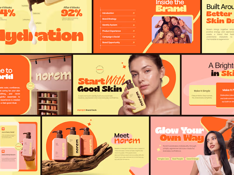
Most brand decks explain a skincare brand. This one makes you feel it before the second slide. Bold yellow, expressive orange, joyful product photography, and a brand strategy that turns daily skincare into a feel-good ritual 92% noticed balanced-looking skin after 4 weeks. Simple Care. Real People. Good Energy. Check it out (https://dribbble.com/shots/27709781-Norem-Skincare-Brand-Identity-Pitch-Deck-Design)
17
23
584
React Native Developer
(3)
Follow
Message
Md Rajibul Ahsan
pro
Dhaka, Bangladesh
Full-Stack App & Web Developer | AI & Store Launch , UI/UX

19
Followers
Follow
Message
Full-Stack App & Web Developer | AI & Store Launch , UI/UX
0
97+ projects. 97% job success. Swipe to see how we got here → We're AttoExa Solutions - a Dhaka-based team building for US and EU businesses in construction, real estate, and B2B services. What we actually do: → Custom mobile apps (Flutter, React Native) → Full-stack web development → AI agents that answer calls, qualify leads, and handle support — built on n8n, Vapi, ElevenLabs, and Go High Level Website - https://attoexasolutions.com/ (https://attoexasolutions.com/)Upwork - https://www.upwork.com/freelancers/rajibulahsan?mp_source=share (https://www.upwork.com/freelancers/rajibulahsan?mp_source=share)Email - contact@attoexasolutions.org (mailto:contact@attoexasolutions.org)#softwaredevelopment (https://www.instagram.com/explore/tags/softwaredevelopment/?hl=en) #aiautomation (https://www.instagram.com/explore/tags/aiautomation/?hl=en) #techstartup (https://www.instagram.com/explore/tags/techstartup/?hl=en) #smallbusiness (https://www.instagram.com/explore/tags/smallbusiness/?hl=en) #digitalagency (https://www.instagram.com/explore/tags/digitalagency/?hl=en) #b2b (https://www.instagram.com/explore/tags/b2b/?hl=en) #webdevelopment (https://www.instagram.com/explore/tags/webdevelopment/?hl=en) #appdevelopment (https://www.instagram.com/explore/tags/appdevelopment/?hl=en)
0
43
1
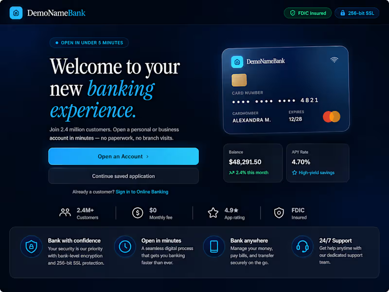
Most banking apps lose users before they even open an account. So I designed one that doesn't. Introducing DemoNameBank a high-fidelity digital onboarding experience for fintech, built to make KYC feel effortless instead of exhausting. Inside the project: Individual & Business account opening flows ID verification, document scanning & liveness detection OTP verification & real-time processing states Business directors, UBOs & signatory management Document upload with review/edit workflows Fully responsive desktop + mobile interfaces Modern glassmorphism-based fintech design system Built with React 19 · TypeScript · Vite · Tailwind CSS. NodeJS This was designed as a high-fidelity project for product demos, UX validation, and fintech design exploration with one goal: make trust visible at every step of the journey. #Fintech #DigitalBanking #UIUXDesign #ReactJS #TypeScript #TailwindCSS #KYC #DigitalOnboarding #FintechDesign #ProductDesign
1
129
0
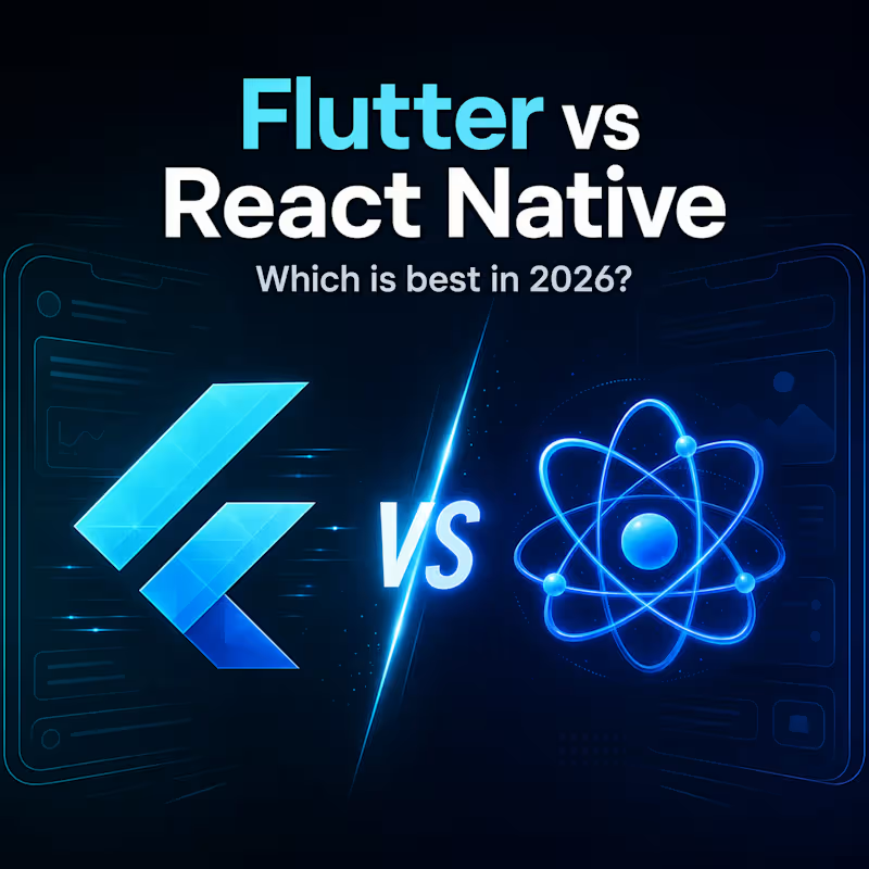
Flutter 4 vs React Native in 2026: which framework is right for your mobile app? Read the full article: https://attoexasolutions.com/flutter-4-vs-react-native-2026/
0
128
0
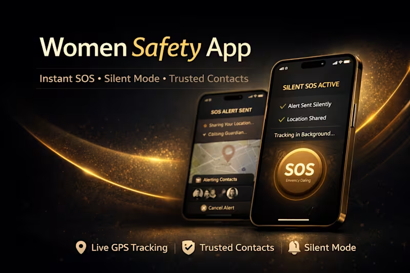
The client wanted a dependable safety app that users could trust in real, high-stress situations—where every second matters and hesitation isn’t an option. I built a real-time mobile solution with instant SOS alerts, live location sharing, trusted contact notifications, and a discreet silent mode. The interface was intentionally designed to feel calm, clear, and premium, helping users act quickly without panic. The result is a secure, scalable, production-ready app that prioritizes speed, reliability, and user confidence in critical moments.
0
304
React Native Developer
(4)
Follow
Message
Tousif Ahmed
Dhaka, Bangladesh
AI FullStack Engineer | 6+ Years of EXP
6
Followers
Follow
Message
AI FullStack Engineer | 6+ Years of EXP
0
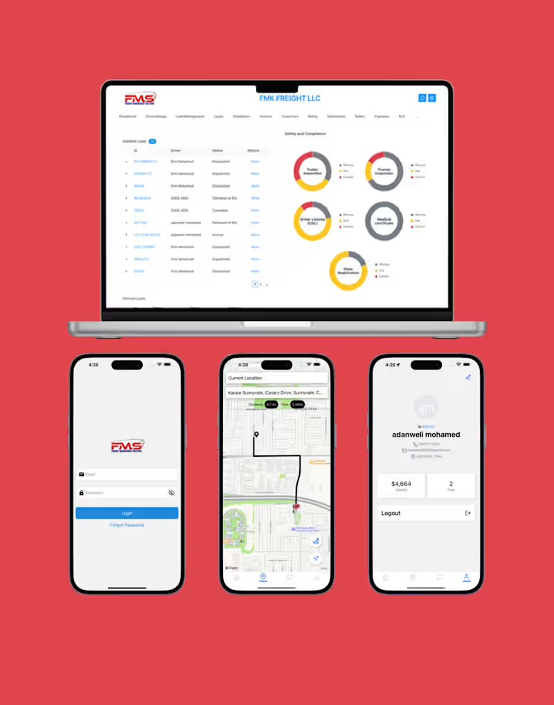
Freight Management Solution | Digital Freight Management System
0
8
0
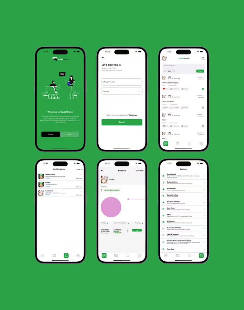
Tradematrix | The Social Network for Investors
0
30
0
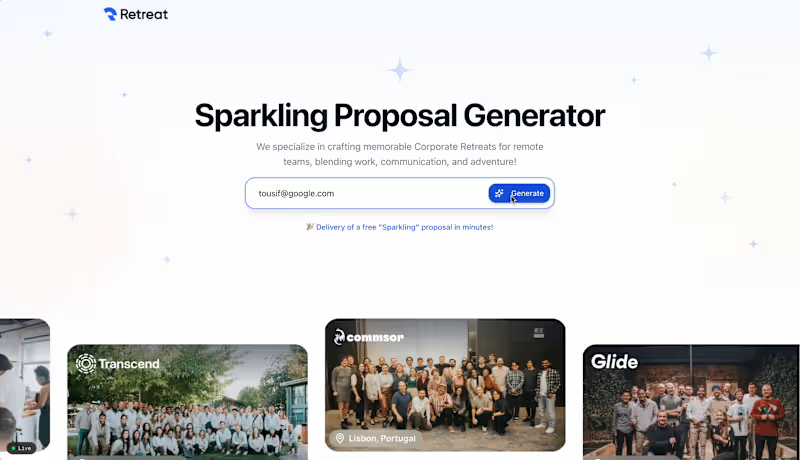
Sparkling Proposal Generator
0
5
0
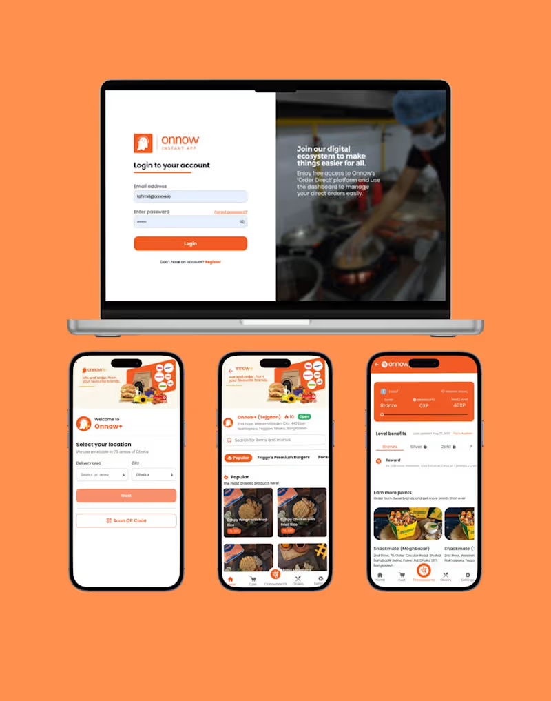
Onnow | Made food easily accessible to over 165M people
0
12
React Native Developer
(2)
Follow
Message
Md Ashrafuzzaman Asif
Dhaka, Bangladesh
Pro Web Developer: Clean, Efficient Solutions
Follow
Message
Pro Web Developer: Clean, Efficient Solutions
0
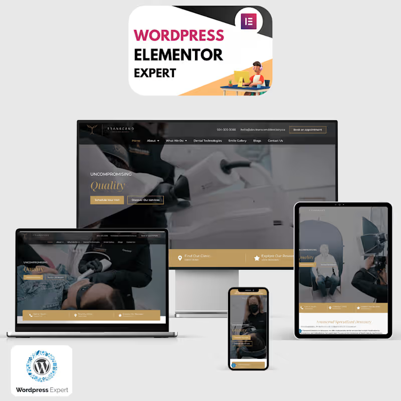
Transcend Specialized Dentistry | Transform Your Smile
0
6
0
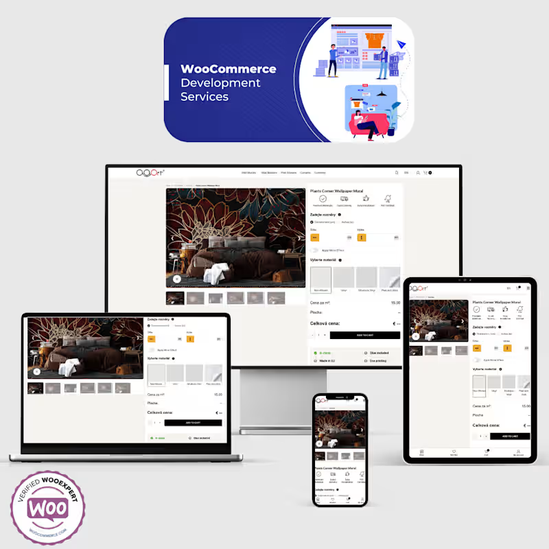
Custom WordPress & WooCommerce Solution
0
16
0
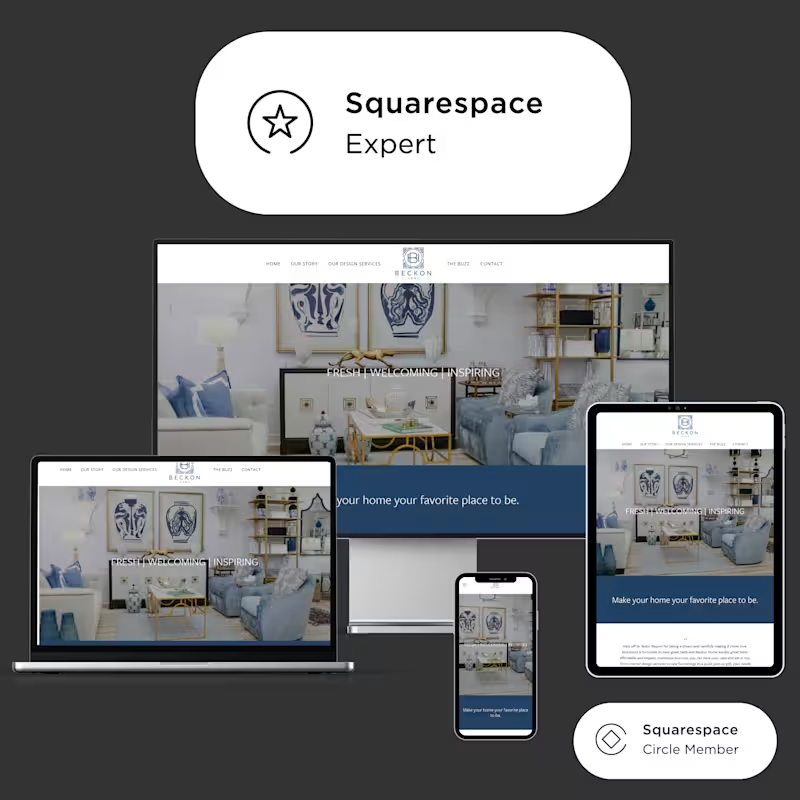
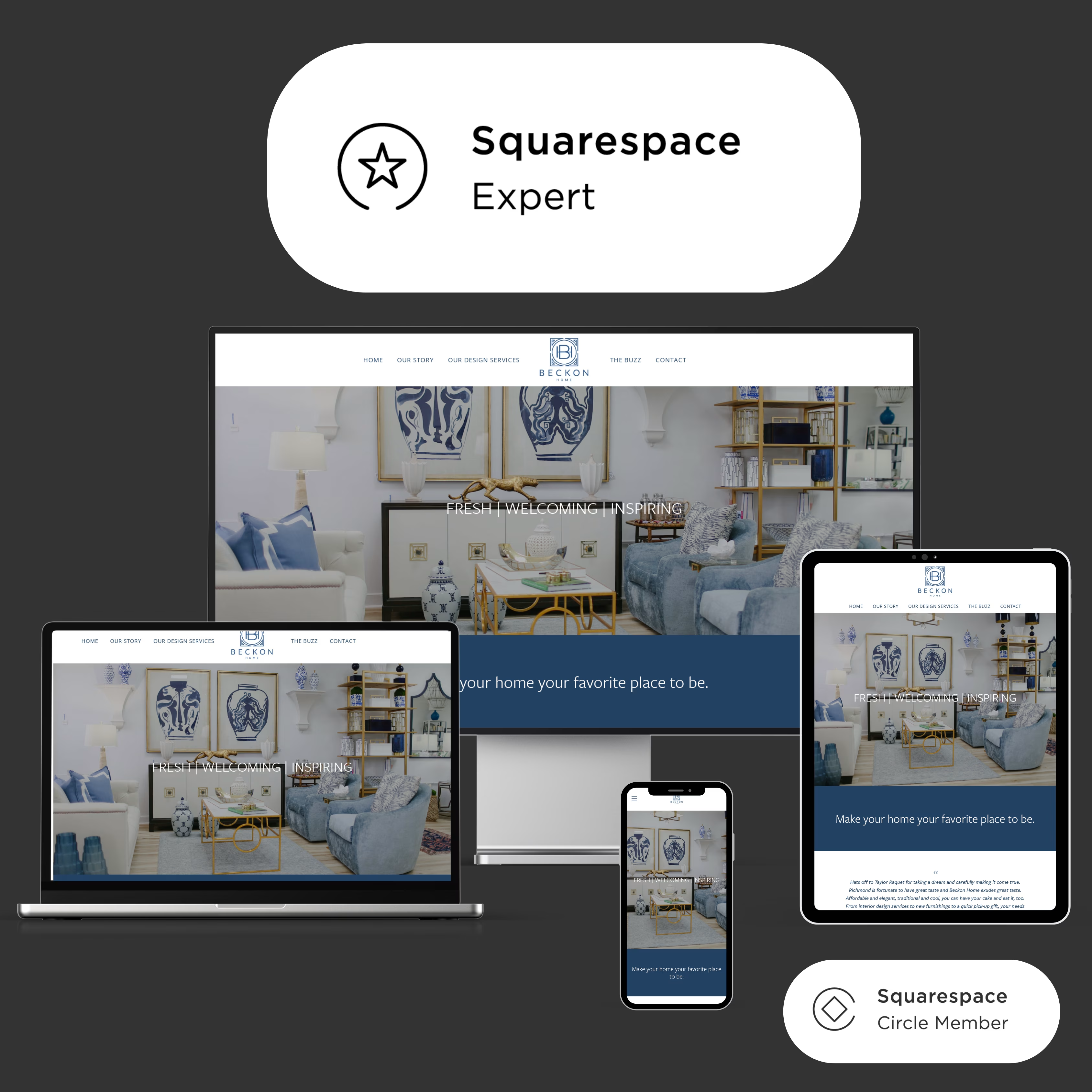
Custom Squarespace Solution with Advanced API Integration
0
7
View more →
React Native Developer
(2)
Follow
Message
Tahsin Ahmed
Dhaka, Bangladesh
UI/UX Designer and Front-End Developer
45
Followers
Follow
Message
UI/UX Designer and Front-End Developer
0
AI Web Design
0
8
0
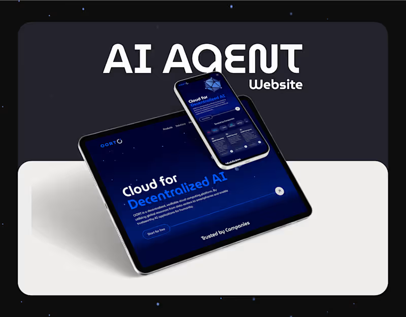
AI Agent website design
0
7
1
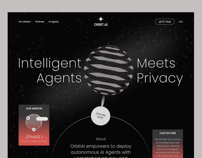
AI Agent Website I Orbit AI
1
6
0
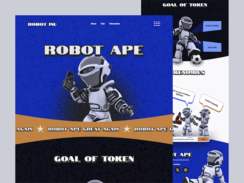
Meme coin
0
4
React Native Developer
(4)
Follow
Message
MD. Tanvir Rahman
Dhaka, Bangladesh
WordPress · Webflow · Shopify · GHL | Web Developer
17
Followers
Follow
Message
WordPress · Webflow · Shopify · GHL | Web Developer
0
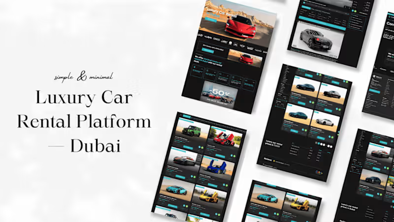
Luxury Car Rental Platform — Dubai A client from the Middle East reached out with a simple request — "I want people to book a car the way they'd walk into a showroom. Effortless." That one line set the tone for everything. The brand was luxury. The market was Dubai. And the expectation was clear — the website had to feel as premium as the cars sitting in the garage. I started with the experience. Every scroll had to feel intentional, every transition had to feel smooth. I brought in GSAP for animations — not to show off, but because a Lamborghini deserves better than a page that just loads. The result was a frontend that moved the way luxury should: quietly, confidently, without effort. Then came the booking flow. The client's biggest frustration with their previous setup was drop-offs — people browsing but never booking. So I stripped it down. Browse by category, pick a car, book it. No extra clicks, no confusion. Just a clean path from interest to confirmation. But the part the client loved most? The backend. He could now log in, upload a new car under the right category, and see exactly who had booked what — all by himself. No developer calls, no waiting. Full control, zero complexity. Built on Next.js and React, powered by Cloudflare, tracked with Google Analytics and Facebook Pixel — the platform was built to scale from day one. What started as "make it simple" turned into something the client proudly calls his best business decision this year.
0
155
1
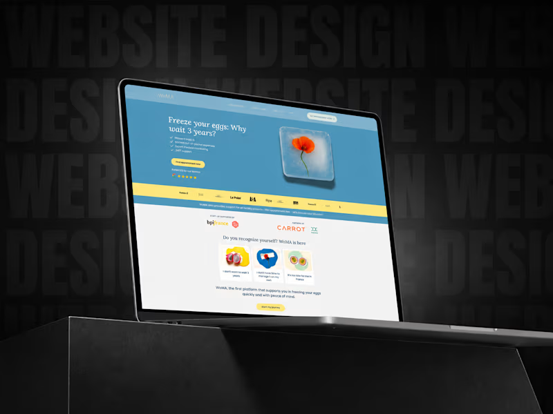
Case Study: Turning a Client’s Webflow Website Into a Cleaner, More Responsive & User-Friendly Experience Sometimes a project does not start with a full rebuild. Sometimes it starts with one simple question from a client: “Can you review my current website and tell me how it can be improved? (https://www.woma.health/)” That is precisely how this project began. The client reached out to me because she already had a website, but it was not looking or performing the way she wanted. She shared the existing website link with me, and after reviewing it carefully, I noticed that the site was built in Webflow. Since Webflow is one of the platforms I work with confidently, I explained that we did not need to start everything from zero. Instead, we could improve the current structure, optimize the layout, make the design more polished, and create a better experience for visitors. After that, the client asked me how I would improve it. So, I reviewed the website in more detail and shared my thoughts about the layout, section structure, responsiveness, and overall user journey. During that discussion, she mentioned that she had already created a Figma design for the updated version of the website. She shared the Figma file with me, and I went through the full design carefully. Some sections were already well thought out by the client, while a few areas needed improvement. I suggested updates where needed, and she also refined some parts based on the information she wanted to present to her visitors. Once the website access was shared, I checked the Webflow structure properly. The client had started working on some sections herself, especially the blog area, but there were a few technical and layout-related issues that needed to be addressed. After we finalized the project scope and budget, I started the development work. The goal was not to make the website overly animated or visually complicated. The client wanted the website to feel clean, balanced, informative, and easy to navigate. Her visitors needed to understand the content clearly, so the focus was on readability, spacing, mobile responsiveness, and a smooth browsing experience. One of the most important parts of this project was making sure the design looked great across different devices. The desktop version had to feel polished, but the mobile version was equally important. I carefully adjusted the spacing, typography, layout behavior, and responsive structure so users could easily read and interact with the website from any screen size. Another key part of the project was the blog page. At one point, the client wanted to organize the blog content in a better way. She asked if we could add a filtering system so visitors could browse posts based on specific categories. I suggested a category-based filtering system, where users could click on a category and instantly see only the relevant posts. This made the blog page much easier to use and helped visitors find the content they were looking for faster. To make the idea clear, I first created a sample version inside the website and showed it to the client. She really liked the concept. After that, she created another Figma design for the blog page, and we refined it together with a few additional suggestions. The final blog page became simple, clean, and user-friendly — exactly what the website needed. This project was a true collaboration between the client’s creative direction and my Webflow development expertise. The client had a clear vision for how she wanted to communicate with her audience. My role was to bring that vision into Webflow properly, make the layout responsive, improve the technical structure, and ensure the website felt balanced and professional. The result was a much cleaner, more polished, and more user-friendly website. What I really enjoyed about this project was the collaboration. The client was involved in the creative process, open to suggestions, and focused on creating something meaningful for her visitors. Even after completing the main work, she continues to reach out whenever she needs help or updates. That kind of long-term client relationship is always valuable to me because it shows trust, communication, and satisfaction with the work. Project Highlights: ✅ Existing Webflow website review ✅ Figma design implementation ✅ Layout and section improvements ✅ Mobile responsiveness optimization ✅ Blog page restructuring ✅ Category-based blog filtering system ✅ Clean, balanced, and user-friendly design ✅ Ongoing client support and collaboration This project is a great example of how a website does not always need to be rebuilt from scratch. Sometimes, with the right strategy, clean execution, and thoughtful improvements, an existing website can be transformed into something much more professional, functional, and aligned with the client’s goals.
1
1
124
0
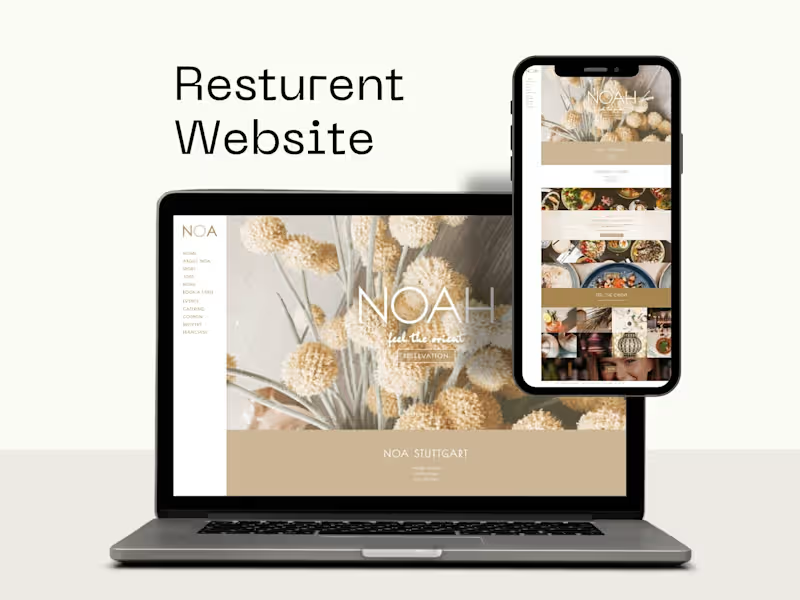
I designed and developed this elegant restaurant website using WordPress CMS, focusing on a premium visual experience, brand consistency, and smooth user interaction. The website was created to present the restaurant’s identity in a stylish and engaging way while making it easy for visitors to explore the menu, discover the atmosphere, and take action through reservation-focused calls to action. The design was built with a strong emphasis on visual storytelling, using large imagery, refined typography, balanced spacing, and a modern section flow to reflect the restaurant’s upscale ambiance. I created the layout to support both branding and usability, helping the business showcase its food, interior experience, opening hours, and key information in a clear and attractive format. Along with the WordPress development, I also integrated essential functionality such as popup plugins and interactive content elements to improve engagement and support promotional or booking-related actions. This project demonstrates my ability to combine custom design, WordPress CMS management, and plugin-based functionality into a polished hospitality website that feels both professional and inviting.
0
352
1
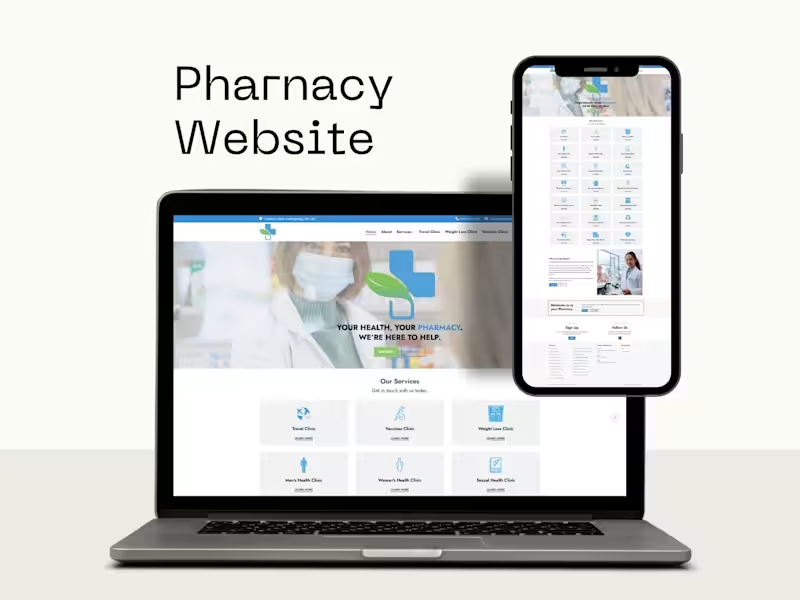
Designed and developed a professional pharmacy website using WordPress, featuring a clean service-based layout, responsive design, and clear business presentation. I also optimized the website for SEO to improve search visibility, page structure, and overall discoverability.
1
338
React Native Developer
(1)
Follow
Message
MD Emdadul Ahsan
Dhaka, Bangladesh
Logic-Driven UX Design with Attention to Detail
Follow
Message
Logic-Driven UX Design with Attention to Detail
0
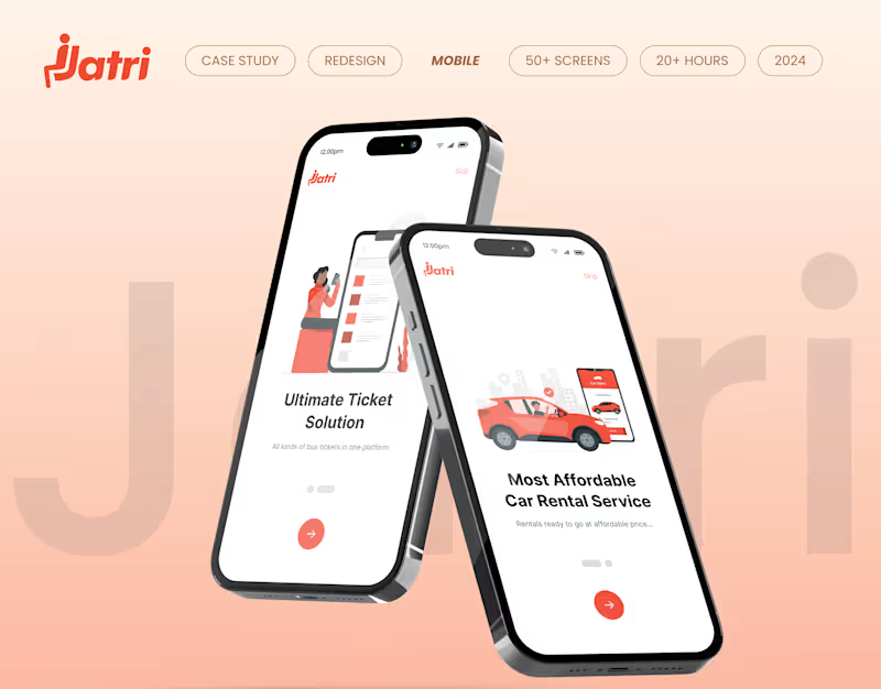
Jatri Reimagined: A Modern UI/UX Transformation
0
1
0
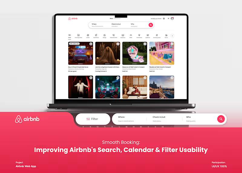
Improving Airbnb's Search, Calendar & Filter Usability :: Behan…
0
3
0
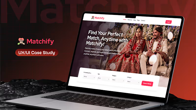
Matchify Case Study Redefining the Matrimony Experience :: Beha…
0
2
0
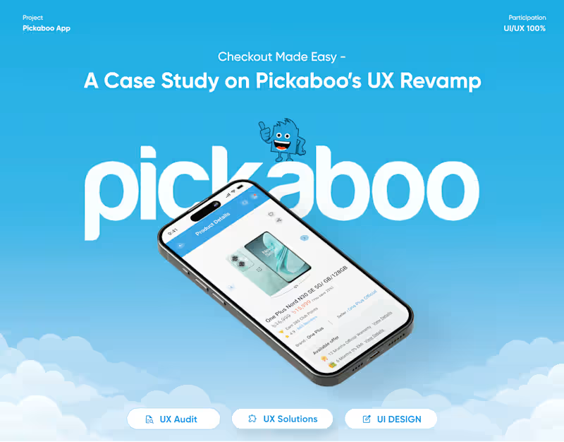
Pickaboo’s UX Revamp Case Study
0
3
React Native Developer
(1)
Follow
Message
Md Mamun Hossain
Pabna, Bangladesh
Full-Stack Developer | WordPress, MERN & SEO
7
Followers
Follow
Message
Full-Stack Developer | WordPress, MERN & SEO
0
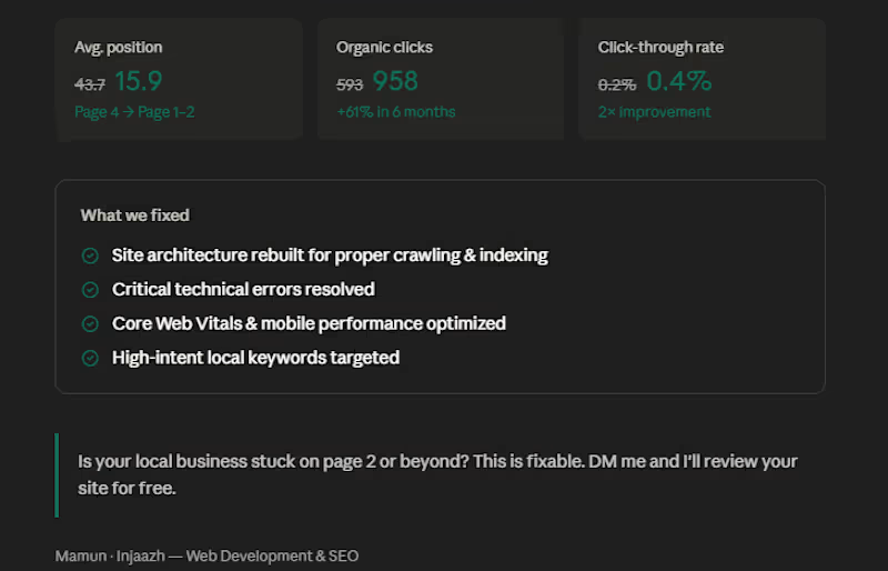
6 months ago, a contractor flooring supplier in Augusta came to me, stuck on page 4 of Google. Average position: 43.7 Monthly clicks: 593 Visibility: almost zero for the keywords that actually bring in customers. Here's what we fixed: — Rebuilt the site architecture so Google could properly crawl and index every page — Resolved critical technical errors that were silently killing rankings — Optimized for high-intent local keywords like "contractor flooring supplier Augusta" and "flooring pros Augusta" — Improved Core Web Vitals and mobile performance — Structured content around the questions real customers search before buying The result after 6 months: Average position moved from 43.7 → 15.9 Organic clicks grew from 593 → 958 CTR doubled from 0.2% → 0.4% The site now ranks on page 1–2 for keywords that bring in actual buyers. No paid ads. No shortcuts. Just technical execution and the right strategy. If you run a local business in the USA and your website is sitting on page 2, 3, or beyond — this is fixable. DM me or drop a comment. I'll take a look at your site and tell you exactly what's holding it back.
0
152
2
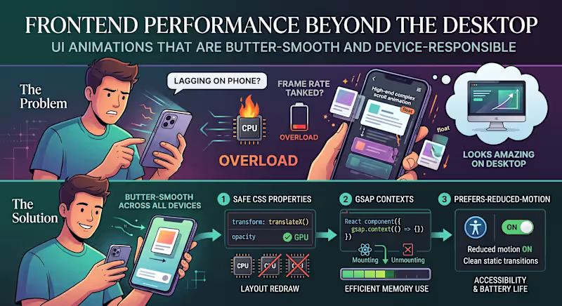
"The animations look amazing, but why is the page lagging on my phone?" The Problem: We’ve all seen modern websites loaded with high-end scroll effects, smooth micro-interactions, and floating cards. On a powerful developer desktop, it looks stunning. But hand it over to a user on a mid-range mobile device or a battery-saving laptop, and the frame rate tanks. The issue is that heavy animations are often tied directly to the browser’s main rendering thread. When your visual effects start competing with data fetching and DOM updates, the entire user experience grinds to a halt. The Solution: Smooth animations shouldn't cost you user performance. If you want high-end motion that stays butter-smooth across all devices, here is the 3-step technical approach to use: Animate Only the "Safe" CSS Properties: Never animate properties that trigger a layout redraw (like width, height, top, or margin). Stick strictly to transform (for moving/scaling) and opacity. These are handled directly by the GPU, bypassing the heavy CPU rendering pipeline. Isolate with GSAP Contexts: If you are building dynamic user interfaces in React or Next.js, use a dedicated animation library like GSAP paired with useGSAP() or explicit context cleanup. Unmounted components with leftover scroll triggers will quietly eat up device memory in the background. Respect prefers-reduced-motion: Always add a media query check for reduced motion. If a user has motion sensitivity or low-power mode enabled on their operating system, serve them clean, static transitions instead of complex scroll triggers. It’s better for accessibility and saves battery life. Visual polish should enhance the user experience, not break it. What’s your go-to strategy for balancing heavy UI animations with real-world website performance? Let’s chat in the comments! 👇
2
2
105
1
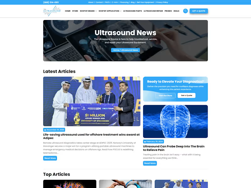
The Ultrasound Source I developed and managed the digital platform for The Ultrasound Source, a premier provider of new and refurbished ultrasound systems. The primary objective was to build a professional, trust-driven interface that caters specifically to hospitals, private clinics, and healthcare practitioners. The website features a complex product catalog that organizes equipment by brand and application, allowing users to easily filter between portable and console units from major manufacturers like GE, Philips, and Mindray.
1
193
0
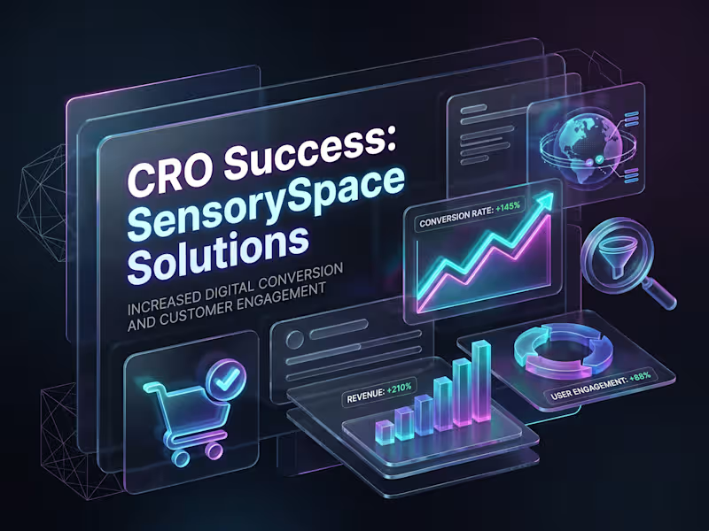
Shopify Conversion Rate Optimization (CRO) for SensorySpace Solutions Project Overview SensorySpace Solutions is a specialized e-commerce store dedicated to selling a variety of sensory products. While the website was generating consistent traffic, the sales and overall conversion rates were falling short of expectations. Operating as a solo freelancer, my primary responsibility was to conduct a comprehensive CRO audit and develop a data-driven framework and presentation to boost their conversions. The Challenge Upon analyzing the store, several key bottlenecks were identified: 1. Navigation Friction: The user experience (UX) and menu navigation were somewhat complex, making it difficult for potential customers to find their desired products quickly. 2. Insufficient Product Information: The product pages lacked compelling descriptions, high-quality visual hierarchy, and adequate social proof (customer reviews) to drive purchasing decisions. 3. Checkout Drop-offs: The process after adding items to the cart was too lengthy, resulting in a significantly high cart abandonment rate. The Solution & Execution To address these issues, I implemented a step-by-step strategic audit and optimization plan: 1. In-Depth CRO Audit: I conducted a deep dive into user behavior and website analytics to create a comprehensive CRO audit report identifying exact drop-off points. 2. UX/UI Optimization Recommendations: I proposed specific changes to modernize the product pages and make them more user-friendly. This included improving visual hierarchy, ensuring Call-to-Action (CTA) buttons were highly visible, and refining product descriptions. 3. Integrating Trust Factors: To build consumer confidence, I recommended the strategic placement of trust badges, secure payment icons, and highlighted customer reviews throughout the buyer's journey. 4. Strategic Presentation: I designed a professional presentation for the client that clearly outlined the audit findings, identified the core problems, and provided direct, actionable solutions. The Result By implementing the recommended framework and optimizations, the store saw several positive shifts: - A noticeable decrease in the website's bounce rate. - A increase in average session duration as users engaged more deeply with the optimized product pages. - A reduction in checkout drop-offs, which directly contributed to an improved overall conversion rate and increased sales. #ShopifyCRO #EcommerceGrowth #ConversionOptimization #UXDesign
0
194
React Native Developer
(1)
Follow
Message
Explore people