Graphic Design Projects in Ahmedabad
Graphic Design Projects in Ahmedabad
Sign Up
Post a job
Sign Up
Log In
Filters
2
Projects
People
Message
1
Tanvi Nayak
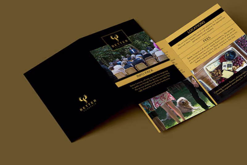
INFO PACK - BETTER FUNERRALS
1
8
Message
0
Sohil Obor
pro
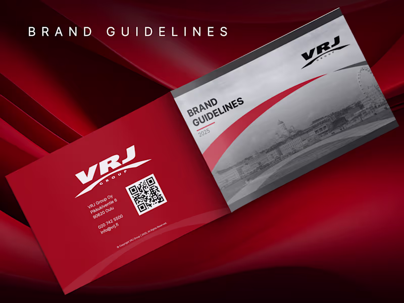
Multipage Brand Guideline Design for VRJ Construction Company
0
4
Message
1
Jayesh MSP
pro
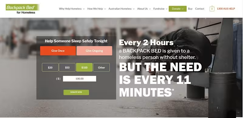
Backpack Bed | Web Development | Web Design | Logo Design
1
9
Message
1
Parmar Parth Ranjitsinh
pro
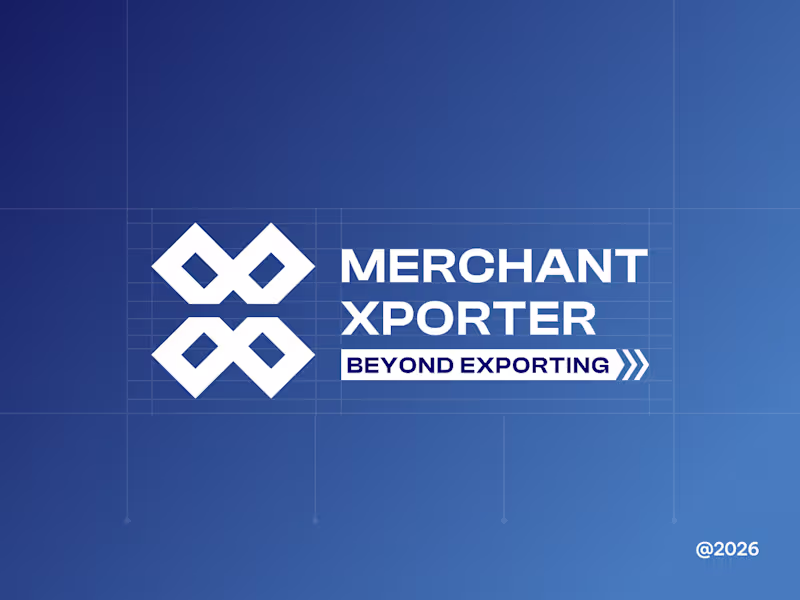
Led the logo design for MerchantXporter with a focus on building a strong, scalable identity for a global e-commerce sourcing and export company. The logo combines the initials M and X, representing Merchant and Xporter, into a unified geometric symbol. The form is inspired by containers, logistics flow, and multiple services operating within a structured system. Designed to be bold, balanced, and highly recognizable, the mark works seamlessly across digital platforms, logistics assets, and physical branding. The final logo establishes a clear, trustworthy visual foundation aligned with MerchantXporter’s global ambitions.
1
132
Message
3
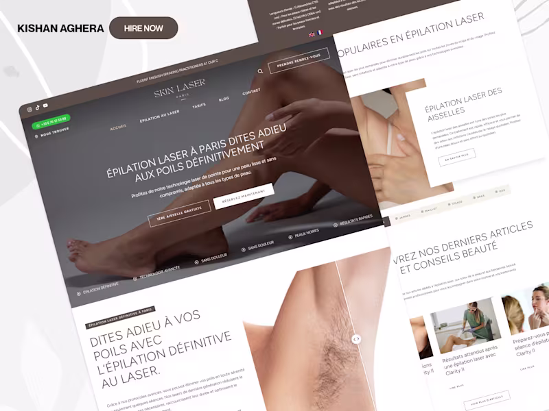
Kishan Aghera (WordPress Expert)
WordPress Website Redesign for SkinLaserParis.com
3
5
Message
0
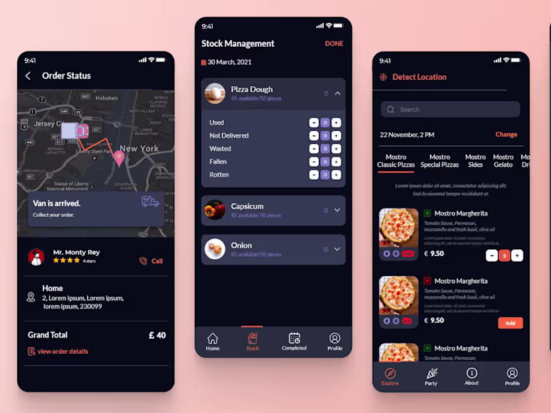
Deep Rathod
pro
Food Delivery App
0
16
Message
1
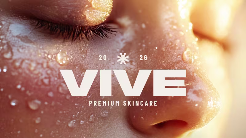
Aneri Shah
pro
VIVE Skincare Brand Identity Development
1
7
Message
0
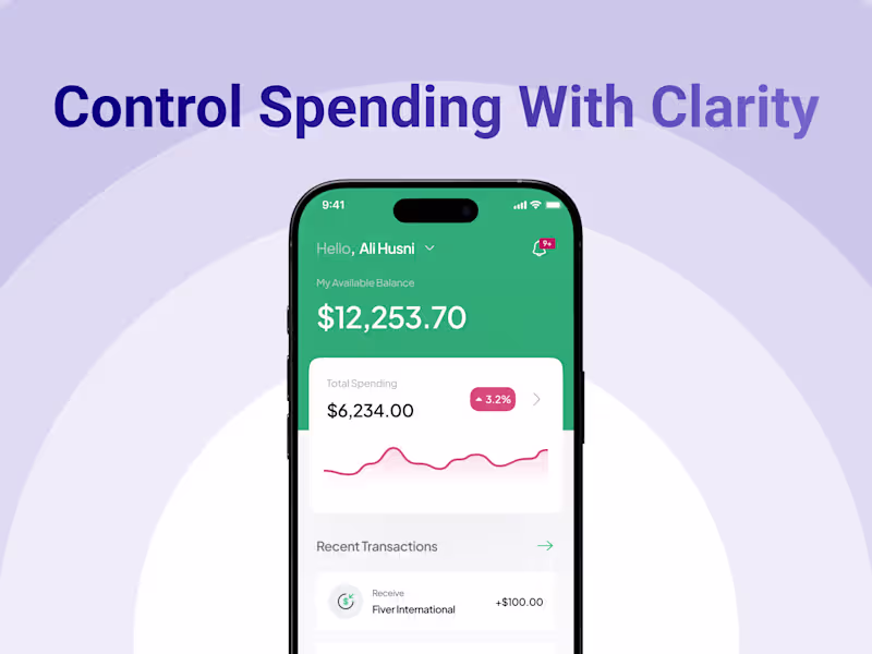
Jignesh Mayani
Payvion: Digital Wallet
0
8
Message
1
Harshil Patoliya
Culturally Rooted Logo Design for Riwayafilms
1
11
Message
8
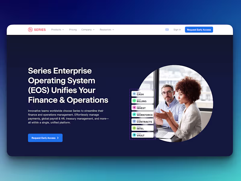
Gopi UI/UX + AI
pro
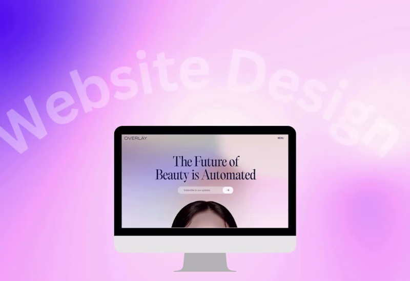
Website Design Showcase Clean layouts, modern aesthetics, and a seamless user experience. 📩 Available for SaaS, AI, Web App, and Dashboard UI/UX projects. 👉 Book a call: https://calendly.com/gopi-uiux/30min (https://calendly.com/gopi-uiux/30min)👉 Dribble: https://dribbble.com/OptimityLogics (https://dribbble.com/OptimityLogics)👉 Behance: https://www.behance.net/optimitylogics (https://www.behance.net/optimitylogics)👉 Portfolio: https://gopi-prajapati-portfolio.vercel.app
2
8
86
Message
22
Dwij Trivedi
pro
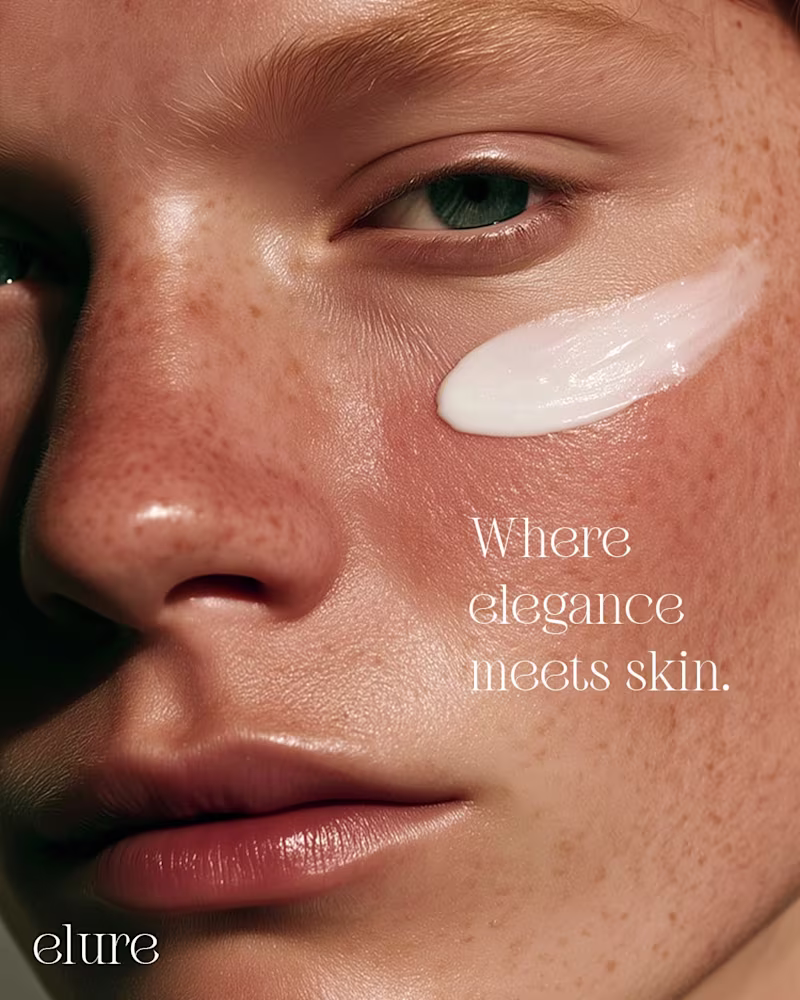
Crafted visuals that speak in quiet luxury. We built this series to highlight texture, depth, and emotion through close-up storytelling. Each frame focuses on the kind of detail that elevates a brand’s presence and drives stronger visual equity across touchpoints. If you want campaigns that feel refined, modern, and built to convert, we can help you get there. Let’s create work that stands out. hola.monkix@gmail.com (mailto:hola.monkix@gmail.com)monkix.in (http://monkix.in)Start your project now🚀
10
22
443
Message
1
Maharsh Gandhi
pro
Designed social media creatives that help brands stand out and connect with their audience through clean, engaging visuals.😍
1
458
Message
1
Vijay Kathiriya
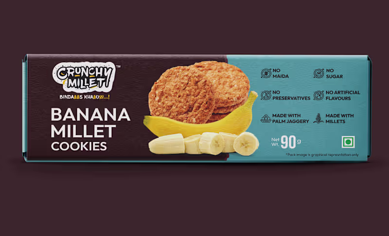
Brand Identity & Packaging Design
1
3
Message
1
Rasik Kanzariya
max
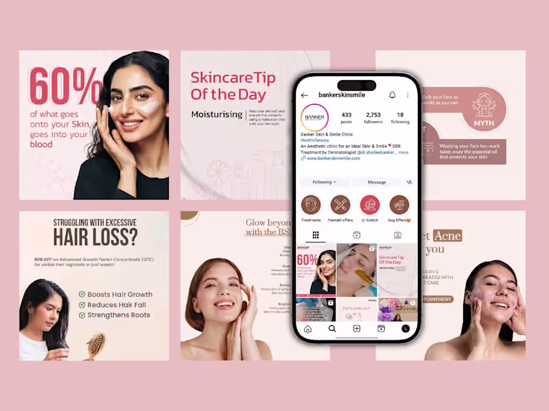
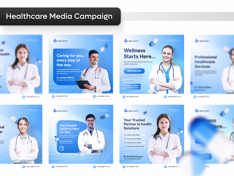
Healthcare Social Media Campaign Design
1
113
Message
2
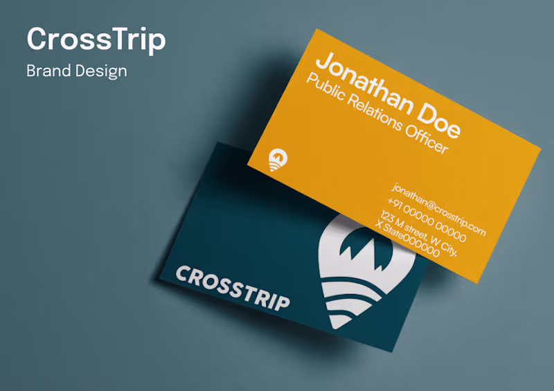
Dhanvi Shah
Created a logo that captures the spirit of travel while staying versatile for digital and print use. Designed a modern, minimal logo inspired by exploration and movement. Paired the symbol with clean typography for a professional yet approachable identity. Built variations for light, dark, and color backgrounds to ensure adaptability
2
55
Message
0
Chintan Savaliya
pro
Branding, Graphics, and Website
0
16
Explore projects