
Premium UI/UX & Web Design for Fintech, SaaS & Web3 | Framer


Premium UI/UX & Web Design for Fintech, SaaS & Web3 | Framer


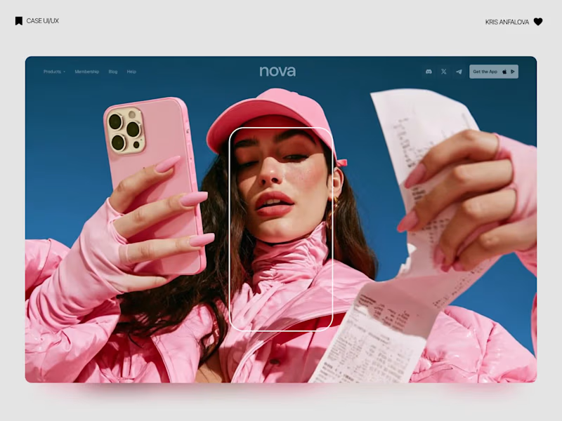
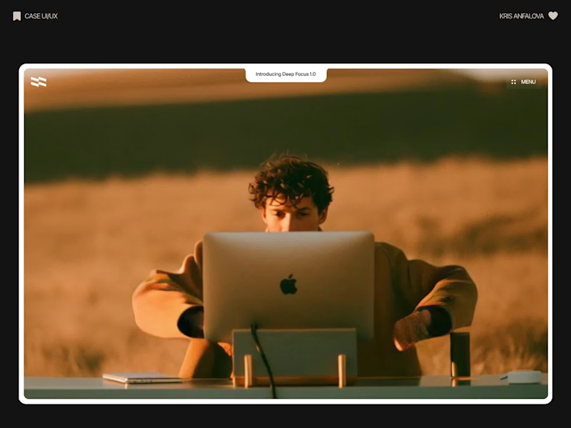
Deep Focus is a fictional macOS app that silences notifications so people can do deep work. The catch is the audience: people who need a productivity app are already tired of apps. Every competitor promises more features, so this page had to promise relief and turn it into a download within seconds.
What I did
I started from the pain, not the product. The second screen lists what a normal day looks like: push notifications, endless pings, 142 unread emails, context switching. I styled those chips like the four benefit chips in the hero, only white instead of frosted, so the visitor reads before and after without a line of explanation.
The hero section design shows no interface on purpose. This product is about absence, and a screenshot would add noise, so a person alone in a field does the proving. The headline “Deep focus. Anywhere.” is a high-contrast serif because every tool in this category speaks in a grotesque, and a serif sounds calm and human.
I kept one action, Download for macOS, with no pricing and no form. The first job of this landing page design is a download, and everything else can wait until after it.
Would you keep the serif for the headline, or switch to a grotesque so it feels more like software?
26
67
1.8K
Electronics(2)

Web experiences for founders. Felt, not just seen.
Web experiences for founders. Felt, not just seen.
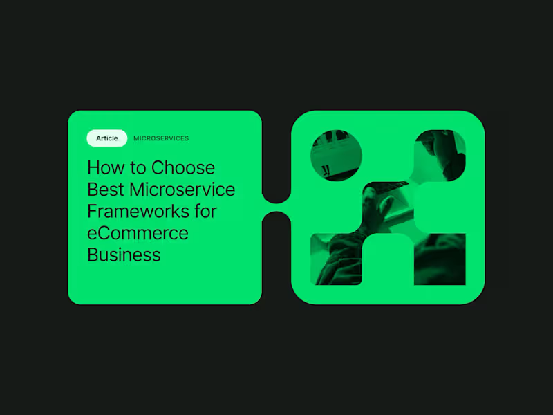
I had the privilege of collaborating with the team at northstar.cx (http://northstar.cx), who crafted the beautiful brand identity for Alokai (formerly Vue Storefront). Based on their exceptional work, I was invited to create this brand showreel introduction that brings visual identity to life.
35
2.1K
Electronics(1)

Full Stack Developer | Mobile Developer | AI Expert


Electronics(1)

Senior Product Designer for SaaS & Mobile Apps
Electronics(1)

Responsive Web design, UI/UX Design, App Design
Responsive Web design, UI/UX Design, App Design


Electronics(1)

UI/UX Designer, UX flows, Framer & no-code, AI tools



Electronics(1)


Senior Web Developer, Webflow Expert


it started with an Upwork profile in 2021.
since then: full-time roles, agency white-label work, and now back on my own doing both.
today I'm sharing my new portfolio: copperflow.dev (http://copperflow.dev)
it's a collection of the Webflow projects I'm most proud of, plus a look at how I work and who I work with.
if you need a Webflow developer who ships clean, scalable, SEO-ready sites for SaaS and B2B, let's talk.
🔗 www.copperflow.dev (http://www.copperflow.dev)
1
276


View more →
Electronics(1)

Full-Stack Web, Mobile & AI Automation Developer



Electronics(3)