

Marketing sites for B2B tech startups


Marketing sites for B2B tech startups
Electronics(1)

Premium UI/UX & Web Design for Fintech, SaaS & Web3 | Framer


Premium UI/UX & Web Design for Fintech, SaaS & Web3 | Framer


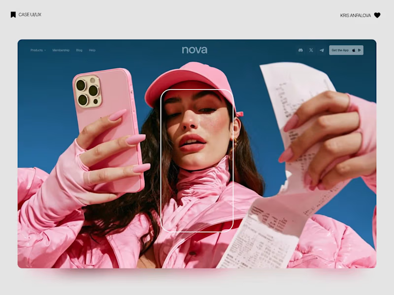
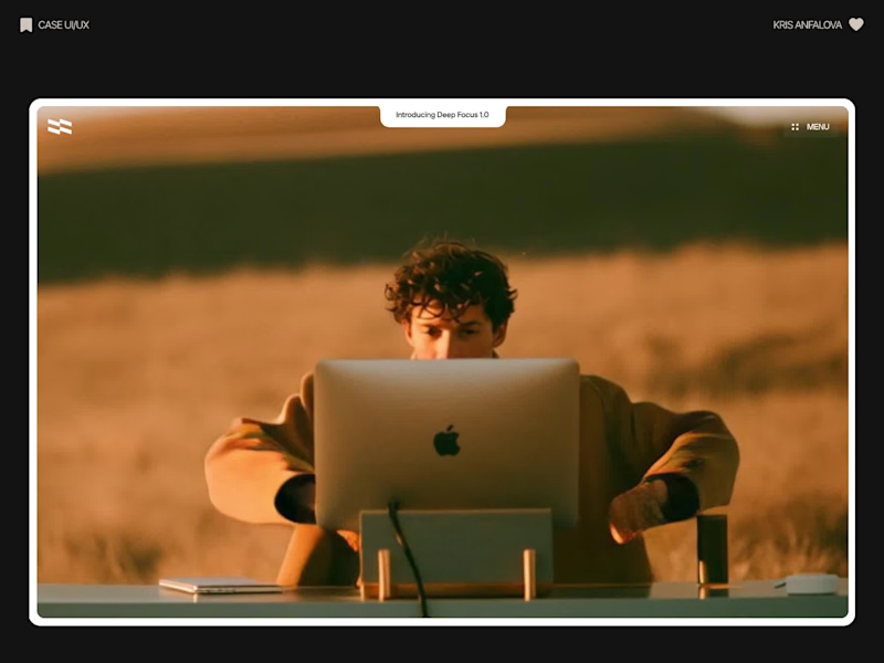
Deep Focus is a fictional macOS app that silences notifications so people can do deep work. The catch is the audience: people who need a productivity app are already tired of apps. Every competitor promises more features, so this page had to promise relief and turn it into a download within seconds.
What I did
I started from the pain, not the product. The second screen lists what a normal day looks like: push notifications, endless pings, 142 unread emails, context switching. I styled those chips like the four benefit chips in the hero, only white instead of frosted, so the visitor reads before and after without a line of explanation.
The hero section design shows no interface on purpose. This product is about absence, and a screenshot would add noise, so a person alone in a field does the proving. The headline “Deep focus. Anywhere.” is a high-contrast serif because every tool in this category speaks in a grotesque, and a serif sounds calm and human.
I kept one action, Download for macOS, with no pricing and no form. The first job of this landing page design is a download, and everything else can wait until after it.
Would you keep the serif for the headline, or switch to a grotesque so it feels more like software?
26
66
1.8K
Electronics(2)

Web experiences for founders. Felt, not just seen.
Web experiences for founders. Felt, not just seen.
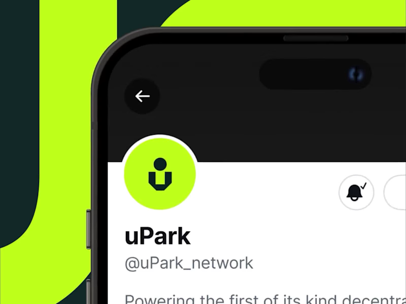
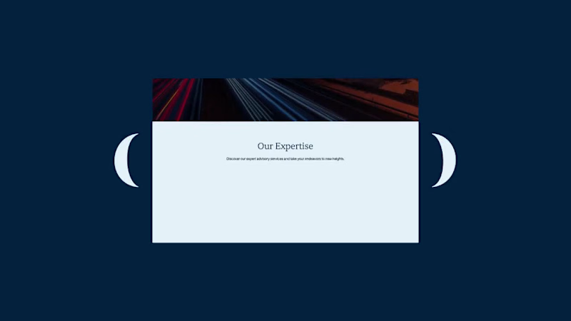
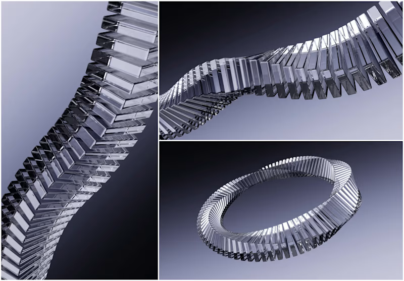
I had the privilege of collaborating with the team at northstar.cx (http://northstar.cx), who crafted the beautiful brand identity for Alokai (formerly Vue Storefront). Based on their exceptional work, I was invited to create this brand showreel introduction that brings visual identity to life.
35
2.1K
Electronics(1)

Logo and Visual Identity design.
Electronics(1)

Senior Product Designer | Webflow, Mobile & Design Systems
- $1k+
- Earned
- 1x
- Hired
- 5.0
- Rating
- 14
- Followers
Senior Product Designer | Webflow, Mobile & Design Systems

Electronics(1)


Design + dev partner for scale-ups and enterprise products.
- $250k+
- Earned
- 50x
- Hired
- 137
- Followers
Design + dev partner for scale-ups and enterprise products.
Electronics(5)

Senior Brand & UX/UI Designer building scalable systems
- 1x
- Hired
- 30
- Followers
Senior Brand & UX/UI Designer building scalable systems

I created Menmi a while ago as a brand mascot for a ramen bar, and it quickly became a client favorite. Eventually, I archived the project from my public showcase.
Recently, while scrolling through Pinterest, I stumbled upon a logo design with a remarkably similar character concept the same spiky hair silhouette, face shape, and ramen element! Seeing that was an instant sign that this concept still resonates and holds great creative value.
I’m unarchiving Menmi to give this character a second life in my portfolio. Never let your solid work hide in the dark just because time has passed!
How do you handle your older, hidden designs when you see similar trends popping up?
17
30
1.5K

Electronics(1)

Product Design Partner For Founders


Electronics(1)