pro
Cheree Zellars
Framer Developer & Brand Designer
- $1k+
- Earned
- 2x
- Hired
- 5.0
- Rating
- 47
- Followers



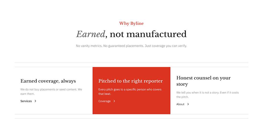
Features section from Byline, a concept PR agency site. Off-black and white base, one red-orange accent for a breaking news feel, and a hover state that fills the active card. Built in Framer.


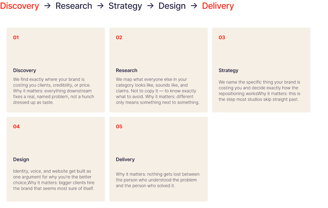
What's one question you use in discovery that makes the direction click for you?
Every project I take on starts with discovery. I’m trying to land three things: who we’re talking to, what the message is, and what’s actually being made. I go back and forth on how much to ask....
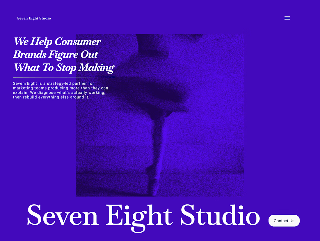
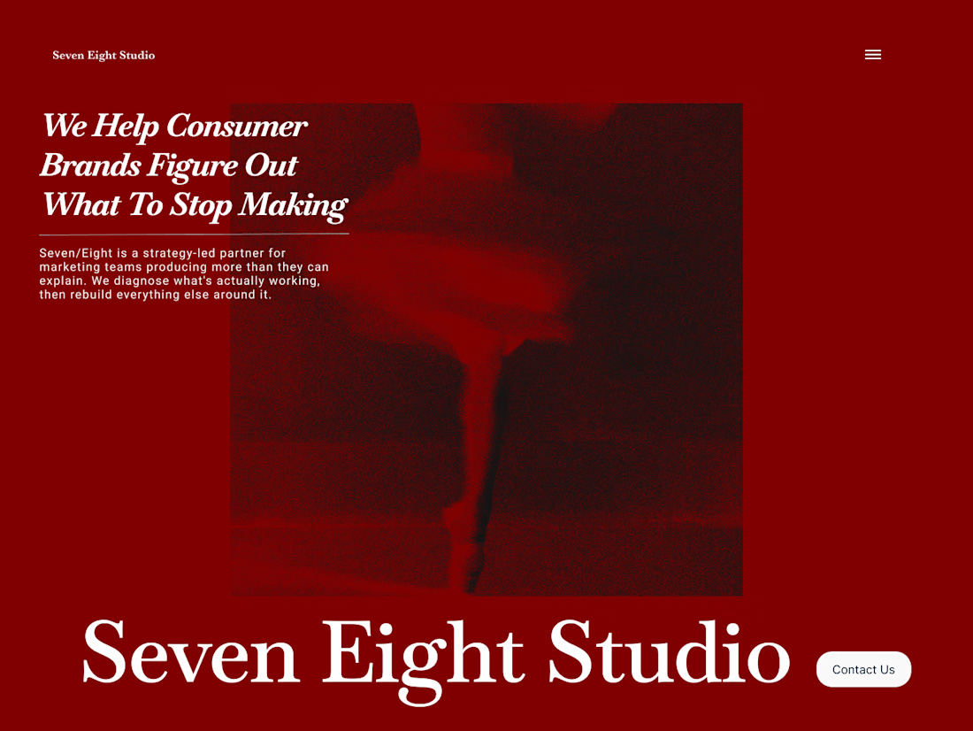
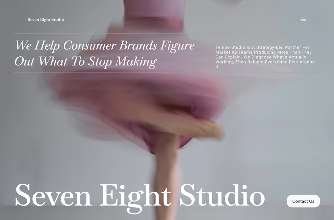
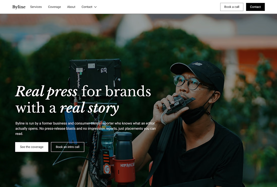
Built this in Framer as a concept project. Goal was to make it feel run by ex-journalists. Choices: editorial serif (Libre Baskerville), a dark photo with one color accent, and copy that positions against blast-style PR.
Where I’m unsure: text legibility over the photo and whether the two CTAs compete. What would you change?
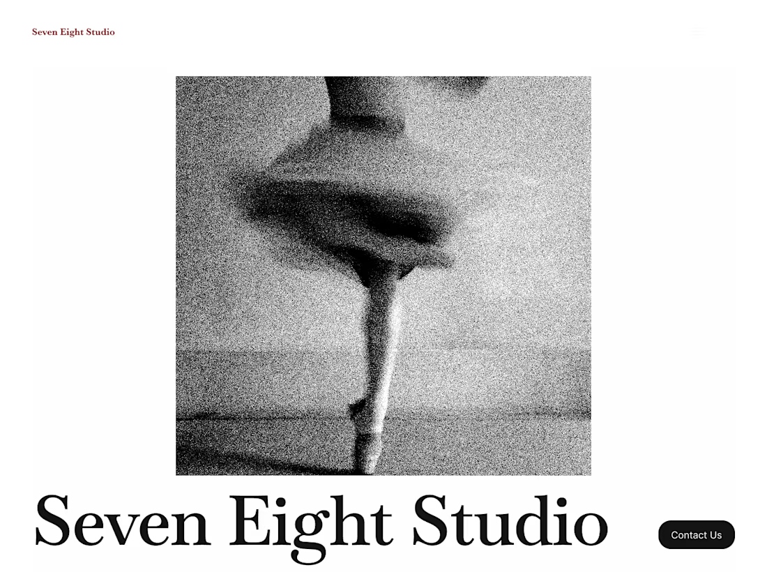
Experimenting with brutalism for a concept project.