
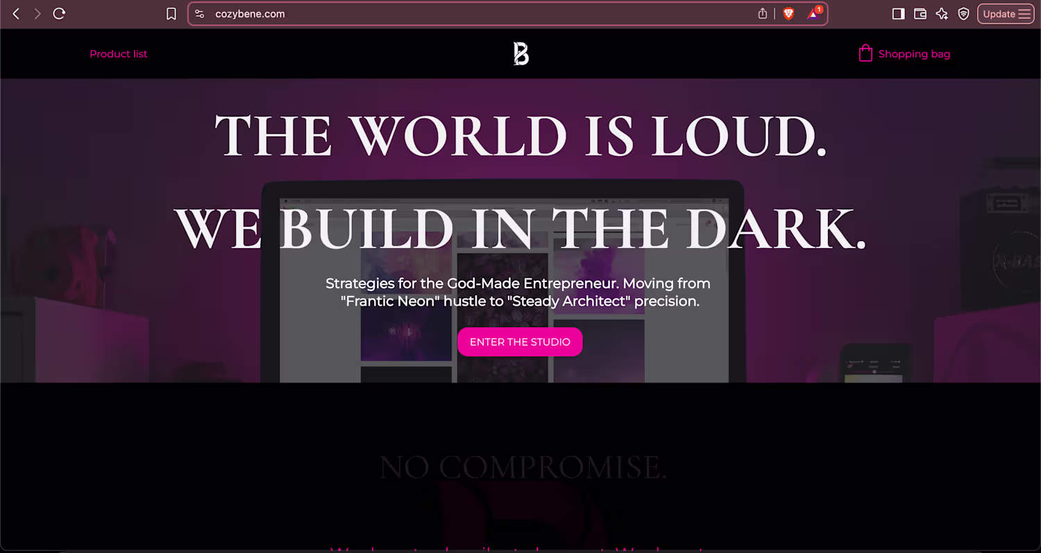
Bene
Strategic Branding || Website: cozybene.com
Ready for work
Bene is ready for their next project!
Weekend shenanigans. What is everyone else getting up to? :)
I find the best way to stay sharp as a Strategist is to go back to the raw creative tools. No briefs, no deadlines, just flow.
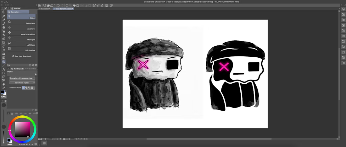
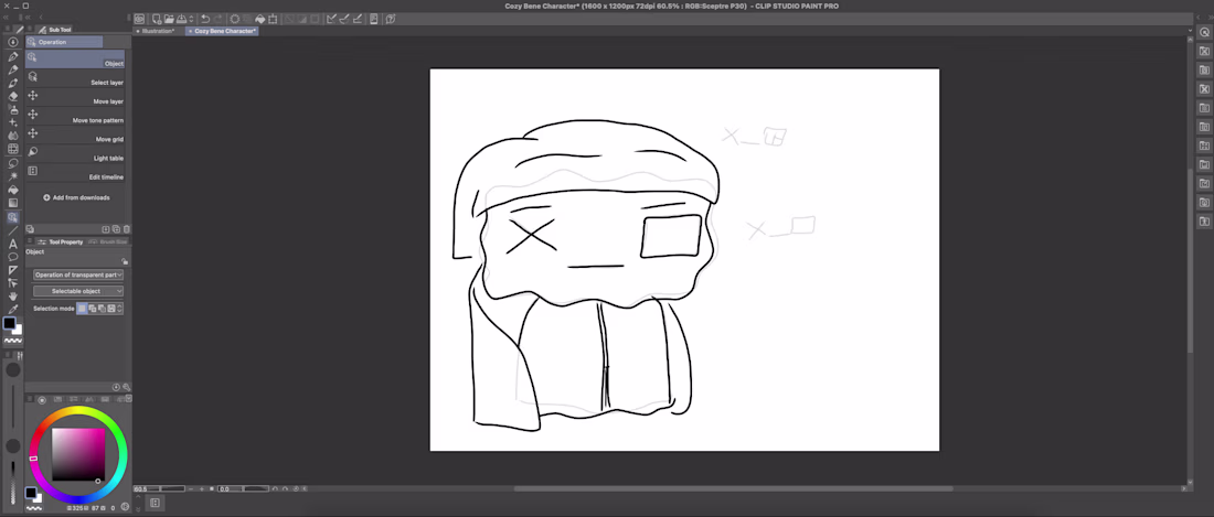
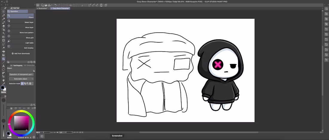
I picked up a Wacom tablet for the first time in 15 years today. Forgot how good the tactile...

Too many strategists treat clients like canvas for their own art. If they love minimalism, everyone gets Helvetica.
This is a failure of empathy.
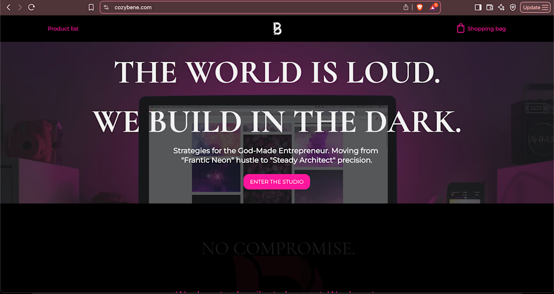
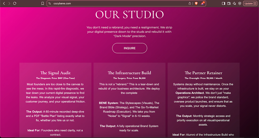
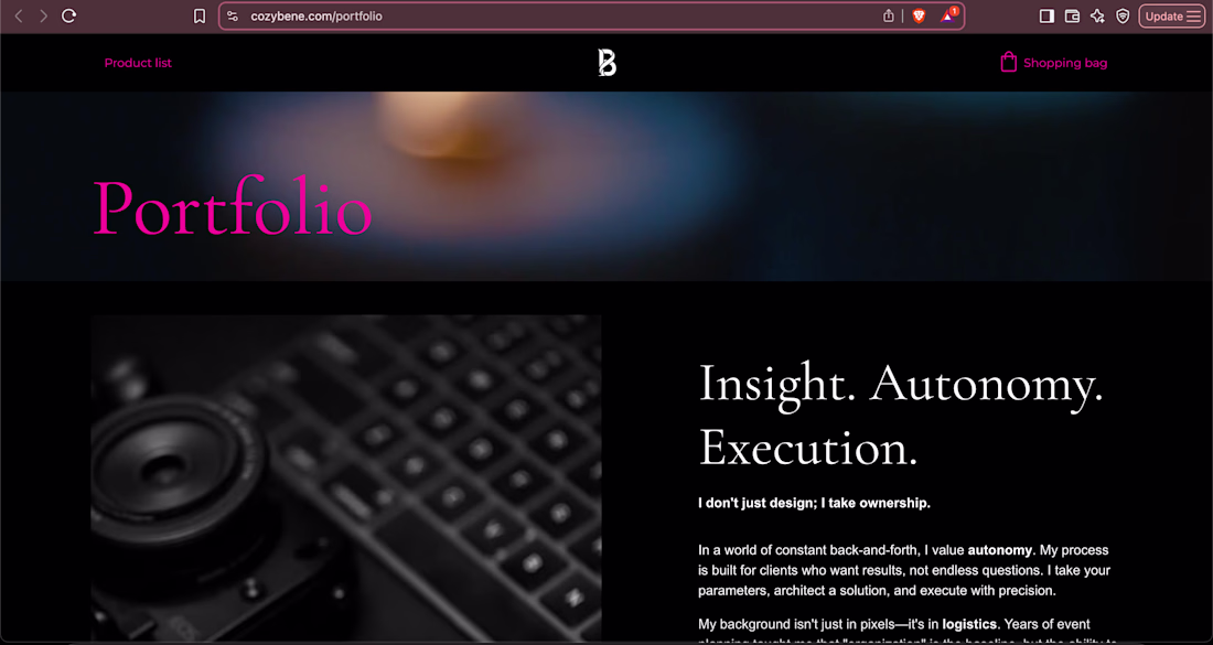
My personal brand is "Dark Mode" industrial and brutalist. But applying that to every client is malpractice.
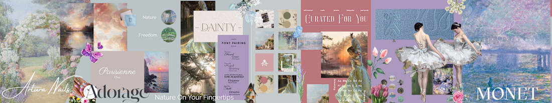
Exhibit A:
Artura Nails...

You don’t build a foundation out of drywall.
You have to know the difference between a Community Hub and a Business HQ.
I used to treat Contra as a storefront. But I realized this space is my "Living Room" a Laboratory to connect and test ideas. A place to connect with fellow...
The path for Holy Wraps is clear: Tactical Soul.
We officially curated this direction after stress-testing three distinct paths. This isn’t a color preference; it is an audit of grit and spiritual discipline.
Why Tactical Soul?
The Contrast: Bridges industrial boxing energy with a...
Two months on Contra and the momentum is real. Glad to be here. Ready to keep building, learning, and connecting with fellow creatives.