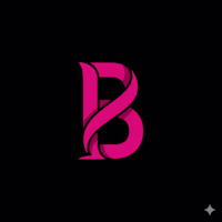
Bene
Strategic Branding || Website: cozybene.com
Ready for work
Bene is ready for their next project!
Too many strategists treat clients like canvas for their own art. If they love minimalism, everyone gets Helvetica.
This is a failure of empathy.
My personal brand is "Dark Mode" industrial and brutalist. But applying that to every client is malpractice.
Exhibit A:
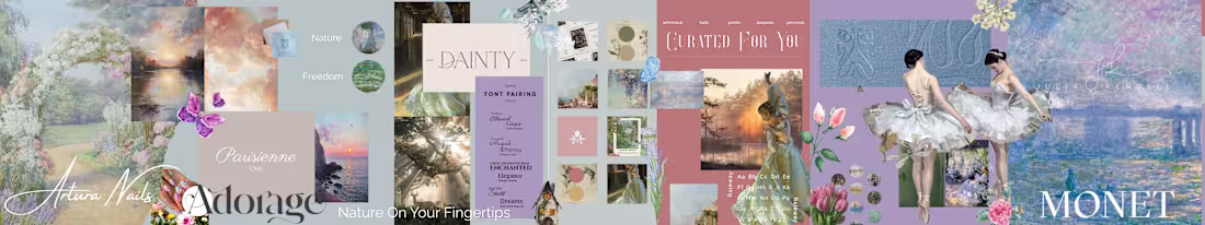
Artura Nails Soul: Monet. Parisienne. Nature. Vibe: Soft, etherial quiet luxury. Result: A breath of fresh air.
Exhibit B:
Holy Wraps Soul: Boxing. Tactical. Heritage. Vibe: Sweat, grit, and aggression. Result: A punch in the mouth.
Two opposing worlds. Same Strategist.
My job isn't to impose my taste. It's to excavate yours.
Which brands stylescape speaks to you?
22
186

The path for Holy Wraps is clear: Tactical Soul.
We officially curated this direction after stress-testing three distinct paths. This isn’t a color preference; it is an audit of grit and spiritual discipline.
Why Tactical Soul?
The Contrast: Bridges industrial boxing energy with a refined, future-forward aesthetic.
The Function: High-visibility orange and heritage typography create a "Tactical" feel that commands attention.
The Vibe: Captures the "Spiritual Athlete" the internal prayer and the external fight.
As a strategist and co-founder, my job is to ensure the brand's "Look" is the invisible skeleton that allows the mission to stand upright. Foundation set. Now, we build the ecosystem.
19
201
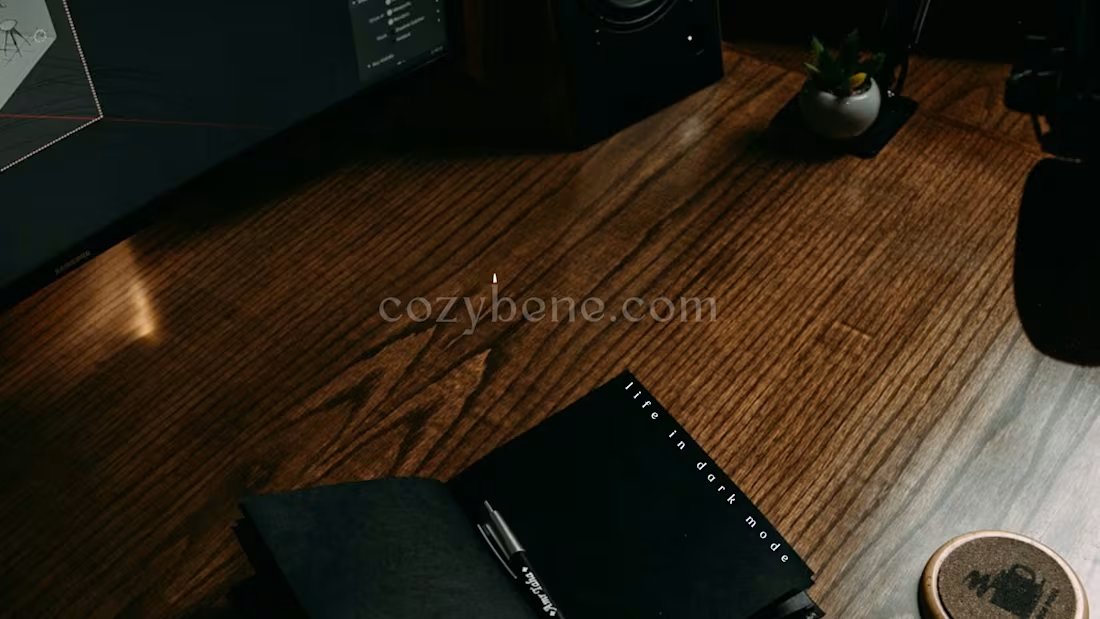
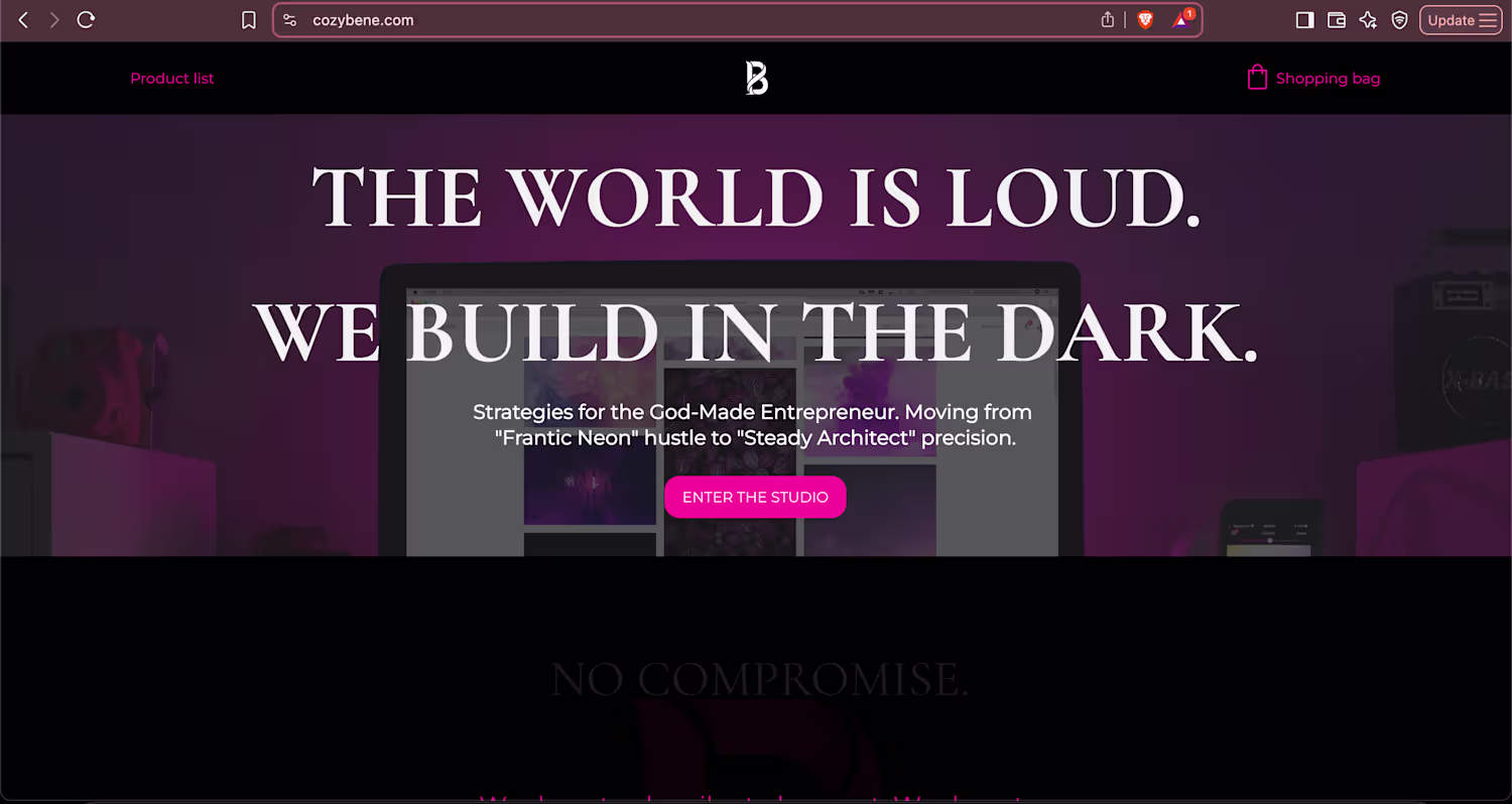
Cozy Bene Rebranding: The Dark Mode Architecture
0
5
BENE: The Brand Operating Manual
0
3
I learned to not chase aesthetic trends when I realized this: Every visual and verbal element in my brand is a deliberate signal to the client’s subconscious.
If those signals are misaligned, if your font says Established but your copy says Frantic, you erode trust. You lose clients, not because you aren't good, but because your brand lacks Integrity of Invocation (what it invokes in the viewer).
2
13
210
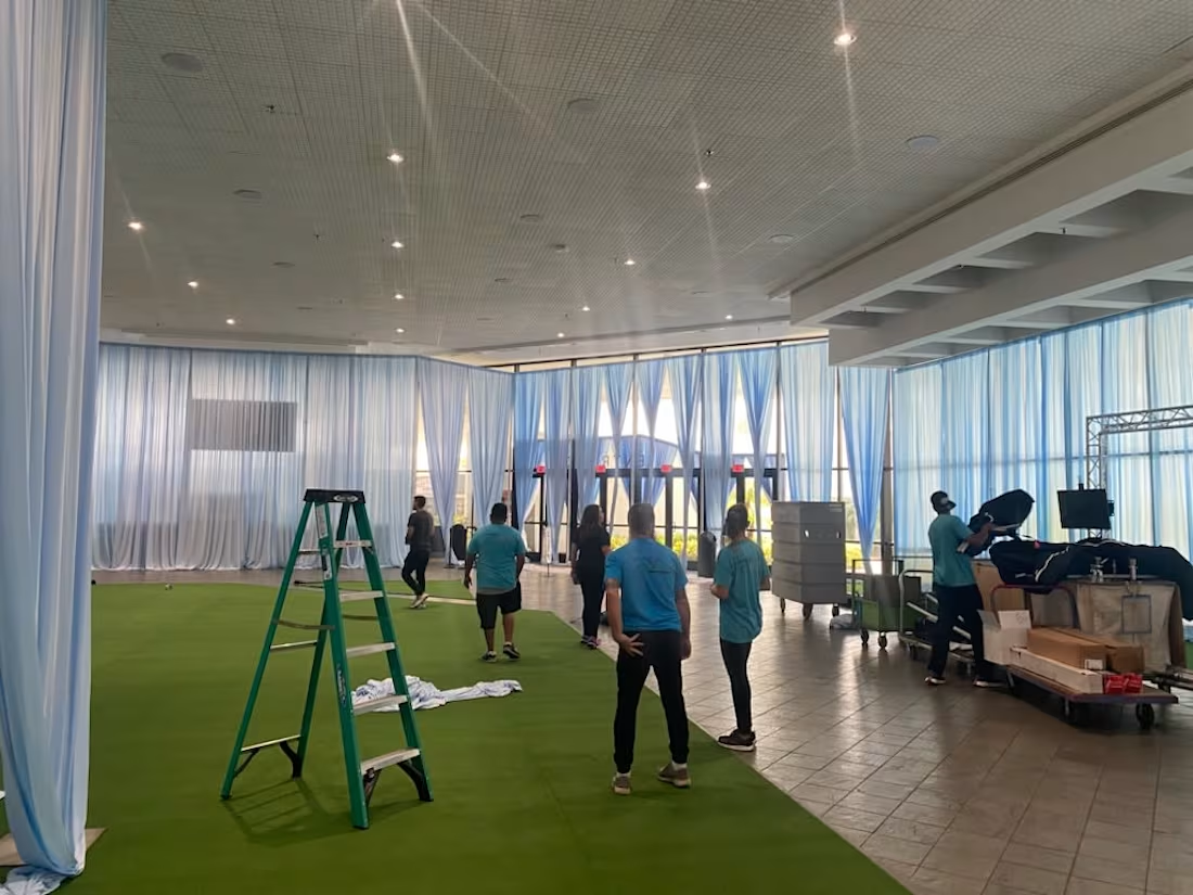
My work in experiential design is where the brand's "clear frequency" becomes a tangible, navigable environment. An event is not a venue; it is a custom-designed space where your brand’s truth must be felt, not just announced.
I am not an event planner; I am the architect of that resonance.
I design custom physical and digital environments, using my skills in Set Design & Execution to translate the visual identity into an immersive, emotional experience. The goal is simple and precise: to create environments that perfectly reflect the client's brand identity with engaging visual elements.
If your next physical touchpoint needs to be a fully realized world that creates a lasting emotional connection, you need a designer, not a decorator. Let's build your brand's truest environment.
17
251
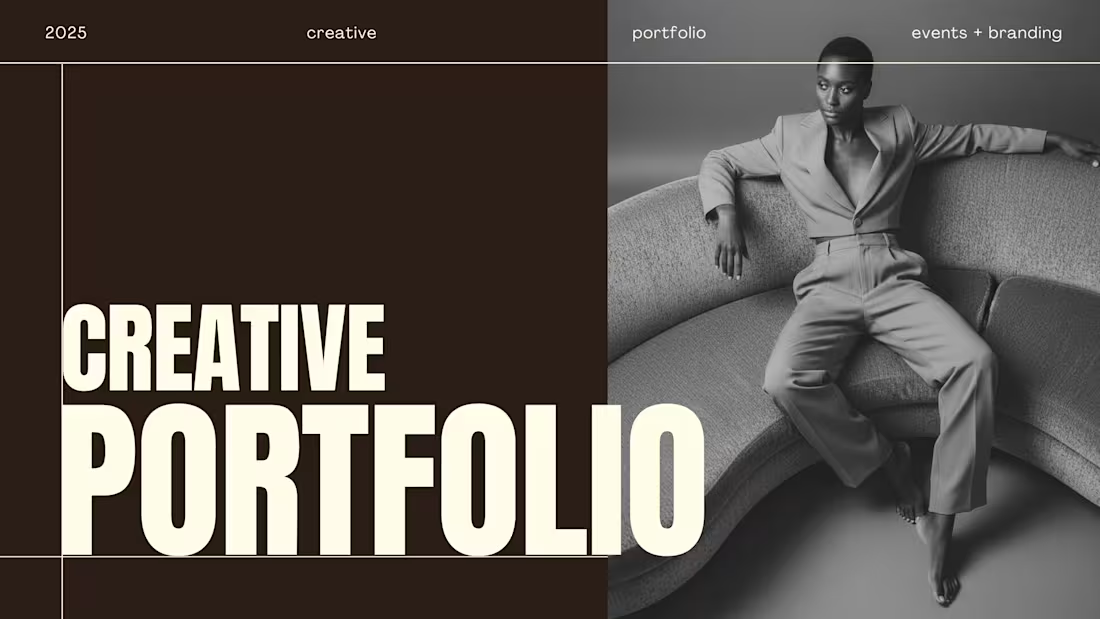
I don't just design brands; I manage the entire experience from tuning the strategic visual identity of projects like Constitution Construction to coordinating over 400 large-scale, cohesive live events. My portfolio is now live and shows the process for turning a company's truth into a clear frequency across both design assets and physical environments. If your brand needs a partner who handles both the blueprint and the live build-out, let's connect here on Contra.
Portfolio Link: TAKE A PEAK (https://rbcreativeportfolio.my.canva.site/)
0
104
You don’t need a louder voice; you need a clearer frequency.
Many founders believe branding is about launching something new, a viral hook, a louder shout. But that’s just static. The strongest brands don’t announce; they resonate. They echo from within.
I don’t create meaning; I uncover it. I strip away the noise, the trends, the templates, the fear of being “under-branded.” I go quiet and listen.
I listen for the truth with a pulse.
When you find it, when you distill your why, your how, your only, you don’t need to force reach. You just turn up the volume.
23
252
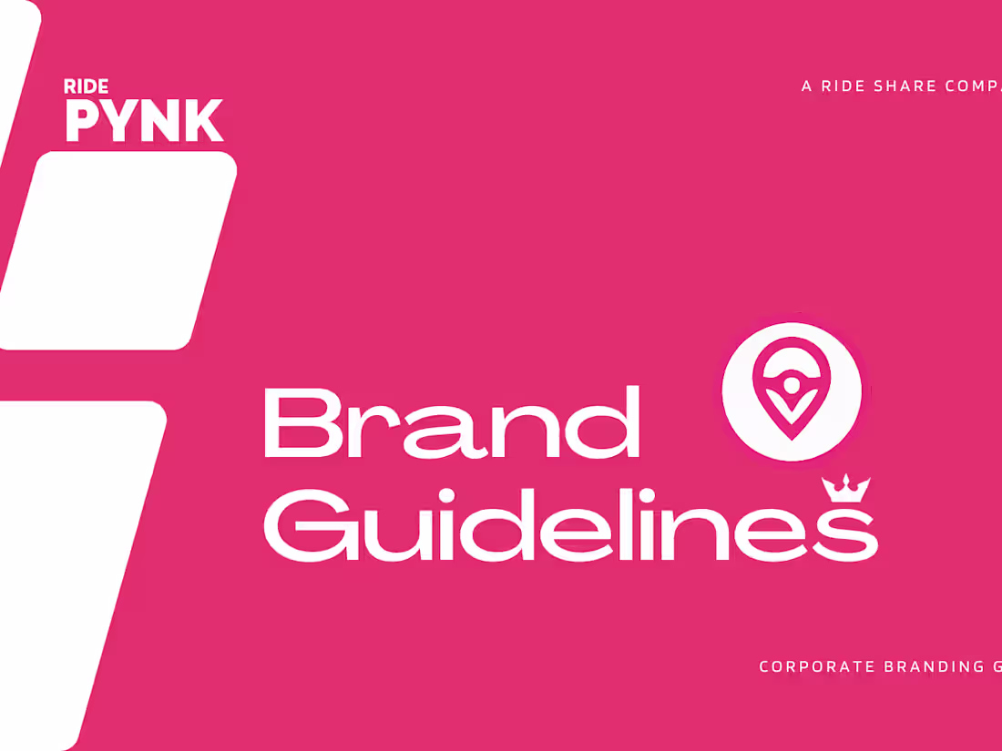
First post on Contra. Sharing these two projects side-by-side for a reason.
Constitution Construction is dark, industrial, and futuristic. Ride Pynk is vibrant, accessible, and consumer-facing.
A lot of designers get stuck in one aesthetic. As a founder and creative partner, I don’t impose "my style" on a business. I find the visual truth of your business and build a system around it.
Whether it’s heavy industry or consumer tech, I build brand guidelines that work.
0
79