Cozy Bene Rebranding: The Dark Mode Architecture
Bene
Project: The Dark Mode Architecture
Client: Internal Rebrand (Cozy Bene Strategy)
Services: Brand Strategy, Visual Identity System, Operational Architecture
The Context
The Noise Problem In early 2025, Cozy Bene faced a critical identity crisis common to many creative founders: the brand’s visual language was contradicting its strategic intent. The original identity relied heavily on "Lofi" aesthetics, anime-inspired character art, and a soft, floral color palette. While visually pleasing, this "loud" aesthetic signaled "freelance illustrator" and attracted low-budget, transactional inquiries.
The strategic goal was to pivot from a personality-driven creative service to a high-ticket strategic consultancy. To do this, I had to dismantle the "influencer" persona and build an "institution."

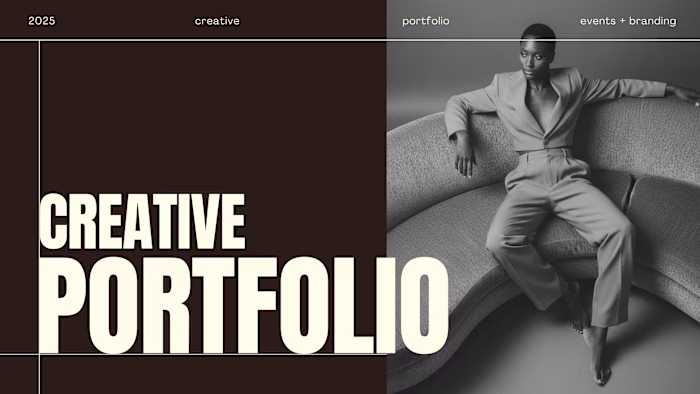
The Previous Iteration: High Noise.
The Insight
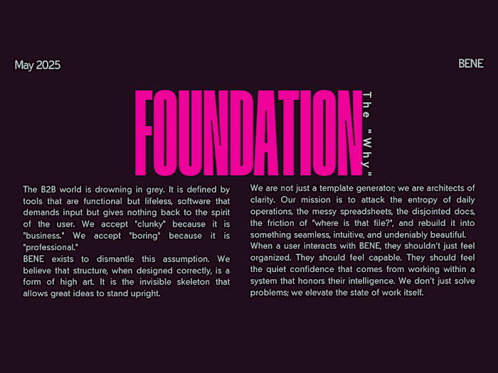
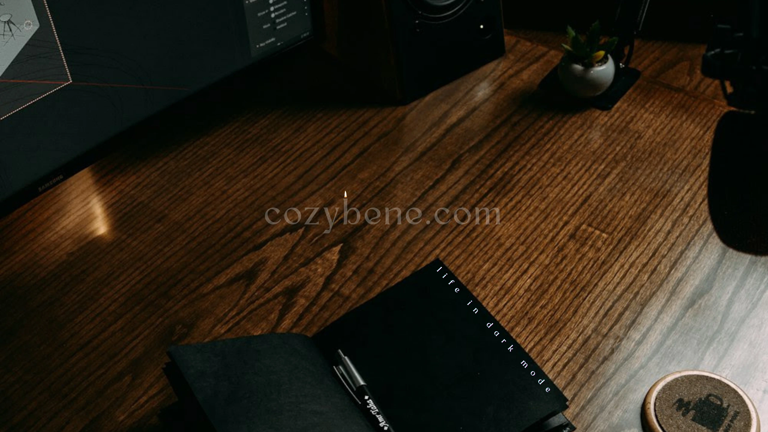
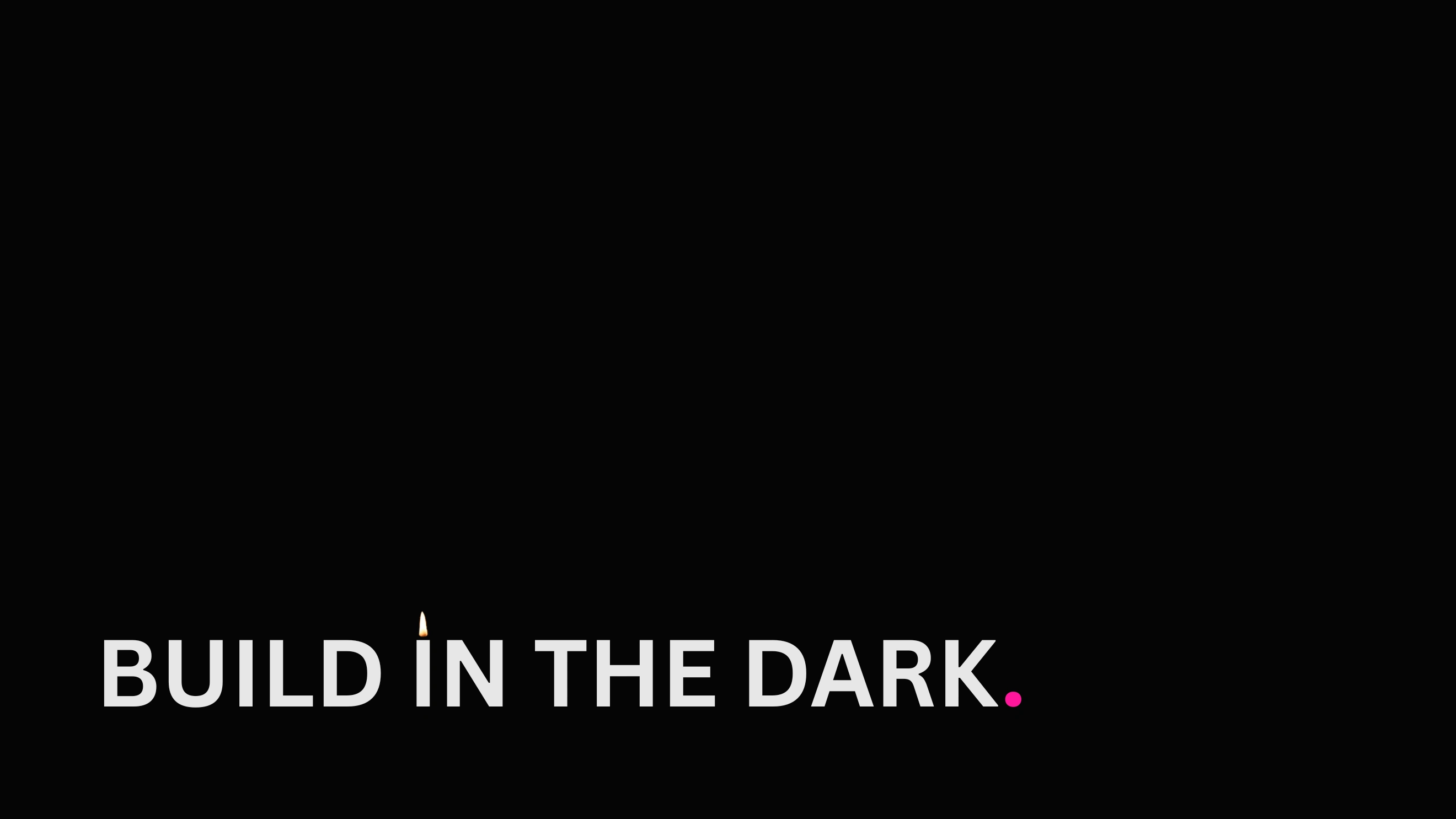
Diligence is Quiet The rebrand was anchored in a singular philosophical shift: "Dark Mode." I identified a gap in the market for the "God-Made Entrepreneur"—founders who are tired of the performative hustle culture and seek steady, architectural growth.
I realized that true luxury is not about adding noise; it is about removing it. I established a new mandate: "Build in the dark. Do not seek the praises of man.". This required a move to a Faceless Brand Strategy, shifting the focus from the founder's personality to the efficiency of the systems being built.
The Solution
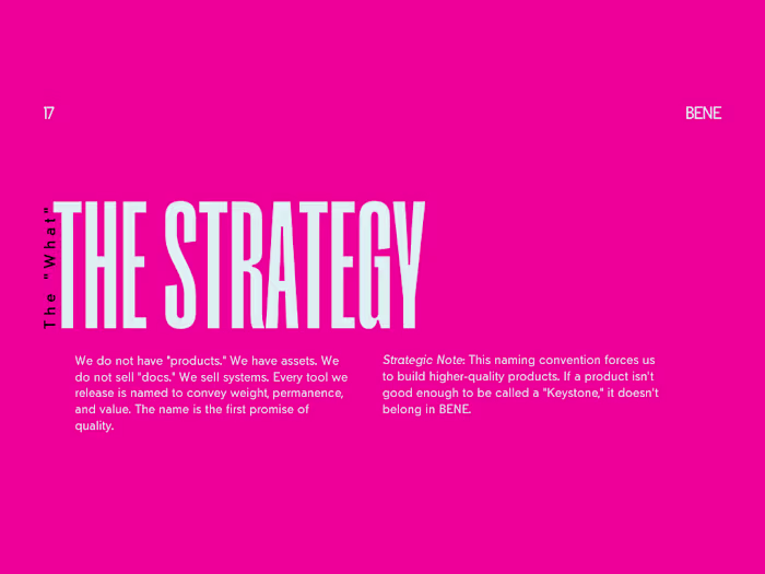
Operations Made Beautiful We executed a "Total System Overhaul" governed by three core pillars:
The Visual Physics We eliminated the soft pinks and replaced them with a high-contrast system designed for deep work.
The Void: "Deep Espresso" (#20111a) serves as the primary canvas, reducing digital eye strain and simulating the "Secret Place" where strategy happens.
The Pulse: "Vibrant Magenta" (#FF179B) is used exclusively for "Keystones"—critical actions or data points—ensuring the user’s eye is never distracted, only directed.

The New Architecture: Systematized Guidelines.
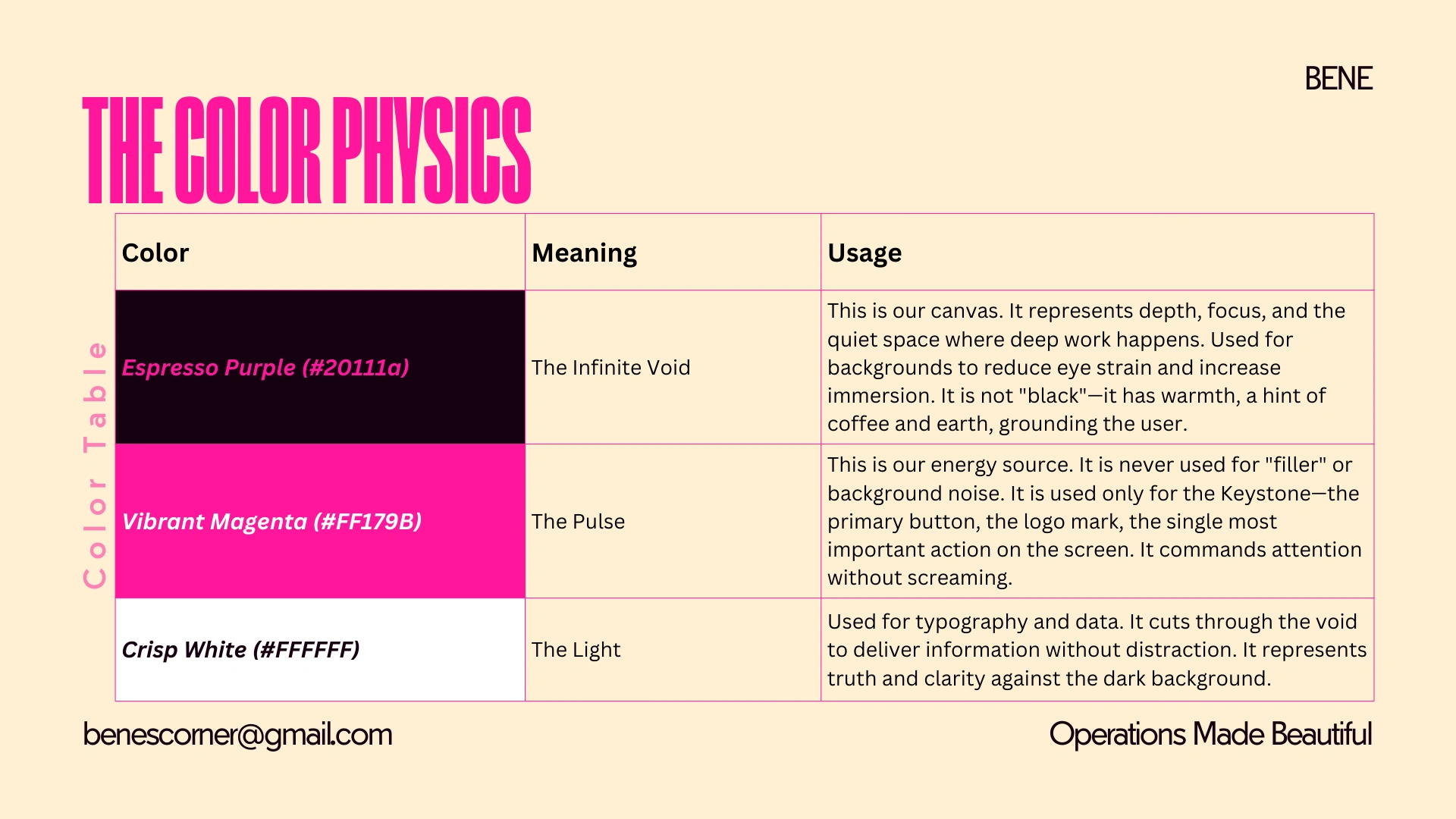
The Signal: Vibrant Magenta on Deep Espresso.
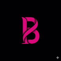
The Sculptural Mark We moved away from character art to a pure symbol: The Ribbon B. Designed as a Mobius strip, it represents infinite productivity and a self-contained system. It is flat, sculptural, and authoritative—designed to look as relevant on a favicon as it would on an architectural blueprint.
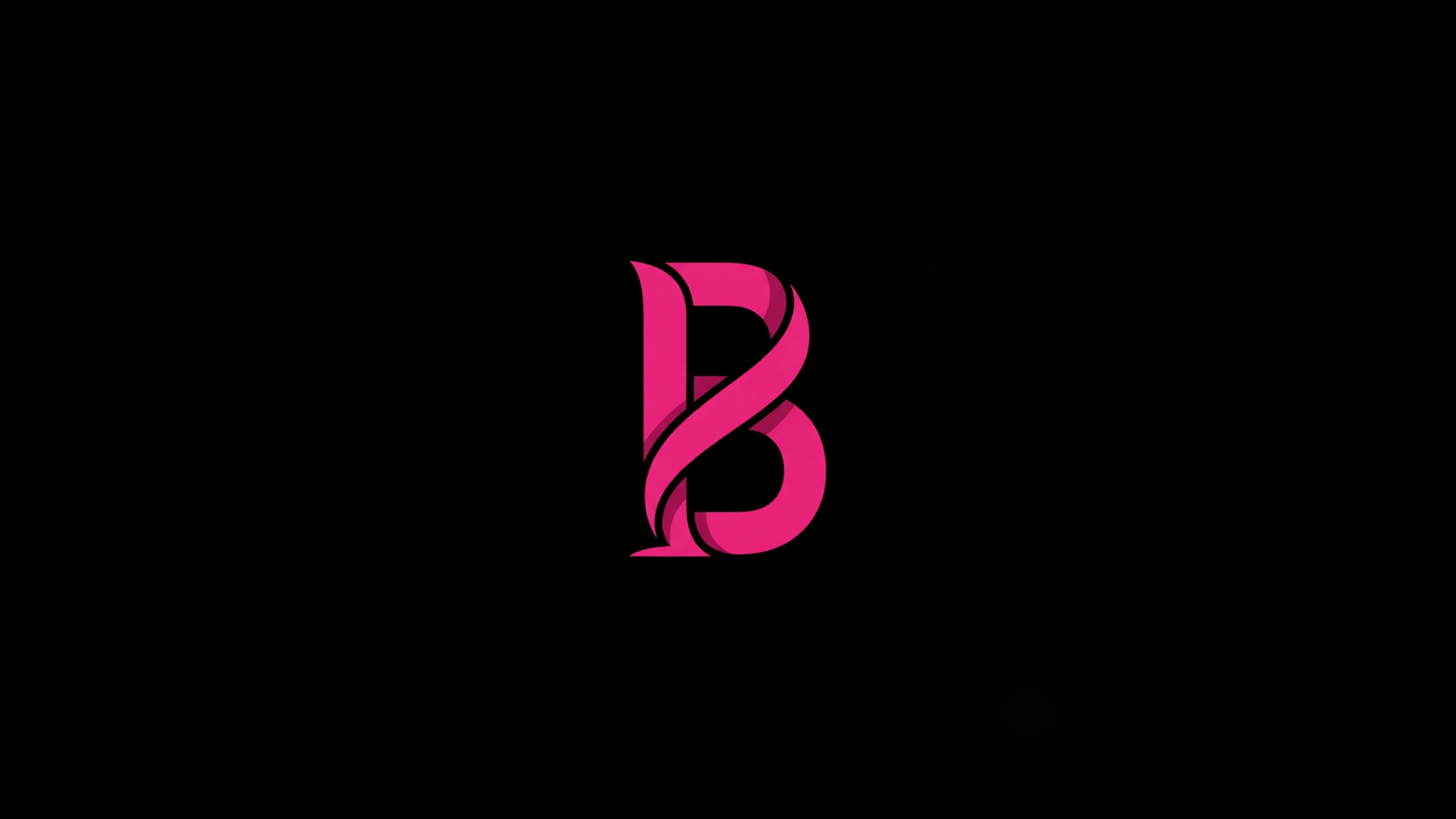
The Mark: Infinite Productivity.
The Operational Framework A brand is only as good as its laws. We developed The Brand Operating Manual, a governing document that standardizes every output—from AI prompting protocols to the "No Faces" rule in photography. This ensured that the "Dark Mode" aesthetic remained consistent across web, social, and client documentation.
The Result
From Freelancer to Firm. The transformation established cozybene.com and cozybenestudio.site as a unified digital headquarters. The new identity immediately filtered out misalignment, signaling "Authority" and "Rest." Cozy Bene is no longer just a service provider; it is now positioned as a Strategic Partner for the entrepreneur ready to build a legacy.
The New Mandate.
Like this project
Posted Jan 3, 2026
Rebranded Cozy Bene to pivot from freelance to strategic consultancy with a new visual identity.
Likes
0
Views
5
Timeline
Nov 29, 2025 - Dec 18, 2025