The network for creativity
Join 1.25M professional creatives like you
Connect with clients, get discovered, and run your business 100% commission-free
Creatives on Contra have earned over $150M and we are just getting started
Back to feedPost

Clean🔥

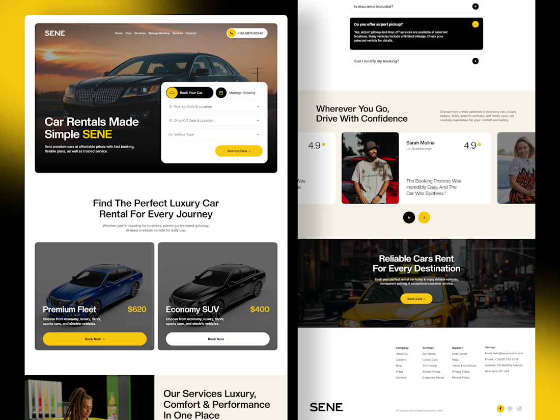
SENE car rental Website Projects
A car rental website shouldn't make people think too much. It should help them find the right car, understand the price, trust the service, and book with confidence.
I designed SENE around exactly that principle.
Need a website that turns visitors...
The network for creativity
Join 1.25M professional creatives like you
Connect with clients, get discovered, and run your business 100% commission-free
Creatives on Contra have earned over $150M and we are just getting started











Related posts


😍

What would happen if a modern skincare product had to communicate without the visual language we associate with beauty today?
Instead, I went back to Art Nouveau, where typography, illustration, architecture, and ornament were treated as one visual system.
The subject actually...




thanks for sharing!

Exploring a clean, modern SaaS dashboard UI. Focused on simple layouts, smooth interactions, and a better user experience 🚀


i had to like this, it got my attention, very nice build mate.

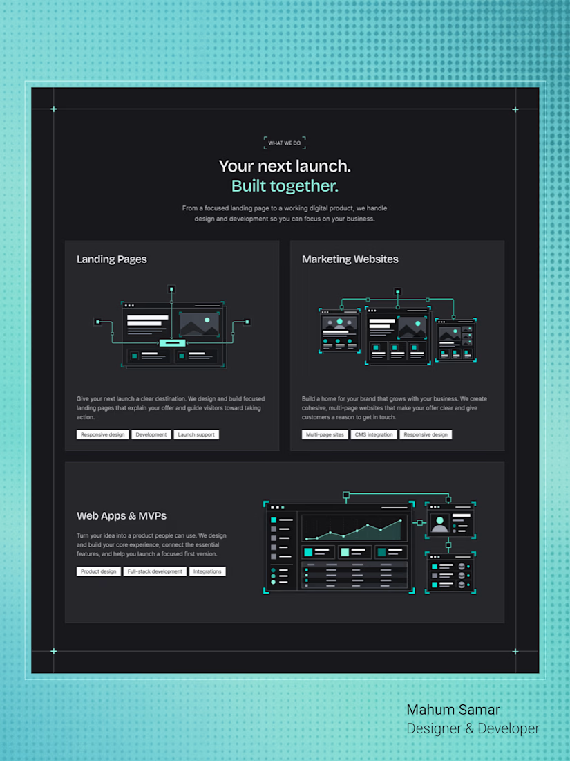
Another section completed for TealSites, a web design and development agency.
This time, I designed the What We Do section, highlighting three core services:
- Landing Pages
- Marketing Websites
- Web Apps and MVPs
The goal was to make each service easy to understand while keeping the layout clean and consistent with the overall visual identity.
I used custom illustrations, subtle grid lines, and teal accents to give each card its own character without making the section feel cluttered.
Designed in Figma.
What do you think of this section?
Clean structure! Love how you separated Landing Pages vs Marketing Websites vs MVPs — a lot of agencies mix them up. The isometric illustrations with the teal accent keep it technical but friendly. How did you handle the responsive behavior for those 3 cards?